Visualizing DataStax DSE Graph
Build powerful graph & timeline tools on DataStax
Ship beautiful graph apps quickly and easily
Our developer toolkits make building graph and timeline visualization apps with DataStax DSE Graph a breeze.
Combining performance with a hassle-free developer experience, they provide a completely flexible way to create graph and timeline visualization UIs that work anywhere, on any device.
They also integrate seamlessly with DataStax DSE Graph, giving your users an intuitive and interactive way to visualize and explore the data they need to understand.

About our toolkits
Our toolkits – KeyLines, ReGraph and KronoGraph – are software development kits (SDKs) for graph and timeline visualization.
They make it easy to create powerful interactive visualization tools that bring your data to life. These tools can then be rolled into your existing workflows and products, helping your users to explore and understand their data.
Our SDKs are 100% database agnostic, but integrate seamlessly with DataStax DSE Graph. They also work with any browser, device or server, leaving you free to choose the stack that works best for you.
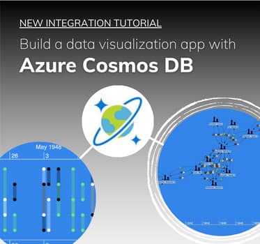
Building timeline and graph visualization tools for DataStax
Whatever your stack, we have an integration tutorial to get you started.
Learn how to create graph and timeline visualization applications that empower users to see, explore and understand the data in their DataStax DSE Graph database.
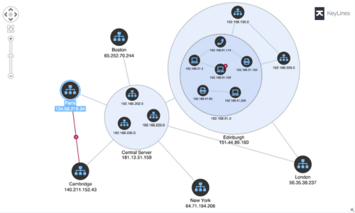
KeyLines: Graph visualization for JavaScript developers
Enjoy the flexibility to code how you like. Add graph visualization to your applications that work anywhere, as part of any stack.
Why do DataStax DSE Graph users choose our toolkits?

The fastest route
We design our toolkits with a fast developer experience in mind.
Equipped with our demos, coding playgrounds, comprehensive docs and expert support, you’ll be ready to ship your application in no time.

An easy integration
Whether you’re using WebSockets or HTTP calls, our toolkits integrate seamlessly with DataStax DSE Graph.
We also have JavaScript and React-specific examples to get you started.

Deliver the best UX
Our toolkits let you customize every aspect of your DataStax DSE Graph application – from branding to functionality.
The result is useful, insightful experiences your users value, and your competitors envy.

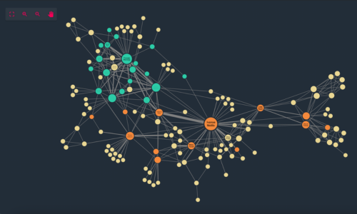
Powerful functionality
From timelines to centrality measures, automated layouts to geospatial maps.
Our SDKs have a huge range of visualization functions and analysis algorithms to uncover insight in your most complex DataStax DSE Graph datasets.

A trusted partner
We’ve been the leading provider of graph and timeline visualization technologies since 2011.
Hundreds of organizations worldwide rely on our toolkits – from pioneering startups to Fortune 500s and national governments.

Harness our innovation
We work year-round creating new features, ready to roll into your apps.
Keep customers happy and competitors on the back foot with constantly-improving, beautiful and unique visual analytics.
Ready to build your DataStax DSE Graph data visualization app?
Who uses our toolkits?
Follow in the footsteps of over 300 organizations already using our toolkits to build and deploy powerful graph and timeline visualization applications.


DataStax DSE Graph Visualization FAQ
DataStax Enterprise Graph is a highly scalable graph database designed for enterprise cloud applications requiring a high performance back-end capable of handling very large volumes of complex and evolving graph data.
It makes use of Apache CassandraTM and Apache TinkerPopTM and is based on the open source Titan graph database.
It also delivers continuous uptime and predictable performance.
DataStax DSE Graph doesn’t have a built-in visualization tool. Instead, their documentation suggests using open-source libraries like d3.
These libraries are great for generic data visualization components, but come with a steep learning curve and lack the performance and pre-built visual graph analysis functionality most graph application developers require.
If you need a fast way to build custom and powerful graph applications, you need a dedicated connected data visualization technology like KeyLines, ReGraph and KronoGraph.
KeyLines is our JavaScript software development toolkit (SDK) for graph visualization. It makes it quick and easy for JavaScript developers to build custom, powerful and interactive graph visualization tools. These can be rolled into your existing products and shipped to unlimited end-users.
ReGraph is our React SDK for graph visualization. It offers the same performance, scalability and end-user functionality as KeyLines, but is specifically designed for React developers.
Every aspect of the SDK is optimized to feel as ‘React-native’ for the developer as possible, including fully-reactive components, state and data flow management and JSX-coded elements with clear syntax.
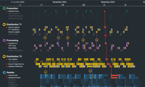
KronoGraph is our SDK for building interactive timeline applications. It comes with both plain JavaScript and React APIs.
The timelines built with KronoGraph reveal how events unfold over time, including heatmap views, individual event views, and intelligence data aggregation.
The toolkits are front-end JavaScript components, so you choose how to connect them to DataStax DSE Graph – via HTTP calls or WebSockets.
Our tutorial shows the WebSocket approach. In this scenario, the visualization files are hosted on a web server and presented to users in the web browser. By interacting with nodes and links in their visualization chart, users raise queries to the DSE Graph database. The data is then returned to the browser as a JSON object.
Hundreds of organizations worldwide use our toolkits to make sense of complex connected data. Their industry sectors include: security and intelligence, law enforcement, fraud detection, infrastructure management and cyber threat intelligence.
If you’re not ready to get started yet, take a look at our blog. You’ll find useful information on all aspects of graph database visualization and best practice.
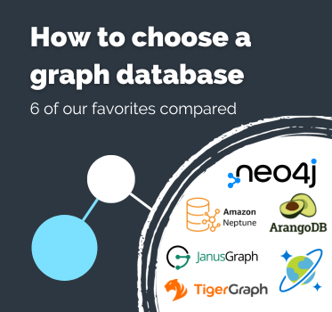
If you want to explore your options with other graph databases, please visit our visualizing graph databases page.
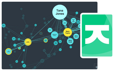
You might also find this webinar, exploring the use of DataStax and KeyLines for fraud detection, useful.