Data modeling is the first step towards great graph visualization. In this blog post, we’ll cover everything you need to start creating effective models that’ll help your users find insight in connected data fast.
What is graph data modeling?
Data modeling is the translation of a conceptual view of your data to a logical model.
During the graph data modeling process you decide which entities in your dataset should be nodes, which should be links and which should be discarded. The result is a blueprint of your data’s entities, relationships and properties. You can use that blueprint to create a visualization model for your charts.
The process is repetitive and often relies on trial and error, but it’s worth doing right. There are many different ways to model a single dataset, but some are more useful than others. Creating the right model makes the lives of your developers and end-users much easier.
What is a node, link and property?
First let’s look at the graph model. If you use a graph database, you’ll already be familiar with nodes and edges (or nodes and links in a visualization environment):
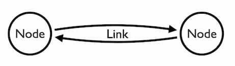
Nodes are the fundamental units of our data. We design our entire model around these entities.
Links are the relationships between nodes. They can be single, directed, self-linking or multiple:
- Single indicates a flexible, ‘on/off’ relationship, where only the existence of a link is important. For example, a connection between known associates.
- Directed shows a direct flow of information, communication or commodities between nodes. For example, a outbound phone call from one suspect to another.
- Self link is a single or multiple link from a node back to itself. For example, an organization suspected of fraud depositing funds into its own account.
- Multiple represents more than one relationship that needs to be visualized separately, not condensed into a single link. For example, multiple, regular payments from one bank account to another.
Properties are descriptive characteristics of nodes and links, but aren’t important enough to become nodes themselves. For example, a person’s date of birth.
There is no formula for deriving a graph model from your data, but having helped many users achieve the right models, we can offer guidance. Let’s walk through two examples that deal with data in a relational format and a key-value format.
The ultimate guide to graph visualization
Everything you need to start building effective graph visualizations
Modeling relational data as a graph
Relational databases are a familiar and reliable option for digital data storage. Virtually every organization has one, or relies on cloud services that use one.
As the name suggests, they store related data in two-dimensional tables of columns and rows. Translating this relational data into a graph format takes some work.
Here’s a set of relational tables containing vehicle data:
| VIN | Reg | Year | Policy_ID | Claim_ID |
|---|---|---|---|---|
| 1[…]3 | 4[…]0 | 2014 | G3Q7T35 | GS[…]344 |
| 1[…]7 | 3[…]B | 2015 | JLL8R2Y | HT[…]475 |
| 1[…]8 | G[…]9 | 2015 | MV3GJ7S | 00[…]000 |
| 1[…]5 | R[…]8 | 2011 | SL28KTB | 00[…]000 |
| 1[…]2 | V[…]8 | 2014 | TDNSN4C | 00[…]000 |
| S[…]9 | O[…]2 | 2016 | X7SHNVW | SF[…]455 |
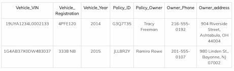
And here’s a list of people with car insurance policies:
| Policy_Owner | Owner_Phone | Owner_address |
|---|---|---|
| Tracy Freeman | 216-555-0192 | 904 Riverside Street, Ashtabula, OH 44004 |
| Ramiro Rowe | 201-555-0107 | 980 Linden St., Bayonne, NJ 07002 |
| Justin Park | 309-555-0157 | 9727 Cedar Dr., Rolling Meadows, IL 60008 |
| Sadie Medina | 239-555-0157 | 9033 Yukon Street, Ponte Vedra Beach, FL 32082 |
| Frankie Chavez | 212-555-0198 | 7549 Eagle Dr., Buffalo, NY 14215 |
| Josephine Wu | 404-555-0163 | 87 Maiden Street, Riverdale, GA 30274 |
And a separate table of insurance policies that connect vehicles to owners:
| Policy_ID | Policy_Owner |
|---|---|
| G3Q7T35 | Tracy Freeman |
| JLL8R2Y | Ramiro Rowe |
| MV3GJ7S | Justin Park |
| SL28KTB | Sadie Medina |
| TDNSN4C | Frankie Chavez |
| X7SHNVW | Josephine Wu |
The tables describe our data model: Vehicles, Policies, and Owners. It’s easy to decide what the links should be:
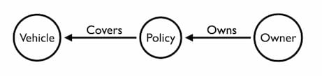
To validate this model, think about your users. What questions do they need to answer? If Vehicle_Year is an important part of the investigation, it should be a node. If not, it should be a property of the Vehicle node.
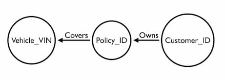
The next step is to select unique identifiers for each node. The Policy_ID uniquely identifies each policy already.
For the vehicle node we have three options: VIN, Registration and Year. Millions of cars are built each year. Registrations can be assigned to different automobiles. The only entity we know is unique to each vehicle is the VIN, sometimes called the chassis number. So that’s the property we’ll choose to represent our vehicle. The Policy_ID uniquely identifies each policy, so that is a straightforward decision.
Finding a unique attribute for the Person node is not as simple. Addresses and names are not unique identifiers.
This is a challenge known as Identity Resolution. One way around it is to assign a new attribute to each person – e.g. a customer ID number:
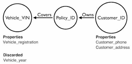
It’s important to resolve the Identity Resolution problem, especially if you plan to visualize your graph. Our graph visualization technology merges nodes with identical IDs. If those nodes turn out to be unique, you may misrepresent important patterns.
All remaining columns can be added as properties, but only if they offer useful information. Don’t add properties to your model just because they’re in your database. You need to make decisions about what’s going to add meaning to the visualization and avoid unnecessarily cluttering the chart.
Modeling key-value as a graph
Data modeling is more complicated if you’re working with key-value data stores such as Redis, Amazon DynamoDB or Aerospike. Relationships in key-value datasets aren’t stored in interconnected tables, so there’s no obvious way to translate from a physical model to a logical model.
Instead, they’re stored in rows as associative arrays:
As you can see, the data isn’t as structured. New columns can be added at any time, introducing new data points and relationships.
Despite this, the same two rules apply:
- Nodes should be the core objects your users need to understand
- Nodes should be unique
You can then infer relationships and add any remaining – and useful – columns as properties to the nodes or links.
Focus on your users’ needs
When you’re designing a graph data model, the most important advice we can give you is this: understand what your users are trying to achieve before you start planning. No matter what format your data is in, the visualization is pointless if it doesn’t help users do their job.
Once you know what your users are trying to do, work backwards from that. For example, an analyst investigating fraudulent insurance claims is only interested in the connections between people. The associated details can help to single out certain nodes, but there’s no need to clutter the chart by creating individual nodes for them.
In this scenario, you’d represent people as nodes, with links between paths that include an insurance claim. Then you’d use our social network analysis algorithms to size the nodes according to their betweenness centrality:
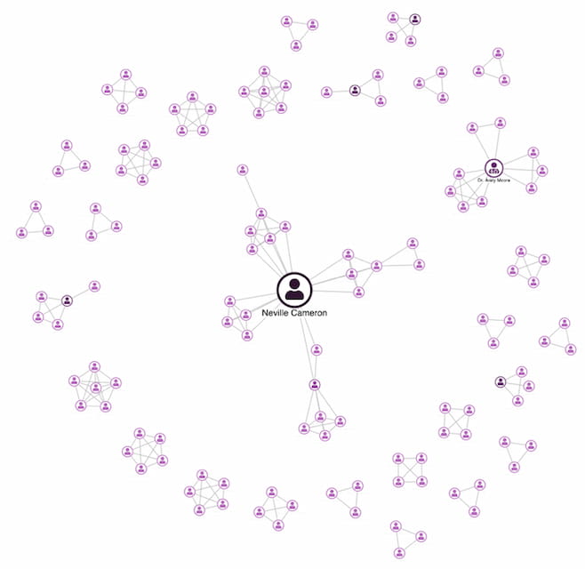
The graph visualization based on this data model gives analysts exactly what they need – a quick and easy way to determine which policyholders are worth investigating further.
Next steps: creating a visual model
Once you’ve chosen a winning graph data model that’s both simple and practical, you can start translating it into your visual model. You can customize every element of your visualization so it matches your existing application and company style.
If you need help with your visual model, we have a collection of design best practice blog posts full of great advice.
Ready to start visualizating your data model?
You can’t design a graph data model in a hurry. Getting it right takes time, but it’s worth doing properly with a user-centered approach that your analysts will thank you for. The best way to get started is to try out your ideas in our KeyLines or ReGraph graph visualization toolkits. Trials are free, just send us a request.
The diagrams for this post were created using Alistair Jones’ excellent Arrow tool.
The ultimate guide to graph visualization
Everything you need to start building effective graph visualizations
This post was originally published some time ago. It’s still popular, so we’ve updated it with fresh content to keep it useful and relevant.


