Graph data is rarely static. Everything happens at a point or duration in time, and networks evolve as connections are formed and broken. We have tools to help you understand the time dimension in your connected data.
This page is about our time bar component, which is part of the KeyLines and ReGraph toolkits.
If you’re interested in building interactive timeline visualizations, take a look at the KronoGraph toolkit.
Visualize dynamic graph data
Most graph data has at least one date or time-stamp, either automatically or manually generated. For example:
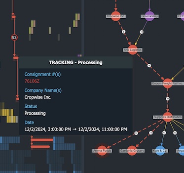
- Fraud investigators need to see the times and dates of financial transactions
- Cyber security analysts need to unpick complex connections in cyber threat intelligence, to learn how threats could evolve
- IT network analysts need to understand when specific connections take place between devices on a network
- Law enforcement agents need to piece together the sequence of events during an investigation.
Exploring graphs with our time bar component helps analysts understand how networks form, cluster, fracture and dissolve over time.
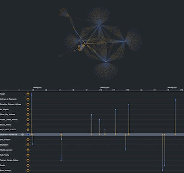
Flexible, interactive filtering
Users can explore their dynamic graph data in an interactive and intuitive way without getting overwhelmed. They have the freedom to navigate using:
- Chart-driven filtering: selecting specific nodes so the time bar shows when they were involved in events
- Time bar-driven filtering: focus on the time an event occurred so the chart shows which items were involved
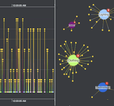
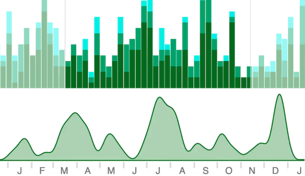
Explore activity volume
Analysts need to understand changes in the volume of activity over time. They want to see a breakdown of the types of activity too.
Color-coded stacked histogram bars make it easy to compare subsets of data at a glance, while area plots give a more fluid display of what’s happening – great for revealing patterns and trends.
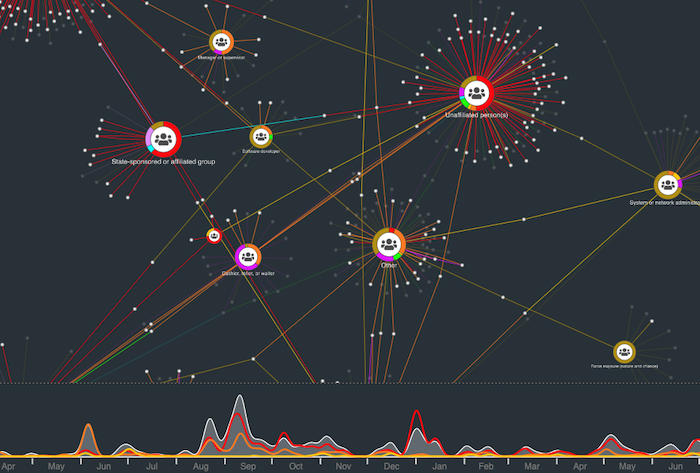
Drill down into the detail
Time bar selection lines are a useful way to highlight items of interest in your data.
Analysts can choose the nodes in their chart that deserve more attention, then compare the corresponding trend lines in the time bar to better understand what’s happening.
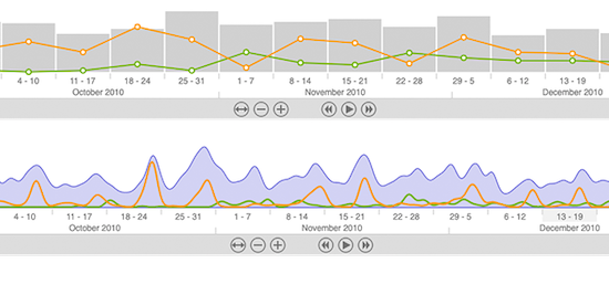
Dynamic animation
Play through time to see how your data evolves.
Filter the range of time shown in your chart, from milliseconds to millennia. The graph visualization chart automatically updates to show only activity happening in your chosen range.
Other intuitive navigation controls let users move back and forth or zoom in and out easily.
You can customize any aspect of the time bar, from the time scales or day/month names to the color schemes. There’s also the ability to use local time zones or Coordinated Universal Time (UTC).