In this blog post, Roger Murby tells us what life’s like as a software test engineer here, and explains how he found the best way to test our data visualization toolkit technology.
Starting my data visualization testing journey
When I first heard that there was a vacancy for a test engineer at Cambridge Intelligence, I hesitated before applying. Back then I wasn’t that familiar with JavaScript, and didn’t know how to overcome the challenges around testing a data visualization toolkit.
Measuring the quality of a feature isn’t as straightforward as checking a generated numerical total against an expected benchmark.
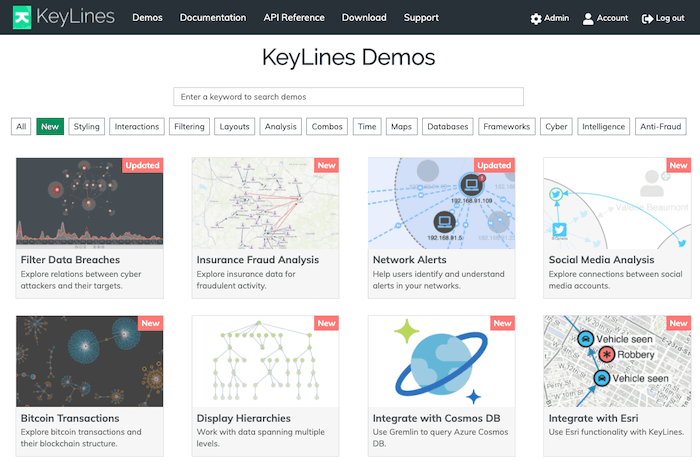
Fortunately, the KeyLines graph visualization SDK comes with over 75 interactive demos and code examples, plus a live-coding playground. These help customers start building their graph visualization apps quickly, and they also gave me an ideal introduction to how to test the toolkit. I found that I could adapt my previous experience with Python and use the fully-documented API to write my own graph visualization demos designed to test different aspects of KeyLines.
So far so good; working out how to use and adapt these demos allowed me to test the full range of the flexibility provided by the API, from how items are drawn on a chart to user interaction options, from plotting geo data to applying complex graph algorithms.
However, I now faced that perennial challenge that all testers must face: having to generate realistic data…
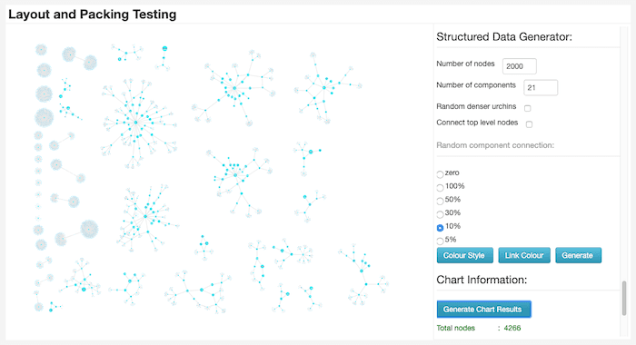
How to design a layouts testing tool
My first big task was to find a way to test a new force-directed organic layout that was still in development back then. Users find our suite of automatic graph layouts essential for untangling and understanding their networks, so performance and quality are key.
These standards are important to our users, so we need to get them right.
The organic graph layout is designed specifically for large datasets, revealing underlying structures by reducing link and node overlaps. Like other layouts, it relies on a sophisticated “packing” algorithm to pack disconnected groups of nodes together on the chart so they’re not too close or too far apart.
To test the layout and packing algorithm thoroughly, I needed a tool that could recreate the huge variety of data networks that our customers use. This range includes everything from large tree-like hierarchical structures to collections of dense knots, and vast numbers of irregularly structured components of different sizes.
I decided to adapt one of my own demos into a testing tool for generating and combining data with very different characteristics.
There’s great scope to create more tools like this and expand our automated tests.
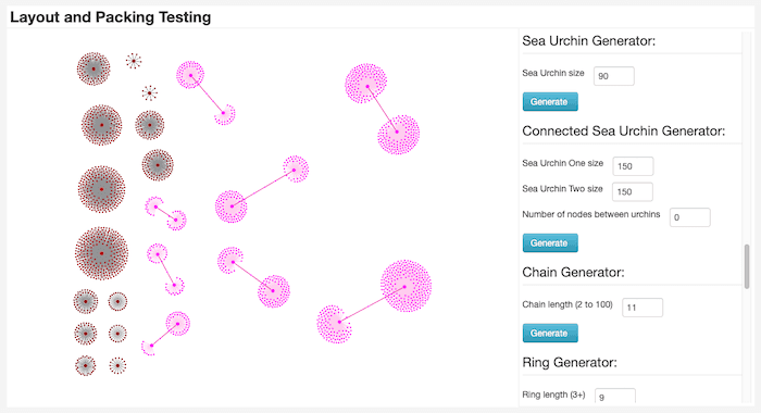
I worked closely with developers to classify a ‘zoo’ of small data shapes. The testing tool gives us the ability to quickly and easily create these shapes, each with their own unique specifications.
Here’s an example of one called the ‘sea urchin’ (for obvious reasons). The tool’s flexibility means that I can set the shape’s exact size, and then link it to a variable number of interconnecting edges.
We’re hiring!
Interested in joining our development team?
Flexibility = maximum scope for testing
The tool also has different mechanisms for creating more irregularly shaped data, like these loosely-connected structures:
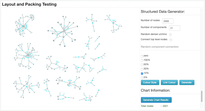
There’s complete control over the number and size of components, degree of connectivity between levels, and the density of node clusters.
Next, we can visualize our sea urchins and other data to give us more variety. That gives us the opportunity to execute different types of layouts, layout options, and packing options and to compare how well they perform.
Analyzing visual test results
With a data visualization toolkit, measuring the quality of a feature isn’t as straightforward as checking a generated numerical total against an expected benchmark.
Layouts are judged against a special set of criteria. For example, are any of the nodes overlapping others, making some of them difficult to see? Do any of the links cross under other nodes, making it hard to identify the link’s start and end points? Does the layout maintain an adequate degree of padding space around components?
We know these standards are important to our users, so we need to get them right.
Color played a useful role in tracking how components were redrawn on the chart. The tool gave me the option to assign colors to nodes in each component, and then assign a different color to newly added nodes. It’s much easier to spot the difference between existing nodes (blue) and new nodes (red), especially when we highlight them as they animate into position.
These two examples also give you an idea about how new nodes are accommodated in the chart when the layout is applied. The new items still have to meet our special criteria, but they must also cause minimal movement to the position of existing nodes displayed on the chart. When a user makes changes to the number of nodes on the chart, they want subtle and intuitive changes so they don’t lose track of where key nodes exist.
More testing challenges to come
As part of the QA team, there’s great scope to create more tools like this and expand our automated tests to cover every area of chart interaction.
Writing my own demos for testing the APIs is a brilliant way to get to know our toolkits better and develop new skills. Our Development Friday Projects – where the entire development team stops working on toolkit features and explores their own visualization-related ideas – also gives us scope to create demos based on personal interests.
We’re hiring!
We’re constantly developing our toolkit technology and we have ambitious plans for the future. This means there are many tough technical challenges to overcome, so we’re looking for the right people to help us find smart solutions.
If you like the way we develop our data visualization software and see yourself fitting right in, take a look at our current vacancies.


