In this post, I will – as objectively as possible! – compare my first experiences with KeyLines vs D3, and explain everything a developer needs to know.
During my PhD in cultural anthropology, I investigated how graph tools can be used to empower community members – a process that included building an interactive graph visualization with D3. I found the library to be powerful, but often confusing and counter-intuitive.
I was excited to join Cambridge Intelligence – a company well known for its excellent data visualization toolkits – and get the chance to work with KeyLines, the graph visualization toolkit for JavaScript developers. I turned what I learned into a series of blog posts looking at KeyLines vs D3. This is the first, but you may also be interested in:
- part 2: Customizing your graph visualization with D3 and KeyLines
- part 3: Advanced graph visualization with D3
DISCLAIMER: This blog post is not a full feature comparison, and I am not a professional JavaScript developer. I belong to the category of advanced users, people who deal with JavaScript (and other languages) libraries and frameworks alongside databases and desktop applications in a daily workflow.

FREE: Buyer's guide to graph visualization
This practical guide to choosing the right technology for your project includes a handy comparison template.
Introducing KeyLines vs D3
The first thing to understand in our KeyLines vs D3 comparison is that they’re aimed at different use cases and are built on different technologies.
Although there is much overlap in how they are used, they are built for different functions:
- D3 is an open source, general purpose library for web-based data visualization. Graphical elements are rendered as svg shapes by default. Some people use D3 with networks, more with geospatial data, and most for other sort of charts.
- The KeyLines graph visualization toolkit is a commercial library specialized in web-based visualization of connected data. It is focused on graphs (node-link structures), geospatial graphs, and dynamic networks (graphs changing through time). It uses HTML5 canvas or WebGL renderers.
Most organizations become interested in network visualization when they need to expose their graph data to business users. By providing users with a tool to explore and understand patterns in their vast stores of connected data, they can more easily exploit its value.
Many visualization projects start with an open-source JavaScript toolkit such as D3.js. Later on, when developers are struggling to introduce more advanced network features (for analytics, performance, user interaction, or developer friendliness reasons) or to improve the readability of the visualization, they migrate to an optimized JavaScript graph visualization library such as KeyLines.
Let’s follow their process.
The graph dataset
For this comparison I will use a dataset generated with generaatedata.com, containing fake company details.
The data itself is a JSON file containing two arrays of objects, one for nodes and one for the links between nodes. This “nodes table” and “links table” structure is very common and looks like this:
{
    "nodes": [
    {
        "Id": 1,
        "Name": "Company Name",
        "City": "City Name",
        "Address": "Address line",
        "Latitude": 50.0,
        "Longitude": -80.0,
        "Event1": "2013-04-02",
        "Event2": "2011-09-17"
    }, {
        "Id": 2,
        "Name": "...",
        "City": "...",
        "Address": "...",
        "Latitude": 30.0,
        "Longitude": -90.0,
        "Event1": "2014-01-10",
        "Event2": "2015-08-04"
    }
  ],
    "links": [
    {
        "Id": 1,
        "Transaction": "...",
        "Event1": "2013-11-13",
        "Event2": "2012-09-18",
        "Source": 1,
        "Target": 2,
        "Event3": "2014-08-30",
        "Value1": 246042,
        "Value2": 70571,
        "Value3": 670796
    }
  ]
}
Let’s start our visualization.
Step 1 – Setup your data
Setup your data with D3
The first step consists of loading the data into the web page, parsing it into the required format, and running a layout.
By default D3 connects links to source and target nodes using the zero-based nodes array index (find out more in the D3 API Reference). That means a link from node 0 to node 1 will actually connect the first and the second nodes in the nodes array, not nodes with id0 and id1 stored in the dataset, which is what one would probably expect. In order to use our own data IDs, we need to create a lookup dictionary object and then map D3 properties link.source and link.target to the corresponding node objects in the dictionary.
function ParseJSONData(data) {
    const nodesDict = data.nodes.reduce((dict, node) => {
        dict[node.Id] = node;
        return dict;
    }, {});

    data.links.forEach((link) => {
        link.source = nodesDict[link.Source];
        link.target = nodesDict[link.Target];
    });
    ...
}
This was my first stumbling block with D3 – it took a while to get my head around this approach and I could only understand it with the help of a developer colleague.
Set up your data with KeyLines
KeyLines has a documented object structure. A mapping function allows us to specify which piece of data corresponds to which KeyLines object and property, with nodes connected through their ids.
function ParseJSONData(obj, chart) {
    const nodes = obj.nodes.map((node) => ({
        id: node.Id,
        type: 'node'
    }));
    const links = obj.links.map((link) => ({
        id: `l${link.Id}`,
        type: 'link',
        id1: link.Source,
        id2: link.Target
    }));

    const chartData = {
        type: 'LinkChart',
        items: [...nodes, ...links]
    };
…
As KeyLines has been designed specifically for network visualization, it has more suitable and convenient data format requirements. A D3 developer will find it easier to understand and work with.

FREE: KeyLines white paper
Our essential guide to building powerful JavaScript graph visualization applications
Step 2 – Create the graph
With a JSON loading function and a parsing function ready, we have our data set up, and we can create the visualization.
Create the graph with D3
In D3 we select an existing DOM element in the web page (a div for instance) which will be the wrapper for the visualization, and we append the main svg element to it:
window.onload = function() {
    ...
    const svg = d3.select("#graph-div").append("svg")
        .attr("width", width)
        .attr("height", height);
    ...
Every other graphical object in the visualization will be appended to the svg element. We will create a line for each data link and a circle for every data node using D3’s enter selection. Since our selectAll function returns an empty selection (there is no DOM object corresponding to the specified selection criteria), the enter sub-selection will contain a placeholder for each data element:
const link = svg.selectAll(".link")
    .data(data.links)
    .enter().append("svg:line")
    .attr("class", "link");

const node = svg.selectAll(".node")
    .data(data.nodes)
    .enter().append("svg:circle")
    .attr("class", "node")
    .attr("r", 5);
Note that we give a class name to each element type, allowing us to manage visual styles with CSS:
.node {
    stroke: #fff;
    stroke - width: 2 px;
}

.link {
    stroke: #999;
    stroke-width: 1.1px;
    stroke-opacity: .7;
}
Alternatively, styles can be assigned inside JavaScript code, using the dot syntax, e.g.:
.style("stroke", "#999");
Create the graph with KeyLines
In KeyLines we specify the DOM element which will be replaced with the canvas element where the graph will be drawn.
window.onload = function() {
    ...
    chart = await KeyLines.create({ container: 'kl' });
};
The only style option we will specify is node color, but KeyLines has plenty of other styling options. In order to change the defaults, we need to add the corresponding line to the data mapping function. The following specifies fill and stroke color for nodes:
chartData.items.push({
    ...
    c: "#000",
    b: "#fff"
});
Then we just need to load the data using chart.load function.
As you can see, KeyLines doesn’t need the added layer of complexity introduced by D3 with selections, because the data formatted by the parsing function is all that’s needed to create the chart.
Step 3 – Run a force-directed layout
Once a developer has his data in a chart, the first thing they will usually do is run a force-directed layout. This will detangle the nodes and links, producing a clearer view of the data.
Run a force-directed layout with D3
If we run the D3 page with the SVG elements without a layout, we would see all the nodes stacked at position 0,0. We need a layout function! We can create a force object, which will control the graph layout, and assign to it the same data we used for the shapes:
    const force = d3.layout.force()
    .size([width, height]);

    force
    .nodes(data.nodes)
    .links(data.links)
    .start();
Next we can use the force tick event to change the positions of the shapes according to the positions calculated by the force layout:
force.on("tick", tick);

function tick() {
    link.attr("x1", function(d) { return d.source.x; })
        .attr("y1", function(d) { return d.source.y; })
        .attr("x2", function(d) { return d.target.x; })
        .attr("y2", function(d) { return d.target.y; });

    node.attr("cx", function(d) { return d.x; })
        .attr("cy", function(d) { return d.y; });
};
The first result needs to be tweaked a little, because it’s too tightly-knit, as the picture shows:
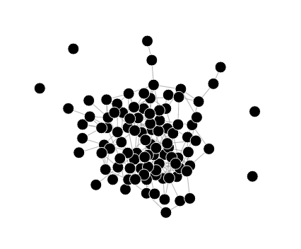
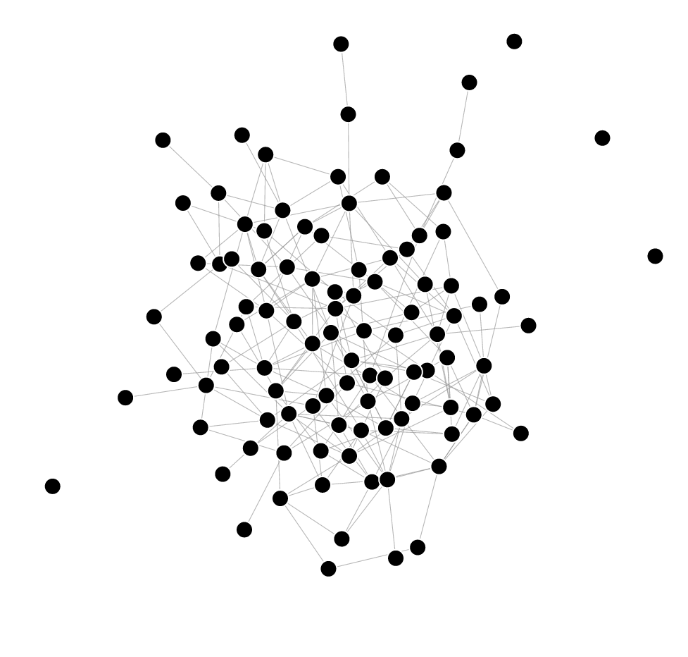
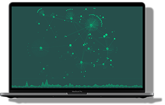
We can specify some parameters of the layout forces. For instance, augmenting node repulsion with .charge(-250) and link length with .linkDistance(80) will reduce link tightness as required, resulting in a more readable graph:
Run a force-directed layout with KeyLines
When loading the data, we can call the layout function and use KeyLines standard (force-directed) layout among the many automatic layouts available.
    chart.load(chartData);
    await chart.layout();
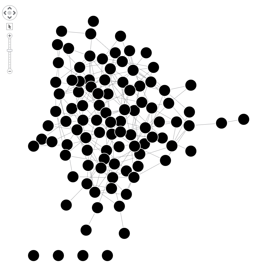
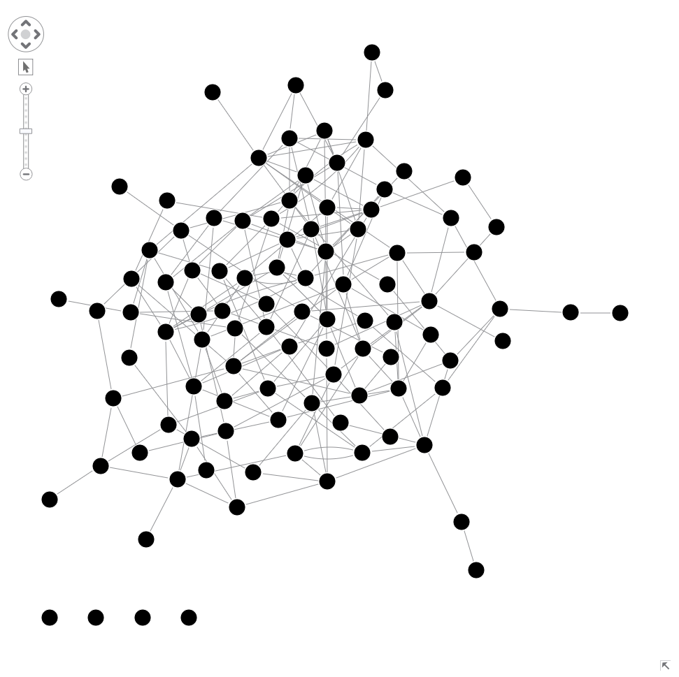
You should find the KeyLines’ default layout parameters a little more useable. For instance, the graph is fitted to screen and node size is automatically assigned. Nevertheless, we can also easily tweak them to increase readability. The tightness option allows us to control how tight nodes are positioned.
chart.layout('standard', {tightness: 2});
Setting the tightness level to 2 will do the job for this sample network:
You can compare the two results by watching their behavior.
Step 4: KeyLines vs D3 graph navigation
Usually the last step of the initial data exploration is to add some chart interactioncontrols for the user. This is where KeyLines really shines.
Graph navigation in KeyLines
The following is possible, out of the box:
Zoom
The user can use the mouse wheel to intuitively zoom in and out the view.
Pan
The user can pan the graph by dragging the background in ‘hand’ mode.
Navigation controls
Placed in the top left of the view, navigation controls allow the user to visually pan and zoom the network, quickly revert to the home view (fitted to screen), toggle the “hand” mode.
Overview window
The user can open the overview window in the bottom right, and use it to pan around the graph, especially useful together with a deeper zoom level to explore the neighborhood without losing orientation.
Select
By default KeyLines allows many selection behaviors on nodes and links: left click selection, selection highlight, shift + click for multiple selection, selection box.
Drag
The user can click and drag nodes and links. Dragging a node changes its position, dragging a link bends its line.
Multiple links
KeyLines automatically applies an offset and bending to multiple links.
These are features that everyone is likely to want and eventually build for their network visualization (I always wanted them all!), and that’s precisely why they are switched on by default in KeyLines.
Nevertheless, we can also deactivate them, tweak them, and even replace the defaults with custom behaviors taking advantage of the full list of KeyLines event bindings.
Keyboard shortcuts
Some useful keyboard shortcuts are enabled by default. These include Ctrl + A => select all visible elements; Del => remove selected items; Arrow keys => precision move selected items.
Graph navigation in D3
In order to replicate in D3 what KeyLines gives us out of the box, we need multiple steps. Some of these are easy, some more difficult.
Drag
For instance, we can recreate the same node drag functionality by calling D3 drag behavior on nodes:
    const node = svg.selectAll(".node")
    ...
    .call(drag);

const drag = d3.behavior.drag()
    .on("dragstart", dragStart)
    .on("drag", dragNode);

function dragStart() {
    force.stop();
}

function dragNode(d) {
    d.x += d3.event.dx;
    d.y += d3.event.dy;
    tick();
}
Dragging links requires a different, and more complex, function.
Pan, zoom, select, highlight and other advanced functionalities
Each of these interactions will need to be implemented separately, using various SVG transforms and JavaScript functions. Some are simple, and some are far beyond the skill levels of this particular author.
In my view, this is where KeyLines really shows its worth.
Graph-optimized visualizations with KeyLines vs D3 general purpose charts
This post shows the very basic network graph drawing functionality of D3 and KeyLines libraries, side by side, to highlight the main differences.
From the developer and user perspectives, I found KeyLines easier to use and optimized for this sort of task. Data bindings, event bindings, styling options, and layout functions, all assume the visualization context is one of connected data in a graph and therefore can focus on the peculiarities of this visualization domain.
Read my next post on customizing your graph visualization with D3 and KeyLines, where I’ll try to take graph visualization to the next level with more advanced functionality. You might also be interested in this blog post: Stretched your diagramming tools to the limit? Here’s the solution.
Try KeyLines for yourself
Have you done your own KeyLines vs D3 comparison? If you want to see how easy and fast it is to visualize your connected data with KeyLines, request a free trial.
FREE: Start your KeyLines trial today
Visualize your data! Request full access to our KeyLines SDK, demos and live-coding playground.


