The cyber security visualization challenge
Cyber threat analysts have a tough job.
They need to understand big, complex, high-velocity data from across their organization. They need to know which of the billions of alerts raised each day demand an immediate response. They need to spot and predict fast-evolving threats from unpredictable sources.
If they fail, their organization is at risk of malicious attack.
Analysts need interactive cyber security visualization – especially graph visualization and timeline visualization. It’s the best tool available to make sense of cyber threat intelligence.
Let’s see why.
Predict: Visualize cyber threat intelligence
Understanding cyber threat intelligence is key to the cyber analyst’s job. They need to identify which threats exist, and how those threats could impact the organization.
There’s no shortage of intelligence available. The challenge is making sense of it and sharing the insight. That’s where graph visualization and timeline visualization are crucial.
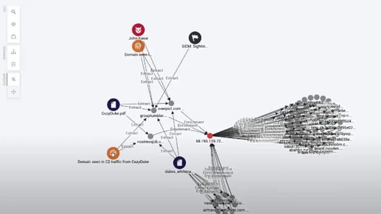
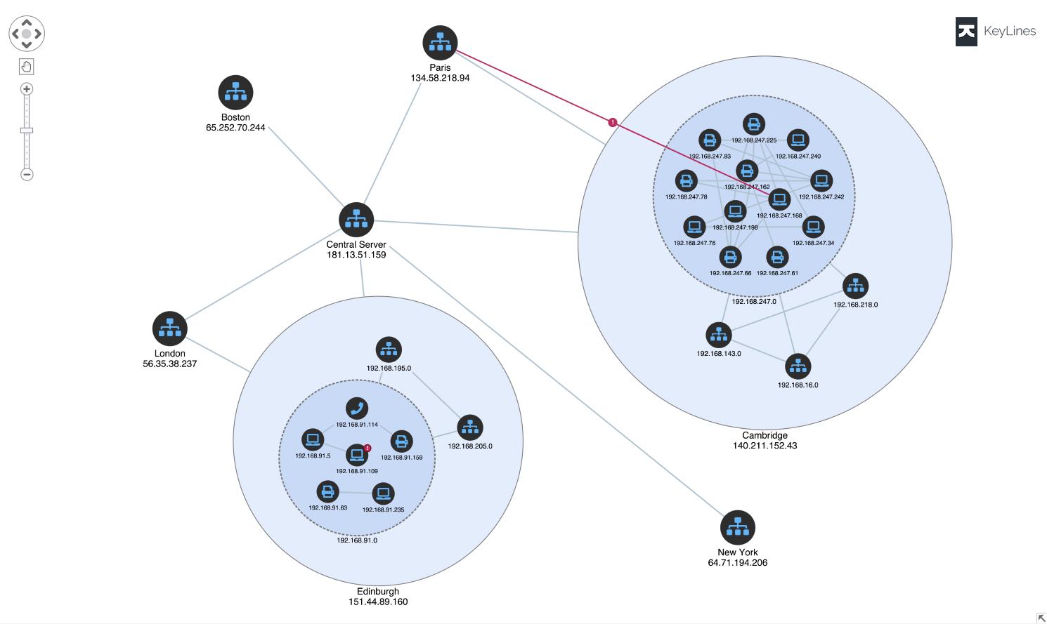
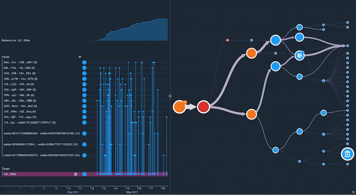
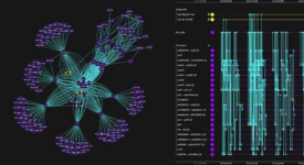
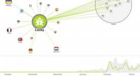
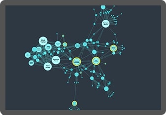
Cyber threat intelligence is densely connected. Visualizing those connections as a graph uncovers the patterns, outliers, and anomalies in a way that reveals your threat landscape and the kinds of attacks you might face.
Analysts need to see cause and effect. Combine graph and timeline views in a cyber security visualization to reveal how and why cyber threats happen, and their impact on the network.
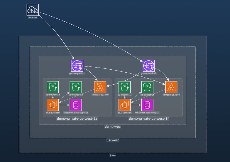
It’s impossible to protect a cloud network when you don’t know what assets you have, or how they’re connected. Visual representations bring situational awareness and actionable insights to cloud security analysts.
Learn more in our cybersecurity white paper
Find out how we help governments, banks, and leading software vendors build powerful graph visualization tools for their cyber threat intelligence analysis.
Monitor: Build smarter SOCs with data visualization
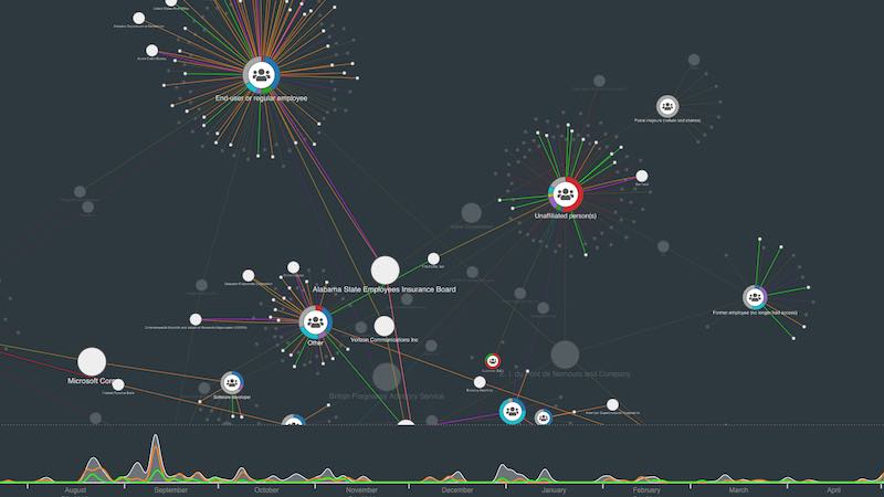
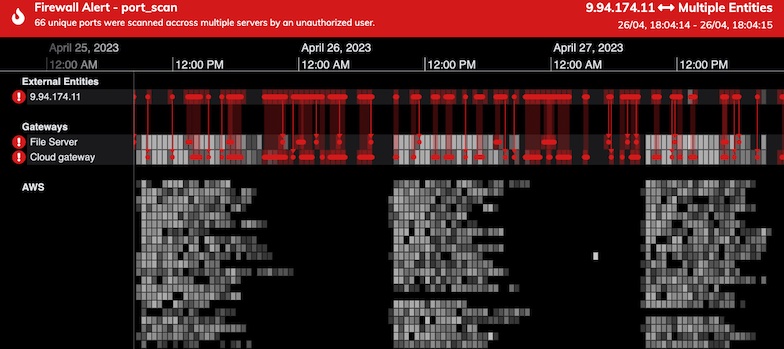
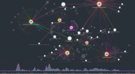
Every day, billions of alerts are raised across networks. Security Operations Centers (SOCs) have to make sense of what’s going on. These central hubs provide visual interfaces and dashboards tracking alerts and activities to help analysts monitor and respond in real-time.
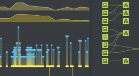
Interactive graph visualization and timeline visualization functionality is an essential component of an effective SOC, providing a fast, intuitive and insightful view of the data.
Using interactive graph visualization we can see events unfold in the network at a glance, powering cyber threat analysis processes.
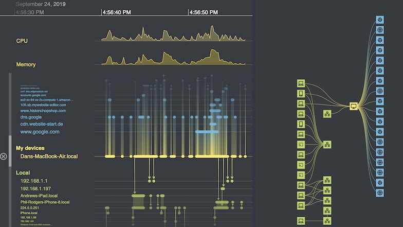
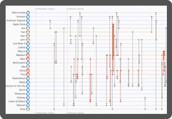
Timeline visualization helps analysts understand the alerts across their cloud landscape, and detect malicious attacks.
Learn more in our cloud security white paper
The ultimate guide to understanding complex cloud infrastructure and combating cyber threats to cloud assets using data visualization.
Investigate: Understand attacks and fix vulnerabilities
The complexity, scale and fast-changing nature of cyber threats mean that – even with the most efficient defenses – breaches are inevitable in most large organizations.
Cyber resilience and effective forensics can allow you to quickly identify breaches and patch vulnerabilities before serious damage can take place. Cyber security data visualization is key to this.
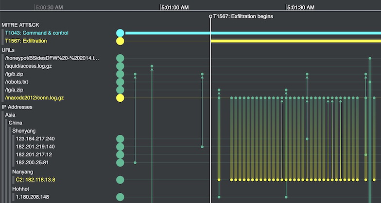
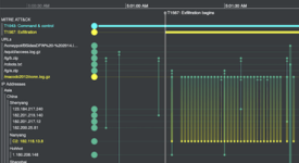
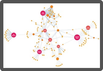
Root cause analysis, powered by advanced data visualization, reveals what happened during an incident: the attack vectors, vulnerabilities, affected devices and scale of damage.
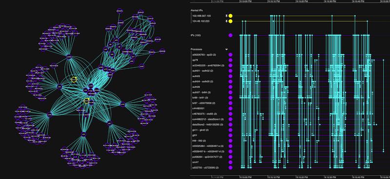
Investigators use recognized frameworks, such as MITRE ATT&CK, to put related timeline events in context and see which cloud assets were affected.
Custom cyber security data visualization
We work with businesses, governments and software vendors worldwide to create the next generation of cyber threat intelligence analysis tools.
Using our graph visualization and timeline visualization technologies, they’ve been able to build interactive applications that join the dots and reveal the cyber threat intelligence they need to understand.

Get answers faster
Discover new dimensions to your cyber data that aggregated methods can’t show. Timeline and graph visualization techniques reveal insight in a uniquely intuitive way, leading to faster decisions and fewer missed threats.

See the full picture
Interact with data from across the organization in a single chart. Our products’ flexible approach means you can overcome silos and gain insight from cyber data from multiple sources, giving you a clearer, more complete picture of events.

Build beautiful visualizations
Build visualizations specifically for your users, your data and the questions you need to answer. Every aspect of the tools can be customized, from the functionality to the look and feel. The result: a beautiful visualization that fits seamlessly with your application, guaranteeing a great user experience.

Stay ahead of the game
We work year-round to design new functionality that customers can quickly add to their applications. With our help, you’ll have the best visualizations around, and stay ahead of your competition.
Cyber security resources
Visualizing cyber security attacks
Essential tools for cyber analysts
Root cause analysis timeline & graph visualization
Malware visualization tools for cyber analysts
Six essential cyber security analysis tools
Webinars

Graph visualization for cyber security
Advanced graph technologies you can use to analyze cyber attacks and protect your assets

Techniques for cyber security analysts
With examples from cyber threat intelligence, SOCs and post-attack forensics

Smarter cyber threat intelligence
How the EclecticIQ platform uses graphs to display cyber intelligence
Want to try it for yourself?
KeyLines
Graph visualization for JavaScript developers
Code how you like and build link analysis apps that work with any stack.
ReGraph
Graph visualization for React developers
Use a simple data-driven API to build customized graph visualization apps in React.
KronoGraph
Timeline visualization for JavaScript or React developers
Design interactive timelines to explore patterns and unfolding events.