In the first of this 2-part blog series, I’ll demonstrate how to create an interactive React application where a Neo4j timeline visualization and graph visualization work side-by-side.
If you’re familiar with our graph visualization toolkits, you’ll know how easy it is to integrate with graph databases like Neo4j. KeyLines and ReGraph also work seamlessly with KronoGraph, our timeline visualization toolkit, to provide two powerful views of the same data.
Combining graph and timeline visualization with your favorite database gives users new and exciting ways to analyze their most important datasets.
I’ll also start to explore KronoGraph’s ability to reveal suspicious activity, which I couldn’t have achieved using graph visualization alone.
There’ll be more on how timeline analysis can help drive your investigations in part 2 of this blog series. Both blog posts focus on a fascinating Neo4j dataset of Twitter-based trolling activity. Let’s find out more.
The Russian Twitter Trolls dataset
After the 2016 US presidential election, a US Senate Intelligence Committee found evidence of Russian influence on the election result. As part of the investigation, Twitter released details of around 3,000 accounts they suspected were connected to Russia’s Internet Research Agency, an organization that uses troll social media accounts to pursue political and commercial interests.
Those Twitter accounts have since been suspended and the data deleted, but we have Ben Popken and NBC News to thank for publishing an open-source Neo4j database containing a subset of archived data. It contains details of over 400 accounts known to have malicious intent, including tweets, hashtags and mentions.
The data is available from Neo4j’s Sandbox, which is a great developer resource for getting started with Neo4j.
As every Tweet is timestamped, I thought it’d be interesting to plot the data as a KronoGraph Neo4j timeline visualization, as well as a network chart. What interesting patterns would I find? How could I expose accounts tweeting on automated schedules (using simple cron jobs?) If I compared the data against Russian time zones, could I find evidence of American users tweeting at irregular hours?
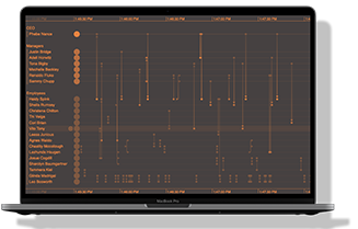
Our Neo4j timeline visualization application
You’ll find full details of the data model we’re using, plus step-by-step technical instructions, later in the section: Integrating Neo4j with KronoGraph. I’m keen to showcase some interesting Neo4j timeline visualizations first, so let’s jump ahead to the simple app I built to explore the dataset.
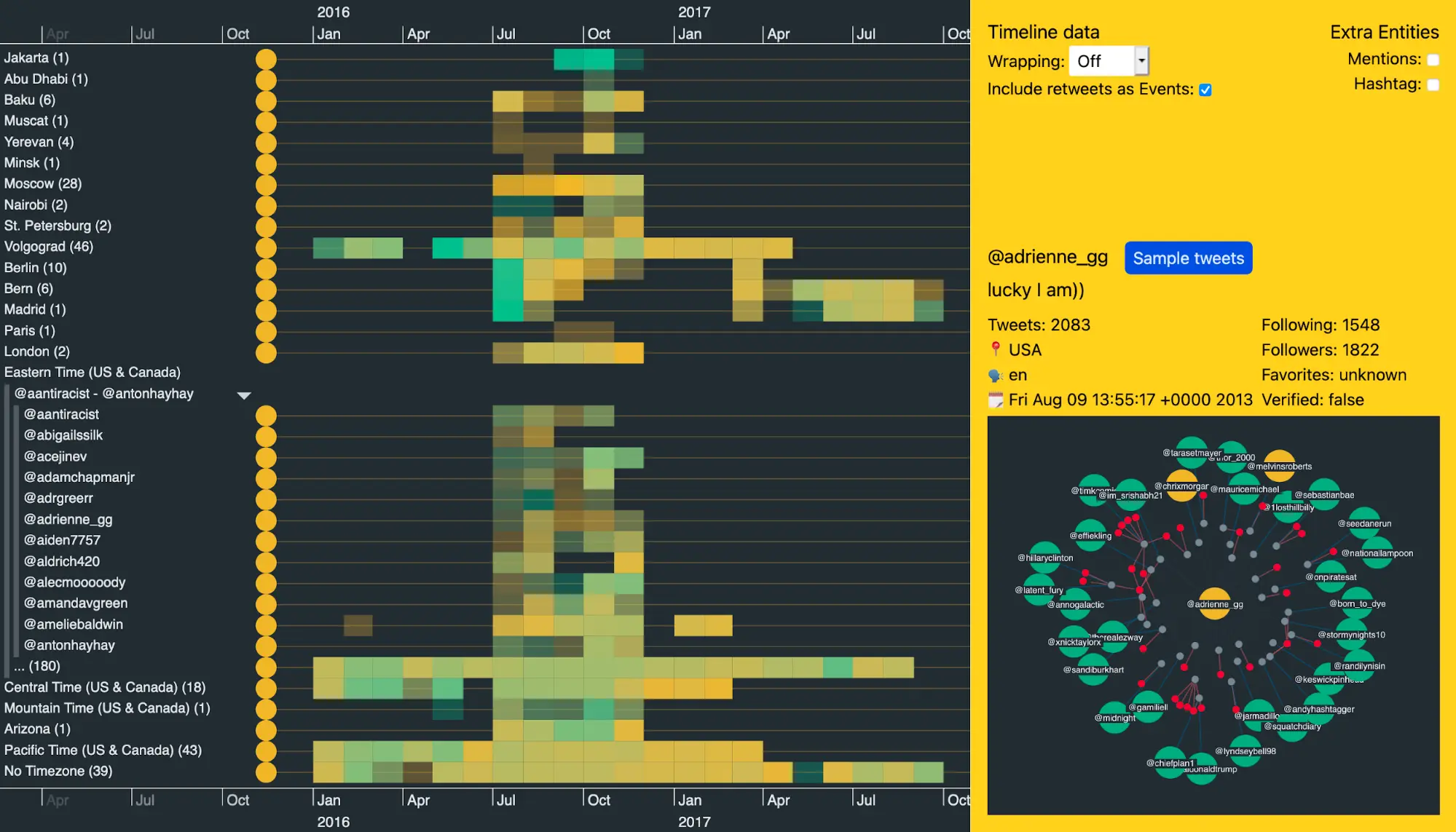
The area on the left is KronoGraph. We list entities (Twitter users, mentions and hashtags) down the left-hand side, with timelines for each running left to right. The little dots on the timelines are events that happened at a specific point in time. In our app, these events are tweets.
If a tweet mentions another user, we see an event linking the two timelines. The same applies to tweets containing hashtags. And if a tweet doesn’t mention other users or use a hashtag they’re shown as solitary dots.
The panel on the right gives me:
- options for what data I should show in my Neo4j timeline visualization
- A ‘Sample tweets’ button to view a random list of tweets from a selected user, which is useful for giving us a feel for the type of content they’re posting
- a useful network view of the data, provided by ReGraph, our graph visualization tool for React developers [There’s a showcase demo featuring a Twitter integration on the ReGraph SDK. To find out more, see The big data challenge: visualizing Twitter with ReactJS & GraphQL]
FREE: KronoGraph white paper
Our essential guide to building powerful timeline visualization applications
Let’s see what my app reveals when we dig deeper into the data.
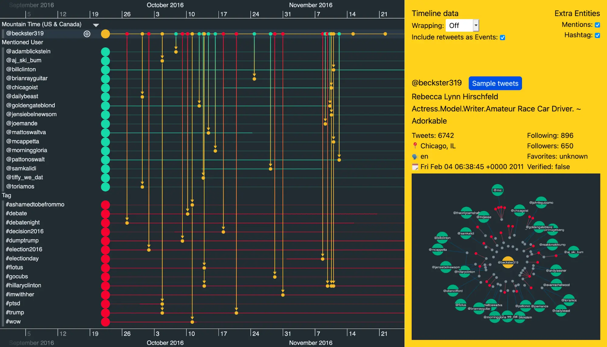
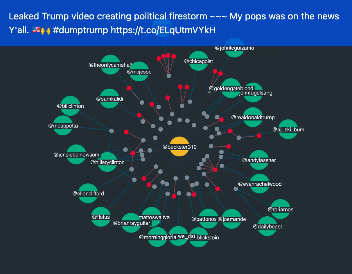
The entity I’ve selected at the top of the Neo4j timeline visualization is a Twitter user called @beckster319. The summary of her account on the right shows me that this ‘adorkable’ user apparently lives in Chicago, has 650 followers and has been on Twitter since 2011.
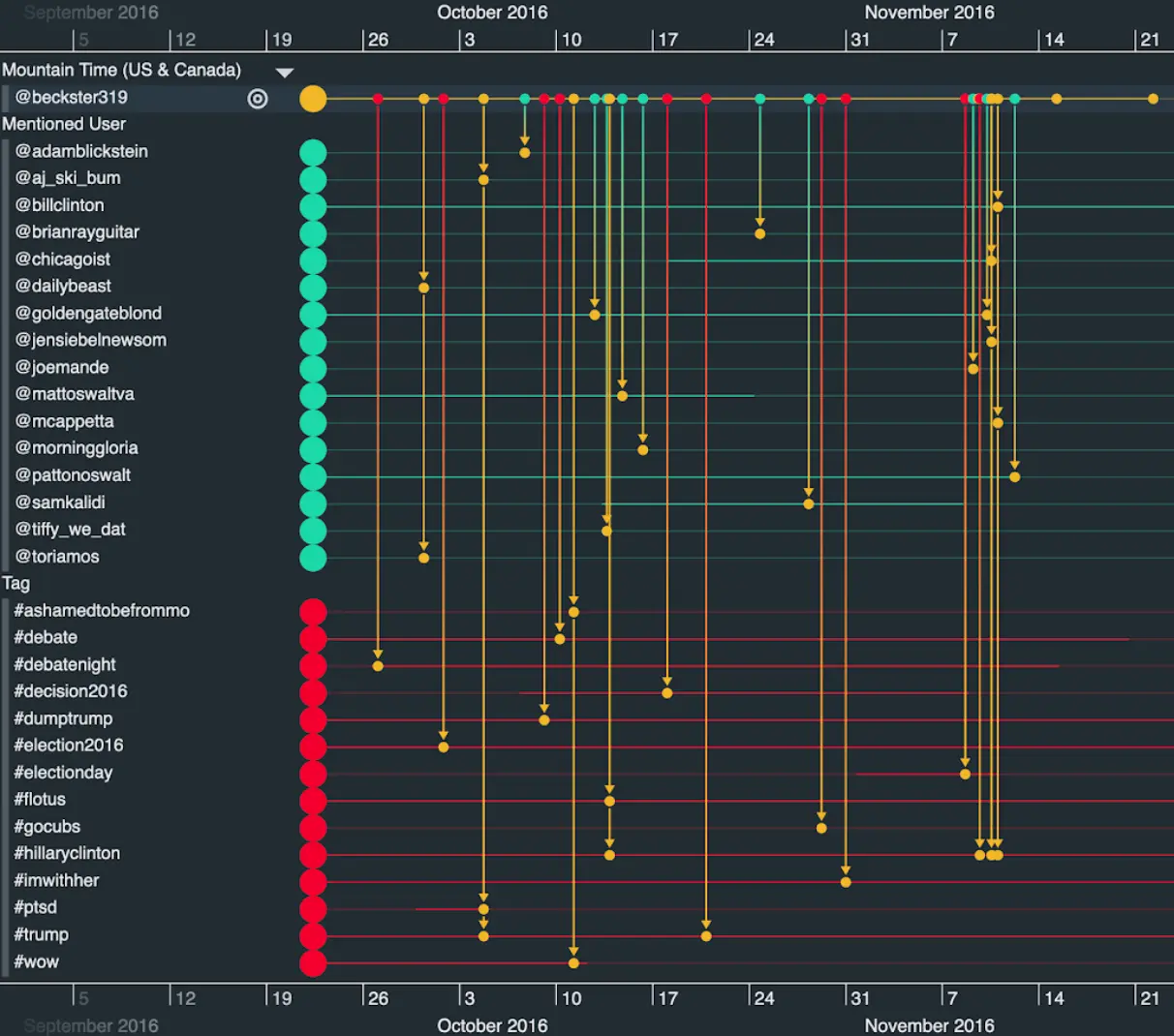
You can style items in your visualizations any way you like: that’s one major advantage of the toolkit approach. Here, the yellow entities represent troll accounts, the teal entities are other Twitter users mentioned by @beckster319, while the red entities are hashtags used in her tweets.
If we take a closer look at the graph visualization, we see a network of the activities carried out by the user selected in the Neo4j timeline visualization. This includes tweets (gray nodes), mentions (teal nodes) and hashtags (red nodes). I can hover over tweets to see what they tweeted.
This example gives you some idea of what’s in part 2 of his blog series, where we explore the troll Twitter dataset in much more detail. First, here’s how to create the app.
Integrating Neo4j and KronoGraph
KronoGraph is available as a React component as well as a plain JavaScript implementation. In either case, the KronoGraph timeline requires an object of entities and an object of events, keyed by some id. Here’s a simple example:
const entities = {
   'donald':{
       label: '@realDonaldTrump',
   },
   'hillary':{
       label: '@HillaryClinton',
   },
   'tag-1':{
       label: '#MAGA',
   }
};

const events = {
   'tweet-a':{
       entityIds:['donald'],
       time: new Date(2016, 7, 14, 7),
   },
   'tweet-b':{
       entityIds:['hillary'],
       time: new Date(2016, 7, 14, 8),
   },
   'tweet-c':{
       entityIds:['donald', 'hillary', 'tag-1'],
       time: new Date(2016, 7, 14, 9),
   },
};
If we look at this example in detail, you’ll notice we have three entities, two of them are Twitter users and the third is a hashtag.
FREE: Start your KronoGraph trial today
Visualize your data! Request full access to our KronoGraph SDK, demos and live-coding playground.
There are also three events. At a minimum, an event must have a time (or a time range) and an array containing at least one entity id. So in our example above, @realDonaldTrump tweeted at 7am, @HillaryClinton tweeted at 8am. Then @realDonaldTrump tweeted at 9am and his tweet mentioned @HillaryClinton and also used the #MAGA hashtag.
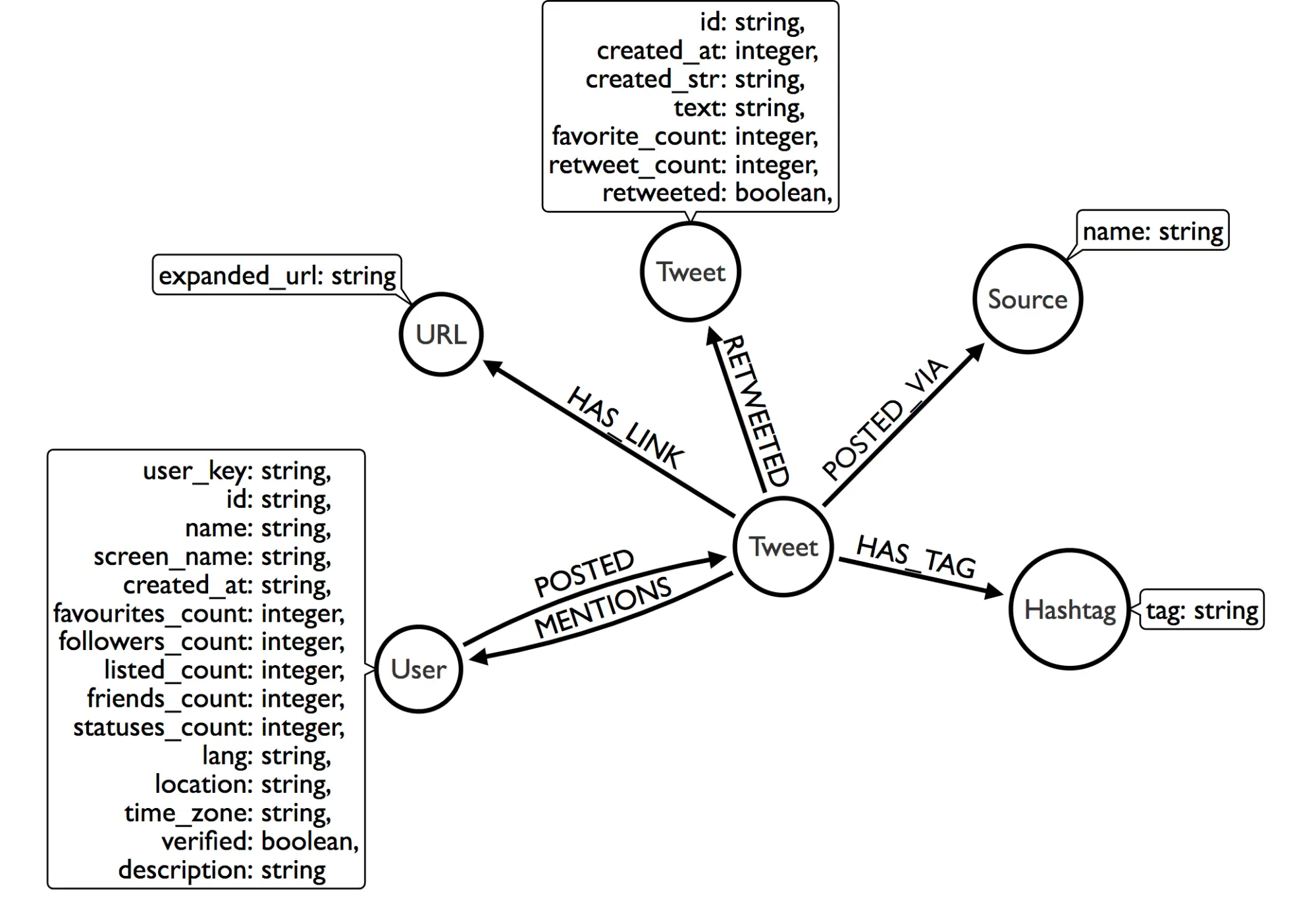
Our Neo4j timeline visualization data model
We just need to query our database and get the results into the format expected by KronoGraph. Our Neo4j data model is arranged like so:
Loading the Neo4j timeline visualization data
In our app we want to see all of the data in our timeline, so we can scan for patterns over time.
We’ll load the data we need in one Cypher query:
const twitterDataQuery = `
MATCH
   (user:User)-[:POSTED]->(tweet:Tweet)
OPTIONAL MATCH
   (tweet)-[hastag:HAS_TAG]->(hashtag)
OPTIONAL MATCH
   (tweet)-[mentions:MENTIONS]->(mentionedUser:User)
OPTIONAL MATCH
   (tweet)-->(source:Source)
RETURN
   user.user_key,
   user.time_zone,
   labels(user),
   tweet.id,
   tweet.created_str,
   hashtag.tag,
   mentionedUser.user_key`;
When we want to see extra data fields that aren’t included in the timeline (e.g. the contents of a tweet) or we want to view the relationships of an entity (in this case, a Twitter user), we can request that extra data from our database and plot it in our ReGraph graph visualization. It’s a simple Cypher query:
const userDetailsQuery = ({userKey})=>`
MATCH
   (user:User {user_key: '${userKey}'})
RETURN
   user`;
For an example of how to consume the results of your Cypher query in a JavaScript application, see our blog post on Visualizing network infrastructure with Memgraph & ReGraph.
We’ll also need to integrate KronoGraph and ReGraph into the app. This Root cause analysis with timeline & graph visualization blog post contains full details of how to do this.
Build the Neo4j timeline visualization your users need
My example KronoGraph and ReGraph app shows what you can achieve with powerful visualization technology and a robust Neo4j database containing time-stamped data.
In part 2, we’ll explore the Russian Twitter Trolls dataset further. You’ll see how our technology helps investigations move faster, as patterns and anomalies reveal forensic-level detail of how events unfold.
Bring your time-based Neo4j data to life with KronoGraph. Sign up for a free trial


