In this Styled Components tutorial, we’ll show how easy it is to build a ReGraph graph visualization app in React with themes created using the styled-components library.
What is Styled Components?
Styled Components is a React library for writing CSS in JavaScript (CSS-in-JS).
With CSS, it’s really easy to target code elements and change them globally. But problems arise if you’re using React components that need their own unique styling. You want a more flexible way to manage and maintain them, which is precisely what Styled Components delivers.
The clue is in the name. Each component has its own style, and when that component is rendered in your browser, the style gets added automatically. You can create themes from these styles, which is an easy way to customize your app.
Styled Components are designed to give developers great user experience and make code maintenance much simpler. It prevents class name collisions and saves you from writing complex selectors.
React apps built using Styled Components perform well for end users too. Using styles on a component basis minimizes the amount of code that’s loaded on a page, plus automatic vendor prefixing guarantees the right browser support.
Why use Styled Components with ReGraph?
ReGraph is our graph visualization toolkit for React developers. It provides fully-reactive, customizable components to embed in your own apps and create powerful connected data analysis tools.
Just like Styled Components, ReGraph is designed to give developers the best user experience. There’s a fully-documented API, detailed developer guides, example source code, and a live-coding playground for rapid prototyping.
End users are high priority too, which is why you can style ReGraph graph visualizations to match their needs exactly. Every element, interface and workflow is customizable – from striking animations to fine-grained control over styling hover and click behaviors.
Developers are looking for quick and easy ways to share colors and styles between their components and ReGraph charts, and Styled Components is a popular option.
Let’s explore how to share styling options between the two libraries. Our Styled Components tutorial will use themes to build a chart with two display modes: light and dark.
Not using ReGraph already?
You’ll need it to follow this Styled Components tutorial
About the credit card dataset
We’ll visualize a simple dataset of credit card transactions – some verified, others disputed and potentially fraudulent – between persons and vendors. The data is from the Neo4j GraphGist tutorial on Credit Card Fraud Detection.
Our simple data model contains:
- people and vendors represented by labelled nodes
- disputed and undisputed transactions between nodes represented by links
Each node and link has a “type” attribute for identification, so the data looks like this:
{
  "0": { "data": { "type": "person" }, "label": { "text": "Paul" } },
  ...
  "25": { "data": { "type": "vendor" }, "label": { "text": "Macy’s" } },
  ...
  "l1": { "id1": "0", "id2": "25", "data": { "status": "disputed" } },
  ...
}
We’ll save the data as src/data.json ready to import later.
Get started with ReGraph
Let’s create an empty ReactJS application using the create-react-app command:
yarn create react-app styled-components-demo
cd styled-components-demo
We’ll include the latest version of ReGraph, downloaded from the ReGraph SDK site:
cp ~/Downloads/regraph-[version].tgz .
yarn add ./regraph-[version].tgz
With ReGraph installed, we can create our first simple visualization of the data. Replace the contents of file src/App.jsx with:
import React from "react";
import { Chart, FontLoader } from "regraph";

import data from "./data.json";

export default function App() {
  return (
    <FontLoader config={config}>
      <Chart items={data} options={options} />
    </FontLoader>
  );
}

const options = {
  iconFontFamily: "Font Awesome 5 Free",
  overview: false,
  navigation: false,
  backgroundColor: "rgba(0, 0, 0, 0)",
};

const config = {
  custom: { families: ["Font Awesome 5 Free"] },
};
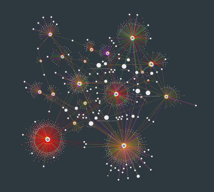
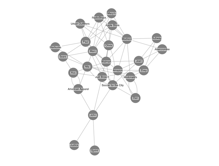
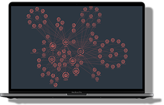
Success! This gives us our first visualization of the credit card dataset.
Defining color schemes
Next we will define two color schemes: one with a dark background and the other with a light background.
We’ll base our color schemes on the popular Gruvbox retro colors. They follow many of the best practices we recommend for selecting the right color palette. For further recommendations, see choosing colors for your data visualization.
For each theme, we need to define:
- a background color
- a color for each node type that’ll stand out against the background color
- colors for the icon and label on each node type
- two colors to style links depending on whether transactions are disputed or undisputed
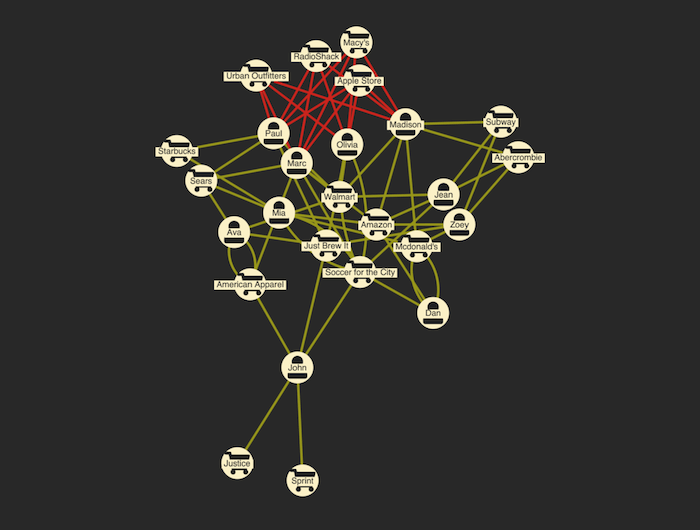
First, here’s the code for our dark theme:
{
  "background": "#282828",
  "node": {
    "color": "#FBF1C7",
    "label": {
      "backgroundColor": "#FBF1C7",
      "color": "#32302F"
    },
    "fontIcon": {
      "color": "#1D2021"
    }
  },
  "extra": {
    "disputed": "#CC241D",
    "undisputed": "#98971A"
  }
}
And here’s our visualization:
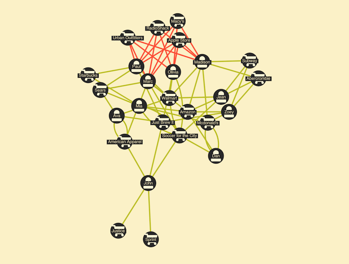
And here’s the light-themed version:
{
  "background": "#FBF1C7",
  "node": {
    "color": "#282828",
    "label": {
      "backgroundColor": "#282828",
      "color": "#F2E5BC"
    },
    "fontIcon": {
      "color": "#F9F5D7"
    }
  },
  "extra": {
    "disputed": "#FB4934",
    "undisputed": "#B8BB26"
  }
}
With our themes defined, we’re ready to add Styled Components that’ll make it easy to apply the same styling to other components.
Adding Styled Components
Alongside styled-components, we’ll add FontAwesome to support our chosen node icons. We’ll also include the lodash library for utility functions.
yarn add styled-components lodash @fortawesome/fontawesome-free
With the packages installed, we wrap the entire app in src/index.jsx with the ThemeProvider component and pass in the dark theme as the theme-value. We’ll define the light theme here too, because we’ll need it later for switching between the two.
const darkTheme = {
  "background": "#282828",
  ...
}

const lightTheme = {
  "background": "#FBF1C7",
  ...
}

ReactDOM.render(
  <React.StrictMode>
    <ThemeProvider theme={darkTheme}>
      <App />
    </ThemeProvider>
  </React.StrictMode>,
  document.getElementById("root")
);
Now we can access this theme through the useContext-API React Hook. To do this, we update the App.jsx file to import the ThemeContext from styled-components.
We also add two imports to load Font Awesome as well as the mapValues and merge functions from lodash:
import mapValues from "lodash/mapValues";
import merge from "lodash/merge";
import { ThemeContext } from "styled-components";
import "@fortawesome/fontawesome-free/css/fontawesome.css";
import "@fortawesome/fontawesome-free/css/solid.css";
Restyling items based on a theme
We’ve imported everything we need to theme our ReGraph graph visualization. Now let’s create a function that adds styling to the data.
Using the mapValues method, we’ll iterate over all the items in our data. Based on item type (node or a link), we’ll then apply the correct styling from the theme we defined earlier.
We’ll also add icons for people and vendors and color the links according to their status.
function styleData(data, theme) {
  return mapValues(data, (item) => {
    if (item.id1 == null) {
      const node = merge({}, theme.node, item);
      if (node.data?.type === "person") {
        merge(node.fontIcon, { text: "fa-user" });
      } else {
        merge(node.fontIcon, { text: "fa-shopping-cart" });
      }
      return node;
    } else {
      const link = merge({}, theme.link, item);
      if (link.data?.status === "disputed") {
        link.color = theme.extra.disputed;
      } else if (link.data?.status === "undisputed") {
        link.color = theme.extra.undisputed;
      }
      return link;
    }
  });
}
Finally, we need to read the theme from the context and apply it to our data using the React App function. We’ll use our styleData function to apply it to the data before we pass it into ReGraph.
export default function App() {
  const theme = useContext(ThemeContext);
  const styledData = styleData(data, theme);
  return (
    <FontLoader config={config}>
  	 <Chart items={styledData} options={options} />
     </FontLoader>
  );
}
Switching between themes
We’ve customized our ReGraph app using the dark theme defined with Styled Components. Now let’s give users the option to switch to the light version. We’ll also set up a background color.
For this we update index.jsx and add a component that tracks the current theme in the state. We also add a button to switch between themes and a styled component to set the background color.
const AppWrapper = styled.div`
  background-color: ${(props) => props.theme.background};
  display: flex;
  flex-direction: column;
  height: 100%;
  transition: background-color 250ms;
`;

function ThemeSwitcher({ children }) {
  const [theme, setTheme] = useState(darkTheme);
  return (
    <ThemeProvider theme={theme}>
      <AppWrapper>
        <div>
          <button
            onClick={() => {
              setTheme(theme === darkTheme ? lightTheme : darkTheme);
            }}
          >
            Switch Theme
          </button>
        </div>
        {children}
      </AppWrapper>
    </ThemeProvider>
  );
}
Notice that after we define the ThemeSwitcher component, we need to replace the ThemeProvider in the call to ReadDOM.render with it.
Take styling to the next level
ReGraph includes an onItemInteraction event that makes it easy to style every hover and select action. You’ll find practical examples of how this delivers the best user experience in 4 easy styling options for interactive graph visualization.
In our scenario, we’ll give users the ability to highlight disputed links when they hover their mouse pointers over them. First we add a new color to the “extra” sections of our color scheme.
For the dark theme, we’ll add:
{
  …,
  "extra": {
    …,
    "disputedHover": "#FB4934"
  }
}
And for the light theme:
{
  …,
  "extra": {
    …,
    "disputedHover": "#CC241D"
  }
}
Next, all we need to do is to listen to the onItemInteraction events and call the setStyle function when the user hovers over a disputed link:
onItemInteraction={({ id, item, hovered, setStyle }) => {
  if (hovered && item.data && item.data.status === "disputed") {
    setStyle({ [id]: { color: theme.extra.disputedHover } });
  }
}}
Now, the link changes color on hover automatically:
Try ReGraph & Styled Components for yourself
This Styled Components tutorial shows how easy it is to create the customized React app your users need. Using their library with ReGraph’s API, there are endless possibilities for designing stylish, beautiful visualizations.
Fancy trying this out for yourself?
FREE: Start your ReGraph trial today
Visualize your data! Request full access to our ReGraph SDK, demos and live-coding playground.


