In our line of work, we see a lot of data.
We’re constantly working with our customers to understand new datasets and new use cases, helping them to build the best network visualization applications possible.
Over the years, we’ve perfected a 6-step process for getting started with network visualization projects. In this network visualization tutorial, Phil, a Cambridge Intelligence developer, outlines how it works.
For more information, or to speak with us about your own network visualization projects, get in touch.
A 6-step network visualization tutorial
- Know your users
- Size up your network data
- Map it to the node-link structure
- Decide how to communicate value
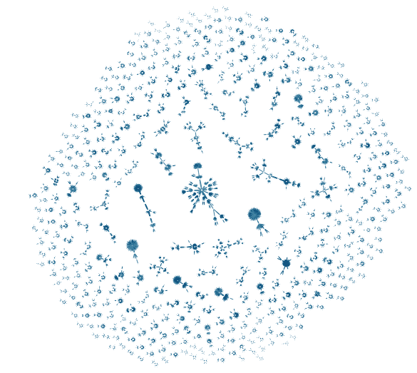
- Manage large data volumes
- Visual design
Step 1 – Know your users
Building a great network visualization requires one key question to be at the forefront of your mind from the very beginning:
What does the application’s audience need to know?
As well as deciding how best to represent your data as nodes and links, it’s important to think about how your visualization is going to be used. What are the questions that people will be asking about the data? What’s important to them? And what’s not important?
Step 2 – Size up your network data
Next on the list is to start understanding the scope and range of the data that you’re dealing with. What does a sample of the data look like? How many data points do you have? What sort of range of values are you dealing with? Are there missing or suspect data values? Is there personally identifiable information that needs to be redacted or anonymized?
Getting this right early is a good start for your network visualization project. You can use network visualization to understand where data quality issues exist. Find out more in Data cleansing with graph visualization.
Step 3 – Map it to the node-link structure
Once you have a handle on the size and scope of your data, it’s time to think about how best to represent it in a visualization.
Sometimes it will be obvious how to show the data as nodes and links, but often a bit of experimentation is helpful. Is it best to show a particular aspect of the data as a link, or a separate node? Give them both a try and see how it looks.
Do two different data items share an identical property? Perhaps you should represent this with a separate node – this is often helpful in anti-fraud applications, when it can make suspicious relationships very obvious visually.
At this stage, a whiteboard (or notepad) is helpful. Think back to step 1 – ask yourself what your users are looking for, then choose a visualization structure that will make it as obvious as possible. We’ve put together data-modeling best practice blog posts to help you.
Step 4 – Decide how to communicate value
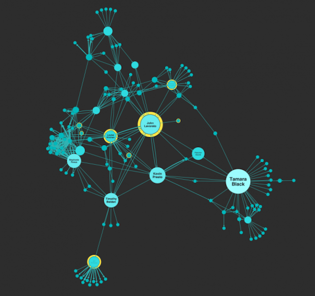
As well as the node and link structure of your visualization, getting the data value representation right is a key challenge. For example, you might want to vary the size of nodes or width of links in your chart to communicate some property in the data.
The challenge here is to choose a good mapping that shows the range of values effectively, without having larger values overwhelm the smaller ones. Using a range of colors to reinforce different sizes can also be effective. Both techniques are shown in the example here. There are further great examples of this in our blog post on graph visualization UX.
Step 5 – Manage large data volumes
Another important consideration is data volume. A chart can display many thousands of nodes and links – but that doesn’t mean it’s always a good idea. You might want to start with a data query that returns a manageable set of results, and then let the user add to them by “expanding” a node to fetch connected items to add to the chart.
Alternatively, you can simplify the chart by grouping related items together in a combo, and let the user ungroup them as required to reveal the individual items.
If your data includes timestamps, the Time Bar is a great way to provide an overview of activity over time, letting the user zoom in on periods of interest.
Read more about visualizing very large networks.
Step 6 – Visual design
Paying attention to visual design is particularly important – good design can make the difference between a visualization that’s a pleasure to use and one that’s visually jarring. It’s important to select colors that work together well; tools like ColorBrewer are useful here.
A well-designed set of icons can be valuable for representing different data types. Our products provide many ways of displaying data on nodes and links – such as enlargement, color, icons, glyphs, halos, line width, and style – but it’s important not to go overboard and produce something visually overwhelming.
For data that isn’t the main focus of your visualization, it’s often best not to present it on the chart at all, but instead leave it to be displayed in a separate panel when the user selects a specific item in the chart. That makes it easier for the user to focus on the data that they are most interested in.
You’ll find more useful information in our blog post on Choosing colors for your data visualization.
Try it yourself
Ultimately, visualization is all about harnessing the amazing power of the human visual cortex to provide insight into the structures and relationships in the data that you’re dealing with.
Network visualization tools like KeyLines and ReGraph provide a very powerful and flexible way to gain insight into data that just looks like a wall of text in a spreadsheet – as well as being a lot of fun.
Request a trial to get started for yourself!


