
Summary:
This article explains how graph visualization supports due diligence investigations by revealing hidden relationships and risks. It demonstrates how connected data helps uncover ownership structures, fraud, and compliance issues. The goal is to help teams make faster, more informed decisions.
Whether you’re vetting a new employee or examining financial records for a money laundering case, due diligence investigations always involve a lot of complex and diverse data. The process is gradual and unpredictable, and investigators often uncover connections in surprising places.
Most successful investigators bring data visualization into their due diligence workflow. Graph visualization (link analysis) and ‘pattern-of-life’ timelines are essential for compliance because they put users in control of the investigation, giving them an intuitive way to navigate and organize the information they’re exploring.
And data visualization communicates insights in a way that’s easy for anyone to understand, supporting a Suspicious Activity Report, a recommendation for enhanced due diligence, or a decision on whether to do business with the person being investigated:
In this blog post, you’ll find out how investigators working with open source (OSINT) data use interactive data visualization for compliance management, and how to take your application’s UI/UX to the next level.
Building the best user experience for an OSINT investigation
We’ll build an app for due diligence investigations to highlight important areas product designers and developers need to think about.
We’ll use the SocialNet API from our friends at ShadowDragon to gather our data. It exposes a wealth of information from social media, review sites, streaming platforms, gaming sites, professional networks and chat forums.
If this were a real OSINT investigation, we’d want to search across all available data sources, and SocialNet comes with a bulk search API to do just that. But for this demo, we’ll keep things simple and focus on just two sources: the UK Companies House API (which registers companies in the UK), and LinkedIn.
Searching for our investigation target
Every investigation begins with a search. One choice you’ll have to make early on is when to bring the results of each search into the chart. It might be tempting to visualize everything straight away, but look at what happens if we visualize the results of a search for “Cambridge Intelligence”:
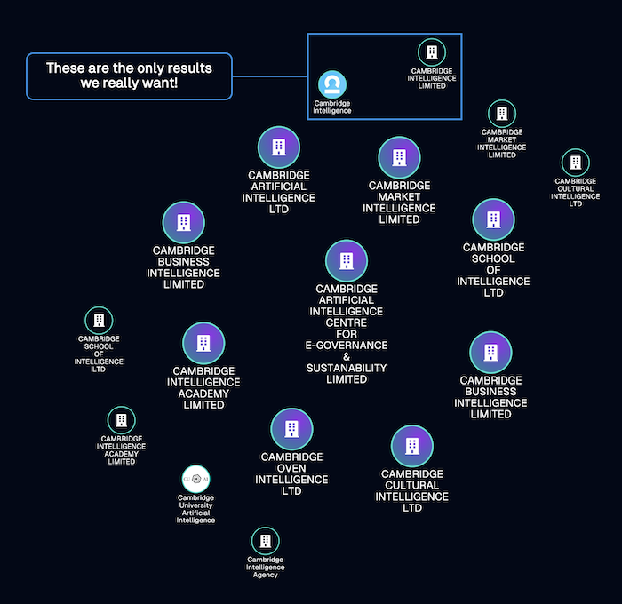
We’re quickly faced with an unsightly ‘snowstorm’ of nodes, most of them aren’t relevant to our investigation. It’ll take the user a long time to manually remove everything they don’t need to see on the chart.
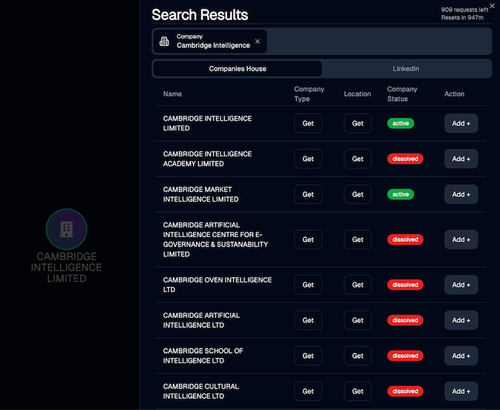
A better approach is to design a search results component which lists results along with the information we need to identify our investigation target. We’ll include an “Add” option so that the user can select which entities appear on the chart as nodes:
Digging deeper into the subject of our investigation
With a de-cluttered chart that’s focused only on the subject of interest, we can start investigating. Now the user needs to expand and explore the graph to discover important connections and paint a more detailed picture of the target. This is where we need to make key decisions about the app’s design and user experience requirements.
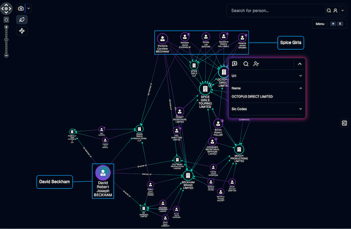
In this example, we’ll investigate an individual of interest, and find out which companies they’re associated with.
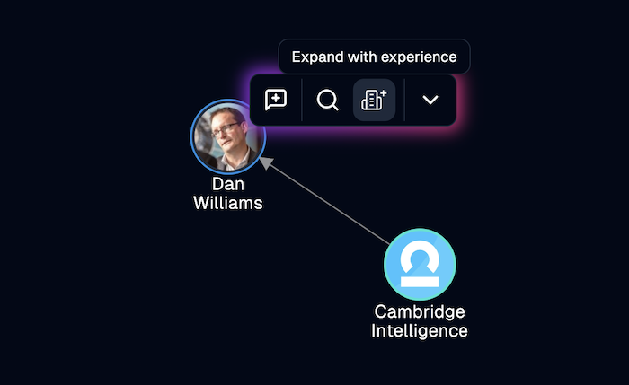
The intuitive chart ‘expanding’ action is one of the most common functions a user expects to see, so we’ve made it easy for them to find with a fly-in context menu that appears when they click a node. When they select the “Expand with appointments” option, they visualize an individual’s business interests:
We can do the same with groups of companies to bring in their associated officers. Again, we think about what actions a user is most likely to take at each step of the compliance investigation, and make them easy to find in the UI. In this way, we make chart exploration more efficient and enjoyable:
Adding visual cues
We also need to consider how to alert the user to delays from the backend as queries are processed. We could use a ‘blinking glyph’ on the node, to let them know that something is happening. Our backend requests are processed in a non-blocking way, so the user can carry on doing other tasks while they wait for the query to execute:
Finally, we need to make decisions about your visual data model. Which items should appear as linked nodes, and which should display as metadata for an existing node?
In this example, when the user brings in a LinkedIn record for a company or person, we request a company logo or avatar image from the SocialNet API and use it as the background image for the node itself:
Entity resolution and messy data
Duplicate and badly categorized data is another challenge you’ll hit when you start to build an OSINT application.
We now know that the Companies House data is full of duplicates – it seems there are no checks to prevent somebody registering a company using a slightly different version of the same name each time.
Here, when we search for David Beckham, the results return two identically-named person entries, and a pair of companies with similar names:
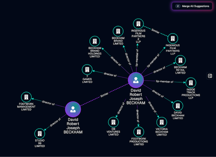
We used a simple word-based similarity library here to identify potential duplicate data, and highlight it in the chart using dashed links.
It’s important to explain to the user what’s going on here. That’s why we didn’t merge the similar nodes automatically. Instead, we flagged them to the user, so that they can decide whether the match is a good one, and merge the nodes when appropriate:
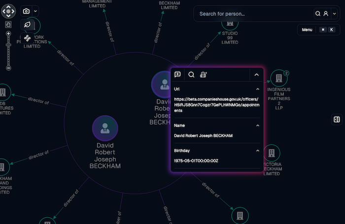
We’ve used a number glyph to show where a node is made up of two or more merged nodes. The user can expand these nodes and see the original raw data inside. This reveals more of the raw data behind the original nodes, so the user can check extra information to see whether the pieces of data belong together:
Prepare a visualization for sharing
It’s a common mistake to think that the link analysis chart in the browser is the ‘final destination’ for an analysis. This is rarely the case. The final presentation of the information in your application depends on your use case and audience, but here are some of our favorite methods for preparing your chart for sharing.
Remove leaf nodes
Once we’ve found interesting connections in the data, we might no longer be interested in the ‘leaf nodes’ – the clutter of nodes with only one connection in the chart. Here we’ve added a button to remove them and resize the remaining nodes to show the most important connections in the network:
Add annotations
The person carrying out the analysis is rarely the same person who needs to make decisions based on their findings. That means that the analyst’s conclusions and recommendations need to be easy for a decision-maker to understand straight away, even if they haven’t been involved in the compliance investigation so far. One way to help them is to add notes and comments to your chart. You can also make nodes of interest stand out by fading nodes that aren’t annotated:
Export your visualization
The final step is export, whether it’s a PDF file or an image embedded in a document. For the finishing touch we’ve added a visual ‘snapshot’ effect, as charts of interest are captured and exported to the clipboard or a file.
Put it all together
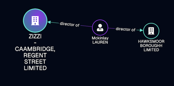
Let’s try out everything we’ve covered in this post, on a real example. This BBC news article talks about celebrity chefs who’ve been targeted in fake company scams. It mentions an example fake company as the misspelled “Zizzi Caambridge”. A search for this restaurant gives us an owner (presumably also fake), and another mis-spelled restaurant:
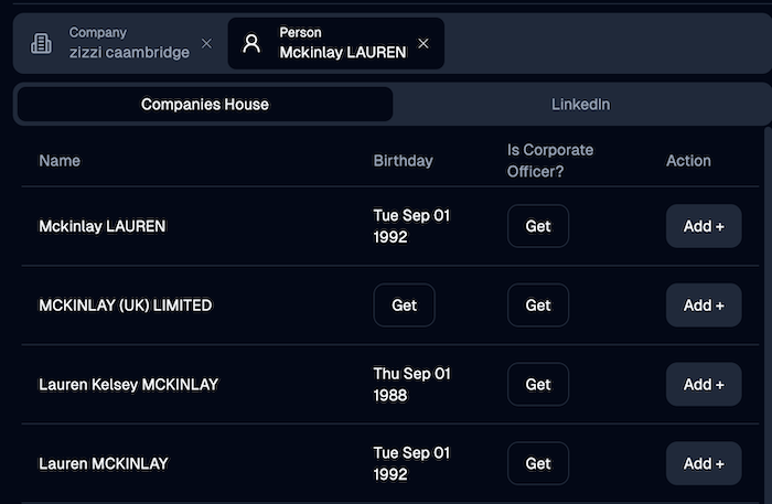
We can then run a second search on Lauren to find a number of other similar people registered with Companies House, each with a suspiciously similar birth date:
And finally we bring these Laurens into our chart, automatically combine them into a single entity-resolved node, and bring in their business interests:
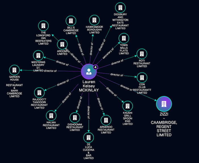
In the space of a couple of minutes, we’ve identified a whole group of fake businesses associated with the one mentioned in the news article.
Try it for yourself
Do you have a project to bring OSINT or any other data source to life? Sign up for a free trial of our network and timeline visualization toolkits today.
Key takeaways:
- Visualization accelerates investigations - graph and timeline views help analysts quickly identify relationships, patterns, and risks across large OSINT datasets
- Good UX improves investigative efficiency - features like selective data expansion and contextual filtering reduce visual clutter and help investigators focus on relevant insights
- Human validation strengthens entity resolution - manual review of potential duplicate records improves accuracy and reduces false associations in due diligence investigations
Share:
