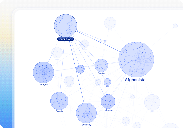
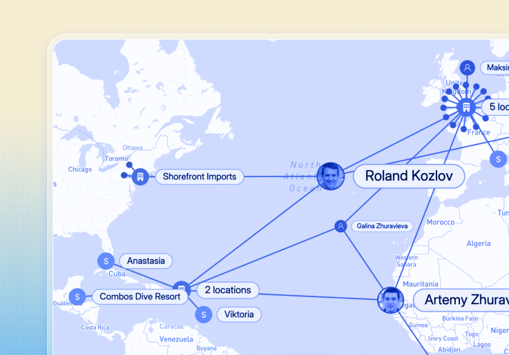
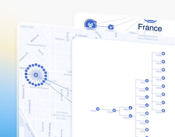
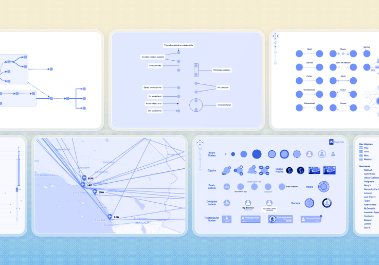
When to combine Graphs with Maps
Some patterns only become obvious when connected data is viewed in geographic context, especially when location adds meaning to relationships.
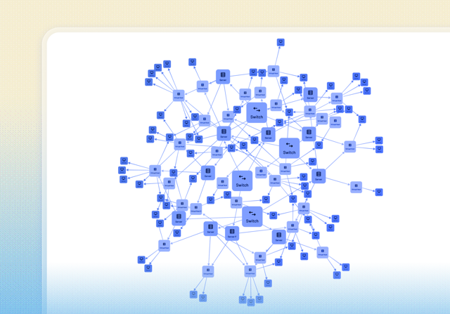
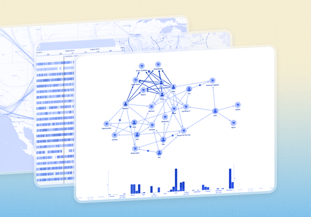
- Physical infrastructure networks
- Maritime, aviation, supply chain or logistics analysis
- Geofenced cyber attacks
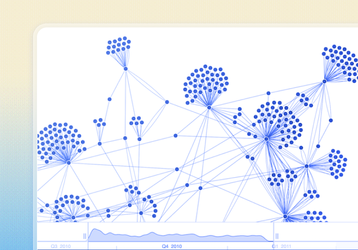
- Movement tracking across locations
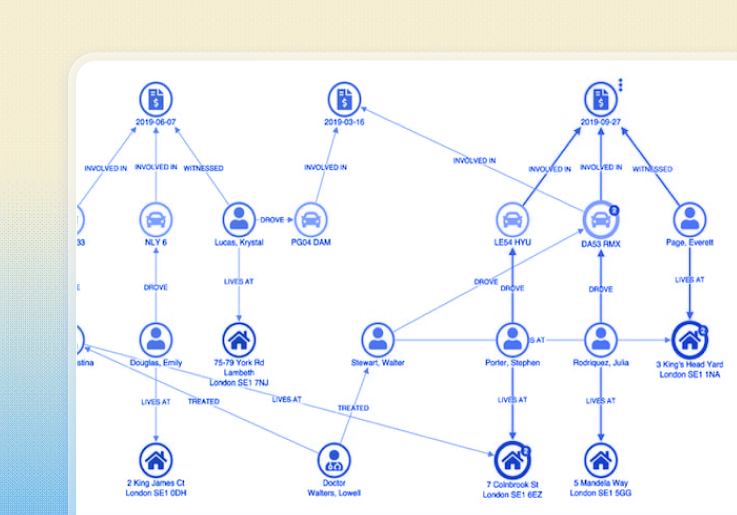
- Terrorism or crime hotspots
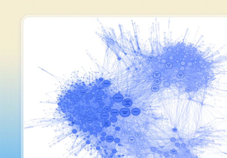
- Distributed assets tied together through shared relationships
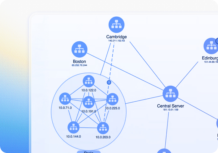
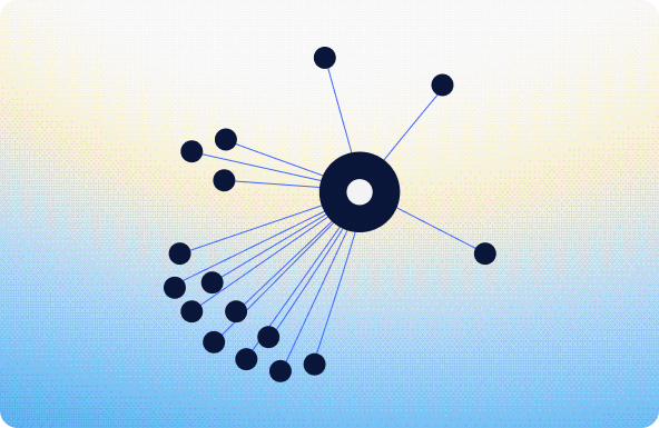
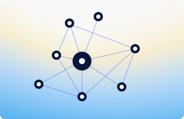
A separate graph view becomes valuable when users need to step beyond geography and explore structure, scale, or complexity in different ways, for example when they want to:
- View the same network using graph layouts (hierarchical, sequential, or clustered by
type)
- Examine dense subnetworks at a single location, such as infrastructure or cyber
assets within one site
- See richly styled nodes and relationships without cluttering maps, keeping geographic
context available alongside
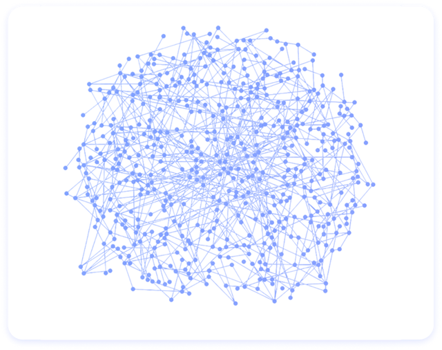
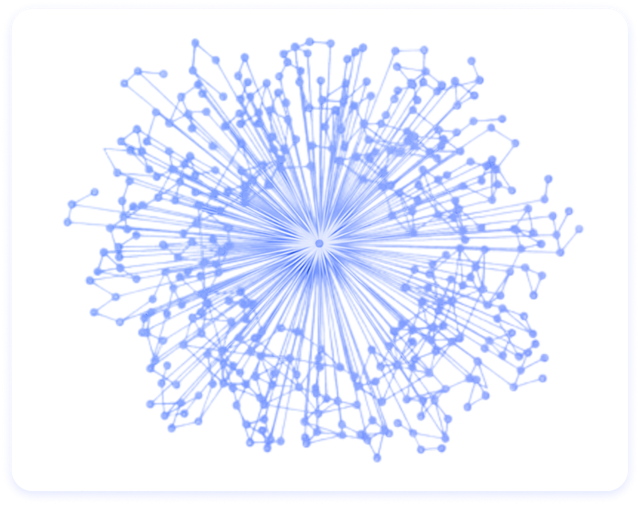
Graph visualization answers how things are connected. Geospatial visualization answers where those things are.