The geospatial visualization SDK for uncovering hidden connections
Build applications that reveal geospatial connections with clarity, not clutter.
Trusted by 250+ organizations worldwide
MapWeave is a geospatial visualization SDK that helps developers build applications for analyzing connections and events in their geographic context.
It offers adaptive rendering, smart edge bundling, and high-performance map layers, making it easy to explore even the largest datasets without visual clutter.
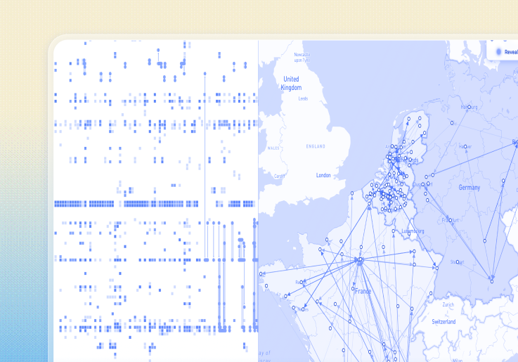
See MapWeave in action
Try these interactive demos in your browser.
Why teams choose MapWeave
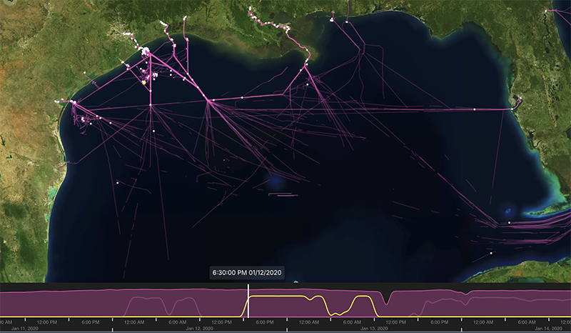
Uniquely actionable geospatial intelligence
Turn connected events and observations into powerful map visualizations.
MapWeave brings geospatial data into focus, helping users uncover relationships and patterns that might otherwise stay hidden
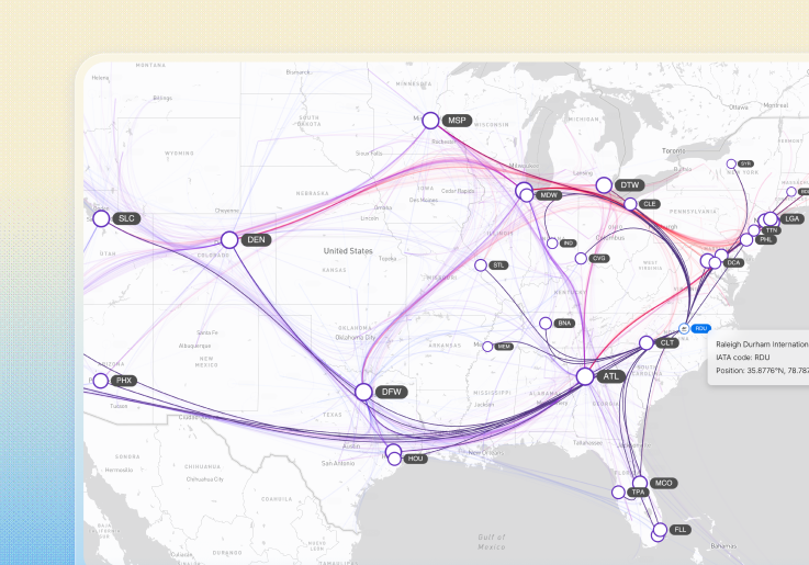
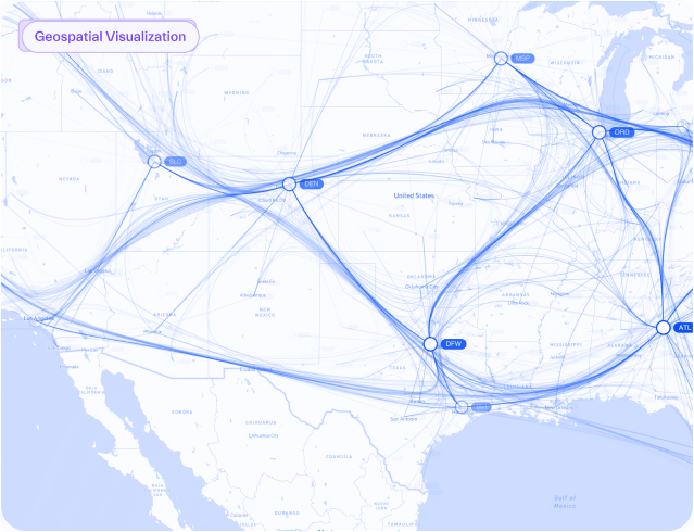
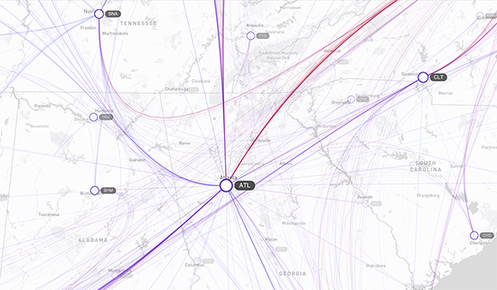
Geospatial insights at scale
Explore your largest and most complex datasets without the clutter.
MapWeave’s adaptive rendering and smart edge bundling reveal patterns, outliers and structures clearly at any zoom level.
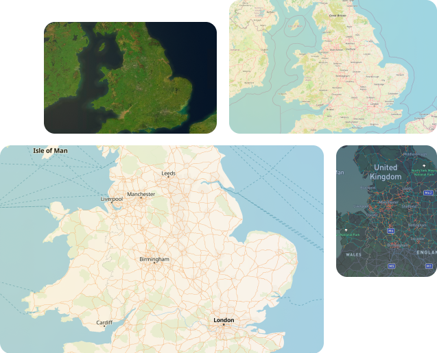
Flexible mapping options
Choose the basemap that works best for your project.
MapWeave supports a wide range of GIS solutions, including Mapbox, MapLibre, offline tiles for disconnected environments, or your own tile servers for live, custom basemaps – giving you full control over the look and feel of your maps.
Integrates cleanly with your stack
Skip the integration headache.
MapWeave’s flexible architecture makes it easy to plug into your existing systems and data. With demos, guides, and responsive support, you’ll be up and running fast.
Features designed for clarity and scale
Adaptive rendering
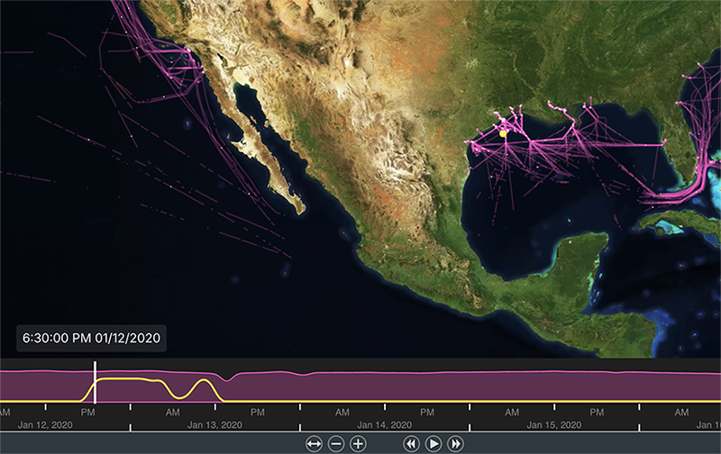
Fast time filtering
Flexible basemap adapters
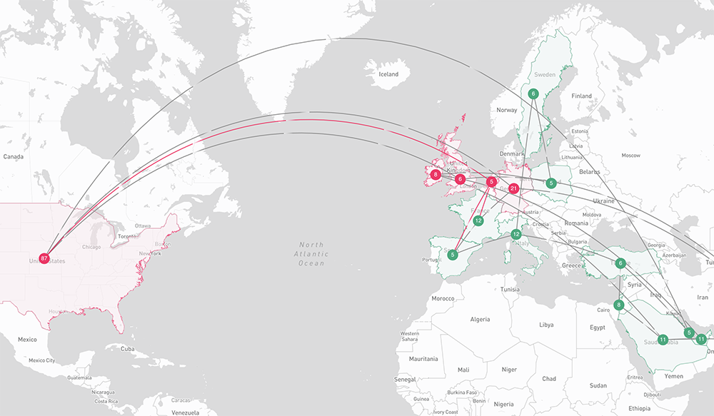
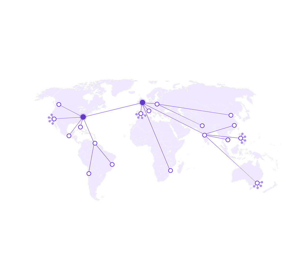
Flows and bundling
Trackers and free network nodes
Start building with MapWeave
Design, support and security
Cambridge Intelligence SDKs are not just SDKs. When you license with us you also get access to a partner with these additional tools and services.
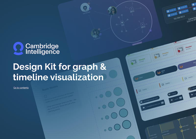
Faster design-to-development workflow
Prototype graph interfaces using our Figma Design Kit before writing a single line of JavaScript. Align designers and developers early, reduce rework, and move from concept to production faster.

Expert support from your first login
Every Cambridge Intelligence SDK comes with expert support from day one.
From onboarding to launch and beyond, our team is here to help you succeed.
First-line support comes directly from the developers who build our toolkits, backed by experts who can provide health checks, deep-dive workshops, and guidance tailored to KeyLines.
ISO 27001 certified
MapWeave is developed and supported under Cambridge Intelligence’s ISO 27001-certified Security Framework.
Frequently asked questions
What kinds of problems is MapWeave designed to solve?
MapWeave is ideal for applications where connections need to be understood in a geographic context or have dynamic entities. Typical use cases include maritime intelligence, communications monitoring, open-source investigations, and building network digital twins.
Can I use MapWeave on its own?
Yes, MapWeave is a standalone SDK for both JavaScript and React. It’s designed for developers who need geospatial clarity at scale, without relying on third-party GIS platforms.
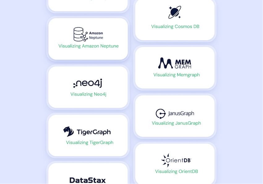
How does MapWeave work with other Cambridge Intelligence SDKs?
MapWeave integrates seamlessly with our graph (KeyLines, ReGraph) and timeline (KronoGraph) SDKs. Many teams choose to combine them for a unified map, network, and timeline experience – but each SDK can also be licensed and deployed independently.
Which mapping services does MapWeave support?
You can use MapWeave, MapLibre, offline tiles, or your own custom tile servers. Its flexible basemap adapters make it easy to integrate into your existing tech stack.
Can it handle large datasets?
Yes, MapWeave is designed to scale. GPU-accelerated rendering and adaptive layouts keep even the largest datasets interactive and clutter-free.
Is MapWeave ISO 27001 certified?
Yes. MapWeave is developed and supported under Cambridge Intelligence’s ISO 27001-certified Security Framework. Learn more on our Security Framework page.
What developer support is available?
Every MapWeave license comes with expert onboarding, health checks, workshops, and responsive support from our visualization specialists.
Start your MapWeave trial