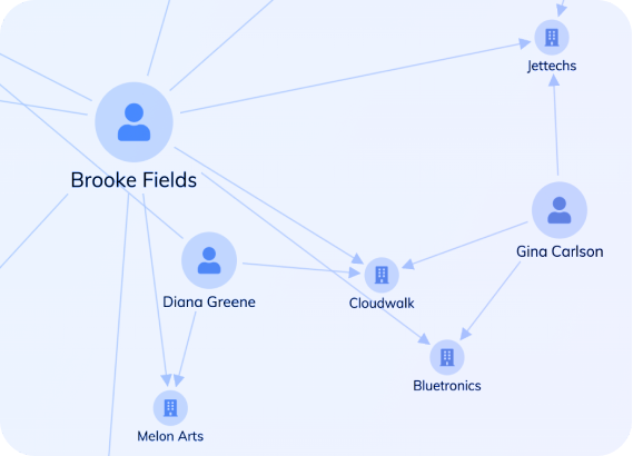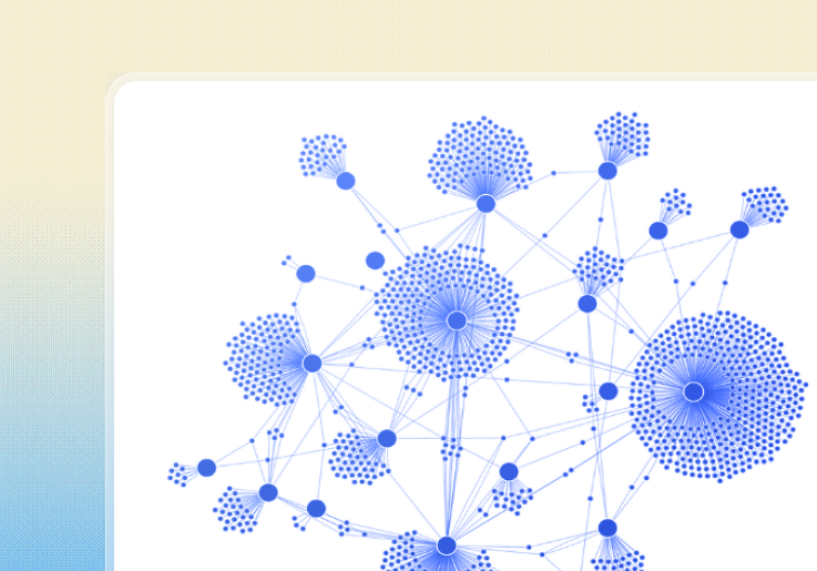
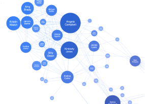
Security & Intelligence
Network visualization and analysis enable investigative teams to transform sprawling datasets into clear, actionable intelligence.
By revealing connections between people, places, events, and evidence, these tools help answer critical investigative questions that traditional methods might miss.
Applications include mapping organized crime structures, establishing chains of custody, recognizing repeat offender patterns, and discovering connections across separate investigations.
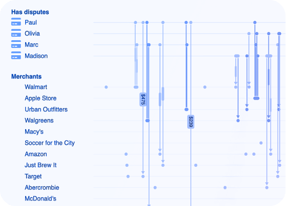
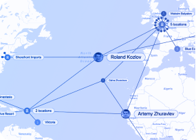
Risk & compliance
Sophisticated fraud schemes typically involve coordinated networks rather than isolated actors. Network visualization empowers investigators to expose organized fraud operations, identify fabricated identities built from stolen credentials, follow illicit fund movements across account networks, and spot suspicious activity patterns in their early stages.
These investigative techniques are used across financial services, insurance claims, healthcare billing, online gaming, consumer reviews, and misinformation tracking.
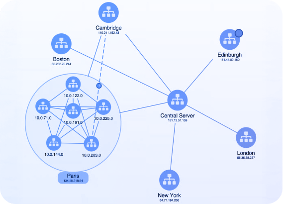
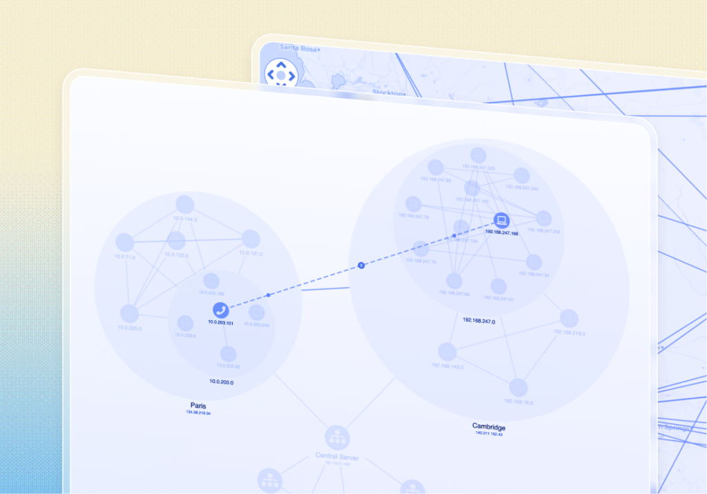
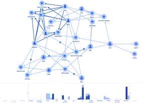
IT Management & network visualization
IT environments generate huge volumes of operational data across services, applications and infrastructure systems that are interconnected across cloud and on-prem environments.
IT infrastructure visualization enable teams to understand complex IT systems, so they can monitor network health, prevent outages and achieve performance and cost optimizations with interactive graph, timeline and geospatial visualization.
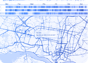
Cybersecurity & OSINT investigations
Publicly available intelligence sources present inherent challenges: fragmentation, noise, and sheer volume. Conventional analytical approaches often prove inadequate for extracting meaningful intelligence. Network visualization addresses these challenges directly.
Since OSINT work centers on mapping relationships among actors, organizations, and incidents across diverse data sources, network visualization provides an intuitive framework for analysis even in highly complex scenarios.
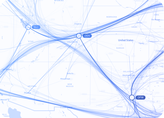
Supply chain and network digital twins
Effective supply chain oversight requires visibility into interdependencies spanning procurement, production, logistics, distribution, and reverse logistics operations. Network visualization helps with analyzing complex operational networks at enterprise scale.
Representing supply chain components and flows as connected networks or temporal sequences enables organizations to maintain operational continuity and optimize performance.