Understanding big, complex network topologies, like IT infrastructure or telecoms networks is challenging. With the help of network visualization, it doesn’t need to be.
Take the identification of alerts, for example. Alerts might be generated from detectable behaviors, like traffic to blacklisted addresses or downtime within the network; or could be manually raised by administrators. Whether it’s fault management in a physical communications network or cyber threat detection in your corporate IT setup, one of the first challenges is knowing where the problems lie.
In this blog post, we’ll show you how network topology visualization can make alert detection and investigation more effective, and help you gain a clearer understanding of your infrastructure topology.
In particular, we’ll focus on combos – the powerful node-grouping functionality in our toolkits that reduces clutter and makes it easier to see the bigger picture and gain deeper insight.
Why visualize alerts and network topology?
If it’s your job to understand and respond to alerts in a network, you need fast insight to see problems as they arise. There’s a series of questions you need to answer:
- Do I have any problems? Most of the time, you need to start with an ‘at-a-glance’ view, to quickly spot alerts and pinpoint their general location.
- What is the problem? If there are alerts, you need to be able to ‘drill down’ into the network topology visualization to understand exactly which systems are affected and where they’re located.
- What’s the impact going to be? Now you’ve identified the problem, explore outwards again to understand how it will impact the wider network.
Data visualization is already common in network management platforms, but often what’s missing is the interactivity, performance and advanced analysis features of network visualization toolkits like KeyLines and ReGraph. As well as supporting the reactive response to alerts outlined above, it gives you the tools to understand your network topology. You can spot bottlenecks or structural deficiencies, and be proactive about defending against threats.
Let’s see how it works.
Network topology visualization and combos
Combos are a game-changer for those needing to understand large, complex IT/infrastructure network data. Exclusive to our technology, the functionality allows you to combine multiple nodes into groups, and organize those groups into hierarchies. It eradicates chart clutter so you can navigate complicated networks at the right level of detail. It’s an intuitive way to explore network topologies, without data overload.
Get detail on demand
Combos can really help when you need to understand connections between different tiers or sections of a network topology.
The example below shows a corporation’s IT network. There are offices at different locations and various subnets within them, all communicating to a central server through which common services are accessed. Links represent communication between any two machines. We’ve used combos to group network assets by subnet and location, so at the high level we get a really simple view of the topology:
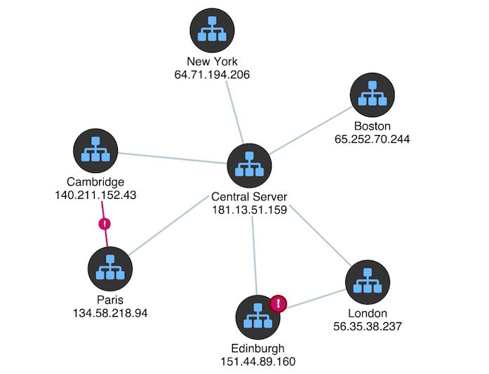
We can see two alerts have been raised, shown in red. The red link alerts us to a potentially dangerous connection between the Paris and Cambridge offices. Let’s drill down by ‘opening’ some combos:
It turns out that the alert was triggered by insecure data traveling between two devices. Using nested combos, we can see this detail when we need it but easily switch back to a high-level view when we’re trying to understand the general picture.
You could also style your visualization using rectangular combos with a grid arrangement. Together with a sequential layout, this gives a clear overview of the IT network, its levels and connections:
Tips for great alert visualization
As well as combos, these examples use other techniques to make it easier for users to understand what’s happening:
- Glyphs on nodes and links, to show alert warnings, port numbers, etc.
- Automated pan and zoom to focus on selected alerts
- Ping animated effects to focus attention on key items
- ‘Revealing links’ to show how a particular node in the network is connected to its neighbors
- Contrasting colours on important nodes and links
These features work well in our example corporation’s IT network. When the user asks for more information about the alert in the ‘Edinburgh’ network, we run an animated sequence to drill down, identify the specific problem (a ‘blacklisted’ application) and reveal all the assets the compromised machine is talking to.
In this way, we’ve gone from a very high-level alert (“There’s a problem in Edinburgh”) to a very specific set of actionable intelligence about which parts of the network may have been compromised.
Power your network topology visualization with combos
To truly understand the power of combos, you need to try the functionality for yourself. Are you ready to unleash combos into your network visualization?
Share: