
Over recent years we’ve seen more and more businesses digitizing their supply chain processes. Our latest demo shows how KronoGraph, our time-based visual analytics toolkit, can support a reliable management tool with supply chain network visualization at its heart.
A supply chain is a network of complex connections between suppliers, partners, processes, systems, customers and more. Supply chain managers have plenty of tools to work with, from smart IoT sensor technology to machine learning and real-time data analytics. But graph and timeline visualization is what pulls it all together, offering the end-to-end visibility needed to stay flexible, futureproof and compliant.
Why supply chain network visualization is essential
Whatever business you’re in, if you’re responsible for an efficient and responsive supply chain, you need good data insights to do it right. Visualization makes this possible. Here are some stand-out examples.
Retail & manufacturing
If a product is unavailable, or its delivery status can’t be tracked in real time, customers take their business elsewhere. For retailers and manufacturers, getting products to the right place at the right time is a basic business requirement.
Government & defense
In a high-stakes environment like a military exercise, huge volumes of critical supplies are shipped across long distances to a precise schedule. There’s often heavy stakeholder involvement too, making government supply chains some of the most complex around.
Healthcare & pharmaceuticals
Every organization needs a fast, reliable and secure supply chain. That’s especially true in the healthcare and pharmaceutical industries, where lives depend on supplies being available at the point of need.
The risk of limited visibility
Supply chain network visualization is a huge asset in any industry, but in this detailed example we’re focusing on retail. This KronoGraph showcase demo is based on the state-wide recall of contaminated spinach in America in 2006. The product was pulled from every retailer’s shelves across the USA, following an E. coli outbreak. Limited visibility in the supply chain meant that it took investigators two weeks to trace the dangerous spinach back to its source.
They eventually found that only a tiny percentage of the product was contaminated, isolated to two locations. But without fast access to that information, they had no alternative but to shut down the entire spinach supply chain nationwide, losing huge revenue for businesses and damaging their reputation with distributors and customers.
How supply chain network visualization reveals insights fast
In the food industry, stringent regulations mean that quality and safety come first. But even the most advanced IoT monitoring and data analytics are useless if you can’t visualize the whole supply chain at a glance. Interactive supply chain network visualization can take you straight to the root of the problem, giving you the fast insights you need to make well-informed, business-critical decisions.
We’ll use fictitious data to look at how things could have panned out in 2006 if investigators had had the added advantage of a supply chain network visualization.
The demo starts with the discovery of a small batch of contaminated spinach at a grocery store. We need to trace its movements through the supply chain to find out the scale of the problem. Our goal is to find the source – and any other contaminated consignments – fast, so that we can take swift action.
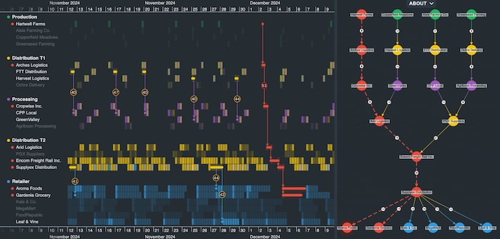
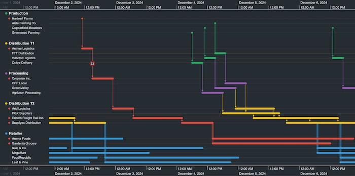
Our supply chain network visualization app combines timeline and graph visualization to give us end-to-end visibility of our supply chain, from farm to retailer.
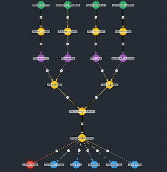
The network chart on the right shows the supply chain mapped out in clear sequences. Levels represent each stage in the supplier network. We can see that the spinach is grown on four farms, then various suppliers take it to processing plants before it’s transported to local distribution centers and finally retail stores.
The timeline chart shows a heatmap tracking every consignment of spinach, with stronger cell hues representing busier time periods – a useful way to track bottlenecks.
Straight away we notice the red alert on both the chart and the timeline. It highlights the contaminated consignment of spinach discovered at Aroma Foods.
We’ll use KronoGraph’s powerful analytical capabilities to trace this consignment back through its entire journey, to identify the source of the contamination, see if other retailers are at risk and try to discover what went wrong.
Powerful traceability: finding issues, fast
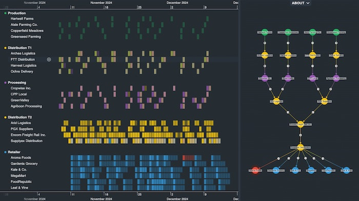
We know where our contaminated spinach ended up, but we don’t know how it got there from the farm. KronoGraph’s ‘reveal’ feature brings the entire journey into focus.
Notice that another retailer, Gardenia Grocery, received spinach from the same contaminated batch, but the other retailers were unaffected. Our product recall strategy will only impact two businesses, so disruption to the network is kept to a minimum.
Finding the root cause of supply chain issues
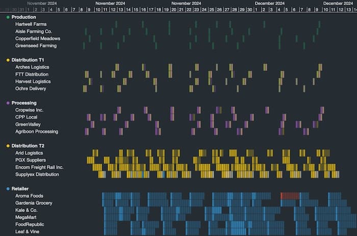
How did the product become contaminated? For this we need to take a closer look at the consignment’s journey. Once we zoom in, the heatmap changes to a timeline of events to give us a more detailed picture.
Now we can see how long each consignment spent at each stage of the supply chain. It’s a good way to analyze efficiencies and identify areas for improvement – why does a product spend so long at a particular distribution point? Is there a bottleneck that needs investigating further?
Tooltips at each stage of the journey help us dig deeper still.
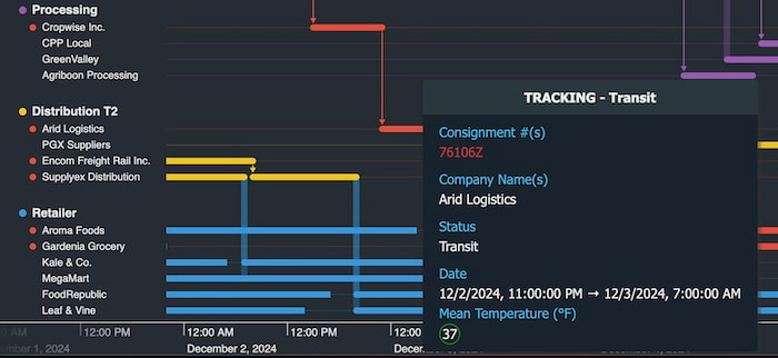
Notice the mean temperature (°F). Food products like spinach must be kept within a controlled range to comply with safety standards. At this stage of the chain, Arid Logistic provided the correct environmental temperature. But if the mean temperature rose above the safety threshold, there would have been an alert raised. We can visualize where these alerts occurred in the network by checking the information glyphs on events.
The amber alerts haven’t caused contamination, but frequent problems between these stages of the supply chain are worth investigating further. The red alert tells us that our spinach reached 53°F during the 4 hours it was in transit between Arches Logistics and Cropwise Inc.
We’ve found the most likely source of contamination already without the need to recall every consignment, keeping the rest of the supply chain working and customers safe.
Start visualizing your supply chain
Like any busy network, if you can map every item together with a web of links between them, you’ll find it easier to understand and manage a smooth-running supply chain. Clever styling, detailed analysis that ‘reveals’ items and useful features like tooltips makes KronoGraph an essential part of your supply chain management strategy.
Getting started is easy. Sign up for a free trial and get access to the supply chain network visualization demo featured here, plus many more to suit every major use case.
Share:
