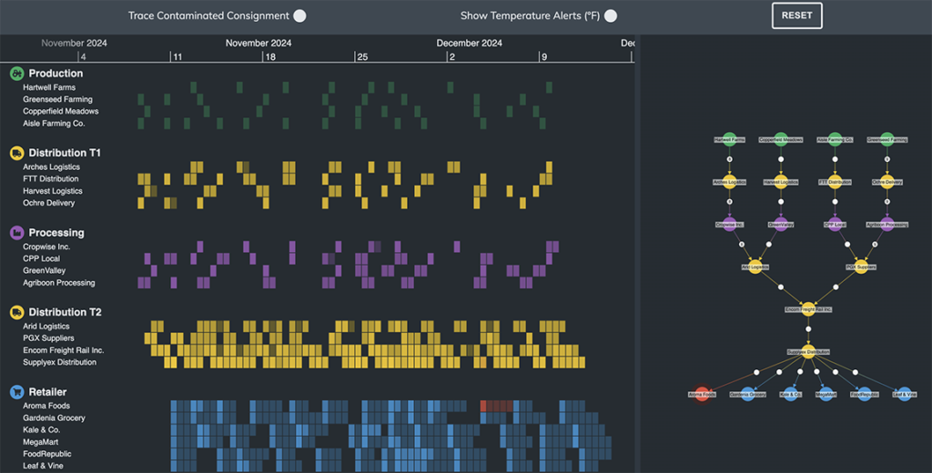
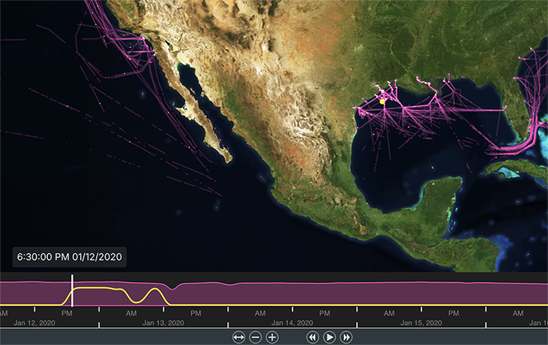
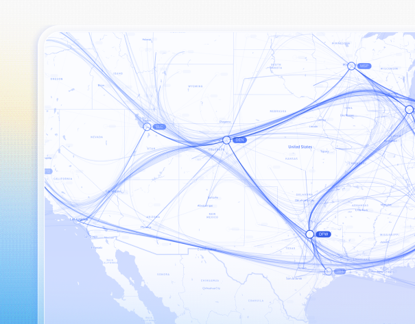
Organizations must track products, suppliers, logistics partners and operational events across multiple regions and systems. From manufacturing and shipping to warehousing and distribution, each step generates large volumes of data.
Understanding how these elements connect is critical to maintaining efficiency, resilience and regulatory compliance.
Supply chain teams must be able to:
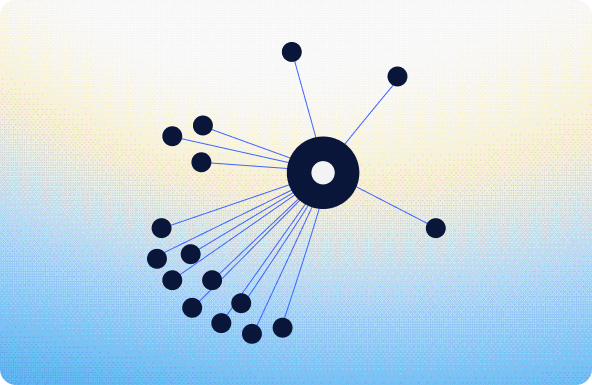
- Understand relationships between suppliers, products and logistics networks
- Monitor supply chain activity in real time
- Identify disruptions and bottlenecks
- Manage regulatory compliance across global supply chains
Interactive visualization helps analysts explore supply chain networks more effectively to understand dependencies, risks and opportunities for optimization.