
Supply chain managers deal with complex, fluctuating networks of stakeholders, processes and systems. It’s a huge challenge, and many teams turn to dynamic, interactive graph visualization for the end-to-end visibility they need. Increasingly, they’re also taking advantage of AI technology to streamline processes and predict disruptions.
AI-powered automation speeds things up, and machine learning improves foresight, but data visualization is key to an analyst’s control over their supply chain. In this blog post, you’ll find out how to transform your supply chain processes by integrating graph and timeline visualization with the latest AI-led supply chain tools.
A supply chain isn’t really a chain – it’s a network
The role of AI in supply chain management
It’s no surprise that artificial intelligence is the heaviest influence over Gartner’s top trends in supply chain tech for 2024. In particular, businesses are turning to AI and automation tools to help them build knowledge management apps, strengthen contingency plans and meet regulatory requirements.
Global consumer goods businesses use AI with other technologies to improve their customer experience, predict demand, prevent fraud and more. Unilever implemented AI across their supply chain, with AI technology built into ice cream cabinets for seamless inventory management, and satellite imaging used with AI to monitor farms and landscapes for better traceability.
But to run a successful AI-led supply chain, you need clear and reliable data insights. And although AI software can be trained to extract those insights, it can’t always translate them to a human-readable format. Data visualization makes it easy to navigate through every stage of a supply chain, from manufacture and distribution to delivery and returns. It gives analysts the visibility they need to detect weak links, mitigate disruption and pre-empt threat.
Bring AI-driven insight to life with data visualization
The two themes driving Gartner’s AI and supply chain top trends for 2024 are:
- Emerging technology used by supply chain leaders to safeguard and steer their businesses
- Blending human expertise with machine capabilities for a competitive edge
AI is a transformative technology, but supply chain leaders rely on data visualization to guide them to the decisions needed to safeguard and steer their businesses. And to successfully blend human expertise with machine capabilities, you need interactive graph visualization to convey AI-driven insights in a way that investigators can understand, analyze and act on.
With the right balance, businesses of all sizes use AI and data visualization to build a supply chain that’s visible, adaptable and future-proof.
AI-led supply chain risk
Organizations use machine learning to analyze data from multiple sources, like historical data, market conditions, weather patterns and geopolitical events to identify potential supply chain risks. But AI tools are only as powerful as the data they can access, so they depend on the quality and availability of information from supply chain partners.
Security risk is another big problem in any loose-end vendor relationship. It’s almost impossible to get assurance of the safety and security measures implemented by AI vendors and open-source models. That brings a heightened risk of sensitive information being accidentally leaked by unsuspecting AI chatbot users.
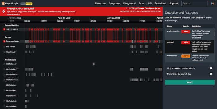
And supply chain organizations are prone to increasingly sophisticated AI-driven ransomware attacks. Data visualization is a proven method for detecting and preventing cyber threats – in fact, cyber security is one of its most widely adopted use cases.
There’s also risk from within when you work with machine learning models. It’s hard to train them to handle sensitive or nuanced data, so they’re prone to hallucination, bias and misunderstanding.
You can save a lot of time and money by automating your data gathering and analysis. But for those borderline decisions that need sector experience or lateral thinking, your analysts need interactive data visualization tools to make the right calls that keep the supply chain safe.
Data visualization and AI for supply chain optimization
To get end-to-end oversight of a supply chain, you need to understand risk and dependency at each stage, from planning and procurement via production and logistics to distribution and returns. Each phase brings its own challenges, adding a new layer of connected data to an already complicated network.
Let’s look at the key supply chain stages where AI and data visualization have important roles to play.
Improved planning and scheduling
AI tools help with production planning and scheduling by processing dynamic information such as customer changes, production capacities, resource availability and order priorities. Interactive data visualization makes that information accessible and explorable for analysts by charting the supply chain end-to-end, allowing managers to visualize scenarios, understand their options and make adjustments:
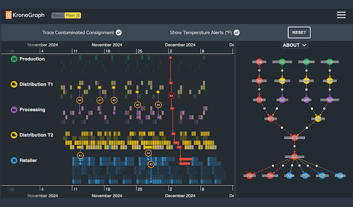
Bring in timeline visualization and they can also model and trace time-based elements more clearly:
Visualize complex AI-gathered supply chain data
Supply chain data is increasingly machine-generated. For example, haulage companies can gather information from shipping crates that know what they’re carrying, in what quantity, and what condition they’re in. If those crates are misplaced, they can even let supply chain managers know where they are.
AI tools can classify and categorize all of this data. If the output is presented as an interactive data visualization, analysts can identify new or unusual activity that indicate problems like weak links or bottlenecks. The human brain is great at spotting patterns, and that’s why visual representations like graphs and timelines are such an important tool for analysts who need to quickly spot trends and anomalies, and anticipate problems before they happen.
Collaborate and communicate with expanding networks
Well-connected organizations work with worldwide networks of supply chains, with each branch planning and making decisions together. Procter & Gamble uses AI to work more collaboratively with retailers across the world. Their global Supply Chain 3.0 initiative helps them to collaborate holistically on the supply chain, instead of optimizing it in stages. They use data and machine learning algorithms to enhance truck scheduling.
They also use AI tools to dynamically route and source goods. With the right data visualization tools, it’s easy to build collaborative AI-powered visual network analysis dashboards. These help to navigate the widest international trade networks, working with suppliers and distributors to find the most efficient and cost-effective trade routes and strategies.
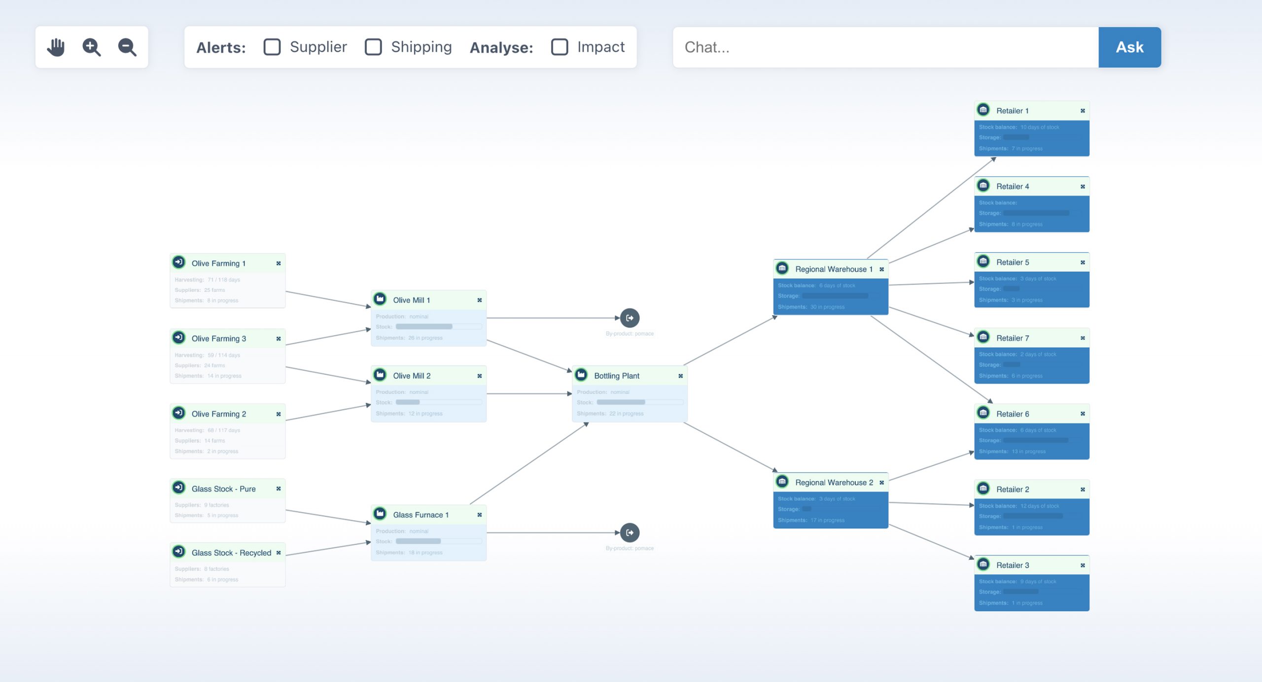
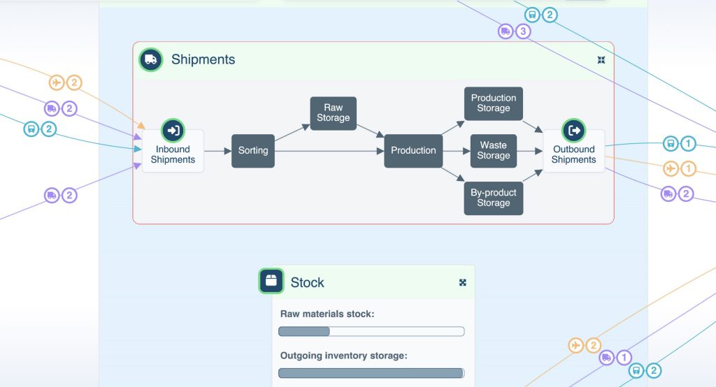
In this fictional example, we’ve created a supply chain management application for a food supplier. The entire network is visible in one clear overview, from olive farmer and packaging manufacturer, via bottling plant and warehouses to several retailers.
We’ve added an alerts function that highlights live issues at the supplier or shipping level.
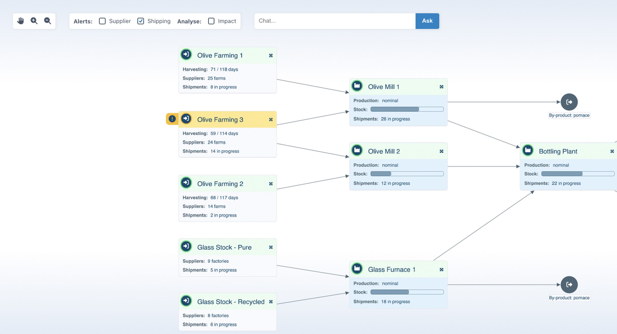
Toggling the shipping alerts shows an issue with one of the olive farms
This interactive application draws on detailed data sources from every stakeholder, and groups relevant information from each one inside separate ‘combos’.
When we spot an alert or identify an area of interest, we can zoom in from an overview of the entire supply chain to the finer detail, without losing context at any stage. With smooth, responsive and intuitive visualization we get a fast update on progress at a high level, and monitor for issues at granular stages from sorting to outbound shipments.
Clever styling makes it easy to get a quick understanding of a lot of information at a glance. Customized icons show the types of transport that are moving olives from farm to mill, as well as the number of vehicles in each fleet; and a dynamic progress bar shows the current stock levels at each location.
Expanding multiple combos to examine each stage of the milling process
Decision-making
Real-time data gathered with AI tools can come at an overwhelming rate and volume. To analyze and modify strategies, plans and resource allocations, and then summarize and extract key insights and trends, supply chain managers need data visualization.
AI tools drive decision-making processes by automatically generating data in different formats, from detailed reports to real-time alerts. And graph and timeline visualization brings that data to life.
For example, a logistics network design or route optimization plan is far easier to understand as a geospatial visualization:
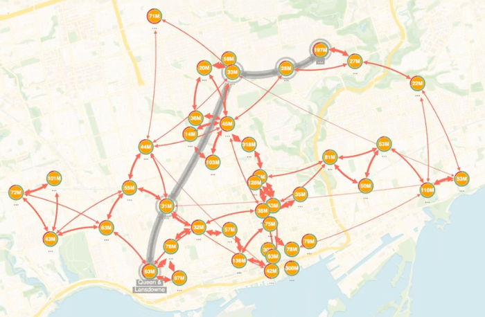
Our geospatial graph visualizations display data seamlessly on any mapping platform of your choice. And they use advanced graph algorithms to identify the most efficient routes.
Visualizing “what-if” scenarios designed by a human supply chain expert is an effective way to test risk assessments or mitigation strategies. If you know that a supplier is at risk of ceasing operations, for example, you can use AI-driven tools to recommend an alternative supplier to secure as a back-up. You can then use data visualization to map out the resulting changes to the supply chain, and help understand the potential knock-on effects to overall network productivity.
To demonstrate this, let’s investigate an alert at Regional Warehouse 2 by zooming in to the visualization:
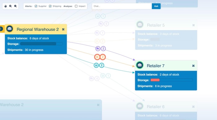
We instantly see that the alert was triggered by a problem with the cargo planes. The storage bar at Retailer 7 is highlighted in red, showing unexpectedly low stock levels. On closer inspection we see that only two days of stock are available. Based on this information, the user can explore opportunities for rerouting stock from a different warehouse. They can visualize those scenarios to make a well-informed decision on the best next steps.
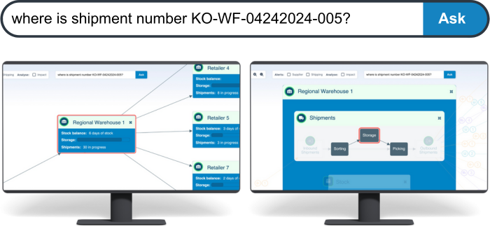
Supply chain managers can query their data using AI chatbots to get fast, actionable insights from a data visualization component. Using a natural language prompt to query the location of a shipment, they can explore the answer visually. Notice how the combo nodes containing the shipment are highlighted in red at each level, from warehouse to storage container:
A smart and responsive interface is essential when the supply chain is at risk. In this example, the user knows that delays are likely at the central airport, so they need to quickly establish how that will compromise their supply chain. They can use the AI chatbot to help with that, too:
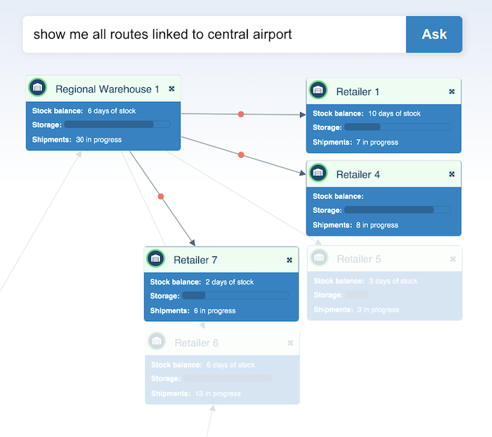
They can use this information to interrogate the data further, visualize alternative scenarios and build a contingency plan.
Power your supply chain with data visualization and AI
A supply chain powered by AI and data visualization can make complex networks more flexible and efficient, helping to cut costs and speed up processes. If you’re looking to build or optimize an AI-driven supply chain that innovates and differentiates, get in touch or request a free trial.
Share:
