
There’s a lot more to credit card fraud visualization than just spotting disputed transactions. To be effective, those visualizations must form part of a wider anti-fraud management cycle of detection, investigation and prevention. Analysts and investigators can optimize their approach to credit card fraud detection by using machine learning and AI technology alongside data visualization.
Network visualization plays an important part in the anti-fraud management cycle
In this blog post, we’ll look at ways to enhance credit card fraud detection with AI and data visualization techniques, uncovering the story behind the data. We’ll also explore the complementary technologies that help companies lower fraud rates and improve customer experience.
The impacts of credit card fraud
In 2023, the total value of global losses due to credit card fraud was 33.45 billion USD. According to Clearly Payments, almost a third of those losses occur in the US, partly due to a rise in the popularity of online payments. These ‘card-not-present’ transactions make up 65% of total credit card fraud losses.
So what are credit card companies doing to protect their customers from fraudsters?
From the customer’s perspective, methods like two-factor authentication (2FA) or biometric verification of purchases are now pretty standard. So are zero liability protection schemes, so customers who report suspected fraud right away aren’t held responsible for unauthorized transactions. Support and advice from GenAI chatbots means instant help is available 24/7. Together with best practice advice on staying cautious and keeping details confidential, awareness of credit card fraud risks has never been higher.
What most customers don’t realize is that these security measures are just a small snapshot of the credit card company’s enterprise fraud management processes. They don’t see the investment in the advanced technologies needed to tackle fraud.
The role of new & existing technology
For many years, credit card companies have relied on analytics, algorithms and decision trees to power their fraud strategy. They focus on segmenting customer behaviors to identify everything from unfamiliar geolocations and atypical spending patterns, to the frequency of credit card use and unusual transaction amounts. They used rule scoring to predict credit limits and risks, and alerting tools to raise red flags on suspicious activities. These drive decisions on whether or not to allow a transaction to go through. Customer confidence is at stake, so you need to be sure you’re doing the right thing.
Companies still focus on behavioral analysis, pattern matching and anomaly detection today. But to improve the speed, accuracy and effectiveness of decision making, there’s been a rise in the usage of AI technologies and machine learning.
An app for credit card fraud detection using machine learning along with graph and timeline analysis
On the Financial Crime Matters podcast, Dr Dmitry Efimov, VP of Machine Learning Research at American Express (AMEX), describes how they’ve embraced AI to keep their customers safe.
Previously, AMEX relied on subject matter experts (SMEs) to segment customers and train many separate individual fraud models to help spot outliers. Thanks to advancements in machine learning, they now use a single fraud model to segment their global customer base automatically, and make predictions based only on the features that apply to that segment. There’s scope to use natural language processing (NLP) to analyze a customer’s social media accounts for evidence of trustworthiness to help with credit scoring.
So where do humans fit into this? What are those credit card fraud SMEs doing now?
The answer is that they’re still an essential part of the fraud intelligence cycle.
Essential human intervention
AMEX’s model is extremely accurate and can make fast decisions automatically, but it doesn’t decide everything. There’s a team of SMEs who analyze and track the fraud model and compare results against case studies, so they can improve the model’s accuracy in real time. They check risk scores, use their knowledge and experience to confirm or deny borderline cases, and are responsible for the final decision. Then they track these decisions and work with customers to understand whether they were right or wrong. These results feed back into the machine learning model, and so the fraud cycle evolves.
We believe that investment in AI technology accelerates and reinforces the automated fraud model processes. Visual data analysis tools are at the core of those processes too, as is human cognition.
When you present AI results in a chart using real-world representations, teams can spot patterns and connections right away, and quickly understand why the AI technology recommended a certain outcome.
Data visualization is also essential for those borderline cases which need investigating further before a human decides what action to take. Let’s explore that scenario in detail.
Our credit card fraud visualization data
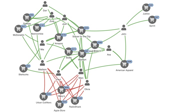
We’ve adapted fake data from this Neo4j graph gist to show a set of credit card transactions, some of which have been flagged, potentially by the AI model, as suspicious. We need to understand what happened, and make decisions about the next steps fast.
In our visual data model, nodes represent people and merchants, linked by transactions. We’ve highlighted suspicious transactions in red.
Here’s the full dataset:
A link analysis chart showing disputed and undisputed credit card transactions
Filter noise and focus on what’s important
The visualization is fully interactive, so we can dig deeper into those transactions with red flags attached to understand what happened. An experienced analyst would suspect an employee at one of these merchants of skimming credit cards. But which merchant?
Skimming, sometimes called cloning, is when a fraudster copies credit card information at the point of sale or ATM, usually with a specialized device.
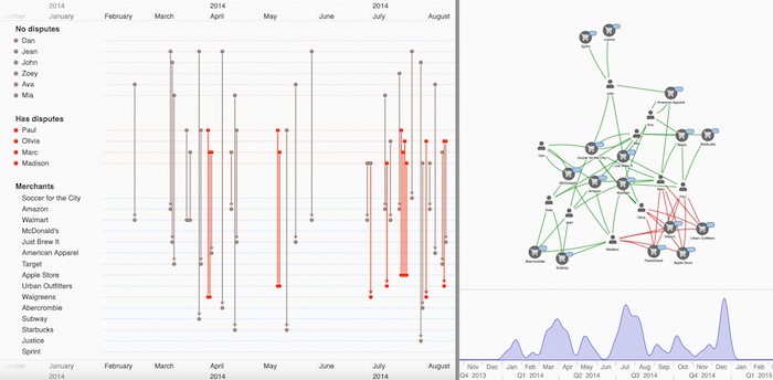
The first step is to filter out the noise. Fraud data is usually big, noisy and complex, so our toolkits support flexible filtering. You can filter the data based on any logic you choose.
Here, we’ll use filters to highlight people connected to disputed transactions.
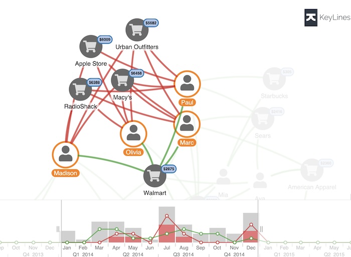
Send undisputed transactions to the background to focus on what’s important
The Walmart node is interesting. We can see all 4 cardholders spent money at Walmart, but none of those transactions were disputed. Could that be where the cards were cloned?
Time-based analysis for better insights
We need to see when these suspicious transactions happened. Our toolkits come with a time bar component to help users see network activity over time you can also check our timeline visualization SDK if you need advanced time-based data visualization solution.
The histogram shows the total dollar value of transactions over time, with red blocks to represent the relative amounts from suspicious transactions. Green and red lines show trends for undisputed and disputed transactions respectively. We can filter transactions by time, using the sliders or the controls at the bottom of the time bar.
Let’s filter to focus on the first disputed transaction in early April.
That narrows it down further. We can see both Marc and Paul’s first suspicious transactions were at Walgreens that month.
Next we need to find out where they used their card before Walgreens. To do that, we’ll switch to our timeline view.
Reveal event sequences with timeline visualization
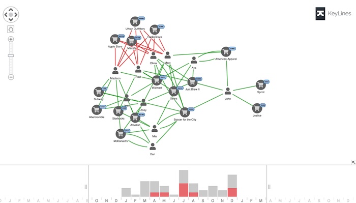
Timeline visualization gives a unique, interactive view of events over time, and the connections between them. We’ll use our KronoGraph timeline visualization toolkit to visualize the same credit card dataset.
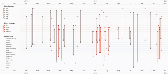
KronoGraph’s scalable timeline visualizations reveal patterns and anomalies in time data
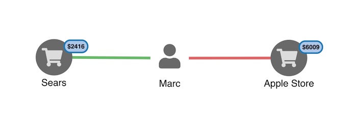
Remember, the network view revealed that the first suspicious transactions occurred in April, so let’s zoom in for a clearer idea of what happened just before that time. We’ll ‘pin’ Mark and Paul’s event timelines, so we see their credit card activity in the timeline visualization and filter out the rest.
We immediately spot something interesting. Just before the red-flagged transactions at Walgreens, both credit cards were used at Walmart.
To an analyst, this is a pretty clear indication: someone is skimming cards at Walmart.
As a result of this human intervention stage, there’s now enough evidence to alert customers and stop the skimmed cards.
Tactical credit card fraud visualization using machine learning
We’ve explored how data visualization technology fits into the wider fraud intelligence cycle, for credit card fraud detection using machine learning. Once a human specialist identifies a new fraud pattern, they can act on it tactically – in this case, by notifying customers immediately – and strategically. They can train the AI mode to detect it, and make the overall process faster and more reliable. Customers become better protected, and fraud levels stay low.
If your fraud process is missing a vital data visualization component, request a free trial today.
Share:
