Cybersecurity teams face hundreds of thousands of alerts on their cybersecurity dashboard every day – and a third of those alerts are never investigated. As the number of remote devices accessing business data grows, criminals find new ways to explore and exploit the wealth of endpoints available to them. “Alert fatigue” risks desensitizing IT departments to red flags as they struggle to keep their systems safe.
How do you protect a complicated cloud infrastructure when you don’t know what assets you have, or how they’re connected? Many businesses use extended detection and response (XDR) to aggregate the threat data behind the constant breach warnings. But without interactive data visualization, it doesn’t give them true insight – it just contributes to their information overload.
For the fast situational awareness needed to triage complex alert data, KronoGraph’s unique timeline visualization is a must-have feature on any serious cybersecurity dashboard.
Cyber alerts made simple with timelines
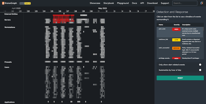
Imagine you’re a cyber analyst working through your ever-growing alerts list. But instead of seeing the standard pie chart, a table of log files and some flashing IP addresses, you see this:
The KronoGraph timeline view displays millions of events in a single interactive visualization. It shows important alerts in context and helps the analyst understand the impact on their wider IT infrastructure. In the example above, brightly-colored events pop out from the timeline, contrasting against the background of gray ‘normal events’. The alerts list on the right of the heatmap gives a handy summary of events the user needs to be aware of – ranked by level of urgency.
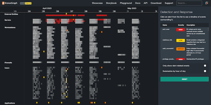
We hover over these alerts to see the events which triggered them. Clicking an alert focuses it in the timeline. Let’s start by checking out the individual events involved in an amber authentication alert. An external IP address has repeatedly attempted to log into a file server, and the final attempt succeeded:
Contextual cyber alert analysis
Showing the timeline of events is a powerful way to explain the nature of an alert. But better still, the analyst can use the timeline to understand the events around it. What other activity on this file server happened immediately before or after the policy violation?
Let’s jump ahead to a few days later, when a red alert shows our database server exchanging a huge number of packets with an external entity. This tells us that data has been exfiltrated from the organization we’re monitoring:
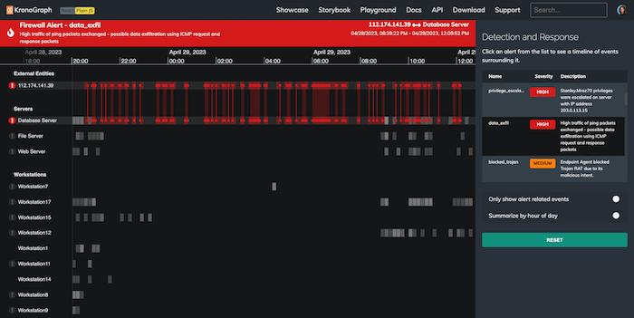
We can see what the criminals were doing, but can we find out how they accessed our server, and stop it happening again? If we know when the enemy was ‘rattling our doors and windows’, we can stop the next attack before it begins.
Let’s travel back in time to look for evidence of that happening.
Cyber alert pattern of life analysis
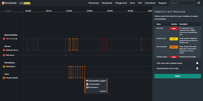
When we use KronoGraph’s pattern of life functionality to display data summarized in hours, we uncover interesting trends. The isolated orange and yellow alerts on the left of the chart stand out. These events happened in the middle of the night, which is suspicious – the heatmap shows that it’s way outside the normal pattern of activity for these users and workstations:
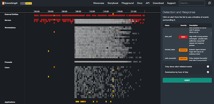
Zooming in to one of the amber alerts reveals a cluster of failed login attempts connected to Priscilla Heller’s email account, in the early hours of the morning, followed by a successful logon. That’s unusual behavior for this staff member… has their account been hacked by a cybercriminal?
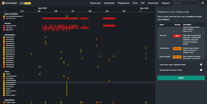
Let’s explore the time period around the data exploit. We filter our view to cut through the noise and show only alert-related events. A pattern leaps out immediately. At the bottom of the heatmap, a spike in activity is represented by a string of yellow phishing alerts:
Connecting alerts for better situational awareness
Here’s what we see when we zoom into one of those phishing events:
On the afternoon of April 26th, a user named Stanley Mraz opened an email from a hotmail account, which contained a disguised hyperlink. It’s a “low priority” alert, but seeing it in context, there are signs that it could be the direct cause of a red alert.
We quickly see that several of Stanley’s colleagues were opening emails from the same address, around the same time. It’s worth investigating these emails, to find out whether they were used as an exploit to access our IT network.
More importantly, we can see Stanley’s name elsewhere on the dashboard. His name appears on a red alert, and the notes show that his privileges were escalated on the evening of April 27th. Stanley fell for the phishing alert, and the attacker used his login to access our file server and carry out the data exfiltration.
As we zoom back to our overview and hover over the alerts we’ve looked at in sequence, we see the whole story unfold across the heatmap:
Add timeline analysis to your cybersecurity dashboard
KronoGraph gives analysts the contextual awareness they need for more effective root cause analysis, so they can fix vulnerabilities and prevent similar attacks.
We’ve seen how timeline visualization brings individual alerts to life, so that analysts can quickly understand what caused them. A cybersecurity dashboard with a visualization component minimizes alert fatigue, and makes it easy to document and share insights in an intuitive and accessible way.
But there’s so much more KronoGraph can do. Request a free trial today, and explore how KronoGraph could transform your project.
Share: