
Organizations worldwide use our advanced data visualization technology to power their root cause analysis timeline and graph visualization tools.
In this blog post, I’ll show you the results of an integration I built between KronoGraph, our timeline visualization toolkit, with ReGraph, our React graph visualization toolkit. We’ll also see how root cause analysis timeline and graph visualization – including time series charts – helps cyber analysts to understand incidents and identify threat sources swiftly and effectively.
Why rely on root cause analysis timelines and graphs?
Root cause analysis is an essential investigation technique for cyber security incidents. When an incident response team detects an attempted breach, they must act fast to isolate it and carry out incident forensics to understand how, where and when the attack originated.
It’s a challenging scenario: threats come from unpredictable sources, evolve quickly and spread rapidly. Cloud-based data suffers from a new set of vulnerabilities as the scope and complexity of the cloud environment makes the security task even harder.
To determine the root cause of an attack, the team may need to trace activity hidden in billions of data points. Until cyber analysts can make sense of their threat intelligence and forensics data, systems remain vulnerable to further attacks.
KronoGraph provides root cause analysis timelines that uncover the exact sequence of events leading up to an incident. ReGraph presents a network view to help spot unusual connections, patterns and anomalies. Together, timeline and graph visualization rapidly reveal the root cause and resulting impact of a cyber security threat.
Adding ReGraph and KronoGraph to your app
KronoGraph comes with a React component that you can quickly and easily drop into your React applications. It also makes integrating with ReGraph, our React toolkit, very simple.
(KronoGraph also has a plain JavaScript API which you can adapt to any framework. It works just as easily with our other graph visualization toolkit: see Integrating a KronoGraph event timeline visualization with KeyLines).
We’ll start off with a simple app, which we can make using create-react-app:
npx create-react-app regraph-kronograph-app
Installing ReGraph and KronoGraph is exactly the same process. We download a package from the SDK and then install it as a local package:
yarn add ./kronograph-X.X.X.tgz
yarn add ./regraph-X.X.X.tgz
Now that we’ve installed them both, we can just import them and use the Chart and Timeline components in our application:
import { Chart } from 'regraph';
import { Timeline } from 'kronograph';

const jsx = <div>
      <Timeline />
      <Chart />
</div>;

ReactDOM.render(jsx, document.getElementById('root'));
We now have two (empty) visualization components in our app, ready to load some data.
Learn more about getting started with our timeline visualization React component.
Root cause analysis data modeling
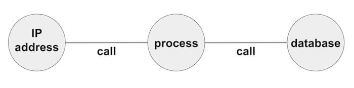
Our fictitious example features an attack on an organization’s IT system. The incident response team has received an alert about an attempt to compromise dataStore 2. We’ll use KronoGraph and ReGraph to build an application that can visualize the entire call stack – each function called by every program in sequence – to find the root cause.
It’s important to think carefully about the data you want to visualize. Depending on your source data, it might make sense to use slightly different models for each component. For example, when analyzing telecommunications, your users might expect to see calls between phone nodes represented as events in the timeline, but as links on the chart.
In our example, we’ll keep things simple by using the same data model for both ReGraph and KronoGraph, but it’s not necessary to do this. You might, for example, want to load individual calls into the timeline view, but just summarize all the calls between a particular pair of nodes with a single link in the graph view.
It’s important to consider usability. Would users prefer to see both their root cause analysis timeline and chart in the same web page or on different pages? We’ll go for a side-by-side comparison so we can interact fully with both components simultaneously.
Filtering & styling
First we’ll do some back end data management to filter out the data we don’t need. If we load everything in our call stack, we’d end up with an unhelpful hairball of densely-connected nodes. Instead, we’ll focus on the events that occurred immediately before and after the incident.
Next we’ll convert our data to the JSON format ReGraph and KronoGraph understands.
At this point we can also add some styling to our nodes, along with adding in any additional data we’ll need later. Almost every aspect of our toolkits is fully customizable, but we’ll keep it simple here with an attractive color scheme.
Loading data into ReGraph & KronoGraph
Both of our React components are state-driven. We’ll store nodes and links separately in our application’s state so they’re easier to update later. The data looks like this:
nodes: {
	'102.498.567.100': { color: 'yellow', data: { callStack: 1, type: 'Alerted IPs' } },
	…
},
links: {
	link1: { id1: '102.498.567.100', id2: 'auth02', color: 'cyan', data: { callStack: '1' } },
	…
},
events: {
	link1: { entityIds: ['102.498.567.100', 'auth02'], color: 'cyan' , time: new Date(1613557030311)},
…
}
As you can see, in our example there’s a 1:1 correlation between links in the chart and events in the timeline, but this may not always be the case. The KronoGraph events model is much more flexible than a graph data model, in that you can have events which connect more than two entities together, or events which only apply to a single entity.
Now all we need to do is pass the state into ReGraph to create the graph view:
<Chart
     items={{ ...state.nodes, ...state.links }}
     options={chartOptions}
/>
And similarly into KronoGraph to create the timeline:
<Timeline
        entities={state.nodes}
        events={state.events}
        options={timelineOptions}
/>
Now we have a ReGraph chart and KronoGraph timeline driven from the same state.
To make the timeline easier to understand, let’s make use of KronoGraph’s smart aggregation capability. You can see we’ve assigned a ‘type’ to our nodes on the data property – in the example, above, the type was ‘Alerted IPs’.
Now all I have to do is pass…
{
	default: { groupBy: 'type'}
}
…to the entityTypes prop, and KronoGraph will group similar entities so they still fit comfortably on the screen.
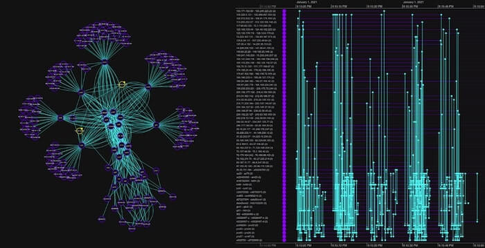
Finally, I added some overall application styling, and here’s the result:
Connecting our root cause analysis timeline and chart
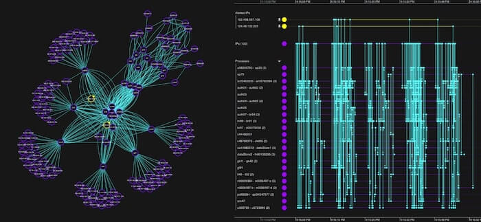
In the ReGraph visualization, I selected the two highlighted IP addresses that triggered the alert, bringing them into focus.
The first suspicious IP address is making multiple repeat calls to various processes. Let’s select the node in the chart.
We’d like this action to cause the timeline to focus solely on the IP addresses connections, so we’re not distracted by other traffic. This is essential when you’re working with huge datasets. To do this is easy – I just pass an event handler function to the onChartChange prop in ReGraph, which tells me when selected items in the chart have changed. My handler can then take this information and in turn update my ‘focus’ state, which I can pass to the focus prop in KronoGraph.
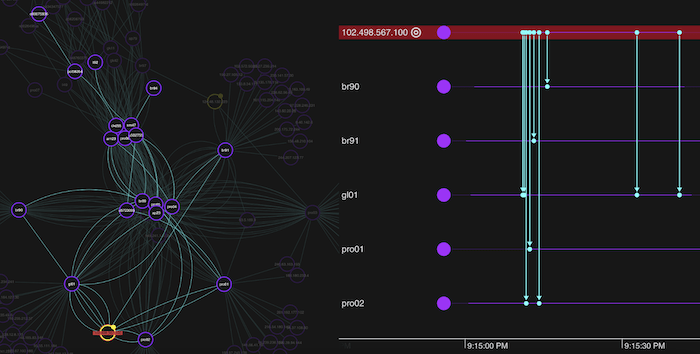
Despite this unusual behavior, it seems the calls were harmless as none of the processes accessed our datastores. Repeat calls can be a sign of a brute-force attack, but these typically involve thousands or millions of attempts, so the small number we have here are more likely reestablishing a dropped connection.
Likewise, it turns out that the other address is a systems administrator accessing restricted functions, so we can also rule that out.
We need to do some deeper root cause timeline and network analysis to find out what’s happening. We’ll start with graph visualization to get the network view.
Sequential layouts
So far we’ve used the organic layout for our network view. While it’s great for detangling complex networks and revealing underlying structures, for root cause analysis we need a different approach to show which events happened in the run-up to the attempted attack.
ReGraph’s sequential layout is perfect for data containing clear sequences or distinct levels of nodes. It displays activities in separate tiers, showing the flow from one node to another and making it easy to track back through our data to spot anomalies. Remember that callStack property in my node data? We’ll pass that to the sequential layout so it knows how to arrange nodes in the correct tiers.
When we click on our dataStore2 node, I modified my app so that ReGraph focuses on just the calls to our affected database, and transitions to a sequential layout with a smooth animation, so we can ignore the rest of the data for now.
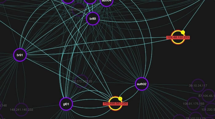
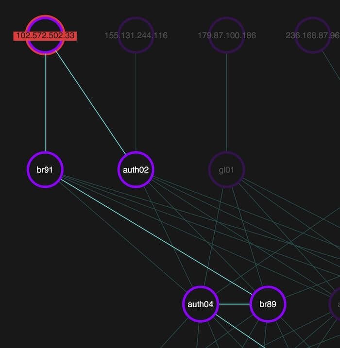
When we examine nodes in the third level down, there’s a slightly different pattern involving one authentication process. It was called by a function on the same level, represented by the horizontal link. A closer look reveals that one IP address is calling multiple authentication processes at the same time:
Now that we know some functions are calling processes they shouldn’t, let’s get a new perspective on what’s happening with our timeline visualization.
Root cause analysis timelines reveal hidden activity
Both the network chart and the timeline are fully interactive, and by updating the state of one when events are triggered by the other, it’s easy to build an app where the two components work together seamlessly.
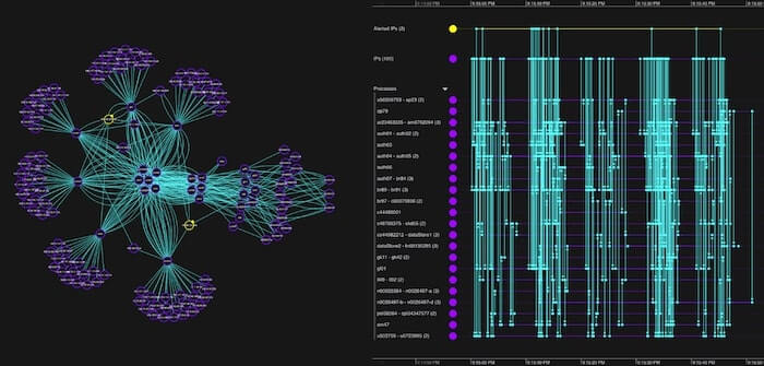
KronoGraph timelines are fully scalable. Users can transition smoothly from an aggregated high-level summary right down to individual events separated by milliseconds. Whatever the scale, you’ll see beautiful, rich interactive timelines.
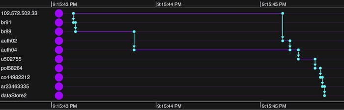
Our root cause analysis timeline reveals the precise order of events. The IP address first sent a call to one authentication process (auth04), then two seconds later sent another (to auth02). We also get a clear picture of the subsequent calls these events triggered and the precise pattern they took before attempting to breach our database.
Correlating events with time series charts
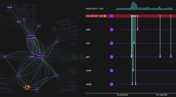
KronoGraph can also display one or more time series charts, used to visualize continuous time series data over a recorded period.
Time series charts share the timeline’s scale, aligning the data points with the events displayed in the timeline. They help analysts to understand interesting patterns and investigate the particular events that may identify root causes.
In the example below, we’ve imported a time series chart that shows application load. Viewing the time series independently would suggest something unusual may have occurred just after 9:15:00pm. When we see the chart in context above the timeline events, we immediately spot a correlation between the application load’s peak and the surge in calls from the 102.498.567.100 IP address that started our investigation.
To add time series charts to your timeline, pass them in the timeSeriesCharts data object:
<Timeline
events={events}
entities={entities}
timeSeriesCharts={
   chart: {
      label: 'Network Performance',
      data: [
        { time: 1629372675131, value: 28 },
        { time: 1629372701960, value: 27 },
      ],
   },
}}
/>;
Set the size and position of the timeline in the timeSeriesCharts options:
timeline.options({
  timeSeriesCharts: {
    sizePercent: 30,
    position: ‘top’,
  },
});
Build a root cause analysis timeline & graph visualization app
Thanks to ReGraph and KronoGraph’s powerful visualization capabilities, we found the root cause and located the attack vector. This level of forensic insight is vital to cyber analysts. They need to understand the nature of threats so the organization can fix vulnerabilities and avoid future incidents.
Cybersecurity is just one example where timeline visualization can reveal valuable insight into how events unfold. For more scenarios, see 5 popular use cases for KronoGraph timeline analysis.
Want to get to the root cause of a difficult problem? Sign up for a free trial to see what our toolkits can do.
This post was originally published some time ago. It’s still popular, so we’ve updated it with details of KronoGraph’s time series charts to keep it useful and relevant.
Share:
