
We’re very excited to add KronoGraph, our timeline analysis and visualization toolkit, to our line-up of data visualization SDKs. It fills a huge hole in the market for people who want to build rich, interactive timelines into investigative applications. It also complements our market-leading graph visualization toolkits perfectly, giving you a brand new way to look at your connected data.
In this blog we’ll take a look at five of the most common applications and use cases for timeline analysis. The timeline images you see were built using KronoGraph, in some cases combined with KeyLines or ReGraph.
1: Communications timeline analysis
Perhaps the most clear-cut use case of all is communications analysis. Whether this is lawful intercept data collected by intelligence or law enforcement agencies, or open-source information such as a corpus of email data released to the public after a major corporate scandal, this kind of data is perfectly suited to viewing as a timeline.
This timeline shows the communications of one individual over five months. There are busy and quiet periods, friendships beginning, ending and re-forming, and some one-way traffic to occasional contacts.
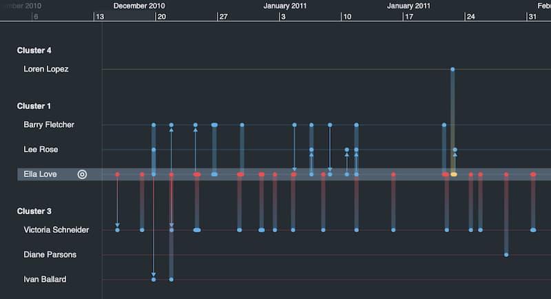
Timelines are essential for answering questions like: Who called whom? Who called first? Did one call trigger a burst of activity amongst others? Can we establish a ‘pattern of life’ that helps us recognize individual or group behavior?
The insight gets even richer when timeline analysis is paired with traditional link analysis or graph visualization, which shows individuals in the context of their network.
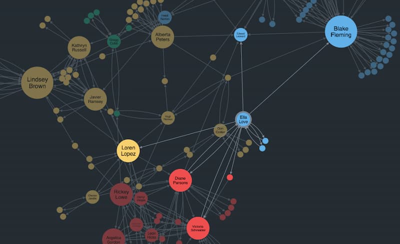
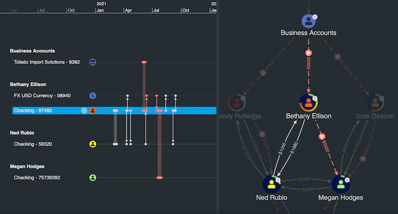
KronoGraph works seamlessly with our KeyLines, our graph visualization SDK for JavaScript developers and ReGraph, our graph visualization toolkit for React developers. That means you can explore the data from both a network and a timeline perspective simultaneously. For example, the chart below shows the same dataset as our communications timeline. It tells us how Ella is connected to the wider network, and whom she talks to the most, but it doesn’t tell you that she calls Barry in December after a three-month hiatus with only her close friend Diane to confide in.
2: Fraud and financial crime
There are many fraud use cases for timeline analysis in the financial sector, but we’ll focus on two: insider trading investigations, and “follow the money” scenarios.
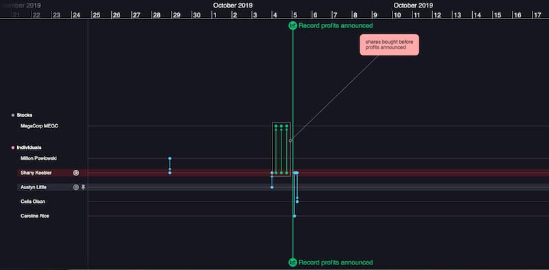
Even the simplest descriptions of insider trading can’t help but invoke a timeline. “Buying stock based on knowledge that is not yet available to the public” – that yet is the crucial word. Understanding the sequence of events in context is crucial to determining the legality of a trade.
Here we’ve used KronoGraph to create an aggregated heatmap timeline. It shows the pattern of stock trading around the time key news events took place. It’s normal that in the run-up to good or bad news, there might be a general market sentiment that causes buying or selling, so it’s not enough to say that buying stock the day before good news is illegal.
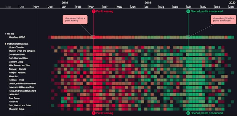
But overlaying court-requisitioned communications data and focusing on individual trades in the run-up to news brings fresh perspective. An analyst can drill down into this timeline to find or illustrate suspicious trading activity. It reveals a pattern of behavior: a tip-off phone call followed by a sequence of trades, followed by breaking news.
Another common timeline analysis scenario is a “follow the money” investigation, perhaps looking at money laundering or tracking the proceeds of crime.
With the wealth of publicly available cryptocurrency ledger data, transactions are visible, if obfuscated. Understanding sequences of transactions is hard to do without a timeline view.
3: Major incident investigation
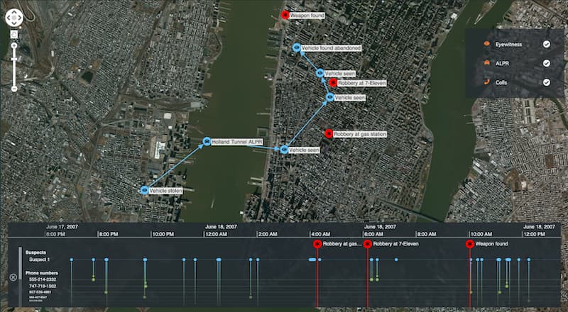
When security and intelligence agencies dissect a major incident such as a crime or terrorist attack, it involves the careful collection and interpretation of multiple data sources. In the example below, time-stamped geospatial observations from witness reports and automated license plate recognition cameras are combined with cell phone records – all of which helps to build up a detailed and defensible picture of how a crime unfolded.
Timelines are crucial at all stages of the investigation process, including:
- Real time information presentation during the incident, for operations center/incident room use, either as a live feed, or for “rolling back time” to take a closer look at something that just happened.
- Investigation and analysis of a past event, where overlaying multiple data sources onto the same timeline can reveal insights about who did what and when.
- Generation of a presentational timeline for use in criminal convictions, where a clear, factual representation of the key incidents in an event can be used to inform court proceedings.
4: Compliance, AML and KYC
The mirror image of criminal investigation is regulatory compliance, which essentially is the exercise of determining “how can I ensure I’m not breaking the law?”.
The use of timelines depends on the type or regulatory laws that must be complied with. Consider the due diligence associated with “Know Your Customer” (KYC) legislation. For example, before a bank does business with an individual, they need to understand who they are dealing with – are they a money laundering (AML) risk, or are they potentially using the bank to handle money used for funding terrorism?
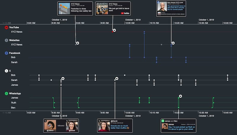
It’s becoming increasingly important to look at an individual’s social media activity as part of this due diligence, whether for ‘adverse media’ concerns or just to build up a picture of their associations and past activity. This open source intelligence (‘OSINT’ in intelligence community jargon) lends itself particularly well to timeline presentation.
5: Root cause analysis/cyber attack forensics
Understanding ‘what just happened?’ is not only the domain of law enforcement agencies. Cyber security visualization and IT/telecommunications infrastructure visualization use cases also have a large emphasis on forensic analysis.
Understanding a cyberattack, for example, might involve a detailed understanding of exactly what communications took place between devices on a network. This combined KeyLines – KronoGraph example takes a small network traffic capture from the Wireshark tool, and shows the activity that a user’s laptop triggers when it visits a particular website.
Understanding this sequence of events could be crucial to understanding the nature of a cyber attack and preventing it in the future.
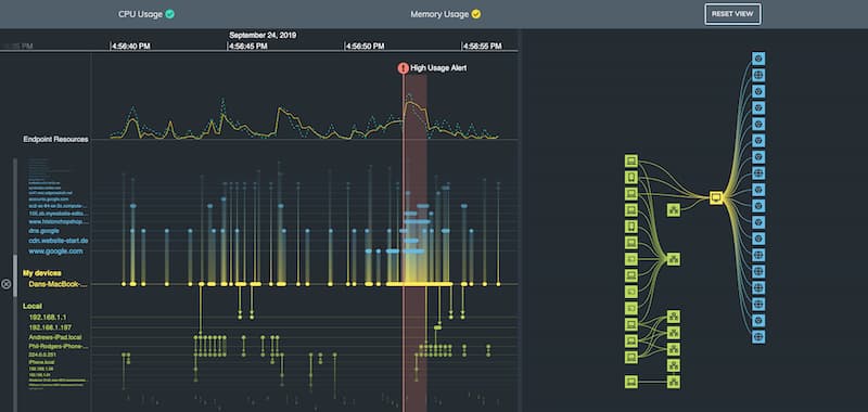
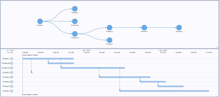
This root cause analysis involves not only device-to-device traffic but also the processes running on the device itself. Timelines need to show not just when connections occur, but also when processes begin and end, how long they last, and which other processes they spawn. The example below shows a ‘Gantt chart’-like timeline created from a machine log. It uses KronoGraph’s flexible event model, which can handle any combination of long-running processes, instantaneous events and dependencies between items.
How timeline analysis can help you
We think the five examples above are only the tip of the iceberg when it comes to applications for timeline analysis software in investigative scenarios. Can you think of others? If so, it’s probably time to try KronoGraph for yourself.
Share:
