Applications built with our powerful toolkits help users find the insights they need. The next important step is to share those insights in the right format with the right people – colleagues, key decision-makers, investigators, legal teams, senior management and more.
With the latest versions of our KeyLines toolkit and ReGraph toolkit, you can now export charts as high-resolution images in customized PDF reports.
There have also been impressive developments with KronoGraph, our timeline analysis toolkit. The latest version includes a new perspective on timelines with support for time series charts.
KeyLines 6.7 & ReGraph 3.4: visualizations as PDFs
Dissemination is a crucial stage of the intelligence cycle. Now users can export graph visualizations as PDFs to use in many important scenarios. They can bring a new level of information sharing to teams, generate case documents for use in a court of law, or provide content-rich reports on an investigation’s progress.
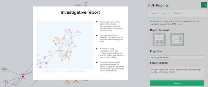
Users simply choose what they want to show in their PDF report – their largest, most complex charts or a zoomed-in area – and then export it as a vector-quality image. You can customize the report templates however you like, with options to set the layout style, text, embedded fonts and more.
To get up to speed, see the KeyLines PDF Reports and Export Chart demos and dedicated documentation, or the ReGraph stories on Export and PDF Reports.
Try exporting your graph visualizations as PDFs
Together with our existing support for exporting charts as ultra high resolution (16K) PNGs and JPEGs, as well as SVGs, the PDF export feature is currently in beta development. We really value your feedback, so please let us know what you think.
KronoGraph 1.8: time series charts
Many KronoGraph users work with a relentless stream of time-stamped data: think vast quantities of network performance monitoring metrics or telecoms records. They want to see an aggregated view of continuous data to give context to individual events and help uncover patterns.
With KronoGraph’s new time series charts, users can now visualize two simultaneous views in their timeline: continuous data alongside a sequence of individual events.
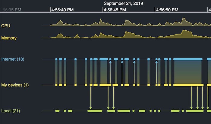
These charts are essential for anyone working with continuous data, especially users of time series databases (TSDBs), which are purpose-built to manage high volumes of time-stamped data points.
There’s full documentation on the KronoGraph SDK, including stories on Time Series Charts and adding tooltips.
Analyze your time-based data with KronoGraph
We’re excited about ways we can keep improving time series charts during its alpha development phase. Once you’ve tried it, please share your feedback.
Try our data visualization toolkits
We’re proud to keep delivering innovative, useful features to our graph and timeline visualization users.
If you want to see what else makes our SDKs so popular with JavaScript/React developers and product managers alike, request a free trial.


