
In the beginning, there were relational databases. Then came a wide variety of NoSQL databases. And most recently, time series databases (TSDBs) are making an impact.
TSDBs are purpose-built to manage high volumes of indexed, chronological data points. With the rise of IoT and the cloud, the quantity of real-time data that exists has dramatically increased. This includes anything from stock market prices to meteorological records, bank transfers to IT server memory usage, telephone calls to air quality levels.
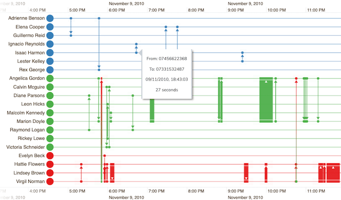
showing precise details of telephone calls between people
Organizations are recognizing the value in monitoring and analyzing their data points to help understand the present and predict the future. It’s not surprising that DB-Engines ranked TSDB as the fastest-growing database type for the last two years running.
Time-based data visualization is a great way to find deeper data insight. Our toolkits offer different visualization options:
- the time bar visualization component in our both of our graph visualization toolkits, KeyLines and ReGraph, offers a powerful way to filter and summarize time-based data
- KronoGraph, our timeline visualization toolkit, lets you build interactive timelines directly from your data to better understand how events unfold
In this blog post, we’ll use the time bar in KeyLines to show:
- how to visualize a telecoms network of SMS traffic to quickly identify issues that need attention. This is for anyone who wants to visualize time-based graph data, no matter what kind of database it’s stored in.
- how easy it is to integrate KeyLines with a TSDB, starting with a short explanation for those who are new to them.
Why use a TSDB?
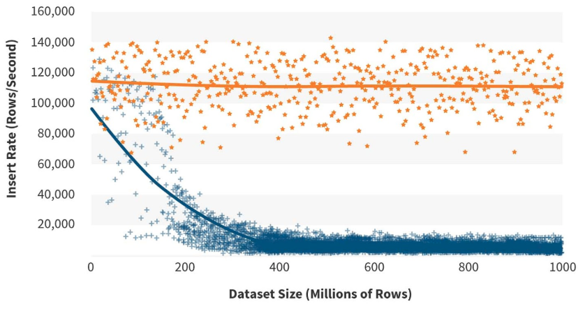
The main advantages of TSDBs is their ability to handle data that’s constantly scaling. In real-time monitoring, new data is continuously being added – sometimes at rates of millions of data points every second. Relational and NoSQL databases aren’t designed for that.
Some other key features of TSDBs:
- It’s easy to carry out data aggregation, so raw data can be routinely downsampled or summarized for analysis purposes.
- They support flexible data retention policies, so it’s easy to store valuable, downsampled data for long periods, and automatically delete details about every data point more frequently.
Working with InfluxDB
We’ve chosen to integrate KeyLines with InfluxDB, the open source time series database from InfluxData. This popular, open source TSDB has a built-in HTTP API, and uses SQL-like queries to interact with the data.
We’ll go through the integration details later, but first let’s understand our dataset.
Visualizing the Nodobo dataset
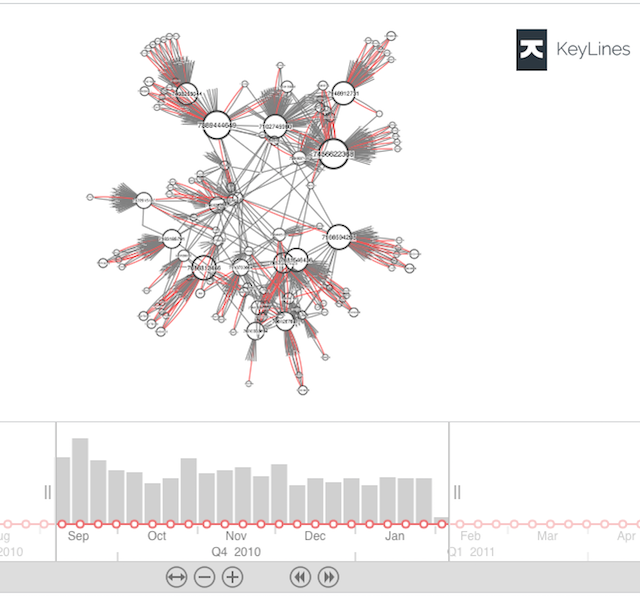
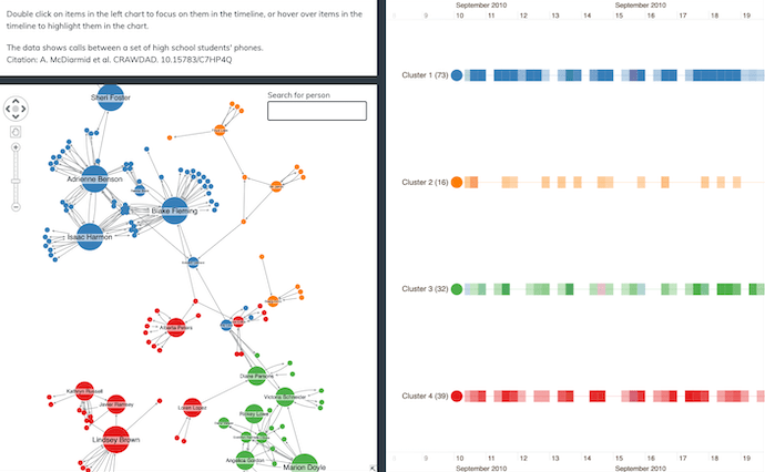
We’re analyzing Nodobo data, featuring the anonymized text message records of 27 high school students over a five month period.
The time series database contains over 11,000 SMS events, with a sender, receiver and timestamp for each data point. For the purpose of this example, we’ve added a ‘slow’ flag for messages that take over three seconds to arrive:
  text_msg from=07434677419,to=07610039694,slow=false 1284574664000000000
  text_msg from=07588304495,to=07641036117,slow=false 1284057337000000000
  text_msg from=07588304495,to=07641036117,slow=false 1284151414000000000
We’ve created nodes for each cellphone, and links for every SMS. Slow messages are shown in red. Here’s what five months of data looks like:
Let’s try focussing on activity during a smaller time range.
Time bar filtering
The ability to filter huge datasets is essential. There’s little insight to be gained from attempting to visualize masses of data points at once.
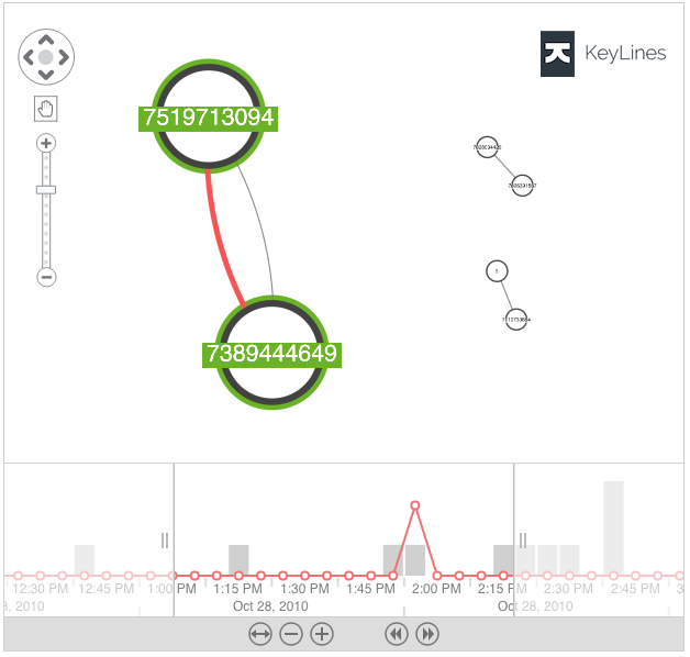
The time bar sliders make it easy to change the scale or time range shown on the chart. The control bar buttons also offer a quick and easy way to zoom in and out to change the granularity of focus.
The results on the chart let us drill into an exact subset of network activity.
Styling items in KeyLines
For anyone monitoring time-based data, identifying patterns of unusual activity is key. Here’s where KeyLines visualizations can help.
Cellphone nodes are sized according to the number of slow text messages they’re associated with. KeyLines achieves this by applying weightings by degree, a useful Social Network Analysis (SNA) centrality measure.

Let’s get back to the time elements of our visualization, and what it reveals about our data.
Identifying patterns with selection lines
The time bar histogram shows the total value of events that occurred at specific times. It’s an easy way to spot changes in the volume of activity, something that’s useful when you’re trying to understand the nature of your time-based data.
Overlay the histogram with selection lines and you can compare values for specific chart items against total values. They’re ideal for showing trends and identifying outliers or unusual patterns.
In our telecoms example, knowing the precise time an error occurred is key. Cross-referencing this data with details of network upgrades or known outages might be useful. It can also contribute useful insight to help with future network performance management.
If you’re keen to know what’s happening under the hood, we’ll walk you through the integration basics.
Integrating KeyLines with InfluxDB
First we need to send an AJAX request to InfluxDB’s /query HTTP endpoint for the time period we’re focussing on.
  // [time, from, slow, to]
  ["2010-09-10T06:26:23Z", 7806391587, false, 7028004429],
  ["2010-09-10T06:32:47Z", 7389444649, true, 7979462281],
  ["2010-09-10T06:37:50Z", 7408255044, false, 7564645771]
Next, the JSON response that’s returned from the endpoint must be parsed into the JSON format KeyLines understand.
The data becomes the node and link objects in our visualization. Creating nodes for each cellphone, and links for each data point, is straightforward:
  function makeKeylinesItems(seriesValues) {
   const nodes = [];
   const links = {};
   seriesValues.forEach( (point) => {
     const [date, from, slow, to] = point;
     nodes.push({ type: 'node', id: from, t: from, b: '#424242' });
     nodes.push({ type: 'node', id: to, t: to, b: '#424242' });
     const linkId = from + '-' + to + (slow ? '@slow' : 'normal');
     if (links[linkId]) {
       links[linkId].dt.push(new Date(date));
     } else {
       links[linkId] = {
         type: 'link',
         id: linkId,
         id1: from,
         id2: to,
         dt: [new Date(date)],
         c: slow ? '#EF5350' : 'grey',
         w: slow ? 5 : 1,
         d: { slow, degvalue: slow ? 20 : 1 }
       };
     }
   });
   return nodes.concat(Object.values(links));
  }
You’ll notice this code will add some nodes more than once, but that doesn’t mean our chart will show duplications. KeyLines is clever enough to discard duplicate nodes that have the same id.
That’s it. The array of nodes and links can now be loaded into the KeyLines chart, and the same data loaded into the time bar.
You can then bind any chart event to the time bar, allowing you to support the filtering and selection actions described in this example.
Every time we filter this way, KeyLines visualizes the data points between two specific timestamps. For example:
SELECT * FROM “text_msg” WHERE time >= ‘2010-09-19T21:07:08Z’ AND time <= ‘2010-11-15T01:00:14Z’
To optimize performance, queries will only bring in new data that doesn’t already exist in the chart – it isn’t loading the entire dataset every time. This is particularly important when you’re dealing with the potentially huge datasets typical of TSDBs.
A word about KronoGraph
If it’s dedicated timelines you need, our KronoGraph toolkit provides heatmap views and intelligent data aggregation, scaling beautifully to accommodate your largest TSDBs. It also integrates seamlessly with our graph visualization toolkits to give you the best of both worlds: a powerful network analysis tool and a dedicated technique for carrying out timeline investigations. Find out more about KronoGraph
Take time out to try our toolkits
Whether you’re an experienced TSDB user or someone who’s keen to interact with their time-based graph data, our graph visualization toolkits have the time bar features you need. We’ve covered some of them here, but there’s also the ability to integrate with advanced geospatial features, use multiple time bars at different levels of granularity, and use continuous animation to demonstrate how networks evolve.
If you want our toolkits to bring your time-based data to life, request a free trial to get started.
Share:
