
We took a radical approach when we built our React graph visualization toolkit, ReGraph. As a result, it’s one of the few state-driven solutions for building React network graphs on the market.
The lessons we learned along the way are useful to everyone building network graph visualization applications – React-based or not. In this blog we’ll share them, but first let’s take a closer look at the different application models and how they impact your visualizations.
Why choose a React network graph?
React is a popular front-end JavaScript framework. There’s lots to say about it (check out our popular blog post on harnessing React Hooks), but the key things you should know are that it is declarative and component-based.
All of the information in a declarative application is held in a central place called state. To update the application, we just need to update that state.
Each React component is a self-contained UI element that figures out how to update itself each time the state is changed. Clever, eh?
JavaScript models – imperative vs. declarative
In an imperative app, data is an input for the chart and changes to the data are driven by the chart. In a declarative app, the data is changed, and the chart is merely the thing showing us the data.
A typical JavaScript-based graph visualization is imperative. The developer takes direct control of the chart and tells it what to do, for example, ‘run a layout’, ‘add this data’, ‘make these nodes red’.
In a state-driven, or declarative, graph visualization the developer changes the data in their application and the chart component decides how to handle the changes. You tell it what you want, not how to do it. The component asks questions like ‘is a layout needed?’, ‘what items are new?’, or ‘have any nodes changed color?’. Each of these questions is answered and then the component animates beautifully from the current state to the new state.
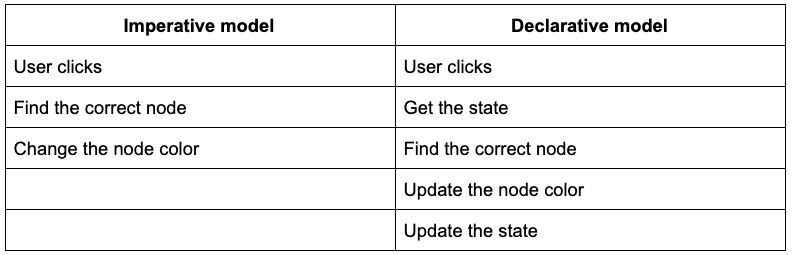
Let’s compare the two. In this demo, a user clicks the button to change the node color.
This is what’s happening in each model:
For such a simple scenario, the declarative model seems way more complicated. True, but let’s see what happens in a more complex scenario. Here we’re adding and removing data before running a layout.
This time, the declarative model is about the same as for the simple example, but the imperative model is far more complex:
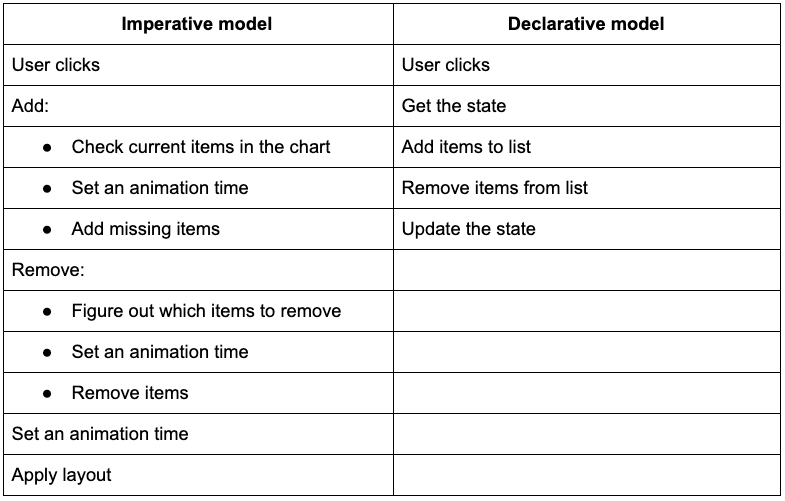
As you can see, the declarative model scales much better. And by letting us make multiple changes at once (adding, removing, and running the layout in a single state update), we don’t have to think too much about the order in which we do things. This takes a lot of complexity out of our application.
Filtering: Should I stay or should I go?
Node and link filtering is an important part of any graph visualization application. Defining your own property-based filter logic means you can focus on the most interesting connections in your React network graph.
Here we’re looking at web vulnerabilities and filtering out the Adobe Flash ones to see what a ‘Flash-free’ internet will look like.
Our two application models consider filtering in exactly opposite ways:
- In the imperative app, we create a list of all of the things we need to remove from the visualization and pass that list to the chart.
- In the declarative app, we build a list of the data we want to keep and we pass this updated list back to the chart to take care of.
Managing large back-end queries is also easier because your front-end code doesn’t have to figure out what’s changed in the data. Just pass the new data to the chart component and it takes care of the rest.
Layouts: an action or a way of being?
Automated graph layouts are essential for untangling and understanding a React network graph. The way we think about layouts is very different in a state-driven application.
In the imperative model, a layout is an action triggered either by the application or by the user telling it to ‘run a layout’.
In a state-driven application, a layout is instead a mode. As data is added or removed, the chart works to maintain the look of the layout, whether it’s a force-directed layout or hierarchy data displayed with the sequential layout.
Paradigms: all or nothing
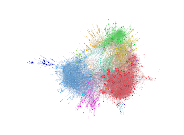
Whenever I talk to people about graph visualization, one question usually comes up: “Can I see all of my data on the screen at once?”.
Our toolkit technology is powerful enough to handle your biggest datasets, but your users will get limited insight from seeing hundreds of thousands of items. Also, getting them to do the necessary aggregating and filtering is not the best use of their professional analytical skills. You’ll find more about this on our blog, including five steps to tackle big data graph visualization and graph visualization at scale: strategies that work.
Maybe this approach is based on the idea that data is an input for the chart, and that all changes to the data should be driven by the chart.
Let’s turn this on it’s head. Think of the data as the thing which is being changed, and think of the chart as merely the thing showing us the data.
Now we can work to design more intuitive graph visualizations which start with a small amount of relevant data, such as an interesting cluster of nodes or a specific question that needs to be answered. This is a recognized analysis technique: focus on a small amount of data and explore outwards, adding chart items incrementally. In this way, we provide users with tools to interrogate their data, rather than tools to sort through it.
But how does this help me?
Even if you don’t use a React network graph, the state-driven approach teaches us important lessons to help with future graph visualization projects.
Firstly, focus on what your data contains and the questions you want it to answer. Graph UI and UX design is important, but don’t get distracted by the shape of the buttons your analysts are going to press. Let a graph visualization component take care of how to display things and handle new data, so you can pay attention to what insight you want your users to find and which threats they need to reveal.
And secondly, it is your data that makes your visualization unique. Lean into that and make sure that users can see the right amount of data at the right time.
Your choice: ReGraph or KeyLines?
Whether you choose an imperative model from KeyLines, our graph visualization SDK for JavaScript developers or a state-driven approach from ReGraph, for React developers, you’ll give analysts the tools they need to bring their connected data to life. Request a free trial to get started
Share:
