
Summary: This article explains how to make large, complex graph datasets usable by progressively reducing scale through a “data funnel”. It highlights five steps: filter early to remove noise, aggregate and remodel data to simplify structure, choose visual models that match user questions, declutter the chart with filters and grouping, and apply graph layouts to reveal patterns. The goal is to transform millions of nodes into a clear, interactive view that supports fast, confident insight.
Understanding big graph data requires two things: a robust database and a powerful graph visualization engine. That’s why hundreds of developers have combined a graph database with our graph visualization technology to create effective, interactive tools to make sense of their graph data.
But humans are not big data creatures. Most adults can store between 4 and 7 items in their short term memory. That presents a challenge when building graph visualization tools. How do you decide which subset of data to present to your users? How do they find the most important patterns and connections?
They’re the questions we’ll try to answer in this blog post. You’ll discover that, with some thoughtful planning, big data doesn’t have to be a big problem.
The challenge of big graph data visualization
For many organizations, ‘big data’ means collecting every bit of information available, then figuring out how to use it. That makes it incredibly challenging to go beyond aggregated analysis to understand individual elements.
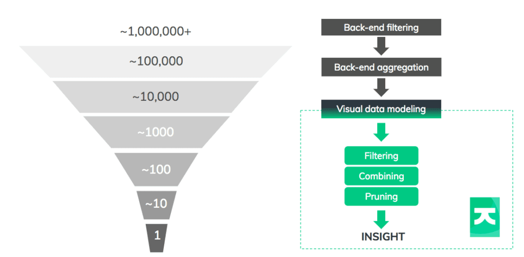
To provide your users with something more useful, think about the data funnel. Using back-end data management and front-end interactions, the funnel reduces billions of data points into something a user can comprehend.
Let’s focus on the key techniques you’ll apply at each stage.
1. Filtering on the back-end: ~1,000,000+ nodes
There’s no point visualizing your entire graph database instance. You want to remove as much noise as possible, as early as possible. Filtering with database queries is an incredibly effective way to do this.
Our toolkits’ flexibility means you can give users some nice visual ways to create custom filtering queries, like sliders, tick-boxes or selecting from a list of cases. In this example, we’re using queries to power a ‘search and expand’ interaction:
There’s no guarantee that filtering through search will be enough to keep data points at a manageable level. Multiple searches might return excessive amounts of information that’s hard to analyze. Filtering is effective, but it shouldn’t be the only technique you use.
2. Aggregating in the back-end: ~100,000 nodes
Once filtering techniques are in place, you should consider aggregation. There are two ways to approach this.
Firstly, there’s data cleansing to remove duplicates and errors. This can be time-consuming but, again, queries are your friend. Functions like Cypher’s ‘count’ make it really easy to aggregate nodes in the back end.
Secondly, there’s a data modeling step to remove unnecessary clutter from entering your chart in the first place. Can multiple nodes be merged? Can multiple links be collapsed into one?
It’s worth taking some time to get this right in your graph visualization. With a few simple aggregation decisions, it’s possible to reduce tens of thousands of nodes into a few thousand.
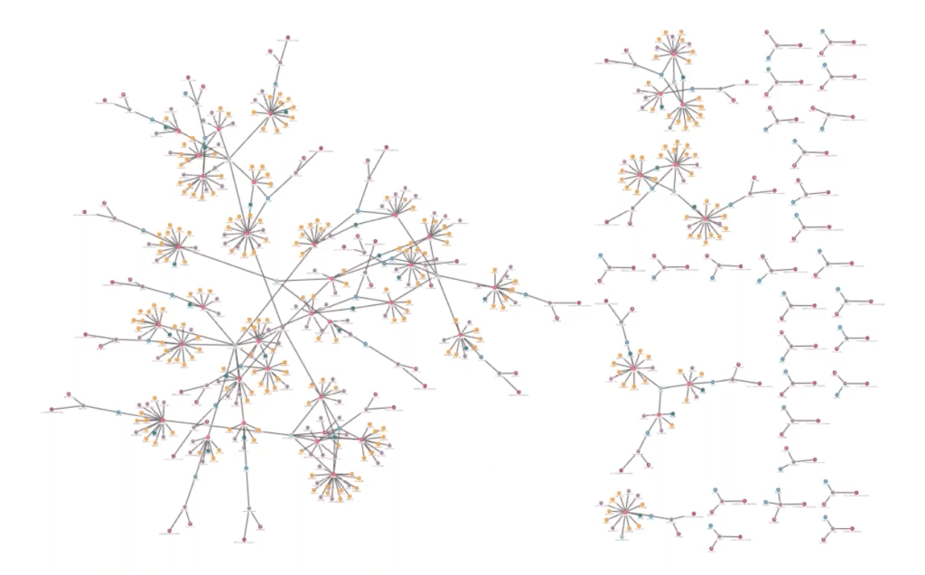
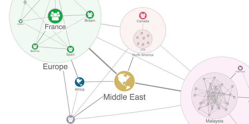
3. Create a clever visual model: ~10,000 – 1,000 nodes
Already by now, you should have reduced 1,000,000+ nodes to a few thousand. This is where the power of visualization really shines. Your user’s graph visualization relies on a small proportion of what’s in the database, but we can use visual modeling to simplify it further.
This visualization shows graph data relating to car insurance claims. Our schema includes car and policyholders, phone numbers, insurance claims, claimants, third parties, garages and accidents:
Loading the full data model can be useful, but with some carefully considered remodeling, the user can select an alternative approach suited to the insight they need. Perhaps they want to see direct connections between policyholders and garages:
Or a view removing unnecessary intermediate nodes and show connections between the people involved:
The ideal visual model will depend on the questions your users are trying to answer.
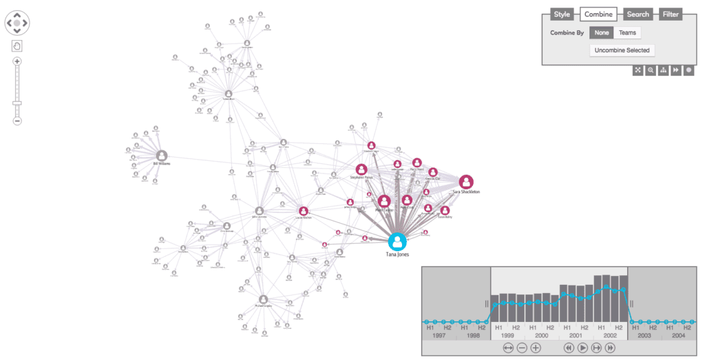
4. Filters, combining and pruning: ~1,000 nodes
Now your users have the relevant nodes and links in their graph visualization, you should give them the tools to declutter and focus on their insight.
Filters are great for this. For a great user experience (and better performance) consider presenting users with an already-filtered view, with the option to bring in more data.
Another option is to use our combos functionality to group nodes and links, giving a clearer view of a large dataset without actually removing anything from the chart. It’s an effective way to simplify complexity, but also to offer a ‘detail on-demand’ user experience that makes graph insight easier to find.
A third option is to remove unnecessary distractions from a graph visualization. This might mean giving users a way to ‘prune’ leaf nodes or making it easy to hide ‘supernodes’ that clutter the chart and obscure insight.
We have plenty of tools to help with this critical part of your graph data analysis. This video on managing chart clutter explains a few more.
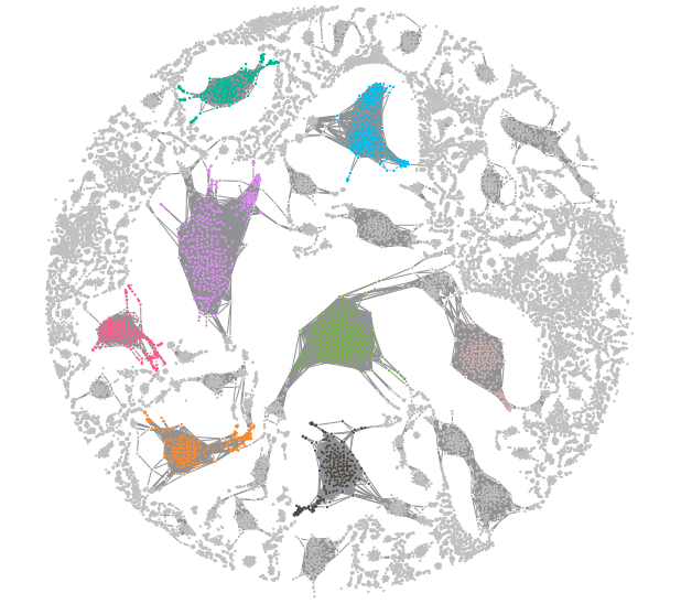
5. Run a layout: ~100 nodes
By this point, your users should have a tiny subset of your original graph data in their visualization. The final step is to help them uncover insight. Automated graph layouts are great for this.
A good force-directed layout goes beyond simply detangling links. It should also help you see the patterns, anomalies, and clusters that direct the user towards the answers they’re looking for.
With an effective, consistent and powerful graph layout, your users will find that answers start to jump out of the chart.
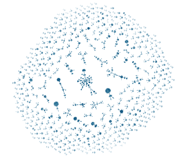
Bonus tip: What if you really need to visualize a massive graph?
Sometimes it’s useful to visualize a massive graph. In these cases, you can rely on our toolkits’ built-in adaptive styling. As graphs grow larger, links can clutter charts, making them harder to read. With adaptive styling, chart elements adapt as the user zooms, resulting in a clear visualization at every scale.
With time-based data visualization, consider using visual timeline analysis. KronoGraph, our timeline visualization toolkit, uses smart aggregation techniques to remove clutter, uncover patterns and reveal how events evolve. Here we use a heatmap view to summarize events over time.
Ready to visualize your own data?
This blog post is really just a starting point. There are plenty of other tips and techniques to help you solve the big graph data challenge (we’ve not even started on temporal analysis or geospatial visualization).
But probably the most important tip of all is this: take time to talk to your users.
Find out what they need to see and the questions they’re trying to answer. Use the data funnel to make their processes as simple and fast as possible, and use the power of graph visualization to turn their biggest datasets into something genuinely insightful.
Are you looking to build your own visualization application to make sense of big data? Request a free trial of our toolkits or get in touch to see how we can help.
Share:
