
Summary:
This article explains why graph analytics are essential for making sense of complex connected data. While visualization shows relationships, graph analytics use specialized algorithms to reveal influence, communities, patterns and key pathways. They help analysts understand which connections matter, how groups form and interact, and where to focus investigation. This results in faster, more confident decision-making across domains like fraud detection, intelligence and cybersecurity.
If you’re serious about finding the stories buried deep in your graph visualizations, you need graph analytics.
They help you discover everything from the fastest route through a supply chain network to similar patterns of activity in a cryptocurrency blockchain, cliques in a social media network to the most influential members of an organized crime group.
Our KeyLines and ReGraph graph visualization toolkits have advanced graph analytics capabilities to help you build powerful applications that reveal insights fast.
This blog post focuses on what they are, why they’re important, and how they give users a deeper understanding of their graph data.
About graphs & graph visualization
Before we explore graph analytics, let’s cover some graph fundamentals.
A graph is a model of data that features connections (called links or edges) between entities (called nodes or vertices). Those connections tell us what kind of relationships exist between entities, making them just as important as the entities themselves.
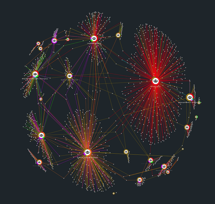
Relationships are complex, especially when you’re dealing with huge networks of connected entities. To understand them better, you need graph visualization to bring your graph data to life.
When you visualize graph data for the first time, you’ll immediately recognize interesting structures and connections. That’s because our brains are great at spotting patterns when they’re presented in a tangible format.
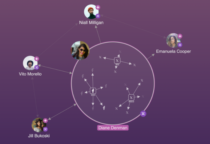
(The Facebook logo is a trademark of Meta Platforms, Inc., and the X logo is a trademark of X Corp.)
The real benefits of graph visualization lie in the ability to interact with the connected data to understand the full story. Your users don’t just want to see where connections exist. When they’re trying to understand relationships, they also need to know:
- Why do some have more important connections than others?
- How do certain relationships impact the network as a whole?
- Which connections have the power to make or break a group dynamic?
For answers, they must rely on graph analytics.
What are graph analytics?
While traditional analytics try to make sense of data points – either individually or in aggregate – graph analytics use a sophisticated set of algorithms specifically designed to uncover powerful insights in graph data.
Each algorithm analyzes connections in a different way and reveals something new. They tell us what’s really going on in a network: who has the most influence, who is well connected, who belongs to a sub-network, and more.
Why do I need graph analytics?
If you’re visualizing graph data already, you’ll know how important it is to simplify complexity, filter out noise, and drill down on the right details.
When users can run sophisticated graph analytics at the touch of a button, they gain much deeper knowledge and understanding. As a result, they can make informed decisions quickly based on details they can trust.
Without these algorithms, crucial information about the network remains hidden, and progress on your analysis is painfully slow.
The calculations graph analytics perform aren’t simple research tasks that can be done by hand: they’re advanced mathematical computations completed in an instant even on your largest, most complex datasets. The algorithms do the heavy lifting for you.
Which graph analytics should I use?
Different graph analytics complement each other to reveal new and interesting data insights. Here are the most popular algorithms.
Path analysis algorithm
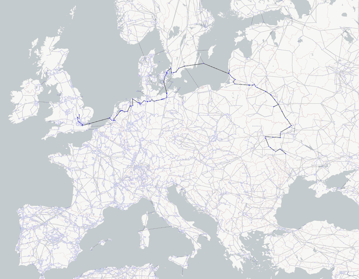
This algorithm helps users understand the different ways to travel through (or ‘traverse’) a network. By measuring how many ‘hops’ each node is from every other node, it calculates distances across the network.
It answers important questions, such as, “what’s the shortest (or fastest) path A would take to reach Z?” It’s useful for identifying routes between physical locations, and finding the quickest lines of communication between people in an organization.
Read about another practical example of shortest path analysis.
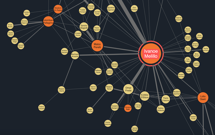
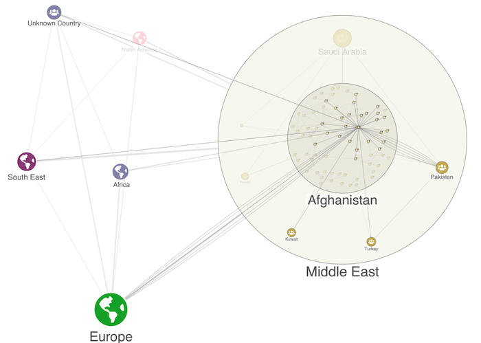
Pattern matching
This graph analytics technique identifies subgroups with similar characteristics inside a network. Repeated patterns in the graph could identify subgroups that are connected in a way that isn’t immediately obvious.
Real world examples include spotting repeated unusual activity in financial fraud, and investigating terrorist cells suspected of working for the same organization.
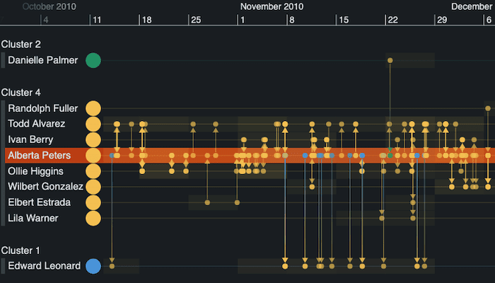
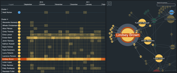
Community detection
Large, complex networks can contain groups of densely-connected nodes. These communities are interesting to analysts – they want to know what bonds them, how the community is evolving and what impact it has on the wider network.
Community detection algorithms reveal which circles people belong to within their wider social network. It’s essential for organizational network analysis to identify informal groups that exist across formal hierarchies.
Once we’ve spotted sub-groups, we can take the analysis one step further by exploring their timelines using our time-based analysis tool, KronoGraph. This reveals how relationships evolved, who’s the most active communicator, and how they keep in contact with the wider network.
Read about another example of community detection routines.
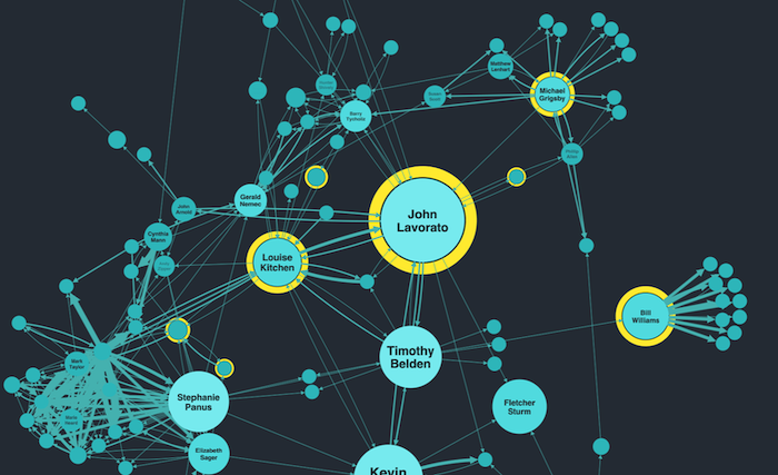
Centrality measures
These techniques help us to understand how nodes interact and which are the most important in the network.
Key to social network analysis are centrality measures. These reveal those who are strategically well placed, those who act as ‘gatekeepers’ between different parts of the network, those who can spread information more quickly, and those who have the most influence.
Who should use graph analytics?
Every organization relying on connected data analysis to make key decisions needs graph analytics.
Our customers use them across a wide range of domains, including:
- Fraud detection – typical insurance claims feature small, isolated clusters of people. If community detection graph analytics reveal that larger groups of highly-connected individuals are involved in multiple claims, it suggests an organized insurance scam.
- Security and intelligence – to disrupt an organized crime network, you need to identify the most influential individuals whose removal would have the greatest impact.
- Cyber security – using path analysis to find the most efficient way to reroute a central server if part of the wider IT network infrastructure is compromised.
For other examples – from network infrastructure to compliance, pharmaceuticals to knowledge graphs – see our use cases.
Get started
Graph analytics are the best way to understand how networks behave. Together with our toolkits’ other advanced features, including graph layout algorithms and custom styling options, they uncover the most important nodes and highlight the connections that matter.
You’ll find demos of how to use graph analytics in your applications, together with example source code, in our SDKs. Request a free trial.
Share:
