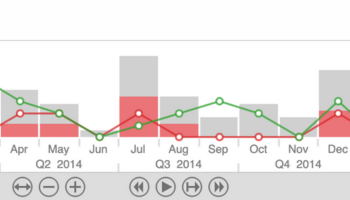
Visuals are not just about aesthetics. Visualizations with clever customization help users follow the story of their data for better analysis. The best styled visualizations allow you to:
- Stand out from the crowd
- Show the right information at the right time
- Fit in with your product’s design language
Stand out from the crowd
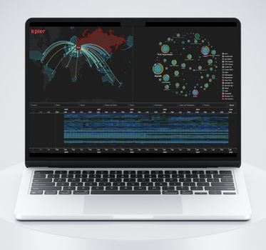
Visually striking, well designed, interactive charts will stand out in a competitive market. We can help you give investors and potential customers the “wow” moment they’re looking for. Here’s a great example showing how our graph visualization toolkits can help cybersecurity analysts explore thousands of cyberattacks in a single visualization.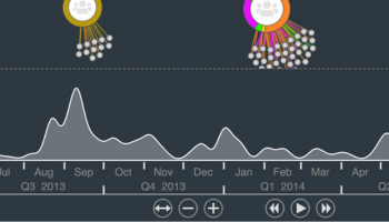
Fit in with your product’s design language
Customization adds intuitive context. Many of our customers build apps using open source tools, and worry that a new component will look like an obvious bolt-on, or confuse loyal customers. With infinite customization options, you can use our toolkits to build a visualization component that fits in so seamlessly that existing users will feel right at home – and new users will never notice it wasn’t there from the outset.
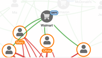
Show the right information at the right time
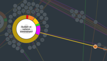
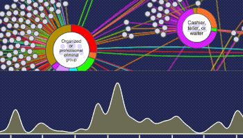
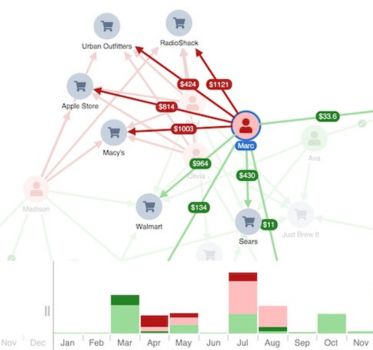
Each item in your visualization needs to communicate important contextual information at the time it’s needed most. Here’s a visualization of a network of vendors and products. Any complex network visualization needs to suit the data set behind the chart, as well as the user’s needs – “one size fits all” doesn’t work. Here we’ve transformed our graph into our UI with interactive nodes, and given users ‘detail on demand’ with progressive reveal at each zoom level.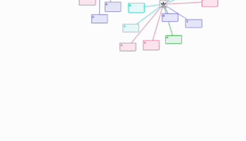
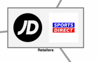
Bridging the gap between design and engineering
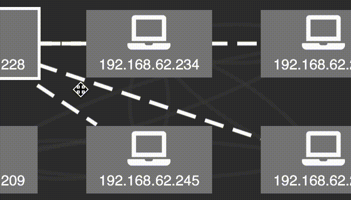
With almost unlimited customization options, our SDKs give you the flexibility you need to meet the most exacting design vision. This visualization of an IT network makes complex connections easy to understand, and quickly reveals any potential network issues. Rectangular combos are the perfect choice for an IT network visualization. Here they’re arranged neatly in a grid pattern, making the best possible use of the available chart space.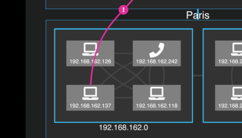

Our experts are ready to help you realize your vision
You’ll be supported every step of the way by the experts who built our SDKs. Whether you have detailed mockups or you’re looking for advice on the best solutions to meet your needs, we can get your project up and running in just a few weeks. Get in touch for an informal chat with an expert today, and find out how our toolkits will transform your roadmap.Ready to learn more?
Our blog includes plenty of resources about graph visualization design and best practice. Or if you’re ready to get started, request a trial of one of our products.
