
Whenever we ask our customers to name the top 3 tools from our graph visualization toolkits, they always mention combos, our smart node grouping functionality.
By grouping nodes and hiding clutter, combos help analysts make complex charts more manageable. They’re an intuitive way to represent subgroups – think cells in a terrorist organization, or subnetworks in IT infrastructure – without overwhelming analysts with too much detail all at once. But when it’s detail they’re after, analysts can explore the data inside each combo to support their investigative workflow.
Combo fans have also told us what else they’d like to achieve with our grouping tool. As a result, our graph visualization toolkits, ReGraph and KeyLines, now feature brand new options for creating eye-catching rectangular combos.
Let’s take a closer look at why we’ve (sort of) squared the circle.
Circular v rectangular combos
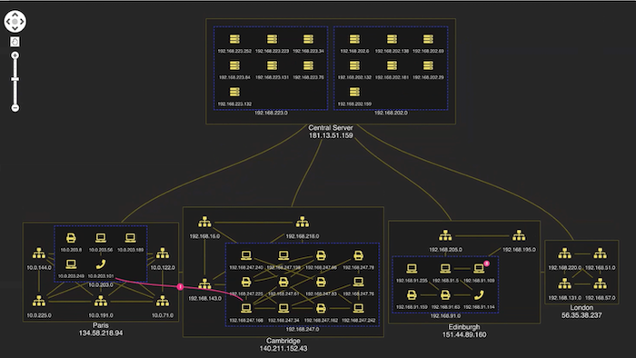
This example visualization featuring network alerts makes good use of circular combos.
The circular design works well with most automatic graph layouts, and you can see how it’s a particularly good fit for this chart’s radial layout. When you open a combo there’s semantic zoom behavior as each nested combo reveals another level of detail. An alert makes it easy to spot which IP address is the source of the problem.
Rectangular combos are the best option when chart space is limited. In circular combos, nodes are arranged at the periphery of the parent combos. They look great but can take up a lot of room, especially when – just like in the Edinburgh subnetwork above – there are only a few nodes inside.
Even without nesting, circular combos use more ‘whitespace’. Rectangular combos provide a tighter space-saving option. When they’re paired with the new grid arrangement option, designed with rectangular combos in mind, the grid is even more compact.
Rectangular combos in action
This demo visualizes an IT network to reveal complex connections and potential network issues.
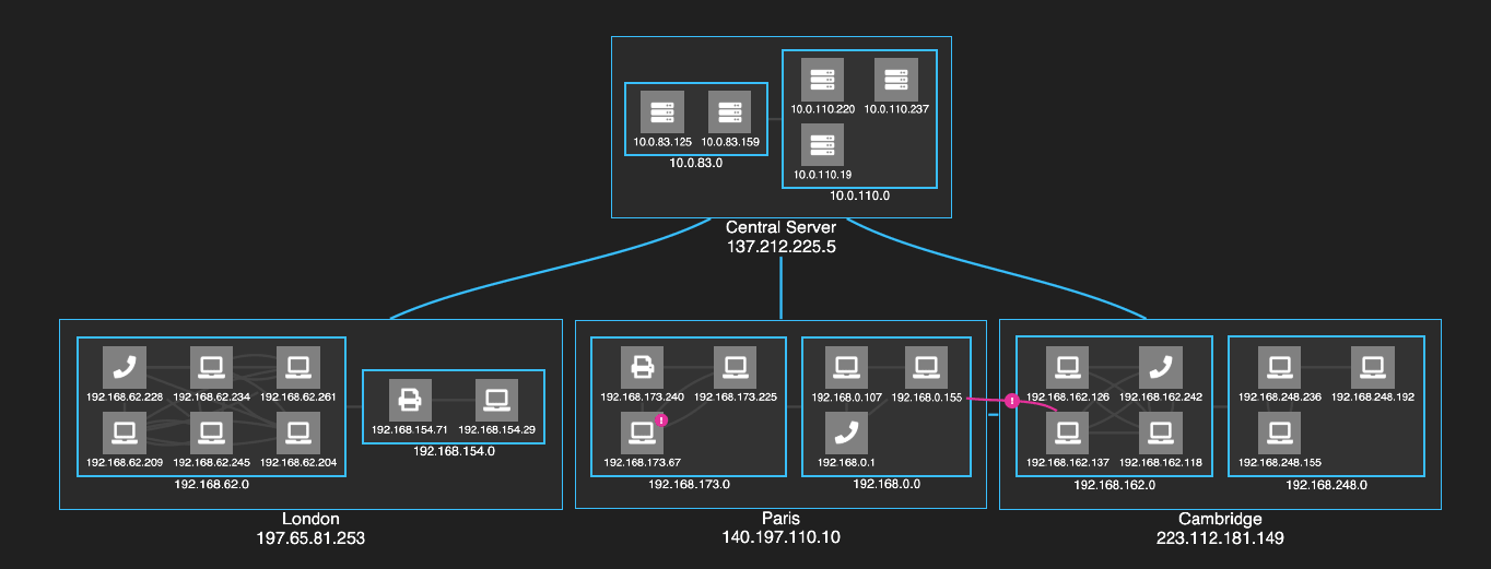
Rectangular combos are the perfect choice. The ordered grid pattern makes efficient use of the available chart space, with nested combos arranged neatly as blocks. The combos look at the order the nodes inside them are passed and then lays them out accordingly. There’s a clear, uncluttered view of the connections between nodes in the network.
This demo also showcases other layout and style options to make your visualizations look slick.
Sequential layout and curved links
Our example uses sequential automated graph layout to help make the flow of dependencies in our ordered grid of servers much clearer. This layout is clever enough to examine link directions across the network and calculate which node belongs at what level. There’s no need to specify them manually: nodes are automatically placed in the right hierarchical sequence.
You’ll also notice that we’ve chosen nicely curved links between nodes and combos. They run closer to the combos than straight links, giving a beautiful, fluid design that adds character and clarity to your visualizations.
Custom styling
Sometimes a rectangular look just fits better with the app’s general UI. Our toolkit approach gives customers the ability to achieve the exact look and feel they want, so extending their options is part of what makes our data visualization tools more appealing than off-the-shelf solutions. (For more on this, see our completely (un)biased review.)
We’ve gone for a modern clean theme with a simple color palette in our IT networks example. With so many graph visualization customization options available, it’s easy to achieve whatever style you want.
There are lots of other style options too: glyphs as alerts on problematic IP addresses, animated links to represent traffic flow, a muted color palette and dark theme that doesn’t detract attention from the data, and foregrounded nodes and connections on selection to direct focus.
What do you think of rectangular combos?
If you want a fresh approach to grouping nodes when space-saving is key, try rectangular combos. They’re just as interactive, intuitive and effective as circular combo nodes, but they might be a better fit for your data and your app UI.
To help you get started with rectangular combos, we’ve updated the KeyLines SDK’s Combos Basics demo and added a new Arranging IT Networks demo. In ReGraph you’ll find a brand new Rectangular Combos story.
Want to try them for yourself? Request a free trial of our toolkits
Share:
