
This blog post focuses on the sequential layout: what it is, how it works and why it’s the best choice for tiered data.
Graph layouts are the rules which determine where nodes are placed on the screen, so they are a crucial tool in graph visualization. That’s why we’re continually finding ways to improve the layouts in our KeyLines and ReGraph toolkits so that your users can visualize their data in an uncluttered, clear and visually appealing way.
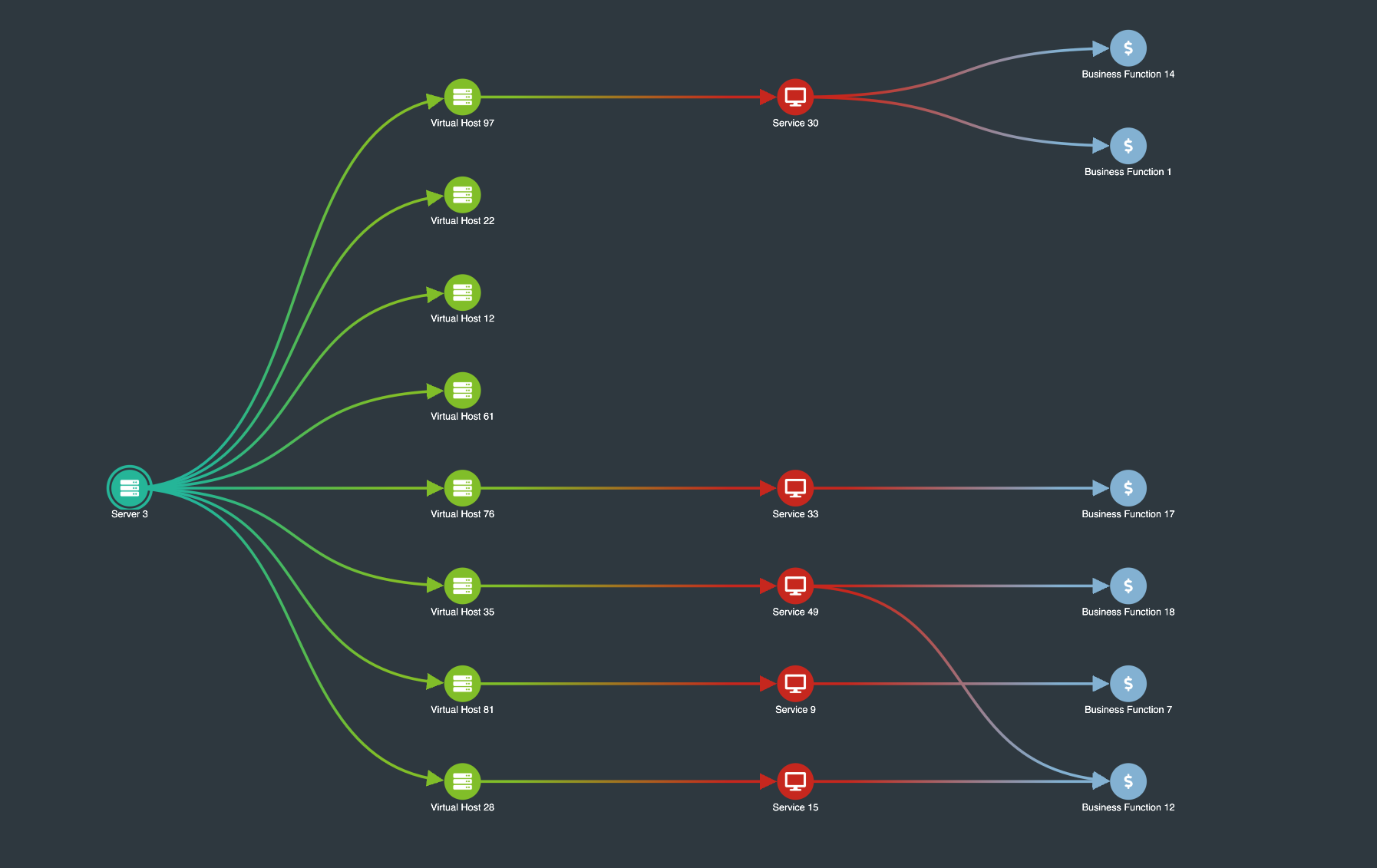
The sequential layout is designed to display data that contains a clear sequence of distinct levels of nodes. It’s good for visualizing data in scenarios where items can be placed in tiers, such as global telecoms networks or management structures. It’s also perfect for situations where information flows from one level to another, such as financial relationships and blockchains.
It takes multiple components into account and minimizes link crossings. Custom spacing between levels makes efficient use of the available screen space while using curved links instantly changes the appearance of the chart.
Minimizing link crossings
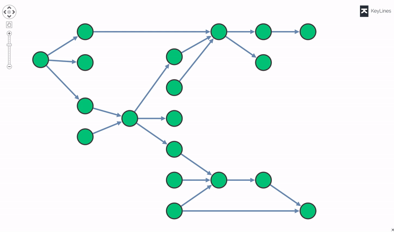
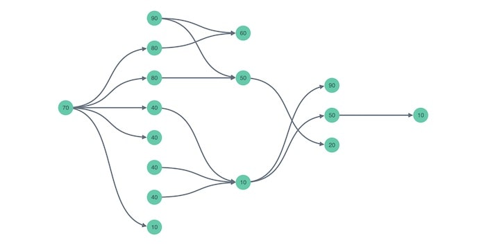
The most common scenario is that links connect nodes between levels. This layout handles these links in two stages:
- First, it places each node at the average position of its neighbors in adjacent levels.
- Second, it swaps nodes in each level to reduce the number of link crossings.
In some cases, your data may have links between non-adjacent nodes in the same level, a potentially confusing picture as links may pass behind nodes. In this situation, the sequential layout will enter a third stage, curving the link (‘offsetting’) so that it doesn’t draw behind the nodes, as shown in the example below. The layout chooses whether to offset the link above or below the nodes so as to minimize crossovers.
Positioning of nodes and reducing link length
Once you’ve ordered the nodes in their levels, there is still some freedom to adjust the positioning of nodes to get a visually pleasing result.
The spacing option affects how the nodes are distributed within each level and give very different visual effects. There are three sequential layout spacing options to choose from:
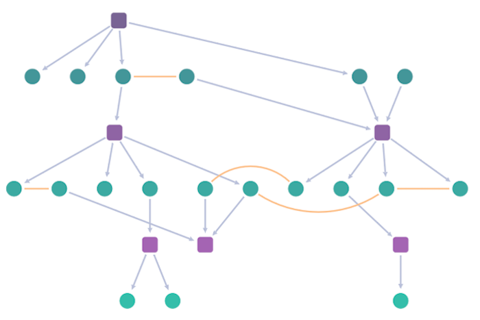
- The ‘auto’ option is the most intelligent option. It automatically positions nodes relative to each other based on the links between them, and subject to the link crossing minimization calculation. This helps shorten link lengths while making good use of of the view area. If there are multiple connected components (groups of nodes that are isolated from the rest of the network) they can be nested together to fit nicely into the available space.
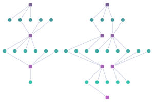
Sequential layout with spacing option ‘auto’
- The ‘equal’ option positions the nodes at regular intervals to give the chart lots of symmetry. It’s great for conveying a sense of the relative sizes of each level.
Sequential layout with spacing option ‘equal’.
- The ‘stretched’ option spaces nodes in each level so that they spread across the entire available width. This is the spacing used in the IT network example at the start of this blog post. It creates a highly organized look which works well for networks with a lot of diagrammatic structure.
Sequential layout with spacing option ‘stretched’.
Another way to help you differentiate nodes inside each level is to arrange them in a specific sequence. You can customize the node order to suit your users’ needs, for example, by bringing the most important nodes in a left-to-right layout to the top of the screen, or grouping nodes by type to provide greater context.
Stacking and packing sequential layouts
The sequential layout’s stacking option makes it easy to visualize wide trees of nodes and densely-populated levels. Stacking creates compact views of each tier at a much more readable zoom level. It saves space by pulling neighboring nodes into neat grids.
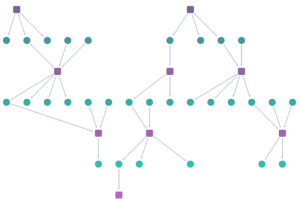
And if your dataset contains many disconnected hierarchies instead of one huge network, you can visualize them in parallel and align their levels of hierarchy, or use the ‘packing’ option to arrange each individual chart in a rectangular or circular arrangement. Packing in this way makes much better use of screen space.
Try sequential layout for yourself
Ready to give sequential layout a try? There are full details on how to get started in our KeyLines and ReGraph graph visualization toolkits. Sign up for a free trial.
This post was originally published some time ago. It’s still popular, so we’ve updated it with the latest sequential layout improvements.
Share:
