
There are many benefits to KronoGraph, our timeline visualization SDK. One of its strengths is how easily it works with KeyLines and ReGraph, our graph visualization SDKs. Combined, they provide a fully-integrated timeline and graph visualization for 360-degree visibility of your connected data.
In this developer tutorial, I’ll talk through an example of combining KronoGraph with KeyLines. If you’re working in React, you can apply the basic principles to ReGraph, our React graph visualization toolkit, too.
Building a combined timeline and graph visualization
Before you start modeling your KeyLines datasets to load into KronoGraph, it’s important to take a step back and think about your end user’s needs. Will they get maximum value from having an identical representation of the same data in both tools, or is it better to extract different parts of the data for each view?
We’ve talked about designing a graph visual model in previous blogs. For this example, I’ll use a dataset of financial transactions to illustrate why your visual model may differ between a graph and timeline visualization, and to show you the power of these two coupled views.
Follow the money
Of all the fraud use cases, ‘money flow’ or ‘follow the money’ investigations benefit greatly from a combined graph and timeline visualization approach.
My simple dataset comprises a set of bank accounts and the transactions between them. I’ve deliberately chosen a raw data JSON format that’s neither KeyLines nor KronoGraph, but is typical of what you might expect from a backend API.
The bank accounts have a unique account number and a named ‘owner’:
{ "account": "023948482", "name": "Zboncak Holdings LLC" }
And the transactions look like this:
    {
      "transactionID": "1000001",
      "from": "02932321723",
      "to": "82344338393",
      "amount": 10452,
      "time": "2018-01-01T21:15:57.211Z"
    }
We’ll build an interactive graph and timeline visualization for exploring the flow of money between different parties, both at a high level (which way did the money flow?) and at a detailed level (who paid whom, how much and when?).
Loading KeyLines and KronoGraph components
I start by downloading KeyLines and KronoGraph, and following the getting started guides on each SDK to add them to my application.
I need to make a pair of div elements on my page, and use the KeyLines.create() and createTimeline() methods to populate them with the components. After setting a few basic options such as a common background color, this is what I get:
That’s the blank canvas. Before populating it, we need to consider two fundamental questions to any graph-timeline design:
- How do I want to model my data?
- How should the two visualizations interact with each other?
Let’s look at each in turn.
Modeling data for graph and timeline visualization
Here’s my plan:
-
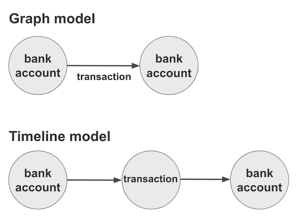
- Bank accounts are fundamental items, because I want to explore the relationships between them. They will correspond to both nodes in my chart, and entities in my event timeline.
- I want to show individual transactions as events on my timeline, drawn as connections between bank accounts.
- On my graph visualization chart, however, showing all transactions would be cluttered and unhelpful. What I want instead is to connect pairs of nodes with a single link showing the net flow of money between those accounts. The link should point in the direction of the net flow, even if there were hundreds of back-and-forth transactions between those two accounts.
- I want to arrange my chart nodes in a left-to-right view that shows the overall flow of money.
Building with our graph and timeline visualization SDKs
Let’s start with the timeline. A quick manipulation converts my bank accounts into entities, which now look like this:
'023948482': {
      type: 'account',
      data: {
        owner: 'Zboncak Holdings LLC',
      }
}
And a similar manipulation lets me create events for transactions, each of which looks like this:
'1000001': {
      type: 'transaction',
      entityIds: ['023948482','82344338393'],
      time: new Date ('2018-01-01T21:15:57.211Z')
}
The reason I give both pieces of data a type is so that I can apply styles to the types. I use the entityTypes and eventTypes data properties to say that all bank accounts should be shown using a yellow font icon design, and all transactions should have a lilac color and my choice of line width.
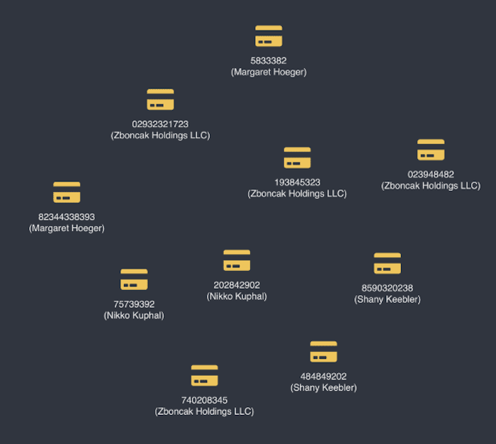
Here’s the result of loading a small test dataset:
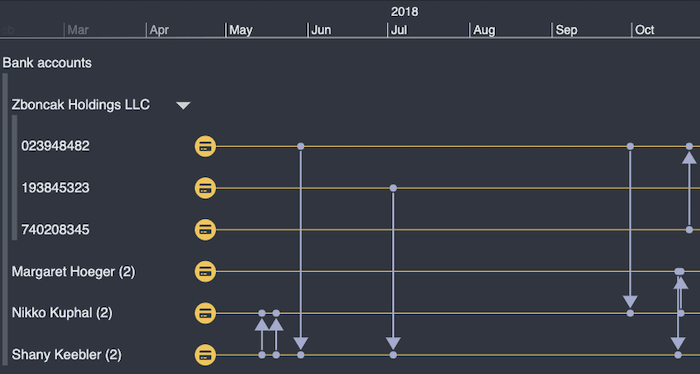
Not bad, but we can do better. By adding a simple groupBy: [‘owner’] to the account type definition, we can eliminate clutter by organizing the bank accounts by their owners. I can either look at the timeline of transactions between owners, or drill down into a particular owner. For example, I can expand the “Zboncak Holdings LLC” group to see the individual accounts making transactions during a particular period.
Building a graph visualization
Now for the graph visualization chart. Nodes are easy – one per account, and I carry over the same color scheme from my timeline to keep things consistent. I’ll build up a 2-line node label which combines the account number and name.
Links need a more involved data model, but it’s easy to manipulate the data the way I want it.
I give each link a unique ID based on the parties involved. Then I’ll build up a dictionary object which I can use to count the values of the various transactions which match that ID. Once I have the net flow of money from party A to party B, and from party B to party A, then I can take each pair of entries in my dictionary and convert them to a single KeyLines link object with the information I need.
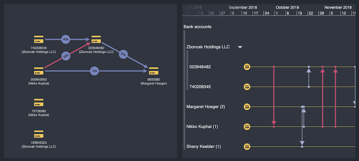
I put a summary of the net flow on my links using a glyph (one of many custom data visualization styling options available), and choose the arrow direction to show the net direction of money. A pair of accounts might look like this:
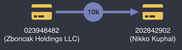
That 10k link might represent a single transfer of $10,000 from Zboncak to Nikko Kuphal, or thousands of individual transactions in both directions, netting out to $10k. There’s no way I could show them all on a graph, so it’s useful to diverge the visual model between the timeline and the chart.
Now let’s think about how the two components will interact.
One dataset, two powerful interactive views
You’re spoilt for choice when it comes to adding interactions to both KeyLines and KronoGraph visualizations. For today, I’m just going to add three:
- Zooming and panning the timeline should adapt the chart to show only the net money transferred during the time window in question
- Selecting a node on the graph visualization chart should focus that entity on my timeline, showing only the transactions carried out from that account
- Selecting a link on the graph visualization chart should highlight the individual transactions on the timeline which contributed to that net flow of money
-
Making the timeline drive the chart
To achieve the first, I listen to the timeline range event which tells me when the user has changed the time range. I then rerun the same link aggregation process, only counting transactions which fall within the resulting range.
Finally I rerun the KeyLines sequential graph layout, which will adapt the positions of nodes to arrange them in the direction of the money flow in the time period. Something like this:
  timeline.on('range', async range => {
    await updateAndMergeLinks(range);
    chart.layout('sequential', {orientation: 'right'});
  });
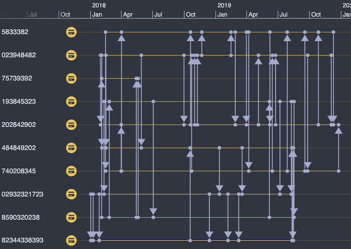
And here’s the result:
Making the chart drive the graph and timeline visualization
The second interaction is easy – I listen to the chart’s selection-change event and pass the resulting selection into KronoGraph’s focus() method.
And here’s the result of selecting a node – see how the KronoGraph visualization adapts to showing only the timeline of the bank account I’ve clicked:
Selecting chart links and timeline events simultaneously
My final interaction also involves listening to the chart selection-change event, but this time checking to see if we’ve selected a link and, if so, highlighting the relevant links in the timeline.
To do this, I’ve pre-cached all the transaction IDs associated with my summary links in the chart on the d (data) property of the links. That way, I can immediately get the IDs of the events I want to highlight in the graph and timeline visualization, and I just have to call the all-powerful timeline.set() command to change the color and line width of the events in question:
Try our toolkits
There are countless other interactions and improvements I could make to this app, but we’ll save those for a future blog on money flow investigations.
The key takeaway for now is that a combination of a graph visualization and an event timeline visualization gives users an extremely powerful tool so they can explore their data in a completely new way. Once you’ve planned your visual model and your basic interactions, hooking up KeyLines or ReGraph with our KronoGraph software development kit is a piece of cake.
If you want to try any of our toolkits – alone or in combination – get in touch to get started.
Share:
