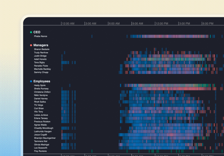
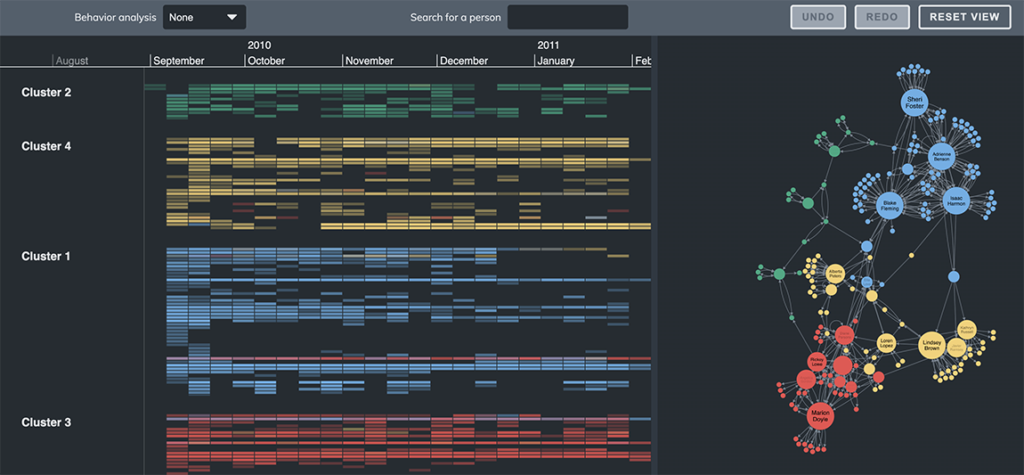
Phone call analysis
Explore the precise sequence of events that contribute to a relationship between two entities, such as calls made between two people.
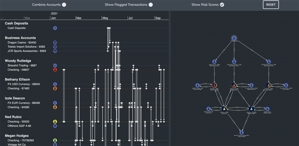
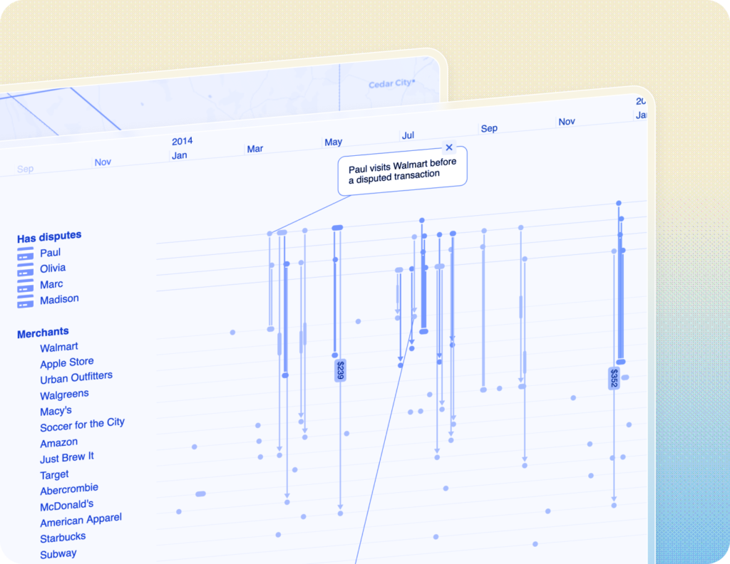
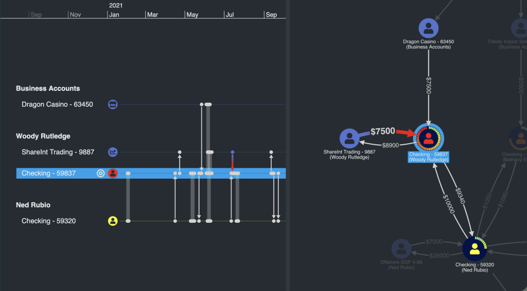
Anti-money laundering
Follow the flow of money in this demo that shows transactions that have occurred within a suspected money laundering operation.
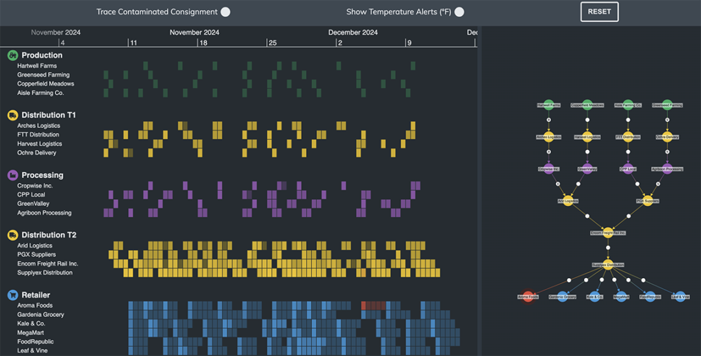
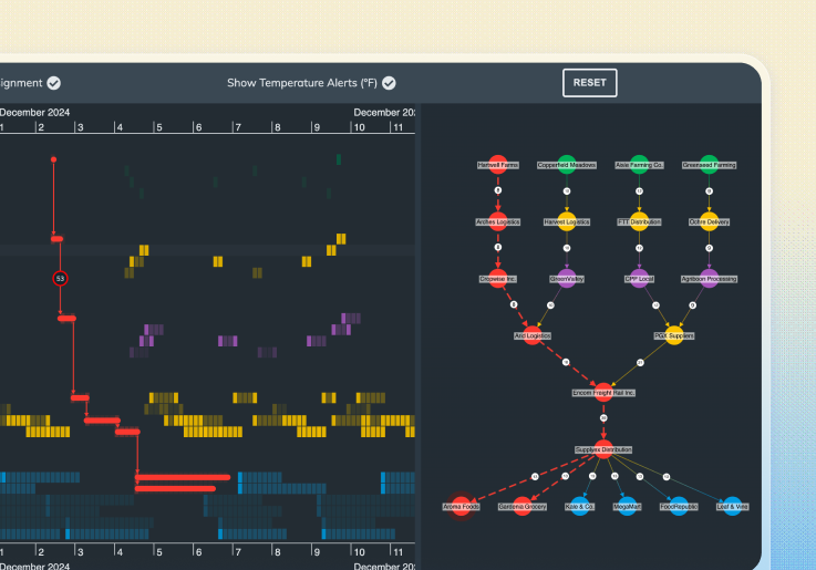
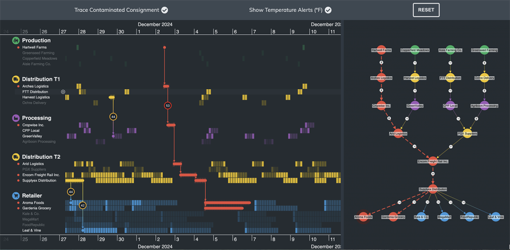
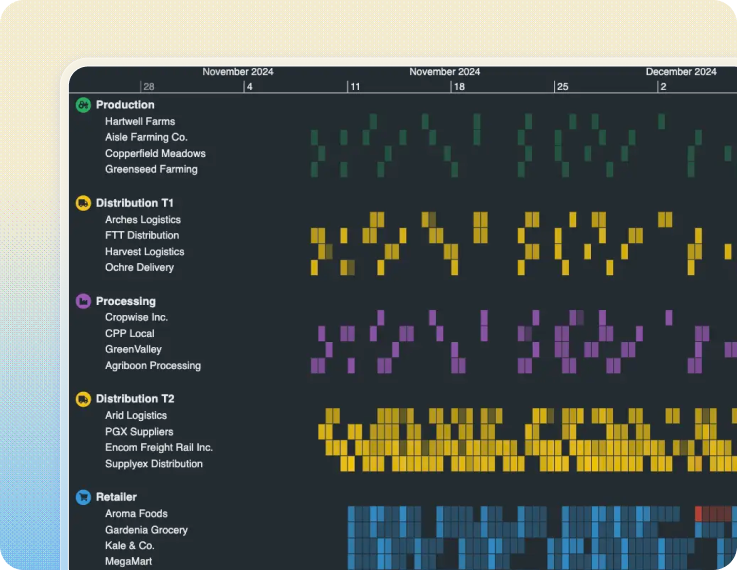
Supply chain investigation
Trace shipments through an entire logistics network.