
Summary:
This article explores how graph visualizations can simplify complex data for analysts in cybersecurity, open source intelligence (OSINT), and supply chain management. By using techniques like “combos” (grouped nodes), detail-on-demand interactions, and link aggregation, analysts can quickly understand intricate networks, spot critical issues, and make informed decisions without being overwhelmed by data overload. The post illustrates practical applications for cloud infrastructure, social media investigations, and multi-layered supply chains, emphasizing clarity, efficiency, and actionable insights.
Data overload is a real problem for busy analysts. How do they spot the red flags in a cyber security network? Or find key connections in an open source intelligence investigation? Or make sense of the myriad of links between every stage of a supply chain? And how can they avoid alert fatigue in the process?
Our graph visualization SDKs help analysts simplify and explain complex networks and alerts. In this blog post, we’ll explore three new ways to do that, with realistic examples from popular use cases.
Identify attack paths in cloud infrastructure
How do you display complex cloud infrastructure in a way that’s human readable? With so many availability zones, redundancies, and multiple cloud providers, there’s a lot for users to keep track of and understand. It’s easy to get overwhelmed and lost in the details.
We’ve designed a way to present cloud networks so they feel instantly familiar to infrastructure professionals and novices alike. This reduces their learning curve and helps them find value in their visualizations fast.
By combining nodes into rectangular ‘combos’ and arranging the items inside in grid formations, we provide a clear and easy-to-digest overview of the entire infrastructure. There are intuitive interactions to explore certain areas in more detail as necessary. We’ve also styled combo labels and behaviors to give users a consistent look and feel.
Another key part of modern cloud security applications is their use of AI and machine learning to create timely and accurate alerts. When you overlay this information on a graph, your analysts see alerts in context and quickly discover where problems exist.
If we restructure the data in the visualization, we create a clear narrative about the issue and how it was resolved. Once it’s exported as a report, you can share each stage of the incident with the wider organization in a clear, concise graph visualization format.
OSINT data exploration made easy
It’s hard to find actionable insights in open source intelligence data (OSINT) fast. There are large volumes of data involved, and a huge amount of processing required to turn that data into something a human can interpret and analyze effectively.
To create a compelling visualization, you need to provide users with the correct amount of detail to answer the questions they’re asking right now. We’ve blogged before about ways to reduce the volume of data through back-end data management and front-end interactions – see five steps to tackle big graph data visualization.
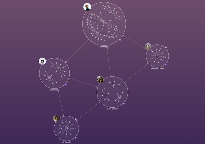
A key part of the process is resolving multiple identifiers into single entities, often stored in different datasets. It’s essential for investigations working with OSINT data from disparate sources – social media profiles, forum posts, news articles, company filings – there’s a need to unify data that refers to one specific entity.
Take this visualized network connecting five social media users. Each node is a combined node or combo containing details of the social media platforms they’re active on. It lets you spot social patterns without overwhelming the chart with the clutter of individual communications.
You can easily show details about the specific items of interest hidden inside combos. Displaying detail-on-demand in this way supports an analyst’s exploratory workflow.
You can also give users the power to bring in additional data from the datastore that is directly related to the current investigation. We’ve used glyphs on open combos to make clear that there’s additional related data available to bring into the chart. Analysts explore in this way to answer important questions. Who else are they connected to? What does this new person’s social media activity look like? Who else in the network do they interact with?
In an OSINT scenario, it’s important to understand how information spreads between different groups. We can do this by digging deeper into the data to see which individual posts and channels connect different users.
Now we can create an OSINT report on the top level interactions of a social group across multiple platforms, all the way down to specific interactions between individuals.
Simplify multiple links in supply chains
A range of industries rely on modern, traceable supply chains to source, manufacture, distribute and deliver goods or services. Despite the name, a supply chain is more of a complex network of intricate connections. Each layer in the network needs to move efficiently and reliably, and visibility of key paths helps managers make contingency plans in the event of bottlenecks, delays or failed links in the chain.
There are often similar paths through the supply chain, and this leads to a common problem: too many links between the same pairs of nodes or combos in a graph visualization. It can make charts look cluttered and difficult to read.
This chart shows multiple links between the same factories, warehouses and store, each representing a specific mode of transport.
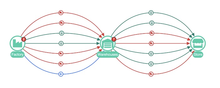
The best way to deal with this is to aggregate the links that have custom properties in common. Now we see connections aggregated by transportation type to create a much simpler representation.
If necessary, we can go one step further and aggregate every link, regardless of transportation type.
The beauty of the link aggregation approach is that the detail is simply a click away. The glyph on the warehouses combo tells us there are seven storage facilities involved in the chain. Open the combo to reveal where those storage containers are located, and which individual transportation links they’re served by.
Get started with beautiful graph visualizations
Would you like to create visualizations that simplify and explain complex networks and alerts? Would your analysts love a detail-on-demand approach to visualization? To get started with our KeyLines and ReGraph graph visualization SDKs, sign up for a free trial.
Key takeaways:
Grouping related nodes increases clarity – using combos to cluster related nodes reduces clutter, making complex networks immediately more understandable for analysts
Support exploratory workflows – detail-on-demand interactions allows users to drill into combos or nodes, providing deeper insights without overwhelming the main visualization
Data aggregation can simplify connections – Combining multiple links by shared properties declutters graphs while still preserving access to the underlying detailed relationships
Share:
