Data dashboards are everywhere. Open any data management app and the chances are the front page features a complex grid of bar graphs, pie charts and metrics. But if your users need to track, measure and analyze connected data, there’s a more effective way to understand the information. That’s using visual network analysis.
This 2-part blog series compares two options for visualizing data: a traditional static data dashboard approach versus interactive visual network analysis. We’ll see how network analysis tools complement dashboards, adding context, interactivity and insight into links and connections.
In this first part we’ll consider how good design, clever styling and intelligent grouping provides users with the most effective way to make sense of their data.
Visual network analysis vs traditional dashboards
Experiences with traditional data dashboards vary. Some do a great job of highlighting key data points and making information accessible. But this isn’t always the case.
Data is sometimes neglected, outdated or presented without sufficient context. The volume of information displayed can be overwhelming. There might be one bit of the dashboard that’s really important, but would have been better as a report or inbox alert. Most importantly, users can find it hard to get the insight they’re looking for from a baffling array of numbers and charts.
Dashboards are also hard to define and design – everyone has their own idea of what the dashboard should show and the form it should take.
Our best performing customers combine their traditional data dashboards with our visual network analysis tools. If you use the right tool for the right data type, you’re set up for success.
Here’s an example of what looks like a dashboard but is actually a visual network analysis tool. Combining a couple of our data visualization tools – ReGraph and KronoGraph – creates a compelling way of interacting with large volumes of connected data.
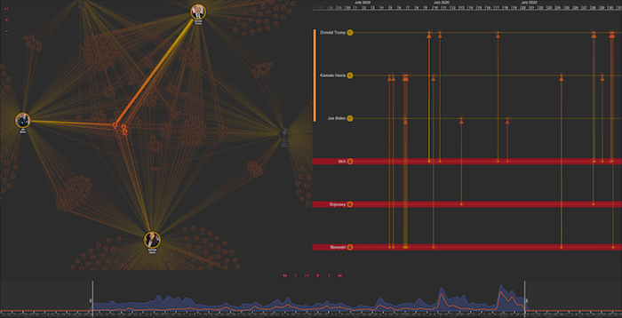
On the left is a detailed network chart of Wikipedia editing activity. The timelines on the right focus on edits to content relating to key people, while the time bar across the bottom provides a useful overview of when those edits occurred.
This view can be embedded into an existing dashboard, showing contextual and connected information on demand. Or it can run alongside a dashboard, in a separate window once the user has uncovered an event or point of interest they want to investigate further.
The core difference between a traditional dashboard and our visual network analysis tool is that we’re able to ask questions of the underlying data. Traditional dashboards usually start with a small subset of data. Instead, this tool immediately presents you with an interactive exploratory environment so you can dig deeper into whichever view you’re most interested in.
Key theories behind our visual network analysis design
The data visualization design theories pioneered by Edward Tufte in the 1980s are just as relevant today. There weren’t many interactive visual network analysis tools available back then, but the main principles still apply.
In his book, The Visual Display of Quantitative Information, Tufte stresses how important it is to consider the viewing architecture in any design. What are the different levels of information you’re surfacing to users? You must think about what your users see:
- from a distance – does it give an accurate summary of the data you’re representing?
- up close and in detail – is more detail available on demand?
- implicitly underlying the visuals – what patterns exist? What insights can we discover?
Let’s see how we can put these theories into practice.
Introducing our visual network analysis tool
He’re we’re using a fictitious dataset of email communications between employees from different departments across an organization. Exploring who talks to whom can reveal a lot about a business. When you factor in social network analysis methods, you can reveal the most influential relationships and how they develop over time.
On the left there’s a network visualization created in KeyLines, and on the right is a timeline visualization in KronoGraph. Forget for a moment that they’re both fully interactive – what can we learn from this static snapshot?
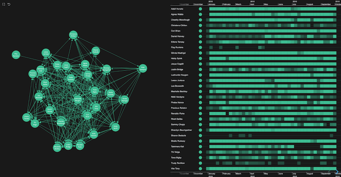
From the densely-connected network on the left, I get the impression that everyone is talking to each other. That’s not so helpful. I notice an outlier in the top right who has sent emails but never received any, but nothing else jumps out. Is this a pitfall of putting this kind of data into a dashboard? It doesn’t tell me a huge amount.
When I look at the right, the timelines do give me some more useful high-level information. Each individual heatmap view instantly reveals when the individual employees sent or received emails.
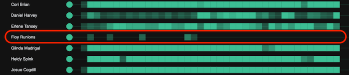
That outlier, Floy Runions from the network view, emails at distinct times that don’t follow the patterns of most of the others. There’s another unusual pattern that stands out too – Sharon Bedsole follows a different profile from the majority. They don’t overlap with Floy either. Maybe they share the same role?
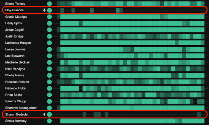
The colors tell me something too: I can see that the higher the opacity, the greater the volume of email traffic.
The great thing about network and timeline analysis is we’re not restricted to a static view, so let’s start interacting.
Identifying communication patterns
Fundamentally, you need to think about the questions you want to ask your data. What is it you want to uncover through visual network analysis?
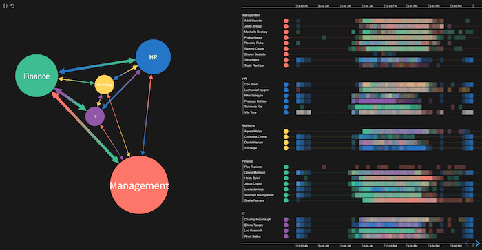
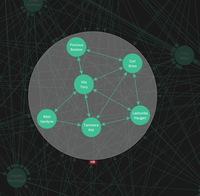
There are a few things I’m keen to understand, starting with ‘which departments communicate with the HR team most frequently?’
First I identify the team I’m interested in. I can use a search facility to highlight those belonging to the HR team so they’re easier to spot.
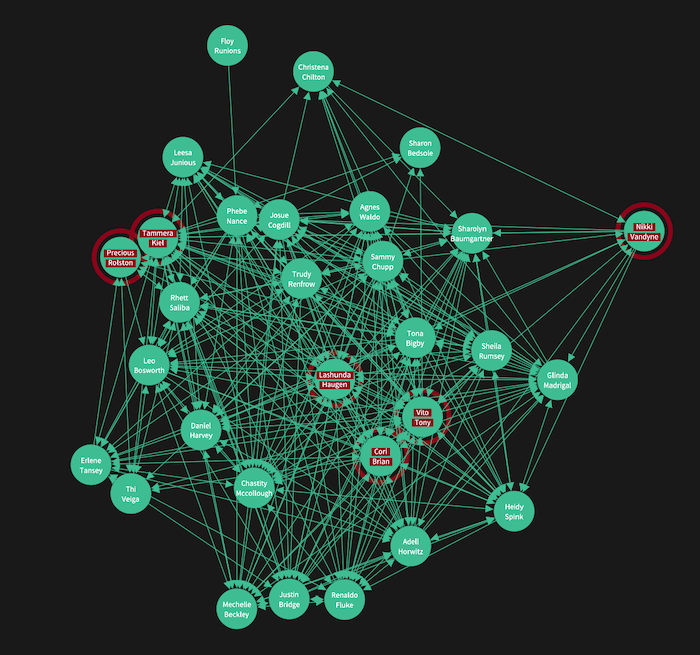
There are many custom styling options available, so your visual network analysis tool can match your application’s theme. I’ve put red donuts around each node so they stand out, but it’s still a slightly distracting view. Let’s make things easier by backgrounding people from other departments:
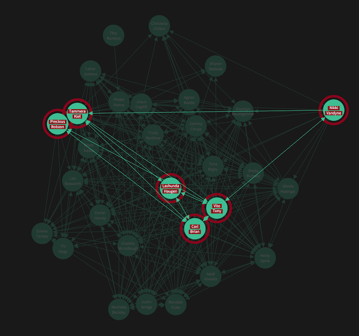
That’s better – I can clearly spot the directed links between each node, telling me who emailed whom. I can also see which employees have formed their own useful cross-department subnetworks inside the organization.
Intelligent grouping
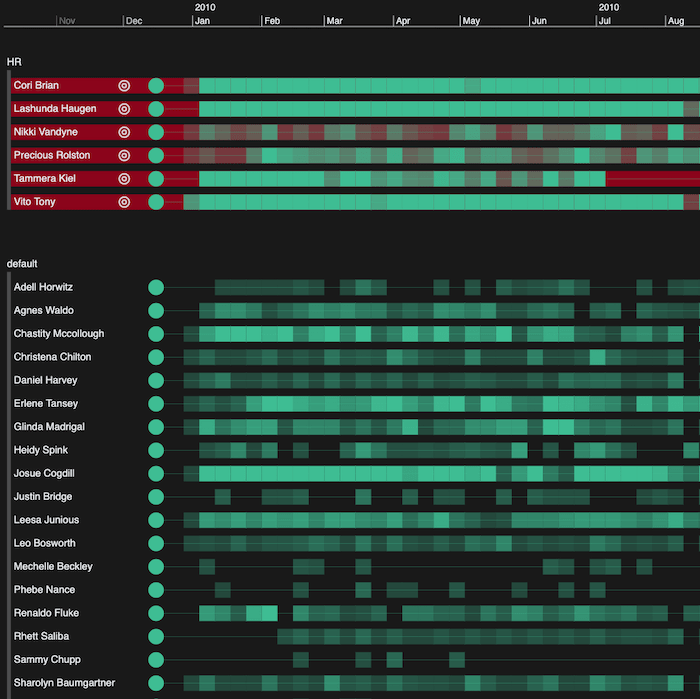
Remember that I want to find out how the rest of the organization communicates with the HR team, not individuals within it. The obvious next step is to group those people together. We’ll do this using combos to combine similar items and declutter our visualizations.
Let’s look at timelines first. Both visualizations are fully-integrated, so I can see the six HR employees highlighted in red and cross-validate who’s who. Next I group those people together in my graph visualization. Immediately, all of those links that were visible before are aggregated into something more manageable.
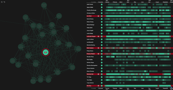
Combos still offer a powerful way to explore the nodes and links inside them on demand. The different levels of viewing architecture slide over each other: I can access the combined items at any time, while maintaining my view of where they sit within the rest of the organization.
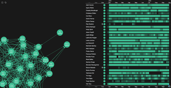
KronoGraph has great support for grouping too. Here’s the entire HR department’s timelines separated out from the rest of the dataset so they’re easy to spot.
Let’s simplify the entire network view by grouping individuals by department in both the chart and the timeline:
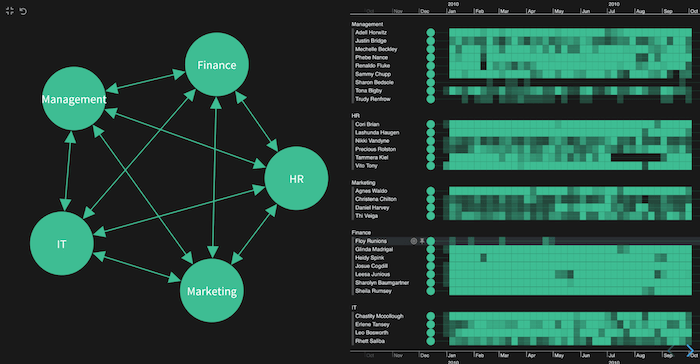
Notice how patterns start to surface. For example, I can see Finance are extremely active on email. Interesting, our friend Floy from earlier is the exception to this. Why is that? It’d be interesting to find out what role he holds in the team.
More than just a dashboard
Next time, we’ll explore our visual network analysis tool further with clever use of color and advanced graph analytics. We’ll also use the powerful ‘pattern of life’ technique to understand hidden behaviors.
In the meantime, if your dashboards aren’t up to scratch and you’re considering alternative options, check out our toolkits.
Share: