In our earlier blog post, visual network analysis dashboards that work, we used established visualization design theories to build an interactive analysis tool for your dashboard reporting system. We explored the data using timeline and network visualization, using clever styling and intelligent grouping to uncover high-level patterns.
This time we’ll make your dashboard even better at sharing context and insight. We’ll use advanced features of KeyLines and KronoGraph – including powerful graph algorithms and pattern of life analysis – to understand specific data connections.
Effective use of color
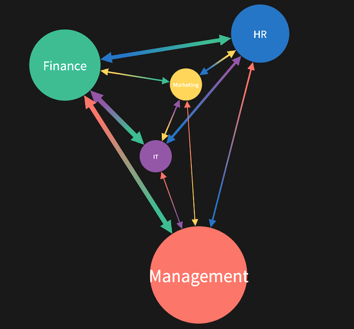
Last time, we used our visual network analysis tool to create a simplified view of the email traffic inside an organization. Chart entities and timelines were grouped by department.
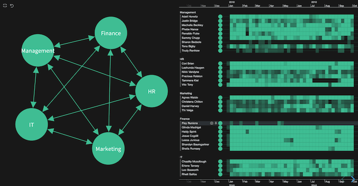
My focus is on finding out who the HR team emailed most frequently. Let’s see if we can represent the different departments more clearly using custom styling.
Color can be hard to get right, but it’s an effective way to categorize sources and show how they interrelate. For practical tips, read our blog post on choosing colors for your data visualization.
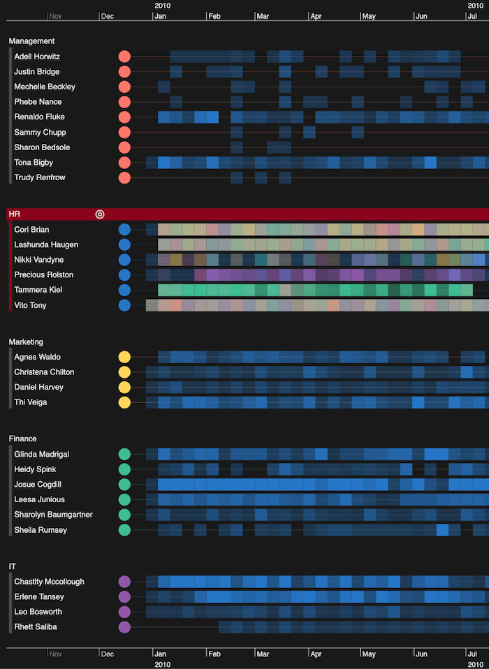
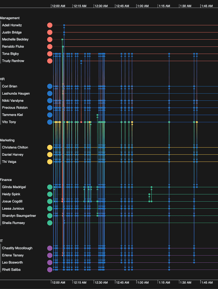
Adding custom colors transforms the timelines. Emails from each department immediately stand out – blue for HR, green for Finance, and so on.
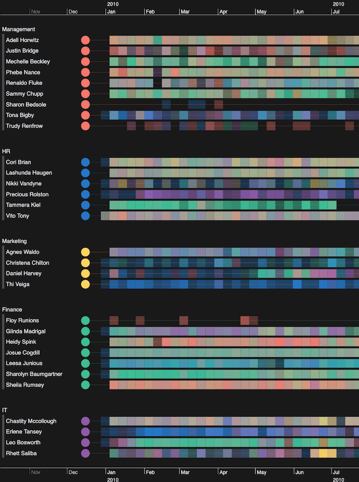
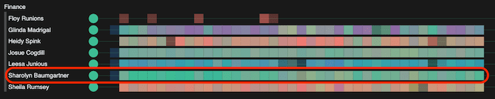
Here’s where the patterns become much easier to spot. Right away, I can see that Sharolyn Baumgartner in Finance mostly emails others in her department, because the heatmap representing her emails is almost all green.
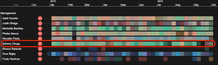
Sammy Chupp in the Management team also sends a lot of email traffic to Finance, which isn’t something I could pick up easily just by looking at the network view.
Powerful graph analysis
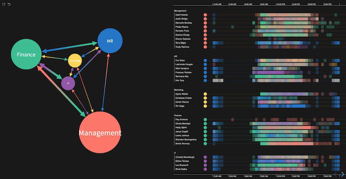
For the graph visualization part of my visual network analysis, I want something that’ll give me at-a-glance insight into my email traffic data.
Using advanced graph analytics, I’ve resized the combined nodes representing each department to show the relative communication between them. I’ve also sized the directional links between departments according to the volume of traffic sent.
Management is clearly far more communicative than the other departments. The reasonable amount of traffic between it and Finance is in line with the email pattern we spotted earlier for manager, Sammy Chupp.
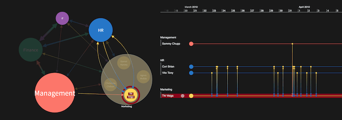
But back to our goal: to find out who HR talks to. I select the blue HR timeline combo on the right of the network chart. The heatmap for every other timeline changes to shades of blue, so we can focus on communication with HR across the organization.
The stronger the blue opacity, the more emails an individual receives from HR. We see that Finance talks to HR often, especially Josue Cogdill. Perhaps Josue organizes payroll and gets details from HR on new starters, leavers or salary changes?
Notice that a couple of people in IT speak to HR frequently too. Again, maybe HR are sharing information on new starters or leavers and managing their hardware and security permissions?
Visual network analysis search
In our interactive visual network analysis tool, there’s more scope to provide context compared with a traditional dashboard view.
I noticed from the timeline view that Thi Veiga in Marketing has a reasonable amount of communication with HR. Who are they communicating with exactly?
I’ve found Thi in the network view: they’re here in the chart as part of the Marketing group combo.
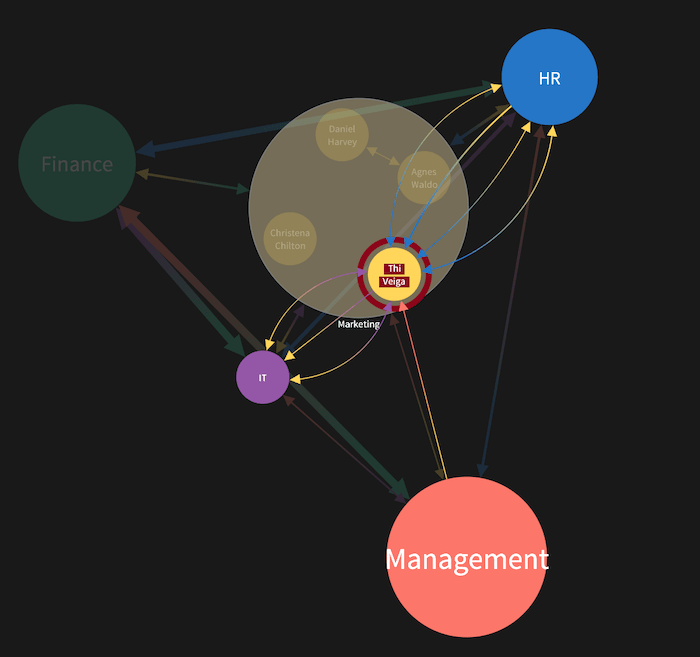
Notice that even though Thi’s part of a combo, I can still see the direct links representing emails to and from other groups. For more information on customizing node groups, see 5 (quirky) ways to style combos for maximum impact.
The links in the chart are aggregated, so they give a nice high-level summary of what’s happening. For a much more granular level, I turn to my timeline view.
Drilling down into event sequences
So far we’ve used the timeline heatmaps to give us a summary view of the data. Let’s take this analysis further and explore individual events in detail.
As I zoom in, I get a detailed breakdown of each individual connection that tells me when emails were sent and received, and by whom.
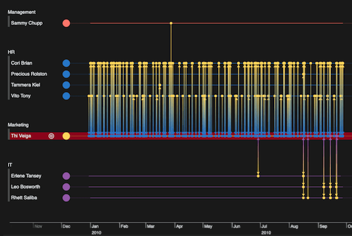
From this I learn that Thi has a lot of communication with Cori Brian and Vito Tony in HR. I can zoom smoothly into the timeline for a more detailed picture.
In KronoGraph, I can zoom into the detail in different ways. I can use my scroll wheel to smoothly bring the details into view. I can also double-click on a particular range in the bars at the top or bottom to zoom to a specific duration. Alternatively, I can marquee zoom to drag across a range and focus on that.
Advanced chart styling with donuts
Our toolkits offer thousands of ways to visualize the same data. Earlier we saw how link widths in our network chart gave us an idea of the volume of communication between departments. Another smart way to do this is through donuts on nodes.
Donuts represent numeric proportions of data on a node. They’re a clever technique for giving users more information about the data underlying the graph view. For best practice advice, see using donut nodes.
Here we’ve used them to give a categorical breakdown of emails between departments.
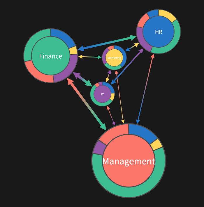
Using our familiar departmental color coding, we can see by the large green segment on the Management node’s donut that they’re more likely to have contact with Finance than any other department. Donuts make it much easier to compare and contrast the levels of inter-departmental communication for each group.
We can add other useful cues to reveal further detail on demand, such as tooltips on individual segments revealing actual numbers of emails. That’s often the kind of thing you’d see on a busy dashboard, but we want to avoid overwhelming the user with too many figures up front. Instead, let users seek out the information they need, exactly when they need it.
Investigating patterns in timelines
Timeline visualization makes powerful analysis methods possible. Here, we’ll focus on pattern of life analysis: a clever technique that helps investigators understand typical behaviors.
When you visualize events over regular time durations (hours of the day, days of the week, etc) similar patterns of behavior emerge. Users can build a valuable picture of what a typical routine looks like for that individual. And once they understand a person’s usual behaviors, they can easily spot anomalies worth investigating further.
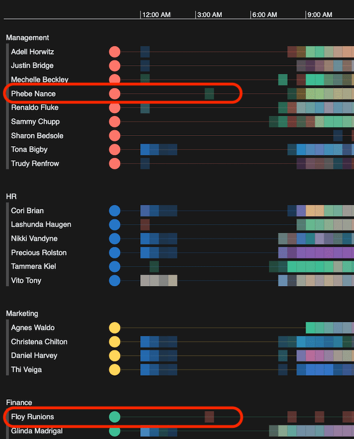
Here I’ve focused on a single day of email communications.
We can see that some people are emailing in the early hours, but then there’s an obvious gap with only 2 people communicating (Floy again!).
Back to our focus on HR’s communication patterns. Again, I can use my zoom options to focus on specific emails. It’s a valuable tool for cyber security analysts who identify suspect alerts, then comb methodically through every piece of communication transmitted, millisecond by millisecond.
Why are there HR emails firing off just after midnight? Are they automated? With every new view of the data, we uncover more insight and reveal potential areas for further investigation.
Build your best visualization tool
Our innovative technology builds interactive visual network analysis tools to complement any data dashboard. Accurate summaries, detail-on-demand and complex analytical capabilities give your users insights that are hard to spot in a static presentation of numbers and bar charts.
Ready to make data visualization an effective part of your dashboard reporting process? Request a free trial.


