
Summary:
This article provides guidance on selecting effective color schemes for data visualization. It covers accessibility, contrast, and meaning to ensure visuals are clear and inclusive. The goal is to help teams use color intentionally to improve understanding rather than distract or mislead.
This blog post explores the vibrant world of color theory for data visualization. It uses both timeline and graph visualization examples to demonstrate how color theory helps you design charts that look good, and make data more compelling.
Colors can make or break your data visualization.
A carefully selected color palette helps you to harness the pre-attentive processing powers of the human brain, and makes insight clearer and easier to find. A badly chosen color palette obscures the information your users need to understand, and makes your data visualization less effective and harder to use.
We’ll use examples from our KeyLines, ReGraph and KronoGraph toolkits throughout.
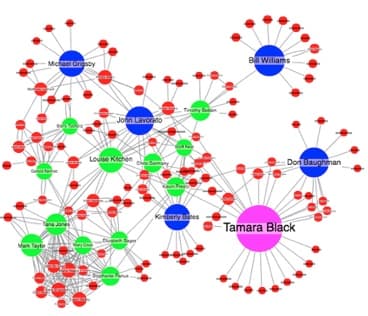
We’re not big fans of the next version, though. It breaks several basic color rules.
About color theory
Color is a highly subjective topic. Reactions to individual colors will vary between people and cultures. Color theory, on the other hand, is an advanced and evidence-based science that can teach us a lot.
For this blog post, we’ll focus on one color theory concept: the HSL model.
HSL breaks color down into three separate channels: hue, saturation and luminance.

HSL model taken from Affinity Designer.
- Hue – is what most people think of as color – red, blue, yellow, green, purple, etc. Each color is plotted on a scale from 0° to 359° to form a color wheel.
- Saturation – is another word for a color’s intensity. The scale measures how different the color looks from neutral gray, which has 0% saturation. Colors with high saturation look brighter and more vivid. In the example above, you can see how saturation increases towards the bottom right corner of the triangle.
- Luminance – describes the spectrum of a hue from dark, based on the amount of black added. In our example above, luminance increases towards the bottom right left of the triangle.
With these three measurable channels, we can start to generate rules for selecting color palettes.
Let’s walk through a step-by-step process for enhancing your visualization with color.
Choosing colors for your visualization
Step 1: Decide what the colors will represent
This may be obvious, but your first step is to decide which aspect of your data you want to represent with color.
In a network of email accounts, for example, each node could have multiple attributes:
- Name
- Email address
- Number of emails sent
- Number of emails received
- Centrality score (measures how well connected the account holder is, used in social network analysis)
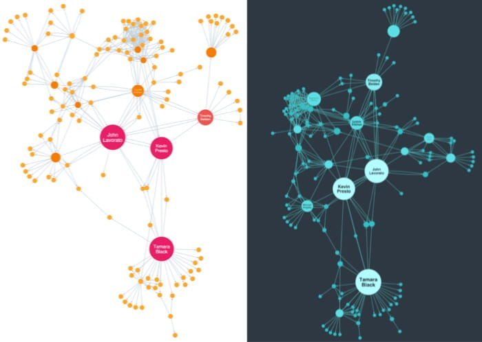
Only one of these attributes can be tied to color. It is up to you to choose one that your users can understand quickly, and will lend itself to a color scale.
We’ve taken a similar approach in this combined network and timeline visualization. It features phone calls between students, with color used to represent which friendship group or cluster each caller belongs to.
In this network and timeline visualization, strong colors represent distinct friendship groups. Read more about timeline visualization use cases.
Don’t forget – you can represent data attributes in many different ways. Color is just one of the tools available. Think about color alongside other options like labeling, glyphs, node sizing, edge weighting, etc.
Step 2: Understand your data scale
Once you’ve chosen an attribute to apply a color palette to, you need to decide which scale to use. Different scales require different types of palette.
The superb Color Brewer tool defines three types of scale:
- Sequential – when data values go from low to high, e.g. centrality score values that range between from 0 to 1.
- Divergent – when data has data points at both ends of the scale, with an important pivot in the middle. For example, the net flow of financial transactions between two accounts.
- Qualitative – when the data does not have an order of magnitude. In our email example, the Name attribute is qualitative data because it doesn’t have a numerical value.
Step 3: Decide how many hues you need
Based on the scale you chose in step 2, you can decide how many hues you need in the palette:
- Sequential data usually requires one hue, using luminance or saturation to define scale. It can be hard to recognize subtle changes in both saturation and luminance, so if you need to represent a scale containing more than five data points, you might want to use two hues.
- Divergent data requires two hues, decreasing in saturation or luminance towards a neutral (usually white, black or gray).
- Qualitative data requires as many hues as values, but remember the limitations of the human brain. Use more than seven or eight colors and the brain struggles to recall what each one represents. Use more than 12 and the brain also struggles to differentiate between them.
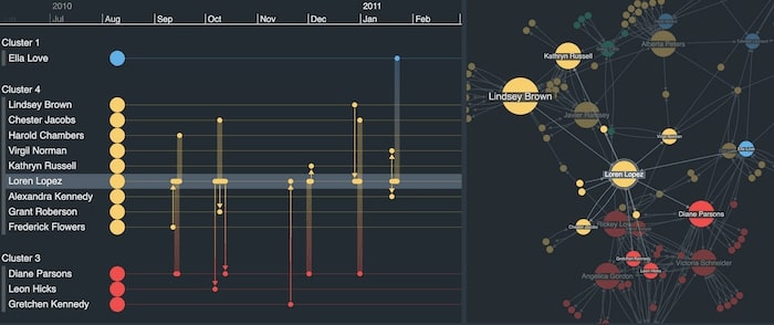
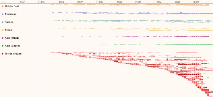
This timeline visualization presents a record of global terrorist activity as a heatmap. Identifying past hotspots or patterns of behavior by terror groups can help security agencies with their ongoing risk analysis. Each region has it’s own distinct hue, and through clever use of saturation, it’s clear at-a-glance which world regions were most affected and when.
Step 4: Be consistent
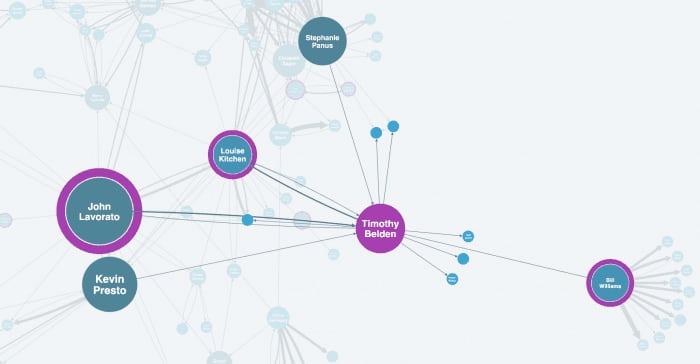
Once you’ve picked your colors and been clear about what they represent, stick with them. A consistent color scheme helps to develop your user’s mental map of the data. Even if you provide slightly different versions of the same data, it’ll feel familiar right away.
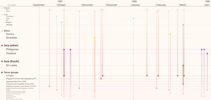
In our risk analysis timeline example, we can zoom in to focus on a specific time duration of interest. The timeline visualization looks different now, with countries and terror groups linked by the events that connect them. Also notice how entities, timelines and gradient links between events match the world region colors we saw in the previous heatmap version.
Step 5: Look for obvious options
Before getting too creative, take a look at your data to see if there’s an obvious set of colors.
Your application or corporate style guide might be a good starting point. If you don’t have one of those, see if there are any color sets your users are likely to understand without a legend.
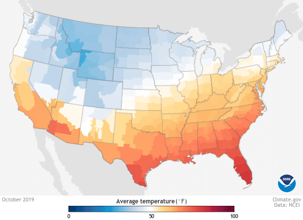
Take this visualization, for example, looking at weather temperatures. Blue and red are readily understood without any explanation, and are easily distinguishable.
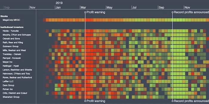
This timeline visualization investigates possible insider trading by institutional investors. Displaying shares as green or red, depending on whether they were bought or sold, is a simple but effective technique that makes the data easier to understand.
Step 6: Create your palette
Now you know how many hues are required, you can do the difficult bit: create a palette.
In most cases, your best option is to use one of the many excellent web resources. ColorBrewer is one of the best for picking schemes for sequential, diverging and qualitative data. Or if you have a starting point in mind, Adobe Color creates palettes from a single color.
There are several groups of colors that work well together. You can identify them by their relative positions on the color wheel:
- Monochromatic – shades of a single hue, ideal for sequential data.
- Analogous colors – colors that sit beside each other on the color wheel. These provide a more varied alternative for sequential data visualization.
- Complementary colors – from opposite sides of the color wheel. When paired with a neutral (e.g. white or gray) these palettes are perfect for diverging data.
- Triadic colors – 3 colors equally spaced around the wheel, which are a good starting point for a qualitative palette.

If you decide not to use one of these tools, you should at least follow this basic advice:
- Only use complementary colors for 2-hue palettes. Users may find palettes with multiple complementary colors confusing.
- Avoid using highly saturated colors. This will overwhelm the chart and make it difficult to find other visual elements, e.g. glyphs or halos. Stick with softer palettes.
- Avoid colors with low saturation and high luminosity. Unless your chart has a dark background, they won’t be easily visible.
- Remember that 1 in 10 men and 1 in 100 women are red-green color blind. Choose colors with different saturation values to make sure users can differentiate between colors regardless of their hue. There are several helpful color blindness online tools to test the accessibility of your visualizations.
Step 7: Convert to RGB
By now you should have a beautiful palette based on color theory for data visualization. Nice work!
There is one final task you need to do: convert your HSL values to RGB.
Colors in Cambridge Intelligence products can be specified in several formats, including the 17 CSS standard named colors, hexadecimal (or shorthand hexadecimal), and RGB. You can do this conversion using an online tool, or programmatically using a simple JavaScript formula.
Color theory for data visualization: next steps
We’ve barely scratched the surface of colors in this post, but it’s enough to get you started. If you want to learn more about using color theory for data visualization, see:
- Five steps to tackle big graph data visualization – and conversely, 5 visualization pitfalls to avoid.
- Color Theory: Brief Guide for Designers – an excellent introduction to color for designers, but equally helpful for developers too.
- Dark theme colors – Material Design guidelines for dark theme.
- Visualization Analysis & Design, by Tamara Munzner – a great introduction to designing useful data visualizations.
- Data Visualisation: A Handbook for Data Driven Design, by Andy Kirk – another great reference for visualization design, covering color and much more. The website is also a great place to find useful resources.
- 10 tools to generate a palette – more ways to create beautiful color palettes.
This color theory for data visualization post was originally published some time ago. It’s still popular, so we’ve updated it with new example visualizations to keep it useful and relevant.
Share:
