
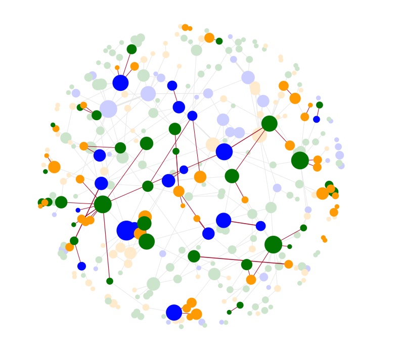
To help users make sense of their complex data, our JavaScript and React graph visualization products offer intuitive ways to group and combine different nodes. We call these groupings combos. They’re great for reducing clutter and organizing your networks into something more manageable.
Insightful user feedback has helped us make combos even better, and there are more improvements to come. This powerful feature will soon move out of Beta development and become an established part of our products.
How you style nodes and links in graph visualizations makes a big difference to your end users’ experience. It’s the same with combos.
To encourage your inner creative genius and showcase some of the most recent combos features, this blog demonstrates five combo styling ideas you’ve probably never thought of.
#1: Make it all about links
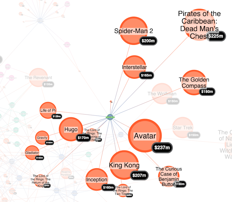
If links inside combos are important to your use case, make them stand out. The ‘lens’ arrangement is great for showing network structure inside combos. Lens puts nodes in a circular grid with connected nodes closer together.
In this example, we’ve minimized the use of color to help focus on important items. Less interesting information is grayed out, and we’ve used color gradients on links between key nodes. Gradients provide a striking visual effect and help users understand flow between nodes better.
Links between nodes don’t have to be straight either. We’ve used a slightly curved offset on links to give a more organic feel to the connections.
#2: Drop the labels
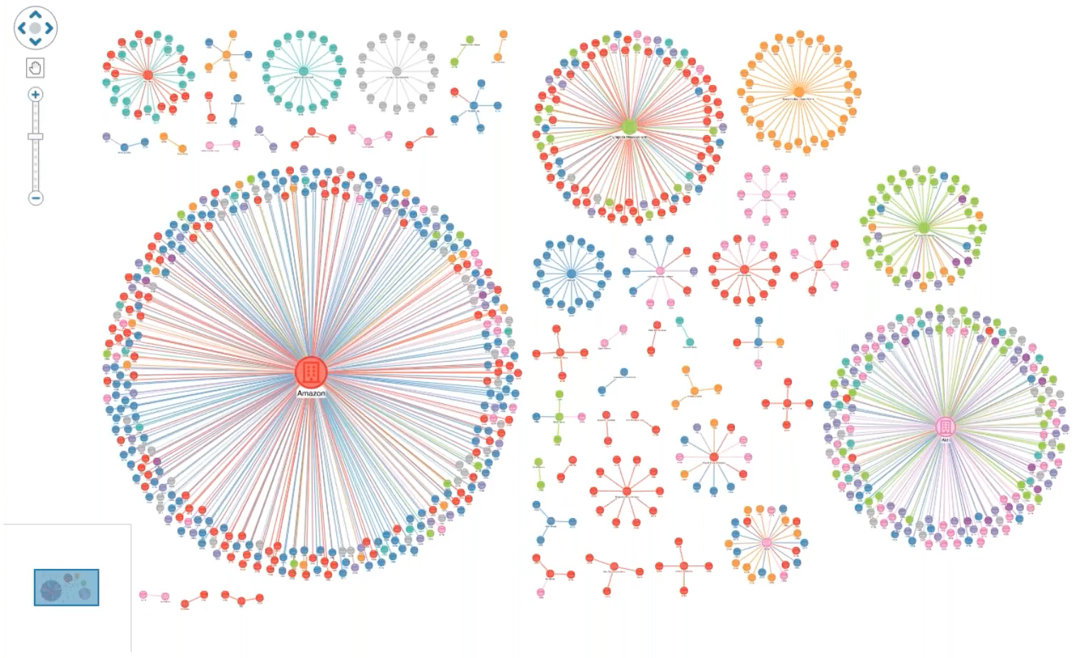
The more data you have, the bigger the combos.
To pack them in tightly, one clever trick is to remove node labels and use the ‘concentric’ arrangement to space them evenly inside the combo. And if you want to reduce clutter even further, hide the links between items inside combos.
In this example, we’re interested in an individual node’s connections to nodes in other combos. Clicking on a node does two things: it reveals a direct connection to another node using a curved offset, and it changes the connected nodes to the default selection color. Both actions make the nodes of interest stand out on the chart.
Even though you can’t see node labels, you still want easy access to information about key nodes. By adding tooltips on hover, your mouse control can display names or other important information. Our graph visualization tools give you all the information you need about hover events and node positions to make this easy.
#3: Add title nodes
Fun fact: when you use the concentric arrangement inside combos, the largest node always appears in the center of the combo.
This means you can add title nodes to your combos. Give them a greater enlargement factor and remove the default combo label and you have an eye-catching title effect. Adding a font icon also means you can choose exactly the right graphic to represent your data.
You can bring pre-combined data into the chart without having to load it first and then combine it. You can also merge data into an existing node or combo using simple code that includes the parent ID property. Here’s how you’d merge a giant title node into an existing combo:
chart.merge({
id: "myTitleNodeId",
type: "node",
parentId: "parentComboId",
c: "transparent",
e: 5,
t: "MY TITLE"
},()=>{
chart.combo().arrange("parentComboId", {name: "concentric"});
});
#4: Add draggable interactions
There are many scenarios where dragging nodes from one combo to another is important. Think employees moving departments, suspects switching to a new terrorist cell, or IT equipment transferring to a new part of a network. If it’s meaningful in your application, you can use drag events to create some fantastic interactive effects.
Here, we’re using a grey highlight color on the open combo backgrounds so it’s immediately clear which combos we’re dragging from and to. Intuitively, you know that releasing the dragged node will rezone it in the new combo. To accommodate the different number of nodes in each combo, the contents of each is automatically arranged.
The events engine powering every user interaction provides vast scope for customizing behaviors like dragging.
Combo border styles can convey information about the nature of the grouped nodes. Dashed borders helps signify that combos are flexible, so data can move in and out. It’s a good match for our IT network of virtual hosts, where a physical boundary doesn’t exist. Again, we’ve used curved links to give a feel for information ‘flow’ from one zone to another.
#5: Have fun!
Our graph visualization products are packed with drawing features, so let your imagination run wild. They include glyphs, font icons, SVGs, donuts and, of course, emojis.
This dataset from the London Fire Brigade in the UK shows incidents involving animals, linked to the area of London where the incident occurred. The incidents are grouped by animal type, and we’ve used an emoji to summarize each closed combo. Don’t use words if a picture will do a much better job!
Find out more
These are just five examples of how to style our unique graph visualization combos feature for maximum impact. We hope they’ve given you some ideas on how to bring your connected data to life with combos.
If you’ve found an innovative approach that we haven’t covered, contact us – we’d love to hear about it. Or if you’re not using our visualization products yet, request a free trial.
Share:
