
In this post, I show how easy it is to design a visual supply chain that’s customized to your users’ needs, packed with critical information, and looks beautiful. If you want the full code for any of the examples you see, just get in touch and I’ll be happy to share.
The importance of supply chain customization
Every supply chain use case – from retail and manufacturing to government and pharmaceuticals – is different. Every organization needs a uniquely-designed supply network visualization to suit their specific challenges and requirements. One-size-fits-all doesn’t work.
When users recognize the visual cues, real-world icons and familiar logos that mirror their supply chain, it’s easier to spot what’s going on in the network. They get a much better user experience and don’t waste time trying to understand a confusing generic flowchart.
But creating beautiful and informative nodes that reveal all the information users need is a complex coding challenge.
Our data visualization toolkits offer a fully-flexible approach so that you can easily visualize and style every connection in your most complex supply chains. The graph and timeline visualization SDKs work seamlessly with other supply chain management tools to keep every stage of the chain visible, fast, reliable and secure. And with basic code you can turn a simple node into something much more powerful and relevant.
KeyLines and ReGraph’s extensive label styling APIs makes nodes better-looking and more information-rich than ever before.
We’ve blogged before about how to customize the end-to-end visibility of a supply chain visualization and reveal key insights (see Supply chain network visualization: the spinach story).
This time I’ll use ReGraph – our graph visualization toolkit for React developers – to focus on customization at the node level, but you can achieve everything you see here using KeyLines, our plain JavaScript SDK.
You want every item in your visual supply chain to communicate important contextual information at the time it’s needed most. I’ll show how to use multiple labels together in one node, give examples from the extensive label styling API, and demonstrate labels as dynamic status indicators.
Representing a distribution network with stylish nodes
I want to create useful, informative nodes that represent the distribution stages of a supply chain on a live dashboard. They need to be easy to maintain and flexible so that we can easily make changes in future. The nodes need to show:
- The vehicle type
- The vehicle’s current status
- The time it left the source location
- The time it’s expected at its final destination
- An option to provide more information
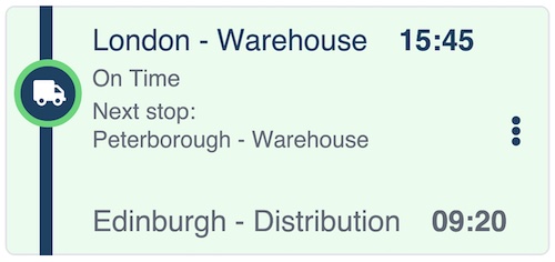
That’s a lot of detail to show on one node, but with smart labeling, I create something clear and easy to interpret:
The basic code to create the node is straightforward:
 multilabelNode: {
    color: '#ebfcf0',
    border: {
      radius: 6,
      color: "#e5e7eb",
      width: 1,
    },
    shape: {
      height: 150,
      width: 330,
    },
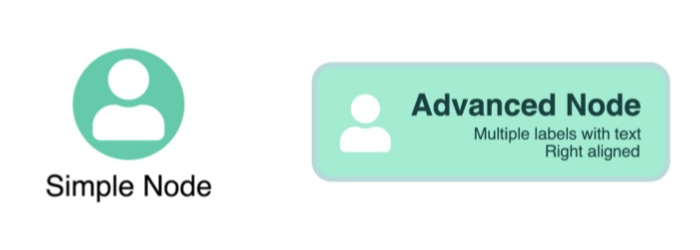
The multiple labels are harder to achieve, right? Not really. Let’s break down the elements on the node and look at some in more detail.
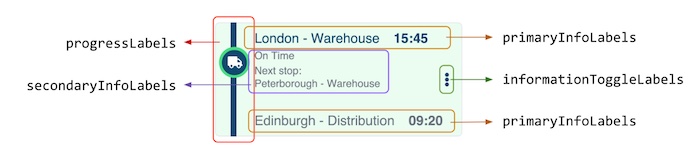
Each node label type belongs to a different semantic layer, and that’s how I refer to them in the code:
AdvancedNode: {
      ...nodeOptions,
      label: [
            // Vehicle progress bar
            ...progressLabels
            // Primary info
            ...primaryInfoLabels
            // Secondary info
            ...secondaryInfoLabels
            // Extra information toggle
            ...informationToggleLabels
      ],
},
For the first piece of primary info – the shipment’s destination details – I can use node label properties to style the label with precision:
// Primary info
      {
        color: '#0c4a6e',
        backgroundColor: 'transparent',
        position: { vertical: 10, horizontal: 50 },
        fontSize: 18,
        text: `London - Warehouse`,
      },
      {
        color: '#0c4a6e',
        backgroundColor: 'transparent',
        position: { vertical: 'inherit' },
        margin: '0 15',
        fontSize: 18,
        text: `15:45`,
        bold: true,
      },
The ‘position’ values mean you can put the label exactly where you want. The ‘inherit’ value puts the ‘15:45’ departure time on the same line as the previous ‘London – Warehouse’ label.
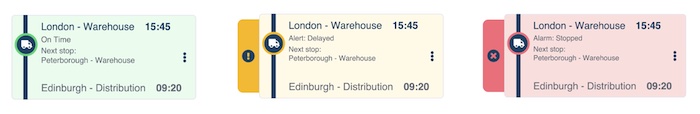
Reusable node styles with minimal code
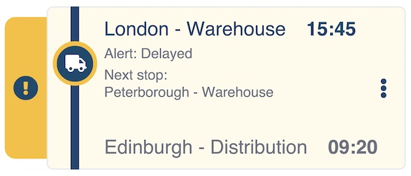
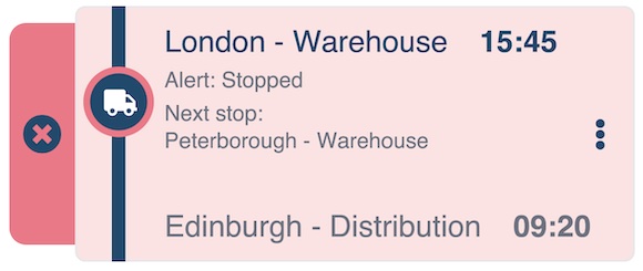
I want to create new versions of our distribution supply chain node that include alerts. Visual warnings are important throughout the supply chain network to notify users of everything from low stock inventories to transport bottlenecks. They need to be instantly recognizable and set at the right alert level – amber for warnings and red for emergencies – and give background information about the issue.
We don’t need to start from scratch because we already have the basic framework for our warning nodes. As you build the node label styles for your visual supply chain, you’ll find that a lot of information – such as size, font, background color and position – is repeated. The best way to make style creation easier is to extract those values into variables that labels can reuse, for example:
const height = 150;
const width = 330;
const primaryColor = '#0c4a6e';
const secondaryColor = '#6b7280';
const backgroundColor = '#fffbeb';
const accentColor = '#fbbf24';
const primaryFontSize = 18;
const secondaryFontSize = 13;
let vehicleProgress = 30;
I’ve also added a ‘vehicleProgress’ variable to make it easy to change the position of the truck icon (more on that later).
Now I just need to substitute the repeated values in the existing code so that future style updates are easy to make. (Remember, the full code for these examples is available on request).
Here’s my warning tab on the left side of the node, using an eye-catching secondary color. The secondary label confirms that the truck is currently delayed.
It’s then a simple case of reusing those variables again to create another node style, this time with a more serious warning:
Powerful animations and interactions
When you customize node labels in your visual supply chain with dynamic elements, you bring them to life. They’re no longer just highly-informative labels: they’re important elements to help users take action fast to maintain an efficient network. They could be buttons on a node to remove a canceled order, or a link to a map application showing the route taken by a delivery driver.
In this example, I’ll animate the delivery truck so it moves along the node to represent progress. It’s easily done with the ‘vehicleProgress’ variable:
  label: [
        // Vehicle progress bar
        {
          color: 'transparent',
          backgroundColor: primaryColor,
          position: { horizontal: 21 },
          minHeight: 150, // adjusting the height to the label ot match the node borders exactly
          text: ' ', // empty space as we need some text in order for the label to render
        },
        {
          color: 'white',
          backgroundColor: primaryColor,
          border: {
            color: accentColor,
            radius: 30,
          },
          position: { vertical: 5 + vehicleProgress, horizontal: 4 },
          fontSize: 25,
          fontIcon: { text: 'fa-truck' },
          minHeight: 20,
          minWidth: 20,
          padding: '8 6 6 8',
        },
You could adapt this for many other node styles in your visual supply chain to represent everything from rising stock levels to reduced manufacturing resources.
Customize nodes the smart way
Now that we’re familiar with semantic layers and have identified common values in our customized nodes, we can go one step further: create a separate function that’ll make advanced nodes for us.
The function creates a customized node based on its alert state and the progress of the delivery vehicle. Here’s an extract:
function createNode(id, type, vehicleProgress) {
  const height = 150;
  const width = 330;
  const primaryColor = '#0c4a6e';
  const secondaryColor = '#6b7280';
  const primaryFonrSize = 18;
  const secondaryFontSize = 13;
  const colorThemes = {
    normal: {
      accentColor: '#4ade80',
      backgroundColor: '#ebfcf0',
    },
    alert: {
      accentColor: '#fbbf24',
      backgroundColor: '#fffbeb',
    },
    error: {=
      accentColor: '#fb7185',
      backgroundColor: '#fee2e2',
    },
  };
The ‘createNode’ function takes a node id, the alert state of the node – normal, alert or error – and the vehicle progress value and decides how to position the truck label. Other code helps us map the node colors based on type, and the warning type based on the current ‘normal’, ‘alert’ or ‘error’ status. Now, we can call the function as many times as we want to create three different node types:
const nodes = {
     ...createNode('node1', 'normal', 30),
     ...createNode('node2', 'alert', 50),
     ...createNode('node3', 'error', 70)}
)
Visualize your supply chain in style
With KeyLines and ReGraph’s advanced level of node styling you can also progressively display label details as you zoom into nodes, and add interactive elements to make the graph an integral part of your users’ workflows. It means you can realize any product design vision without compromising on the perfect look and feel, and make your visual supply chain tool stand out from the competition.
Don’t forget – the code for these examples is available on demand. And if you’re a current ReGraph or KeyLines user who wants a free node customization session with our experts, email us today.
Share:
