
Summary: This article shows how to visualize large, highly connected networks more effectively by combining two layout techniques. The organic layout helps users explore overall structure and identify central hubs, while the sequential layout is better for examining specific paths and relationships within a sub-graph. By switching between layouts – and using tools like filtering, ordering, stacking and animated transitions – analysts can move from big-picture understanding to clear, focused investigation without losing context.
We’re all about connected networks here at Cambridge Intelligence, and there’s no more famous network than the internet itself. But highly connected networks present data visualization challenges. In this blog, we’ll map out the shape of a small portion of the internet with a network chart, and you’ll see how two very different layouts from our graph visualization toolkits – organic and sequential – team up to give a great user experience for large network visualization.
Internet routing 101
The internet is not one single homogeneous network – it’s a network of networks, or Autonomous Systems (AS).
When you send a message from your computer to a server elsewhere in the world, the IP packets of your communication might first pass to your home router, which in turn lives within an AS operated by your Internet Service Provider (ISP).
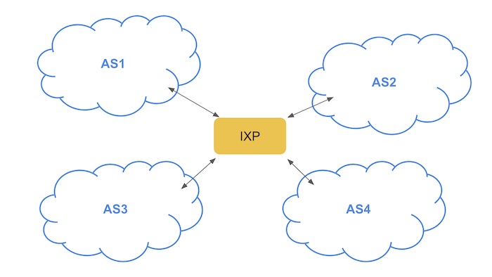
From there, it might hop between multiple routers in that AS until it reaches an ‘edge router’ or ‘border router’. Thanks to a system called the Border Gateway Protocol, these routers pass your message to subsequent autonomous systems until it reaches its destination. If you’re operating a network, it’s in your interest to connect to others – and a common way to do this is by ‘peering’ with others, often via an Internet Exchange Point (IXP).
The data model
So, in a nutshell, networks (Autonomous Systems) connect to each other via IXPs. The good folks at PeeringDB maintain a database of these relationships, and for this blog post I’m going to use their API to explore part of the Internet as a graph. We’ll keep the model simple for now and just have two types of nodes: Autonomous Systems (blue), and IXPs (yellow).
A first look at our large network visualization data
I built a simple demo application which sends queries to the PeeringDB API, and converts the results into a graph visualization using our KeyLines toolkit for JavaScript developers. I start by querying the network which my home router is connected to, the British Telecom (BT) network.
BT currently connects to 23 IXPs – here’s what that looks like in my app:
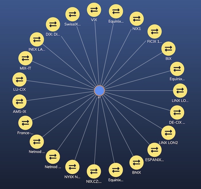
Visualizing my home router’s connections to BT exchange points
I’ve used a simple color scheme with a font icon for IXPs, and a gradient background to add a bit of depth to the color palette. For more on designing your color scheme, check out Choosing colors for your data visualization
My interaction model is also simple – double-clicking a node queries the PeeringDB API and brings back the IXPs or peer networks it’s connected to.
For obvious reasons, I won’t try to bring the entire internet into my browser! I’d like to build up the network a bit so I have a realistic amount of data to explore the different layout options our toolkits provide. So I’ll add some automation to keep expanding a random node in the network, and leave it running for a few minutes.
Here’s what it looks like after just ten queries:
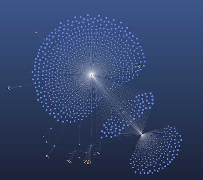
Straight away, we can see that this graph is going to get big! Some of the IXPs in the database provide peering for hundreds of networks, creating a ‘starburst’ visualization. However, before we start looking for effective ways to deal with starbursts let’s allow the network to grow a bit more. Many of those blue AS nodes will probably connect to other IXPs, so we wouldn’t expect all these starbursts to remain.
How the organic layout handles large network visualization
Our toolkits provide a selection of powerful automatic graph layouts for untangling complex networks.
I started out using the organic layout. It comes with neat adaptive behaviors that give nice animated transitions from one API query to the next, so I don’t lose context. It’s also extremely scalable – our fastest performing layout for a large network visualization.
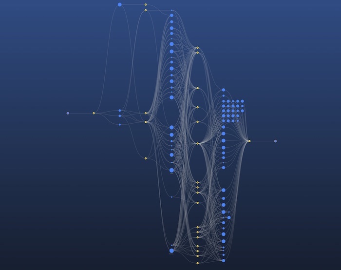
After 40,000 nodes and links have been added, I pause the loading to take stock. Here’s what it looks like now:
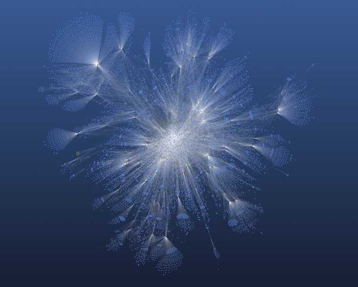
It’s certainly pretty, and I make a mental note to use it as wallpaper for my laptop. Giant network visualizations like this are always impressive.
A top tip for esthetics when your networks get this big is to add an alpha value to your link color so they are slightly transparent. This means that when you get a dense area of connections, the visual effect will be to make the links in that area brighter and give a delicate cobweb-like appearance to the chart.
So it looks great – but is it useful?
We usually warn against loading too much into a single graph visualization but this bird’s eye view is still interesting for initial exploration.
We can see the high-level structure emerging – a central, highly-connected region surrounded by outer branches which are less well-connected. At the edges, the graph is tree-like, resulting in potential pinch points where, if a critical router goes down, a large number of downstream networks could be disconnected from the wider web.
At the center, the graph is a highly connected hairball with massive redundancy in pathways. I’m pleased to see my BT network is relatively close to the center of the graph.
Zooming in to the dense region reveals the names of some of the high throughput networks and IXPs that form the backbone of the internet:
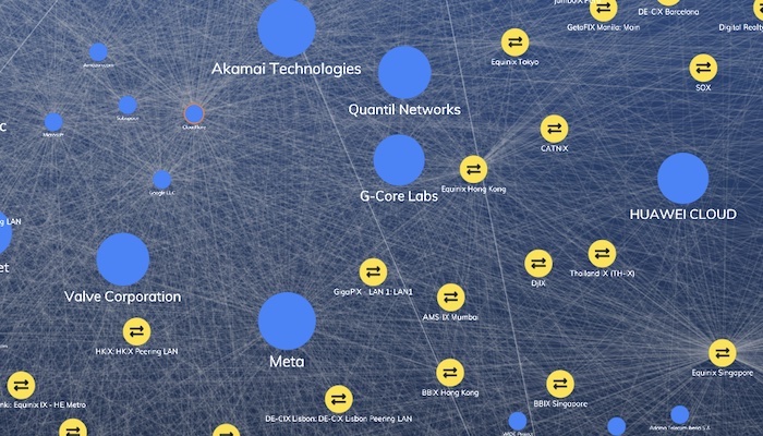
I’ve sized nodes based on their published level of traffic in PeeringDB. Big global networks and IXPs like Equinix appear frequently in this central core.
Some nodes, such as Cloudflare, Microsoft and Google LLC (the cluster of nodes in the top left) don’t publish their traffic level to PeeringDB so they appear deceptively small. The beauty of graph analysis and the clever organic layout algorithm is that these nodes get brought to the center of the graph, reflecting their importance, even though they don’t publish any information on their size to the database.
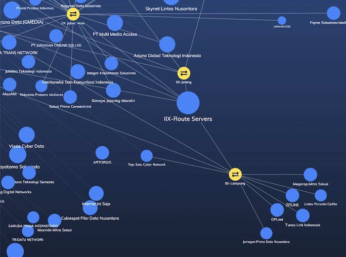
Further out in our large network visualization you’ll find networks which are removed from the central core, such as this group of local networks in Indonesia. If your internet service is provided by one of these networks, you’re relying on a small number of providers to connect you to the rest of the internet.
The sequential layout for distinct data tiers
Fun as it is to explore the big dataset, an analyst in the real-world would simplify this network down to a smaller subset (or sub-graph).
There are many ways to do this. I’ve chosen to select two nodes, and ask KeyLines for the shortest paths – the route with the smallest number of links – between them.
My approach is this: when the user selects a pair of nodes, calculate the shortest paths between them, and filter everything that’s not on one of these paths out of the dataset. Once we’ve done this, we have an alternative layout option available to us – the sequential layout.
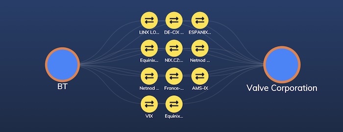
Here’s a simple example – the paths between my BT network, and Valve Corporation’s gaming network.
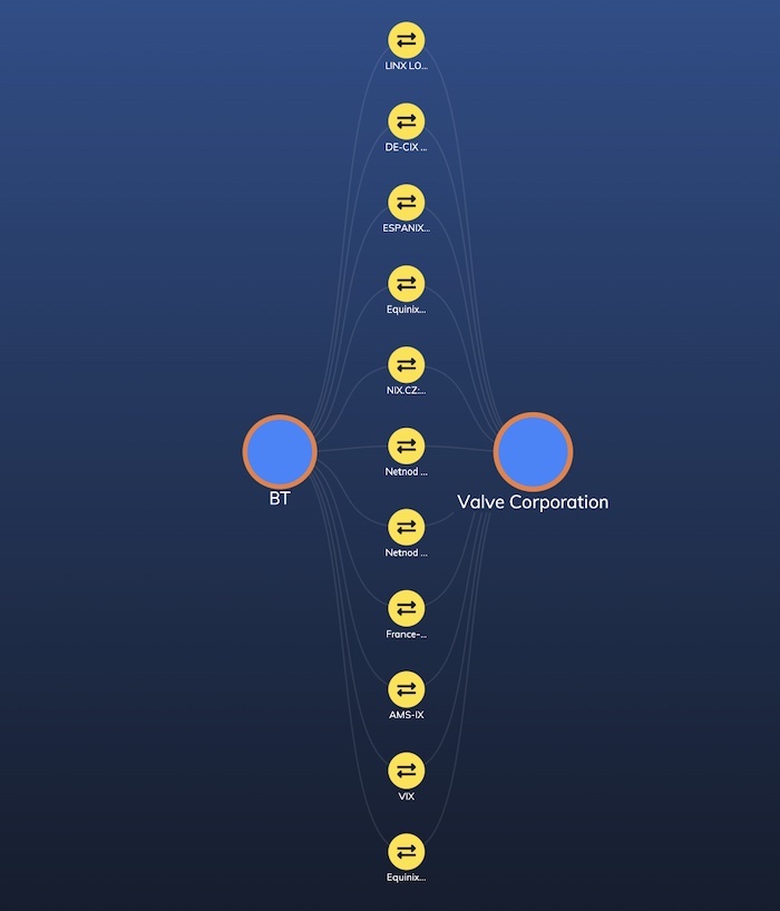
Both BT and Valve are well connected – they’re peering through a number of IXPs to keep well connected to the rest of the world.
This kind of sequential view is great for seeing the sequence of steps from one node to another – but it does suffer from some scaling issues. Two recent enhancements to our sequential layout can help us out here.
First, we’ll use the orderBy property to sort nodes in the layout. Here, I’m looking at routes between my BT network at the top, and one of those peripheral nodes from the big network in Indonesia at the bottom. I’ve sorted the layout from left to right by the traffic capacity claimed by the network operators.
It doesn’t reduce the clutter on screen, but it does help you decide where to look first.
Secondly, we can use sequential layout’s stacking feature to collect similar nodes together in manageable grids. Here’s how my Valve Corporation example looks with stacking turned on:
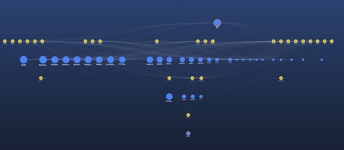
Much more compact! Combining stacking and ordering gives us beautiful charts, such as this representation of the path from a small network in Brazil to one in Indonesia:
And finally, to help a user understand what’s happening, it can be helpful to add an animated transition between the organic and sequential views. Here’s what it looks like when a pair of nodes is selected.
There’s so much more we could do with this dataset but I hope I’ve given you some inspiration for dealing with large network visualization. In summary:
- Use organic layout for big graphs, but switch to a more regular layout like sequential to show specific detail of a subgraph, such as shortest paths or key relationships.
- To keep the sequential layout usable, try a combination of animation, filtering, ordering and stacking.
Large network visualization for your users
We’ve only scratched the surface of the power of graph visualization tools like KeyLines and ReGraph when looking at network routing. But if you’ve been inspired by what you’ve seen, and want to take the next step yourself, why not contact us for a free trial?
Share:
