
In this blog post, I take a look at what makes the updated organic layout in our toolkits the most powerful, high-performing layout yet.
The fundamental aim of graph visualization is to help users understand their connected data and find actionable insight. It’s the most effective way to bring your data to life, revealing patterns and connections that’d be difficult to find in millions of rows of raw data.
At the heart of graph visualization is an efficient layout that untangles complex networks fast.
Choosing the right layout for your data
A poor layout keeps patterns and relationships hidden from all but the most persistent user. But a good layout allows even the most inexperienced user to tell a story about their data before they start their detailed analysis. That story will most likely evolve as they deepen their exploration, but knowing where to start saves time and makes their job much easier.
In our toolkit technology we’ve designed a range of automated graph layouts, each one designed to highlight different aspects of your data.
Users commonly ask “which layout is right for my data?” Every layout has been developed with quality and performance in mind, so which one should you choose?
The answer is (almost always) organic layout.
Why choose organic layout?
Organic layout provides great layout quality and high performance. In some visualization apps there’s often a trade-off between the two: you get an intuitive arrangement but it takes forever to load, or you get a fast display but the layout makes little rational sense.
We’ve spent years developing an option that delivers on both counts.
Let’s take a closer look at what organic layout has to offer.
High quality visualizations guaranteed
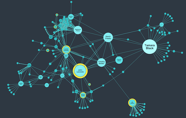
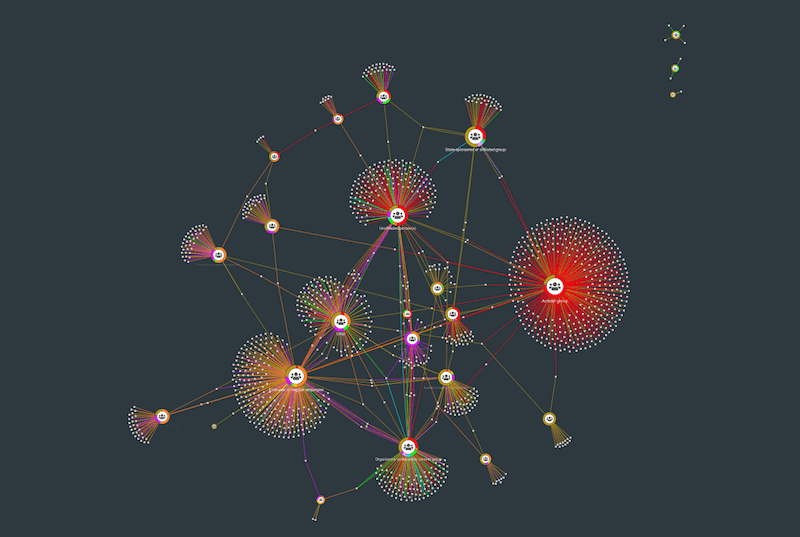
Organic layout is force-directed graph layout, so physical forces determine where nodes are positioned relative to each other. There’s also a clever packing algorithm that arranges multiple components in a circular pattern with the largest ones in the center, giving a more natural organic feel (hence the name!).
We’ve optimized these behaviors to give the best possible results and make sure users can identify patterns more easily.
It’s important to see the full picture, so we’ve reduced the risk of overlapping chart items to make sure every element is easy to spot. Too much whitespace can be distracting, so we’ve minimized this to give a compact network view. There’s also clear distance between different connected components, making sure separate clusters stand out.
The result is a layout that not only looks great, but also reveals the underlying structure of the data.
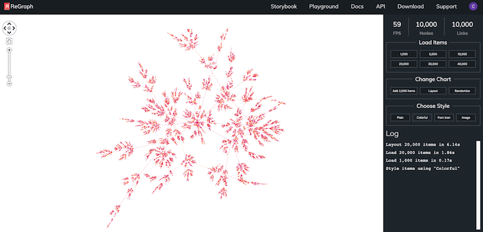
Our best performance yet
Benchmark tests show that organic layout is typically 5-10 times faster than our standard layout, with the largest performance improvements seen in networks of 1,000+ nodes and links.
Of course, even with superior performance, large networks can take a little time to load. When that happens, it’s best UX practice to make users aware that something’s happening under the hood. That’s why organic layout now has added support for incremental progress event reporting.
Using a preloader or progress bar helps to manage user expectations. No matter how short the wait time, by indicating how much of the layout process is complete, you’re effectively reducing uncertainty and increasing trust in your application.
Adapting to changes the smart way
One of the (many) challenges with graph visualization is keeping track of your data as you update the network.
Every time you interact with the chart – filtering data, resizing nodes or running time bar animations – node position changes are inevitable. So what’s the best way to handle that?
One approach is simply to rerun the layout every time a change is made. This delivers a great result and is useful during the early stages of analysis where each re-run may present a slightly different perspective of the data. But it creates a lot of extra movement of chart items. If users have already established a network shape they want to work with, it may cause them to lose their mental map of the data. Re-establishing that context is time consuming and makes interpreting the data harder.
Our solution to this is to rely on built-in adaptive graph layout behaviors. We’ve worked hard at optimizing these in our organic layout, making sure movements in the graph are minimal whenever a change is made. These incremental iterations are subtle but effective: the layout adapts intuitively to accommodate chart updates so it’s easier for users to keep track of their data.
Get started with graph visualization
High-quality layouts are just one of the reasons why building an application with KeyLines, our graph visualization SDK for JavaScript developers or ReGraph, our graph visualization toolkit for React developers, is the right choice.
Don’t just take our word for it – sign up for an evaluation account and start exploring your connected data.
Share:
