FREE: The ultimate guide to graph visualization
Explore proven strategies for building successful graph visualization applications.
Connected data is all around us – financial transactions, communications records, and IT networks, to name a few. One of the primary benefits of a graph visualization application is that it helps you reveal the unexpected connections in complex data that your business needs to understand.
From Fortune 500 corporations to governments and small businesses, we’ve helped over 300 customers develop their own powerful graph visualization applications. Our graph visualization software can visualize data from virtually any source and turn it into valuable insight.
In this post we’ll demonstrate the other benefits of graph visualization, and why it should be a core part of your web application.
Graph visualization, sometimes called ‘network visualization’ or ‘link analysis’, is the process of visually presenting networks of connected entities using a node-link model. It enables analysts to intuitively identify trends, outliers and patterns of behavior, helping them make the right decisions, fast.
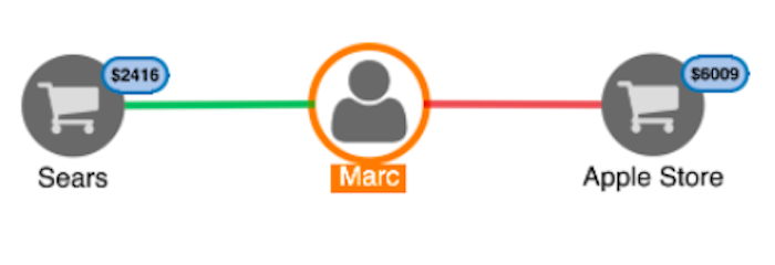
Visualizing data in this way is sometimes overlooked or viewed as a non-essential. But when you understand the benefits of graph visualization, you’ll see it as a must-have and not a nice-to-have. It’s the most effective way to uncover, explore, understand and communicate insight from complex data.
Let’s see how.
There are many ways to present data to your users, but the node-link structure instantly makes sense, even to people who’ve never worked with graphs before.
This chart, for example, represents a network of businesses and people associated with Donald Trump. Even someone with no data analysis experience can follow the connections and pick out interesting patterns.
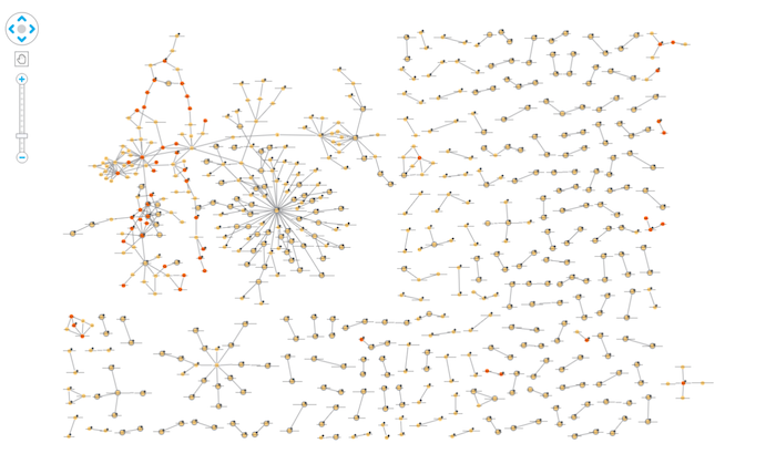
With a graph visualization application, it’s easy to explore relationships and uncover trends, insights and network structures in graph data. This means your analyst tools can be used by the widest possible audience.
The node-link model of graph visualization can be applied to pretty much any dataset. As long as there’s an interesting relationship in your data somewhere, you’ll find value in a graph visualization application.
Here, we’ve created the KeyLines SDK to build a graph visualization application, integrated with the GitHub API. The graph shows us Neo4j’s Github project – who builds and maintains the code – data that wouldn’t conventionally be presented as a graph. See our Graphing GitHub blog post for more on how we did this.
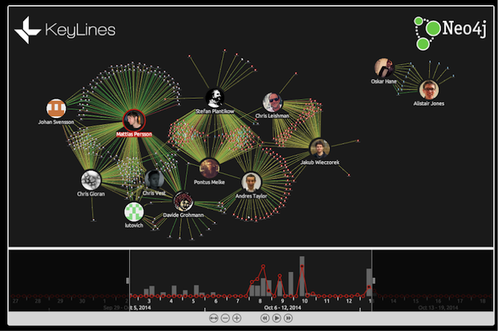
Whether your users need to visualize email communication, credit card fraud, IT networks, or data that isn’t inherently ‘graphy’ – graph visualization can help. It brings a new dimension to any dataset, revealing insight that would otherwise go undiscovered.
Our brains struggle with processing data, but are great at spotting patterns if the data is presented in a tangible format. Armed with visualizations, we can spot trends and outliers very effectively.
For example, in this chart – representing email data collected by US federal investigators during the Enron collapse – we can quickly identify patterns in the network. Influential nodes are sized larger, making them stand out instantly, and clusters of closely connected nodes are easy to spot.
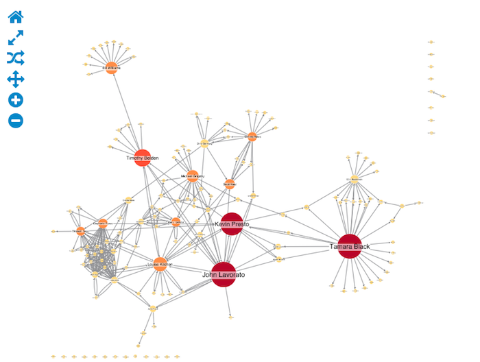
Integrating graph visualization into your web application will help your users gain insight into their data quickly. Analysts often need to make fast decisions, based on a deep understanding of data. Graph visualization applications empower them to do that with confidence.
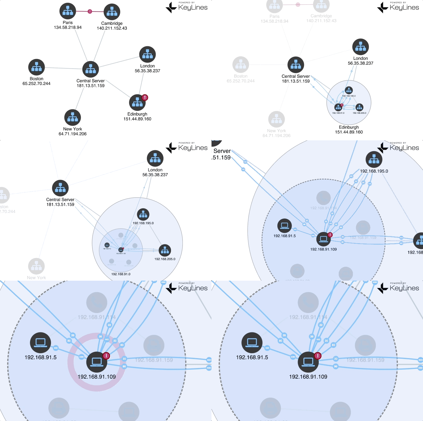
Exploring network data interactively allows users to gain deeper knowledge, understand context and ask more questions, compared to static visualization.
The example below uses KeyLines to show a corporation’s IT network. Exploring the data interactively and incrementally uncovers insight that would be impossible to see in a flat, tabular format without losing context or detail.
Now that we’ve shown some of the high-level benefits of graph visualization you’re probably ready to give it a go. There are plenty of reasons why our graph visualization toolkit technology is the right choice.
Ready to create your own graph visualization application? Sign up for a free trial.