
Summary:
Hairballs happen when we try to visualize everything in a richly connected graph. The chart becomes so dense that no meaningful patterns are visible. The solution isn’t to add more compute – it’s to design for the user workflow, not the raw data model. By focusing on the entities analysts care about (e.g. people) and deriving relationships or metrics (e.g., betweenness centrality), we reveal the key structures and suspicious patterns hidden inside the mess. Hairballs are healthy in the data – just don’t expose them directly to your users.
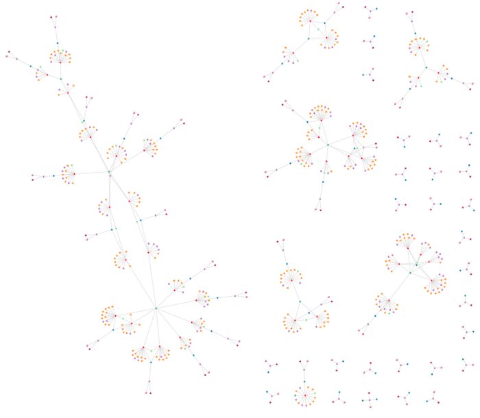
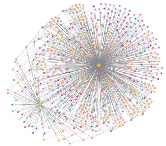
This is the first of three blog posts on common graph visualization challenges.
Part 2 looks at ‘the snowstorm‘, and part 3 explores ‘the starburst‘. First we’ll focus on a problem that affects many large datasets: ‘the hairball’.
A familiar graph visualization problem
A typical venture into the world of graph visualization goes like this…
You’ve invested in the latest and greatest big data tech stack. You’ve curated data sources brimming with insights to empower your end users’ investigations and analysis. They just need a visualization tool to bring it to life, revealing beautiful interconnected structures that blur the boundaries between data science and art.
So you evaluate a technology like our graph visualization SDKs, load your data, and wait with bated breath for the results.
And when the chart loads, there’s a strong chance you’ll see one of three common problems:
- The hairball – with connections that are so dense, they can’t be usefully visualized.
- The snowstorm – packed with many small, separate components where nothing stands out.
- The starburst – where a single node dominates the chart.
These will all hinder your users. The difference between success and failure hinges on what you do next.
Do you accept that this is the nature of your data, advise your users to boost their hardware and leave them to it? Or do you spend hours trying to understand the root causes of the problems in your data and designing a visual investigation tool that really works? Why do these beasts appear? What aspects of the underlying data give rise to them? And what can you do about it when the underlying data is not yours to control?
We’ll look at snowstorms and starbursts in future blog posts. For now, we’ll examine the infamous hairball.
Where do hairballs come from?
It’s ironic that the desire to connect information together – the heart of all things graph – is ultimately responsible for these issues. Let’s see how the hairball problem builds up.
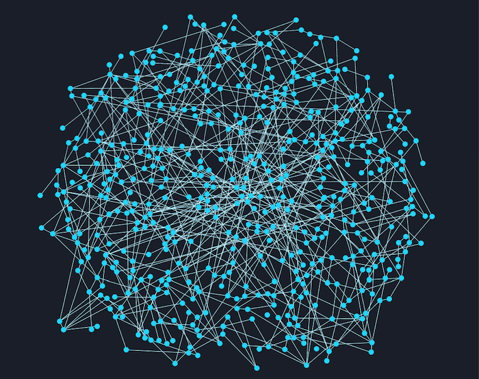
We’ll take an example from the world of vehicle insurance claims fraud, and imagine building a knowledge graph from scratch. We start with a database of people – our insurance policyholders, named drivers, witnesses, etc.
As you can see, visualizing the node/link structure is uninspiring.
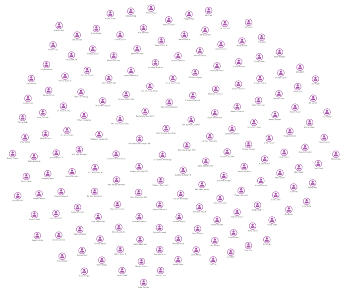
Now some of these people own insurance policies, so the next step is to add those policies to our knowledge graph.
This view tells us something. We’ve added some custom styling of our graph, color-coding the nodes by type. We can spot which people have policies, but it’s hardly justification for a knowledge graph project. Let’s push on.
People have phone numbers and addresses; policies cover vehicles and have claims logged against them. Let’s see what happens when we add those details.
Our organic graph layout highlights some structures. But our quest for knowledge continues.
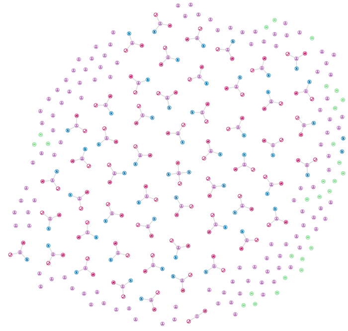
Next, we add records for the types of damage claimed by policyholders, and the details of the mechanics who fixed those damages. The visualization starts to take shape.
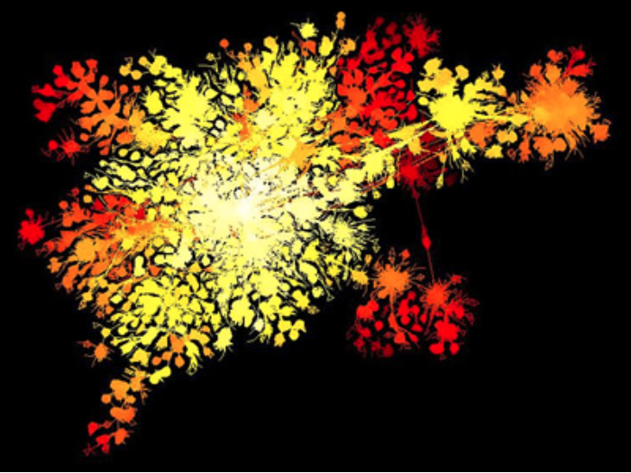
And finally we add nodes representing the country where claimants live, or where their vehicles are registered.
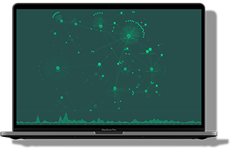
And this is where it all goes wrong.
You can see the problem. This dataset is exactly what you want from an underlying knowledge graph. It’s rich and well connected, and it answers questions like “Are there patterns of insurance fraud that vary by country?” and “How far on average do people travel to have their cars fixed?”. But as a graph visualization, the result is near to useless. Quick and easy analysis is impossible.
We have a hairball.
The solution: focus on the workflow, not the data model
Of all the insurance claim charts above, which one do you think is the best graph visualization?
It’s a trick question of course, although most people will pick the one with the most detail just before the hairball appears.
The smart response is: “None of these visualizations is useful, because you haven’t told me what the end user is trying to do.”
There are many ways to combat hairballs, including graph filtering and node and link aggregation, but I’d recommend that you don’t try to visualize everything in your underlying knowledge graph. Instead, start working backwards from the job your end users need to get done.
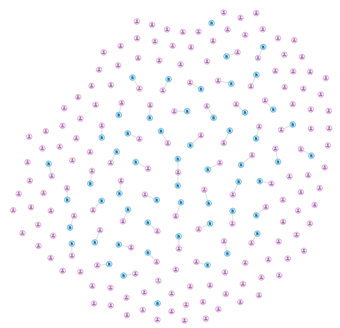
In this use case, our goal is to identify suspicious individuals with unusual levels of connectivity. All we really care about is the people nodes – everything else is metadata.
Let’s see what happens if we create a new visual representation that is derived from our raw graph as follows:
- Represent people as nodes.
- Put links between two people who are connected via a path that includes an insurance claim (graph databases are really good at this kind of query).
- Size the people nodes based on their betweenness centrality – one of our powerful social network analysis centrality algorithms.
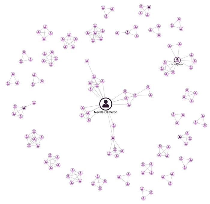
The result is much clearer. We can immediately see a few interesting individuals who were hidden in the original hairball, focusing the user and leaving them to decide whether further investigation is needed.
By remodeling the data, we’ve created a more effective graph visualization. The original hairball revealed the links, but simplifying the data gives users something practical and effective.
Or, in other words, hairballs in your knowledge graph are a good thing. Just don’t let them anywhere near your UI.
Try it for yourself
If you have the data, our visualization toolkits can bring it to life. Request a free trial of our graph and timeline visualization SDKs to get started.
FREE: Start your KeyLines trial today
Visualize your data! Request full access to our KeyLines SDK, demos and live-coding playground.
Share:
