
In this blog post we’ll show you how quick and easy it is to integrate JupyterLab and ReGraph to create beautiful Python graph visualization tools.
Blog post contents
Data scientists often work with large and difficult datasets. To find insight in their complex connected data, they need the right tools to access, model, visualize and analyze their data sources.
ReGraph, our graph visualization toolkit for React developers, is designed to build applications that make sense of big data. With powerful layouts, intuitive node grouping, social network analysis and rich styling options, ReGraph helps data scientists organize their data, reveal and highlight patterns, and present their insights to the world in a clear, beautiful way.
And here’s the best thing – it’s easy to integrate with JupyterLab, one of the leading tools for working with Python in data science.
To give you an idea of what you can achieve, we’ll also create beautiful Python graph visualizations from a large and challenging dataset featuring US case law.
JupyterLab: All-in-one for data science
Project Jupyter supports interactive data science through its software, standards and services. We’ve previously written about Jupyter Notebook, a web application that’s popular with data scientists for its versatility, shareability and extensive language support. Jupyter’s next generation project, JupyterLab, provides a flexible and extensible environment, making it easy to integrate with third-party components.
![]()
As a front-end web application, ReGraph fits seamlessly in any environment and works with virtually any data repository. It’s the perfect candidate for integration with JupyterLab. Designed for React, ReGraph provides a number of fully-reactive, customizable components that fit nicely into an extension or widget. Here’s how.
Jupyter graph visualization with ReGraph
First we need to download and install ReGraph. Not using ReGraph yet? Sign up for a free trial
To integrate ReGraph components with JupyterLab, we’ll create a Python widget, because that’s the language of choice for many data scientists. We’ve based our custom widget on the IPython widgets structure. This library synchronizes the underlying data model between the Python code and the data. Once built, we can use the extension directly from Python code in JupyterLab, making it interactive and ready for visualizations.
For graph network analysis and manipulation we’ll use NetworkX, the Python package that’s popular with data scientists. ReGraph comes with its own advanced graph analysis functions, but it can also translate and visualize existing algorithms, which makes it easy to integrate into an existing project.
So with ReGraph, our Python widget and analysis tool ready, we just need some data to visualize.
Our dataset: about Harvard’s Caselaw Access Project
We’ve chosen data from Harvard University’s Caselaw Access Project.
The goal of the project was to “transform the official print versions of all historical US court decisions into digital files made freely accessible online.” The resulting database took 5 years to complete. It includes over 6.4 million cases going back as far as 1658 and it’s represented by 47 million nodes and links.
This dataset features connections between US court decisions in the form of citations. It’s already in graph format, with nodes representing cases and links representing citations from one case to another.
A quick word about citations: In US case law, citations to other cases are often used to identify past judicial decisions in order to prove an existing precedent or to deliver a persuasive argument.
The data has been the source of other projects that use visualization methods such as heatmaps, scatter graphs and geomaps. We’ll use graph visualization to find real insight and bring citation source data to life.
Relying on the project’s own API to find and download cases, it’s easy to prepare a script which uses keywords to query the cases we want to visualize, and convert the results into the JSON format ReGraph understands. We’ll look at examples once we’ve loaded our first set of data.
Cleaning & modeling the data
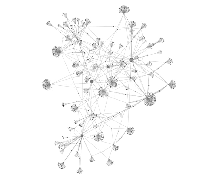
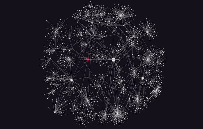
Let’s visualize a sample of data to give us an idea of its structure. This is what the first 1000 lines without any styling looks like:
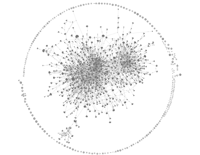
The organic layout is a great starting point for large datasets like our Python graph visualization. It gives an idea of the overall shape of the data, making it easier to spot densely-connected nodes of interest. Notice the mass of highly-connected clusters at the center, surrounded by smaller components around the edge.
Time to dig deeper into the data and focus on the detail.
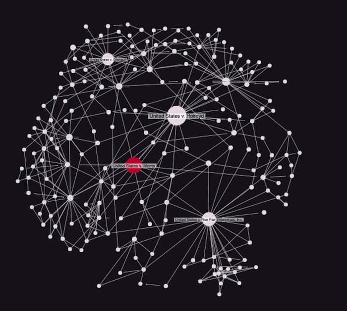
Visualizing citations using ReGraph
Let’s visualize cases cited by the Morris worm case. Morris worm was one of the first computer worms distributed over the internet (back then referred to as ARPANET) and it contributed to the emergence of cyber security as a practice. In 1991, its author, Robert Tappan Morris, was tried in the United States v. Morris case and became the first conviction under the Computer Fraud and Abuse Act.
We’ll use Python to generate a graph from the citation tree up to 4 steps away from the original Morris case:
import networkx, json
with open('./case_data/'+str(1138268)+'_cybercrime_citations_hops_'+str(4)+'.json') as f:
    citationTree = json.load(f)

nodes = []
edges = []
node_names = []
for item in citationTree:
    if 'id1' in citationTree[item]:
        edges.append((citationTree[item]['id1'],citationTree[item]['id2']))
    else:
        nodes.append(citationTree[item])
        node_names.append(item)

G = networkx.Graph()
G.add_nodes_from(node_names)
G.add_edges_from(edges)
print(networkx.info(G))

Name:
Type: Graph
Number of nodes: 1581
Number of edges: 1832
Average degree: 2.3175
Then we add the data attributes to the graph:
attributes = {i:{} for i in nodes[0]['data']}
for i in range(1,len(nodes)):
    for j in attributes:
        try:
            attributes[j][node_names[i]] = nodes[i]['data'][j]
        except:
            continue
for i in attributes:
    networkx.set_node_attributes(G, attributes[i],i)
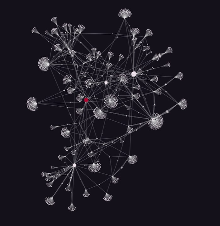
After that, we can simply convert the NetworkX graph to ReGraph format. This creates our basic Python graph visualization:
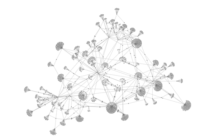
Success! Now let’s dig deeper to understand where the most important nodes and connections exist.
Using social network analysis
We’ll use NetworkX’s centrality measures to explore the dynamics of our network.
Remember that we’re doing this to show how easily ReGraph integrates with an existing Jupyter environment that has centrality measures set up already. ReGraph has its own powerful graph analysis features to uncover relationships, but we’ll keep things simple here and stick with NetworkX’s algorithms.
In NetworkX, we’ll use betweenness centrality to measure the number of times a node lies on the shortest path between other nodes, revealing the most influential nodes in the network. In our case, those will be the most cited cases.
networkx.set_node_attributes(G, networkx.betweenness_centrality(G), 'betweenness')
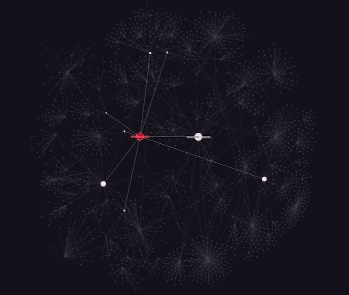
Then we’ll use one of ReGraph’s clever styling features to size the nodes depending on how influential they are.
from ReGraphDemo import BasicDisplayReGraph, networkx_to_regraph_format, isLink

#convert networkx graph to basic ReGraph format, assigning attribute values to item attributes or to the data prop.
regraph_graph = networkx_to_regraph_format(G, mapped_attributes={'nodes':{'size':'betweenness'}}, data_attributes={'nodes':['frontend_url', 'jurisdiction_name', 'jurisdiction_id', 'court_name'})

#add styling:

for item in regraph_graph:
    if isLink(regraph_graph[item]):
        continue
    else:
        #normalize the size and prevent 0
        regraph_graph[item]['size'] = 100**regraph_graph[item]['size']
        #add labels
        regraph_graph[item]['label'] = {'text':regraph_graph[item]['data']['name_abbreviation']}

BasicDisplayReGraph(items=regraph_graph)
Even without additional styling, 4 nodes clearly stand out and could be of interest to data scientists.
ReGraph’s advanced styling options
You can customize every element, interface and workflow in ReGraph. For data scientists trying to understand their data better and present a clear picture to their audience, there are many effective styling options to make key information stand out.
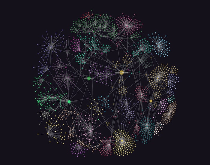
A popular choice right now is to display the chart in dark mode. Here it helps to create contrast between the clusters of cases, and makes the original case stand out in red:
NetworkX offers functions called communities for finding groups of nodes in networks. We can use it to reveal clusters of related data in our dataset, and use ReGraph styling to highlight them in our layouts.
import networkx.algorithms.community
communities = networkx.algorithms.community.greedy_modularity_communities(G)
We can also highlight the neighbors of selected items and make them stand out:
Jupyter graph visualization layouts
ReGraph’s range of automatic layout options help to detangle data and uncover hidden structures. It gives data scientists an easy way to experiment and see the data from different perspectives.
Let’s visualize our citation hierarchy using ReGraph’s popular sequential layout. This is specifically designed for displaying data with a clear sequence of links between distinct levels of nodes. And there is no need to define levels – ReGraph calculates them automatically.

Radial layout is another great layout for displaying levels. It arranges nodes in concentric circles around a selected node, making the dependency chain clearer.
There’s also lens layout, which pushes highly-connected nodes to the center so they’re easier to find. It works particularly well for densely connected networks.
All of our layout options are adaptive. Every time you add, move or remove data from the network, chart items adapt organically to the changes using minimal movements. It means nodes remain in the areas of the chart that users expect them to be, so their mental map of the network isn’t destroyed.
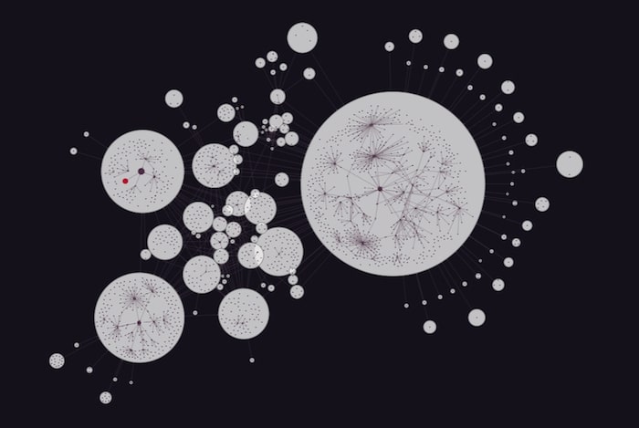
Combos and filtering
When you’re visualizing a large dataset, one useful way to reduce clutter is to introduce combined nodes or ‘combos’.
Combos let you group nodes with similar properties. It makes busy charts much easier to navigate and analyze. Toggling between opening and closing combos, you can view the groups you’re interested in and keep the rest in the background.
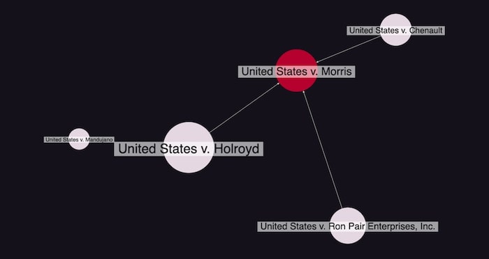
An alternative option to help make sense of huge datasets is by network filtering.
Filtering is entirely flexible – you can define your own filter logic based on the attributes of your data. Here we’ve filtered our citation data by betweenness centrality to show only the most connected cases, creating a more manageable chart of key nodes:
If we keep filtering the data in this way, we end up with the 4 most cited cases associated with US v. Morris. It’s a powerful way to reduce noise and reveal insight that helps drive further analysis.
Integrate ReGraph with your data science tools
With a ReGraph and JupyterLab integration, you can work with your favorite data science tools and visualize your largest datasets. It gives data scientists the opportunity to interact with their big data in a way that helps them understand it better and solve complex problems.
Ready to start your ReGraph journey? Request a free trial today.
Share:
