This Azure Cosmos DB tutorial shows you how to build a graph database visualization application using Microsoft’s multi-model database service with our graph and timeline visualization SDKs.
Many of our customers integrate their visual analysis tools with Azure Cosmos DB because it lets them store both graph and tabular data, and choose which API they want to use for queries. There’s support for MongoDB, PostgreSQL, Apache Cassandra, Apache Gremlin, and Tables, and our data visualization toolkits work with all of them.
This Azure Cosmos DB tutorial uses the Apache Gremlin API because it stores the data in a graph format, which is broadly similar to how you’d want the user to see it. If you choose an alternative API, much of the tutorial is still relevant but the format of the queries and how they are parsed would be different.
New to Azure Cosmos DB?
Visit the Integration Center for practical info
Azure Cosmos DB tutorial steps
This tutorial covers how to:
- Create a graph data model
- Create a new database in Azure Cosmos DB
- Populate the database with graph data
- Build a hybrid graph and timeline application to query it, using KeyLines and KronoGraph
- Analyze the KeyLines graph visualization to find network insights
- Analyze the KronoGraph timeline visualization to reveal time-based patterns
We’ll use a publicly-available dataset of world championship chess matches spanning over a century. Every player has played against at least one other player in the dataset, creating connections between every one, so it’s a great format for a KeyLines graph visualization. And the dates span from 1887 to 1985, so players who weren’t alive at the same time can be linked through older or younger intermediaries, which we’ll see by inspecting data timelines using KronoGraph.
Create a graph data model
Our chess dataset is in CSV file format, not a graph, so we’ll have to think about what sort of graph data model to apply. Which data elements should be nodes and what should connect them?
The rows in the CSV file are individual matches and the columns are properties, which includes the players, the date of the match, whether black or white won, the location of the match, and the opening move.
Different graph models would work here, but in our model:
- Nodes represents players as chess piece
- Links represent matches between two players
- Color-coded glyphs on links to represent whether a player used black or white chess pieces
- Labeling glyphs on links to represent the number of wins, draws and losses
This model also lends itself to timeline visualization using KronoGraph too, because each match takes place on a specific date.
Create a new Azure Cosmos DB database
We’ll use the Azure Cosmos DB for Apache Gremlin service to load the chess data. We won’t go into detail in this step since you’ll likely be using different data, and we aren’t using any visualization tools yet, but we’ll provide enough to get started.
Creating a new database in Azure Cosmos DB is straightforward – the free tier is good enough for our purposes.
The one thing that could trip you up at this point is the mandatory selection of a partition key. This allows the database to scale across multiple physical partitions. Our dataset only has 685 games, so it’s not necessary for performance reasons, but the key is still required. Whatever you choose here will have to be included as a property later on, so it’s important to remember. I chose ‘event’ as my partition key.
Populate the database with graph data
Now we can load the data into Azure Cosmos DB. There are different ways to load data, including a purpose-built bulk loader, but that requires .NET. I’m working in JavaScript, so we’ll write a script and load it in record-by-record. We’ll use the node.gs gremlin driver for this:
npm install gremlin
And then update our JavaScript file:
const gremlin = require("gremlin");
We also need to give the driver configuration details, including where to find the database and how to authenticate:
const configs = {
  // These details can be found from the Azure Portal
  // The endpoint can be found on the Overview tab
  // under the heading "Gremlin Endpoint"
  // e.g. "https://your-cosmos-database.gremlin.cosmos.azure.com:443"
  endpoint: "yourendpoint",
  // The Primary Key is found on the Keys tab
  primaryKey: "yourkey",
  // The name of your Cosmos database is given in a table on the Overview tab
  database: "chess",
  // The collection is the ID given in the same
  table collection: "chess_games",
};
Create nodes for players
The first step is to load the CSV file and parse out the unique players. Each chess master has played multiple matches so they appear in the table multiple times, but we only want one node per player.
const fs = require('fs');
const csvData = fs.readFileSync('./Game_Nodes.csv', 'utf8');
I’m using papaparse to convert the CSV to the JSON format our toolkits require:
const blackPlayers = getUniqueValues(results.data, 'Black');
const whitePlayers = getUniqueValues(results.data, 'White');
const players = _.union(blackPlayers, whitePlayers);
The getUniqueValues function looks like this:
function getUniqueValues(arr, prop) {
  return [...new Set(arr.map(item => item[prop]))];
}
Now we’ll use the Gremlin client to connect to the database. To do that, I’ve created a function called getGremlinClient. This is unwieldy code, but it opens up a connection to the database based on the URL and credentials supplied above, with some error handling to explain if things don’t go as expected.
function getGremlinClient({
  retryInterval = 60 * 1000,
  submitTimeout = 10 * 1000,
} = {}) {
const errors = {
  CONFIGS: "Invalid database configurations for cosmos.",
  CONFIGS_DETAIL: "Please update cosmos-router.js file with your DB details",
  OPENING: "Error opening cosmos Gremlin connection",
  CONNECTING: "Error connecting cosmos Gremlin",
  SUBMITTING: "Error submitting cosmos Gremlin query",
};
const displayableError = ({ message, detail }) => {
  console.error(`${message}: ${detail}`);
  return new Error(message);
};
// if configs are invalid, the submit function rejects all requests
if (Object.keys(configs).some((key) => !configs[key])) {
  return {
    submit: async () => {
      throw displayableError({
        message: errors.CONFIGS,
        detail: errors.CONFIGS_DETAIL,
      });
    },
  };
}
let client = null;
let error = null;
let lastConnectionAttemptAt = 0;
const setError = (message, detail) => {
  // set client and error
  client = null;
  error = displayableError({ message, detail });
};
const connectClient = () => {
  if (client === null) {
    if (lastConnectionAttemptAt + retryInterval < Date.now()) {
      lastConnectionAttemptAt = Date.now();
      const authenticator = new gremlin.driver.auth.PlainTextSaslAuthenticator(
        `/dbs/${configs.database}/colls/${configs.collection}`,
      configs.primaryKey
      );
    // create a gremlin client
    const gremlinClientConfig = {
      authenticator,
      mimeType:
      "application/vnd.gremlin-v2.0+json",
    };
    client = new gremlin.driver.Client(
      configs.endpoint,
      gremlinClientConfig
    );
    // catch any asynchronous connection errors
    client.open().catch((err) => setError(errors.OPENING, err));
    client._connection.on("error", (err) =>
      setError(errors.CONNECTING, err)
    );
    }
  }
};
return {
  submit: (statement, bindings) =>
  new Promise((resolve, reject) => {
    // create and connect client in case it's disconnected
    connectClient();
    // if client still doesn't exist, reject immediately with the last error
    if (client === null) {
      reject(error);
    } else {
      // if the request doesn't get done within the specified time, raise a new error
      const timeout = setTimeout(() => {
        setError(
        errors.SUBMITTING,
        `Submit timeout (${Math.round(submitTimeout / 1000)}s)`
      );
    reject(error);
    }, submitTimeout);
    // resolve the promise if submit is successful, set a new error otherwise
    client
    .submit(statement, bindings)
    .then(resolve)
    .catch((err) => {
    clearTimeout(timeout);
    setError(errors.SUBMITTING, err);
    reject(error);
    })
    .finally(() => clearTimeout(timeout));
    }
  }),
};
}
Our Gremlin query should add a vertex (synonym for node) for each unique player in our dataset. But there’s a potential pitfall here – remember the partition key we had to add earlier? That property is required on all items, nodes and links, so we’ll have to add that here too to avoid errors. So the code looks like this, where playerName is a variable holding the name of the player.
const gremlinAddVertexQuery = `g.AddV('player').property('name','${playerName }').property('event', 'event');`
Then we use the submit function to send this up to the database:
let cosmosPlayer = await gGc.submit(gremlinAddVertexQuery);
The submit function returns JSON detailing the item that was added. In many cases, this can be ignored, but I want to capture it here. Azure Cosmos DB will automatically create an ID for each node and link added, and it’s the only way to know what that ID is. We’ll use it when creating edges, so we’ll need to store it here. I’m doing that with a little dictionary:
mapPlayerToId[playerName] = cosmosPlayer._items[0].id
Now we have populated the database with nodes, let’s move on to links.
Create links between players
Next in our Azure Cosmos DB tutorial, we need to populate the database with links – these are the matches between two players. Since each record identifies a single match, the code is a little easier. We’ll use addE() to add the link, and identify the two endpoints by their IDs from the dictionary we made earlier together with some of their properties.
let fromPlayer = mapPlayerToId[result.White];
let toPlayer = mapPlayerToId[result.Black];
const gremlinAddLinkQuery = `g.V('${fromPlayer}').addE('played').to(g.V('${toPlayer}')).property('date',' ${result['Date']}').property('result', '${result['Result']}').property('event', 'event')"
let match = await gGc.submit(gremlinAddLinkQuery);
Directional links will always go from the player who played the white pieces to the player who played the black pieces. This becomes important later.
Forward queries to the database
We need a way to get the data out of the database. The simplest method would be for the browser to build the Gremlin queries on the client-side and submit them to the database and then parse the results, but that’s not a workable solution for anything but the most basic of projects. It’s also not secure: a user could find the authentication key in the JavaScript, and you’re vulnerable to Gremlin injection where a user could edit the Gremlin query and take full control of your database!
In this Azure Cosmos DB tutorial, we’ll build an express server that sends the Gremlin query up to the database and then passes the results back to the browser. This also allows us to avoid any Cross-Origin Resource Sharing (CORS) issues.
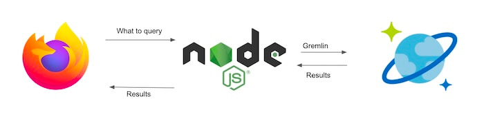
We’ll set up an express server and designate a route handler to pass requests up to the database:
const express = require('express');
const app = express();
The express server needs to allow CORS:
app.use(function(req, res, next) {
res.header("Access-Control-Allow-Origin", "http://localhost:8000");
next();
});
Finally, we need the text of the Gremlin query. Here I’ve defined two:
- one that queries a player by name and returns that player and their matches and opponents
- a simpler one that returns all of the matches in the database and the players involved
const queryTemplates = {
player:
“g.V().hasLabel(‘player’).has(‘name’, querySearch).inE(‘played’).outV().hasLabel(‘player’).project(‘degree’).by(outE(‘played’).otherV().dedup().count()).path().unfold()”,
all:
"g.E().as('e').bothV().as('v').select('e', 'v')"
};
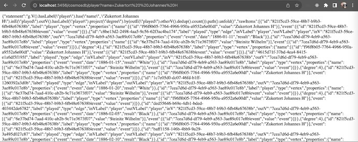
Once this is running, we can test it by hitting that endpoint directly from the browser. Here I’m querying for Johannes Zukertort, a chess master from the late 1800s, and getting JSON in response.
Build a hybrid graph and timeline visualization
The browser now has access to the data, so next we need to visualize it. We’ll use two of our visualization libraries, KeyLines and KronoGraph.
KeyLines is our flagship graph visualization toolkit for JavaScript developers. We’ll use it to visualize and make sense of the network of nodes and links representing players and matches. If you are building a React application, you’d use ReGraph for this, our graph visualization SDK for React developers. The integration would look similar, and I’ll point out differences in the data formats as we work through the steps.
KronoGraph is our timeline visualization toolkit for React or JavaScript developers. We’ll use it to analyze timelines in the data, understand patterns over time, and spot periods where a higher volume of matches were played.
To build a web application, we need HTML, CSS, and JavaScript. We’ll keep the HTML simple – we won’t include additional UI elements on the page except for KeyLines and KronoGraph:
<body>
<div id="container">
  <div id="kl-chart"></div>
  <div id="kronograph"></div>
</div>
</body>
</html>
The main work is going to be in our JavaScript. We need to submit the query to the server, get the results back in JSON, and parse that JSON into the format KeyLines and KronoGraph expect.
To fetch the data, we submit the query when the page loads. In this case, we’re using the all query we defined on the server side, because we want a graph of all the matches in our dataset. (If we wanted to bring back just an individual player, we could use the player query.)
const rawData = await fetchData('all', '' /* unused */);
async function fetchData(queryType, querySearch) {
  const uri = getEndpoint(queryType, querySearch);
  let response;
  try {
    response = await fetch(uri, {
      method: "GET",
      credentials: "same-origin",
    });
  } catch (err) {
  console.log(err);
  throw Error(`Error while fetching ${queryType} "${querySearch}"`);
  }
  if (!response.ok) {
  throw Error(`Fetch failed with status ${response.status}`);
  }
  const content = await response.json();
  // if server returned some human readable error message
  if (content.error) {
    throw Error(content.error);
  }
  return {
    statement: content.statement,
    items: content.rawItems,
  };
}


function getEndpoint(queryType, querySearch) {
  return `http://localhost:3456/cosmosdb/${queryType}?name=${encodeURIComponent(querySearch)}`;
}
Graph visualization with KeyLines
If you remember, our Gremlin stored our link in an object called e and the end of the link in an object called v. I intentionally tried to keep the Gremlin simple and readable.
g.E().as('e').bothV().as('v').select('e', 'v')
This is returned from the database as an array of objects, each of which has a, e and v objects. But each link has two endpoints, so where is the second one?
The subsequent entry in the array has the same link, but it uses the other end of the link as its vertex. So when parsing the results, we need to iterate through each one and look at both that entry and the subsequent one. This gives us a reason to use this fun for loop:
for (let i=0;<rawData.items.length;i+=2) {
//step through every other object
In this loop, we’re creating a new entry in an array for each link, and also one for the endpoints. We don’t have to worry about duplicates: it’s fine if we end up adding nodes more than once because they are the endpoints to multiple edges. KeyLines takes care of that for us.
We’re also adding some of the many styling options on offer to make the chart easier to understand at a glance. This function will look slightly different if you’re working with ReGraph, which uses a dictionary instead of an array, but the general structure will be similar:
const node1 = {
  type: 'node',
  fi: {
    t: KeyLines.getFontIcon('fa-chess')
  },
  id: rawData.items[i].v.id,
  t: rawData.items[i].v.properties.name[0].value,
};
const node2 = {
  type: 'node',
  fi: {
    t: KeyLines.getFontIcon('fa-chess')
  },
  id: rawData.items[i+1].v.id, //the other endpoint
  t: rawData.items[i+1].v.properties.name[0].value,
};
const result = rawData.items[i].e.properties.result;
const link = {
  type: 'link',
  lid: rawData.items[i].e.id,
  id1: node1.id,
  id2: node2.id,
  d: {result },
  a1: (result === 'Black'),
  a2: (result === 'White'),
  c: result === 'Black' ? 'rgb(25,25,25)': 'rgb(140,140,140)', //color based on result
};
nodeArray.push(node1, node2, link);
We can choose a background color for the chart that contrasts with the nodes and links to make them stand out:
chart.options({backColour: 'rgb(52,134,235)'});
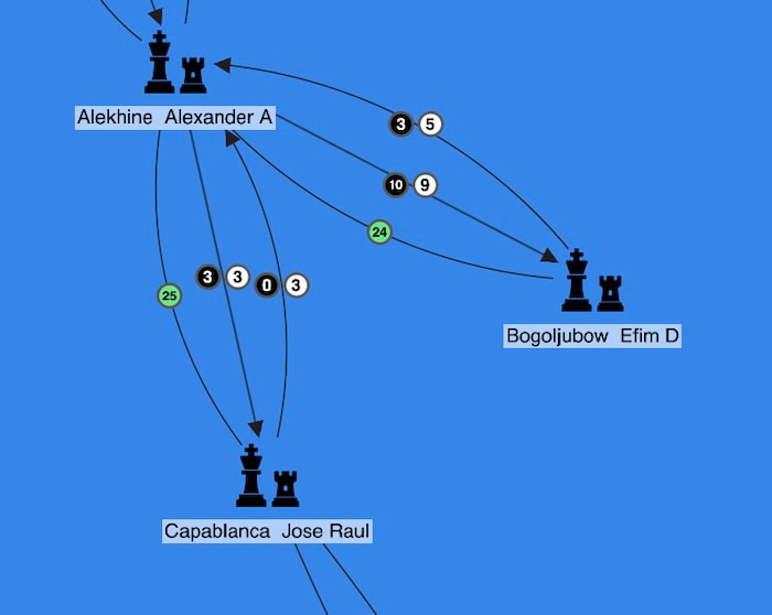
So this is what happens when we load our first visualization…
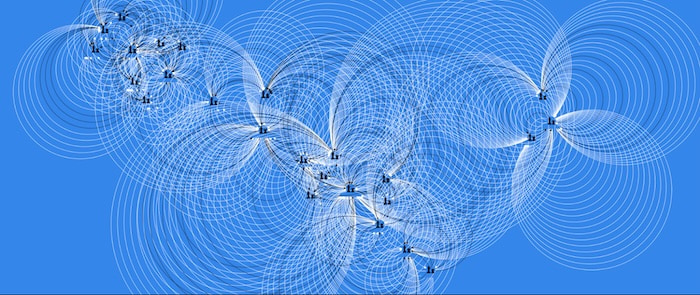
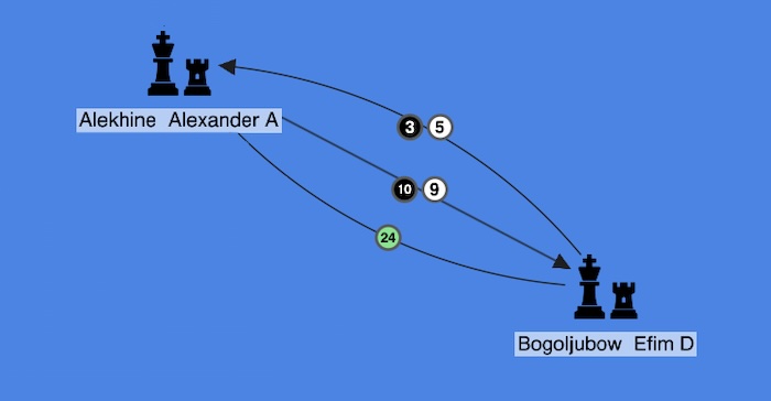
…oh no! This loopy mess is because each set of players has had dozens or more matches between them, and we told KeyLines to draw each one separately. What we actually want to do is to summarize the relationship between each set of players with a small number of links. We can do that by using KeyLines’ link aggregation feature. This is a chart-wide setting which tells KeyLines to draw just a single link, or one link per type or direction, between two nodes instead of a separate one for each game. For an example of aggregate links, see 3 new & easy ways to simplify complex data visualizations.
chart.options({ aggregateLinks: {aggregateByDirection: true}});
The visualization currently color-codes each link depending on the result of the match, but if we’re consolidating those links and only showing one for each type of result (win, lose or draw), we lose that information. Instead, we’ll add that property to a glyph on the link to make them more useful without overloading the chart with too much detail:
let blackGlyph = {c: 'rgb(0,0,0)', t:0, fc: 'rgb(255,255,255)'};
let whiteGlyph = {c: 'rgb(255,255,255)', t:'0', fc: 'rgb(0,0,0)'};
let drawGlyph = {c: 'rgb(106, 230, 137)', t:'0', fc: 'rgb(0,0,0)'};
This gives us something much more manageable:
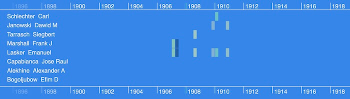
We can see that Frenchman Alexander Alekhine played Russian-born German Efim Bogoljubow many times, and Alekhine had 19 wins, 8 losses and 24 draws. Of those wins, 10 were with black pieces, and 9 were with white pieces.
When we zoom out, we see an unbroken chain from living chess legend, Gary Kasparov through to Johannes Zukertort, who took part in the first World Chess Champion match.

But how do we know when each of these matches occurred? What’s the temporal pattern that resulted in a multi-century chain of links between chess masters? That’s where KronoGraph comes in.
Timeline visualization with KronoGraph
First, we need to get the data into KronoGraph. The data is still visualized as a graph, but we use slightly different terminology:
- nodes on the graph are entities (because they exist throughout time)
- links between nodes are events
In this dataset, our entities are the players themselves. The matches are the events, because each occurred on a specific date in our dataset. So a tournament where two players play multiple matches against each other looks like this:
To accommodate this slightly different format, we have different parsing logic (but still with that funky i=i+2 for loop).
for (let i=0; <rawData.items.length; i+=2) {
  const player1 = rawData.items[i].v;
  entities[player1.id] = {
  fontIcon: {
    fontFamily: 'Font Awesome Solid',
    fontWeight: 900, // use the 'solid' font icon
    text: 'u{f439}', // chess pieces
  },
  label: player1.properties.name[0].value,
};
const player2 = rawData.items[i+1].v;
entities[player2.id] = {
  fontIcon: {
    fontFamily: 'Font Awesome Solid',
    fontWeight: 900, // use the 'solid' font icon
    text: 'u{f439}', // chess pieces
  },
  label: player2.properties.name[0].value,
};
const match = rawData.items[i].e;
switch (match.properties.result) {
  case 'White':
  events[match.id] = {
    entityIds: [player1.id, player2.id],
    time: Date.parse(match.properties.date),
    color: 'rgb(255,255,255)'
  }
  break;
  case 'Black':
  events[match.id] = {
    entityIds: [player2.id, player1.id],
    time: Date.parse(match.properties.date),
    color: 'rgb(0,0,0)'
  }
  break;
  case 'Draw':
  events[match.id] = {
    entityIds: [player1.id, player2.id],
    time: Date.parse(match.properties.date),
    color: 'rgb(106,230,137)'
  }
  break;
 }
}
return({entities, events});
The switch statement is there because we do a couple of different things depending on the result.
If black wins, we switch the order of the entities so that the winner is always listed first. This means the arrowheads show the winner pointing towards the loser of the match, mirroring the link logic in the KeyLines graph visualization. Also, the color of the link represents whether the winner of the match played with the white or black pieces, with green representing a draw.
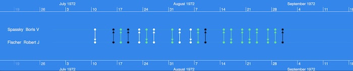
Let’s see how this looks on the timeline:
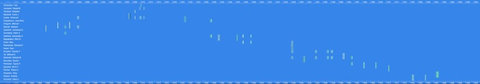
When we’re looking at this much data at once, it’s not so useful to see every individual link, so KronoGraph automatically switches to heatmap mode. The heatmap aggregates multiple links to help users spot patterns fast.
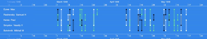
We can see in our dataset that matches occured pretty regularly with two noticeable gaps, between 1896 and 1906, and again between 1939 and 1945. As we zoom into a specific window of time, KronoGraph automatically adjusts the view again to show multiple events that happened close together. Here were five players involved in the world tournament during spring 1948:
Our last bit of JavaScript is going to make the graph and timeline visualization interact with each other. We’ll bind the KronoGraph’s range event, which fires whenever the user zooms or pans the time range, to the filter function on the KeyLines chart, which controls whether nodes and links are shown or hidden:
    timeline.on('range', timelineRangeHandler);

async function timelineRangeHandler() {
  const { entities: visibleEntityIds } = timeline.getInRangeItems({ focus: false });
  const filterOptions = { type: 'node', animate: false };
  const { shown, hidden } = await chart.filter(item => visibleEntityIds[item.id], filterOptions);
  if (!isEmpty(shown.nodes) || !isEmpty(hidden.nodes)) {
    await chart.layout('organic', {mode: 'adaptive'});
  }
};
Here’s how our hybrid network and timeline application looks:
At this point, we’ve got a functioning, interactive application visualizing the same data in two powerful ways. There are so many more ways to improve our app, from customizing every element to adding UI features, creating new interaction events to including additional data.
Checkmate for Azure Cosmos DB & our SDKs
We’ve created a basic interactive graph and timeline visualization application from a CSV dataset, using Microsoft Azure Cosmos DB as the datastore. It shows the value of visualizing connected data in different models and different views – both the traditional node-link visualization alongside a timeline. KronoGraph works well for standalone timeline visualization applications, but its power is multiplied when paired with either KeyLines or ReGraph.
Request a trial today to get started with any of our toolkits.
Share: