FREE: Managing fraud with visual link analysis
The ultimate guide to the role of link analysis and timeline visualization in fraud detection, investigation and prevention.
When it comes to combating money laundering, link analysis and AML go hand in hand.
In this blog post, we’ll see how it’s used at each stage of the money laundering process – placement, layering and integration. We’ll show how our toolkit technology makes compliance easier for anyone who works in industries targeted by money launderers, from the financial services sector to capital markets, gambling and real estate.
Money laundering, or passing off illegally-obtained funds as legitimate financial assets, is big business for criminals. According to the United Nations Office on Drugs and Crime, the amount of money laundered in a single year is 2-5% of global GDP – that’s $2 trillion USD.
These illicit funds are associated with the most serious crimes, from human trafficking to drug dealing, terrorist financing to funding weapons of mass destruction. If money laundering goes undetected, organized criminal enterprises expand, and the integrity and stability of trusted global financial markets and systems is at risk.
The International Monetary Fund (IMF) helps shape the AML policies of its member countries, but it’s down to individual countries to enact their own regulations. Most countries require precise reporting and record-keeping, but AML compliance is about more than well-maintained process documentation.
Institutions and service providers need to carry out an extensive customer due diligence (CDD) and know your customer (KYC) process. That involves the verification of a customer’s identity, screening them against sanctions lists, watch lists or for connections to politically exposed persons (PEPs).
They also need to monitor all customer transactions, identifying and reporting any that exceed certain thresholds or match particular patterns. It requires the collection and management of data at scale.
How do organizations manage and make sense of large, complex datasets? How do they identify financial irregularities and suspicious activities? How easily can they ‘follow the money’ to identify where it came from and where it’s going?
The need for innovative methods to detect and prevent money laundering drives many institutions and agencies to the latest analysis-based technology. And that means visualizing data to carry out link analysis for AML.
The ultimate guide to the role of link analysis and timeline visualization in fraud detection, investigation and prevention.
Link analysis, sometimes called ‘graph visualization’ or ‘network visualization’, is the process of visually presenting networks of connected entities as nodes and links. Typically, the nodes represent specific data points, and the links represent the connections between them.
Link analysis for AML focuses on the hidden relationships, patterns, dependencies and anomalies that exist in a suspected money laundering operation. It presents data as an interactive visualization that’s used to investigate complex connections and event sequences, and expose money laundering activity.
Let’s look at examples of the three stages of money laundering to show how link analysis AML can combat and prevent fraud.
The first stage of money laundering is the placement stage, where funds are first introduced into the financial system. There are many ways to do this, but one popular method is for criminals, terrorists or other bad actors to hide the fact that they are the beneficial owners of a company.
Financial service organizations are legally required to carry out Customer Due Diligence (CDD) to understand the individuals and businesses they provide services to. But company ownership structures can be incredibly hard to untangle.
Fraudsters often use layers of shell companies – organizations that exist in name only, with no active business operations or assets. These shell companies may exist across many different jurisdictions, including those with poor AML compliance regulations or strict banking privacy laws. Analysts face a serious challenge to make sense of who is linked to which business and for how long.
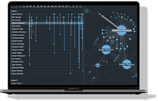
Link analysis gives a clear picture of business ownership and control structures. This example shows a network of directors and the companies they’re associated with. Each individual is sized according to how many directorships they hold, so we immediately spot the two most prolific in the dataset.
The time element, displayed below the visualization, is key to monitor ongoing progress and development of professional relationships. The higher red activity line shows how Brooke took on director roles at multiple companies simultaneously, whereas Gina tends to move from one company to another.
If we focus on Brooke and Gina’s directorships during the last quarter of 2012, tooltips on links reveal that they were both on the board of a company called Cloudwalk.
Filtering data by time makes it easy to scrutinize the impact of changing circumstances such as mergers and acquisitions, new majority shareholdings, transfer of control, and changes in beneficial ownership. It also reveals how that impact affects risk.
The second stage of money laundering is layering, where criminals move money swiftly through a series of global accounts and exchanges to cover their tracks. It’s a common feature of crypto-based fraud, where the ultimate goal is to cash out (for a real-world example, see WannaCry analysis: visualizing their ransomware attack).
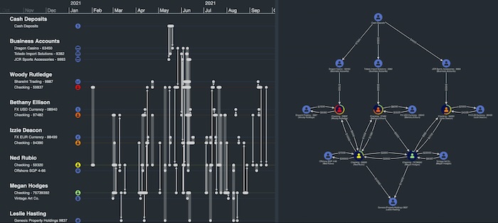
This demo shows a ‘follow the money’ scenario, where funds are moved through a range of multi-layered personal, checking, casino and business accounts across different currency exchanges. The visualization on the right helps us understand the shape of the transaction network, while the timeline visualization on the left reveals insights into the flow of money over time.
We’ve also assigned risk scores to account holders based on evidence from our CDD analysis: a red person icon = high risk.
Layering often follows unusual patterns of activity, such as moving money in smaller amounts over short periods of time in an attempt to avoid suspicion. The AML visualization shows the net flow transferred between accounts, but we can use the timeline to dig deeper and look at individual transactions over time.
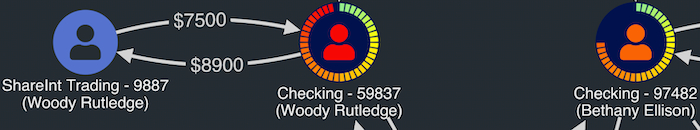
Look at what the visualization reveals about Woody Rutledge’s activities. He moved $7500 from a Dragon Casino business account into his personal checking account over three transactions in quick succession, then used further transactions to move it to a ShareInt Trading account before moving it back again. Suspicious?
Forensic accountants using our visualization toolkits to power their link analysis for AML can also rely on rules-based algorithms to reveal suspicious transactions. It helps them to focus on key problems and make decisions fast about which accounts need further investigation.
The third and final money laundering stage is integration, where ‘dirty’ money is returned back to the criminal as ‘clean’ using a legitimate financial system. Common ways to achieve this are through the purchase of high-value assets such as artwork, precious stones or real estate, investing in bogus business ventures, or payment of fake invoices for high-cost services.
Again, bringing a visualization element to your link analysis for AML brings complex data to life. This basic chart shows connections between a number of individuals and contracts they hold with two organizations.
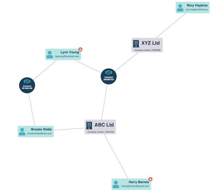
Through graph visualization styling, we’ve added property information discovered through customer due diligence to two of the individuals.
While Lynn Young’s contract investigation is ongoing, she’s linked to Harry Barnes through another contract with a company called ABC Ltd. Are his interests legitimate?
Harry’s criminal record would cause analysts to look closely at his involvement in this network. Is he working with Lynn Young to use a fake contract as a way to move money out of the business?
We’ve explored potential uses of link and timeline analysis to simplify and enhance AML activities at every stage.
Whenever there’s a need to understand complex connections between accounts, people or institutions, a powerful visual tool embedded into the user’s workflow is essential. It helps analysts and investigators understand their data more quickly and effectively, leading to more robust compliance processes.
Hundreds of organizations, from leading fraud software vendors to banks and financial regulators, rely on our toolkits to power their compliance and AML data visualization processes. Why not try them for yourself?
Visualize your data! Request full access to our SDKs, demos and live-coding playgrounds.
Registered in England and Wales with Company Number 07625370 | VAT Number 113 1740 61
6-8 Hills Road, Cambridge, CB2 1JP. All material © Cambridge Intelligence .
Privacy Policy | Security Framework


