What is a graph layout?
A graph layout determines how your nodes are positioned on screen to highlight their relationships and importance within the network. You could say that graph layouts ARE graph visualization. The right layout depends on the type of data you’re visualizing and the questions you’re trying to answer.
We’ve been refining our industry-leading layouts for over 15 years. Whether your data has natural patterns that should emerge organically, or clear structures that need to be emphasized, we have the tools to help you gain maximum insight.
The first decision to make when you’re choosing the right graph layout for your data is: Does your data have inherent structure, or will patterns emerge naturally?
Organic layout: Let your data tell its story
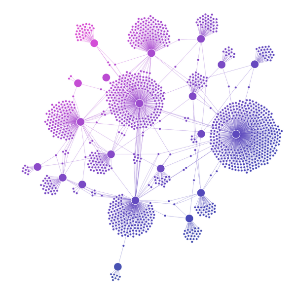
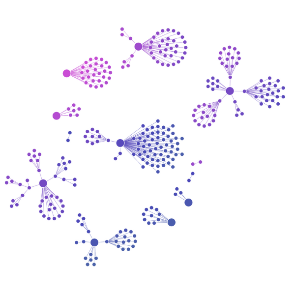
When you think of graphs, you probably think of force-directed layouts. These are the classic graph layouts, computed by applying forces to all links as if they were springs, and then calculating where the system would sit at equilibrium.
Organic layout is our top-tier force-directed approach – engineered to untangle components and reveal global chart structure as quickly as possible, with minimal link crossings and maximum practical density.
It’s the workhorse of graph visualization, used across industries, and should generally be your first point of call when you want to see what patterns naturally emerge from your data.
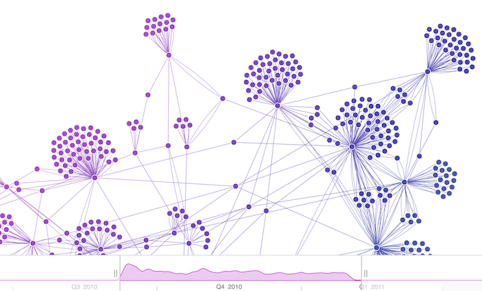
Working with dynamic data sources
- Layouts adapt to accommodate new data, displacing existing elements smoothly and subtly
- Elegant transitions between states provide consistent context so users can see exactly what has changed
- Filtering operations produce fluid animations toward the updated layout with smooth node and link transitions
Structured layouts: When constraint brings clarity
While organic layouts excel at revealing natural patterns, certain use cases benefit from applying strategic constraints that guide how the data is displayed.
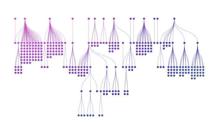
Highlighting hierarchies
When your data has clear parent-child relationships, dependencies, or flows that move in one direction, our sequential layout excels at organizing these structures.
It’s perfect for org charts, classification systems, or showing how networks evolve over time through level positioning. Our sequential layout has exceptional automatic level assignment based on link direction – you can throw anything at it and get a useful structure.
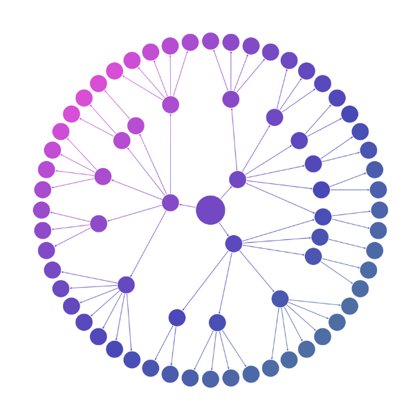
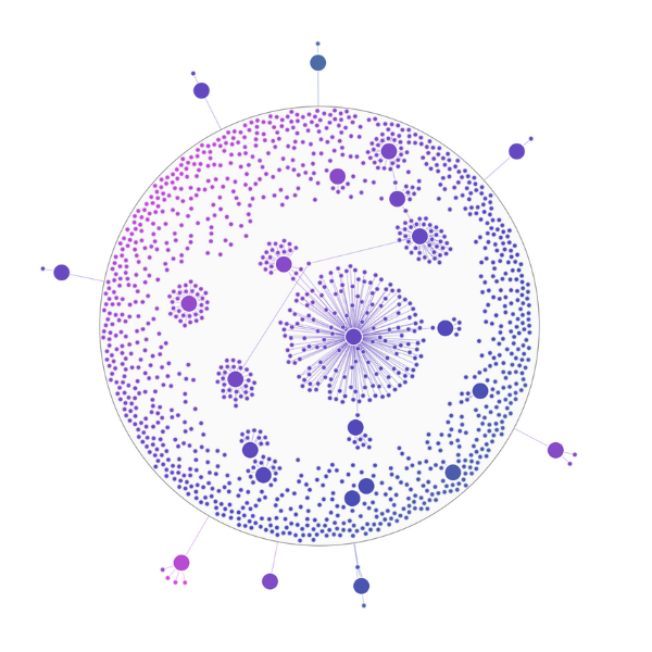
Radial layout
For hierarchical data with minimal top-level nodes and larger volumes of child nodes, our radial layout offers a circular alternative – arranging each level in concentric circles around the previous level.
This works particularly well when the space around central nodes can expand with level depth.
Fitting into tight spaces
When you need to maximize readability in confined areas like combination charts, we have several approaches, for instance:
Lens layout (pictured here, in an expanded ‘combo’) forces results into a circular shape with major components at the center.
Grid layout arranges nodes in clean, predictable rows and columns.
These approaches work best for smaller data subsets and combination charts where space optimization is the priority, while organic layout remains better for revealing global structure in larger datasets.
Specialized layouts for context-rich data
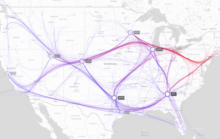
Working with location-based data
Creating good layouts on maps is particularly challenging. There’s little freedom to position nodes if their location is fixed geographically, and you need to handle huge ranges of zoom levels – from thousands of kilometers to a few meters.
That’s exactly what MapWeave delivers. Our unique, geospatially-aware graph layout handles any combination of free and fixed nodes and adapts with your zoom level to reveal local detail or global insight.
- Adaptive geographic scaling – automatically adjusts based on zoom level, switching between detailed markers and clustered nodes
- Smart geospatial layout – items automatically reposition when you add data or change filters
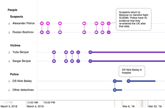
Working with time-based data
A very popular way to add structure to connected data is to show how it evolves over time. But timeline visualization brings its own unique layout challenges – there’s very little freedom to position items without misleading users about when events occurred.
Our KronoGraph timeline library has powerful layout capabilities that ensure large, complex, chronological datasets can be clearly laid out on screen.
For example, KronoGraph’s unique non-linear time layout compresses regions of the timeline where there is no activity, and gives extra space to busy periods. Individual rows can be ordered and grouped to minimize connection length, bringing closely related entities nearer to each other.
What are the principles of an effective graph layout?
Layouts are the secret to turning a dry table of values into something that humans can actually understand and gain insight from. They augment our ability to see patterns and allow us to use spatial reasoning, processing individual data points at a scale that simpler charts can’t support.
By using color, size, position, and clustering techniques, we help users form hypotheses and get exactly the right amount of detail during every step of their investigation.
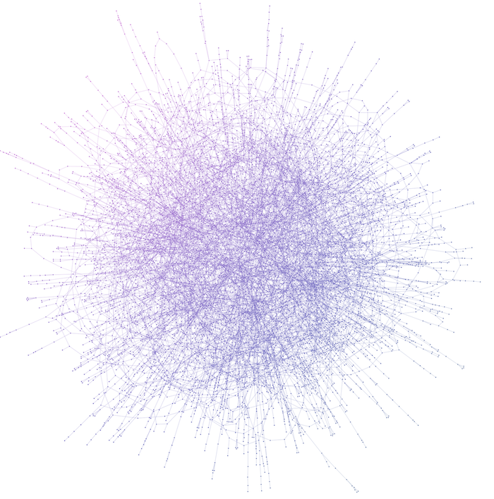
Getting it right takes a mixture of technique and intuition. Here’s a “hairball”: a dense cluster of nodes and links that creates visual clutter. While avoiding this level of clutter is important, overly loose link spacing or poor layout proportioning can create excessive white space, making graph details difficult to read.
Six key performance metrics
Whether you choose organic or structured layouts, we apply the same rigorous quality standards:
- Performance – how quickly the layout reaches the optimal arrangement
- Overlaps and link crossings – minimal overlapping of links, nodes and their labels
- Density – how well the layout fills the screen. Not too much clutter, not too much white space
- Global structure – easy to identify high-level features of the graph at a glance
- Movement – minimal node and camera movement with good FPS performance, making it easy to follow what’s changed
- Consistency – all these quality measures stay consistently good every time we run the same layout
Performance is important, but it’s not enough to create a layout that completes quickly. At Cambridge Intelligence we push our layouts as hard as we can to make them fast, but we never lose sight of the fact that end users need high quality, actionable intelligence.
FREE: Start your trial today
Visualize your data! Request full access to our SDKs, demos and live-coding playgrounds.
