What is Customer 360?
Customer 360 projects collate and integrate all the information an organization holds about its customers into a single view, revealing valuable business insight. This could be demographic data, buying history, web analytics, or information from any other channel.
Visualizing this data enables them to make predictions about future customer behavior and take the actions needed to reduce churn, improve service and increase revenue.
Who needs customer 360 insight?
Healthcare
Healthcare firms want to manage medical referrals, understand patient histories and investigate issues and complaints.

Insurance and banking
Insurance companies want to investigate fraud, manage regulatory compliance and uncover up-selling opportunities.

Retail
Retailers want to reduce customer churn, maximize customer lifetime value and understand the effectiveness of specific marketing campaigns.
Customer 360 visualization for customer-facing agents
Whether it’s to identify the best next action, understand historical context or find an up-sell opportunity, employees on the frontline need fast and clear customer insight.
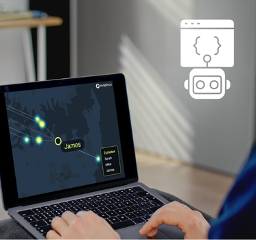
There’s a bewildering volume of data available to them, and speed is critical. Presenting information as intuitive visualizations built into existing customer relationship management (CRM) tools, agents can join the dots and make the right decisions, quickly.
Let’s look at some examples.
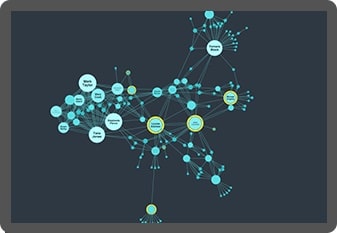
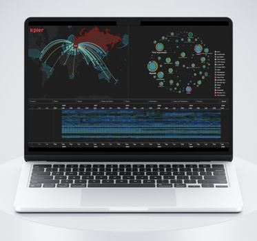
Advanced graph visualization makes complex customer data easy to understand. With powerful filtering, agents can drill down to reveal just the information they need to know to make the right decision.
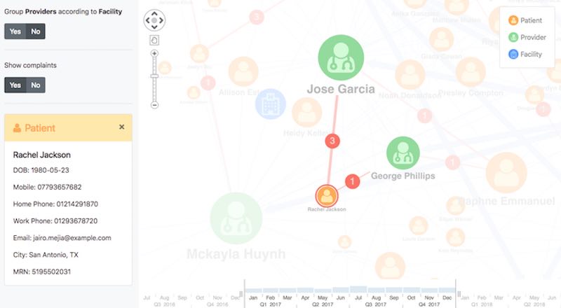
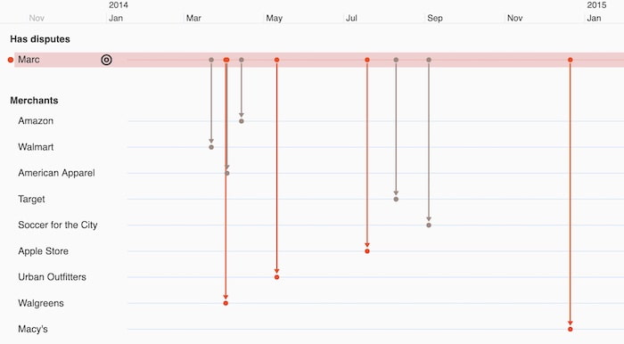
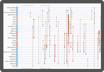
Armed with timeline visualizations, customer-facing agents can get an at-a-glance overview of a customer journey and understand sequences of interactions as they happened.
Strategic planning with Customer 360
Where customer-facing agents use insight to manage specific interactions, business leaders turn to Customer 360 views to uncover, understand and predict business trends.
This audience needs a view of many different customers simultaneously. When they understand aggregated data they can see correlations in behavior, make predictions to reduce risks, and uncover opportunities to exploit.
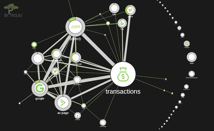
Using a global view of customer data, it’s possible to identify and predict patterns of behavior that could inform strategic decisions. Visualization techniques, like node combining, make larger datasets easier to navigate.
In this example, Bonsai’s analytics platform shows us that the customer journey is a graph:
Custom-built Customer 360 visualization tools
We’ve helped organizations including Barclays, CGI, and First Republic Bank to build powerful Customer 360 visualization tools.
Get a step closer to obtaining a 360-degree view of your customers – request a free trial.

Overcome data silos
Bring together data from across the organization in a single chart. Our flexible approach means you see the full customer 360 view and gain insight from all your data sources.

Get answers faster
Discover new dimensions to your data that aggregated methods can’t show. Timeline and graph visualization techniques lead to richer customer insight, and better, faster decisions.

Innovative network views
We work year-round to design new functionality in our toolkits. With our help, your team will have the best visualization tools to keep them one step ahead.

Custom tools
Visualization tools, custom designed for your business, users and systems, empower anyone in the business to understand rich customer insight.
Want to try it for yourself?
KeyLines
The graph visualization SDK for JavaScript developers
KeyLines is your fast-track to graph visualization success on any tech stack.
ReGraph
Hassle-free graph visualization for React developers
ReGraph for React makes building state-based graph visualizations a breeze.
KronoGraph
Advanced timeline visualizations that scale quickly & easily
Build advanced interactive timeline views, customized for your applications.
MapWeave
Geospatial visualization SDK that uncovers every connection
Build apps that make geospatial connections clear and insightful.
Registered in England and Wales with Company Number 07625370 | VAT Number 113 1740 61
6-8 Hills Road, Cambridge, CB2 1JP. All material © Cambridge Intelligence .
Privacy Policy | Security Framework
