Give analysts the whole story with KronoGraph
KronoGraph, our timeline visualization toolkit, helps investigators understand how events evolve. But when they’re analyzing individual timelines in large datasets, how can they see the full picture without getting lost in it?
Only KronoGraph lets users combine thousands of timelines into a single visualization. Watch Product Manager Matt Latham explore KronoGraph’s innovative ability to show an entire dataset while honing in on key events.
The next generation of visual timeline analytics
This non-technical webinar is for anyone who wants an expert-guided tour of KronoGraph 2.0. Through beautiful demos, you’ll see how timeline visualization makes it easy to spot patterns and highlight interesting events while keeping sight of the big picture.

Whatever use cases your analysts and investigators operate in, the volume of connected events they need to understand is vast. A high-level view of their data is a strong starting point, but insights are often hidden inside thousands of data timelines. KronoGraph’s unique lens acts as a magnifying glass over the data, so users get to inspect individual timelines without losing context.
You’ll see this, and other powerful interactive features, as Matt presents showcase applications built using KronoGraph to investigate:
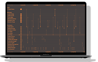
- suspicious insider trading and how the lens works with heatmaps
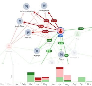
- disputed credit card transactions and how to flag alerts with glyphs
- the chronology of a crime spree mapped using graph visualization
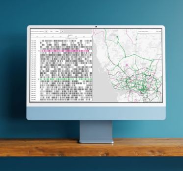
- the cause of a single traffic issue in a busy IT network
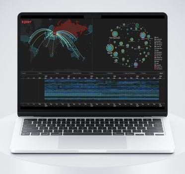
- which country was affected by terror events at a point in time, and who was responsible
