Summary: This article shares practical ways for developers to build accessible graph visualization tools that work for as many people as possible. It explains why accessibility benefits all users, then offers guidance on keyboard navigation, screen reader support, color and contrast, text and icon clarity, and animation safety, aligned with WCAG and Section 508 standards. The goal is to help teams design graph UIs that are more usable, inclusive, and effective from the start – not added as an afterthought.
Building software that people can actually use shouldn’t be revolutionary – but accessible design is still an afterthought for many developers. When companies race to ship features, accessibility considerations are often the first corner people consider cutting.
When you improve accessibility, you guarantee equal access for people with diverse abilities. It’s also a competitive advantage hiding in plain sight: accessibility features often benefit everyone. You might use subtitles in a noisy coffee shop, dictate texts while cooking, or navigate with keyboard shortcuts because it’s faster. These started as accessibility solutions but became standard features because they make technology easier for everyone.
This guide shares practical tips for building graph visualization tools that work for as many people as possible. The recommendations follow the W3C‘s Accessibility Guidelines (WCAG) and US Section 508 standards, with specific examples for KeyLines, ReGraph, and KronoGraph.
In this article
Why accessibility matters for your business
Understanding what your users need is the first step in any development process. Accessibility considerations should influence your core design choices from the start, not be added later. If you aim your product at diverse users from the outset, you’ll reach a much broader market and create a better user experience for everyone.
Working out accessibility requirements is straightforward:
Start with the basics. Can users navigate without a mouse? Can screen readers access your content? Are colors distinguishable for colorblind users?
Test early and often. Use accessibility checking tools while you design, not after launch. Find ways to make this quick and easy, such as browser extensions, plugins or webcheckers.
Involve diverse users. The best way to know if something works is to test with people who actually need these features.
Keyboard navigation
Many people use keyboard shortcuts for convenience, but they’re essential for users who struggle with a mouse or who rely on screen readers.
Built-in keyboard support in KeyLines
KeyLines supports these shortcuts by default (some keys may differ by keyboard):
- Select all items: Ctrl + A
- Cancel active dragging: Esc
- Play timebar animation: Space
- Delete selected items: Del
- Move selected items: Arrow keys
Standard browser navigation also works – users can Tab through controls naturally.
Adding custom keyboard controls
You can extend keyboard functionality in KeyLines:
- Add a search box that users can Tab to and enter text to find nodes
- Add a focus function that users can Tab to and press Enter to give focus to the chart
Keyboard controls in ReGraph and KronoGraph
ReGraph (our React SDK) and KronoGraph (our timeline SDK) take a different approach. Instead of built-in shortcuts, they make it easy to create exactly the controls your users need. Both SDKs support standard events including key-down and focus, so you can tie keyboard control to common interactions like searching for nodes or interacting with combos and event folds.
Here’s how to add keyboard controls for panning and zooming a KronoGraph timeline:
timeline.on('key-down', keydownHandler);

function keydownHandler(e) {
  if (e.keyCode === 37) {
    timeline.pan('left');
  } else if (e.keyCode === 39) {
    timeline.pan('right');
  } else if (e.keyCode === 73) {
    timeline.zoom('in');
  } else if (e.keyCode === 79) {
    timeline.zoom('out');
  }
}
Customizing interactions
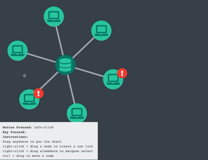
KeyLines’ events engine lets you customize every interaction to meet your users’ needs. For example, if users need a quick way to create links between nodes, you can build that behavior. The examples in our demos combine keyboard and mouse controls for faster navigation, but you can easily make them keyboard-only if needed.
Screen readers and text alternatives
Our products work with the accessibility tools your users already know – screen readers, text-to-speech systems, and Braille devices – rather than replacing them with proprietary solutions.
Making charts screen reader accessible
To make your charts accessible to visually impaired users:
Add keyboard navigation. Let users move through charts with their keyboard to find what they’re looking for.
Create text versions of your charts. Formatting this in the right way lets screen readers describe the data to users who can’t see the visual chart.
Add audio descriptions. When users hover over or focus on a node or link, read out the important information about it.
Using ARIA labels correctly
We recommend using ARIA labels appropriately with all our products. For complex visualizations like KronoGraph timelines and network graphs in ReGraph and KeyLines, you have two options:
If you’ve made the chart fully accessible with keyboard navigation and text alternatives, use ARIA labels to help screen readers understand the chart structure.
If the chart isn’t fully accessible yet, use the aria-hidden attribute to hide it from screen readers. This prevents users from getting stuck in a visualization they can’t navigate. Make sure you also add an aria-label or visible text description that explains what the hidden chart shows – for example, what data it contains or how it’s structured. This way, screen reader users understand what information is in the visualization, even if they can’t interact with it directly.
But hiding inaccessible content is only a temporary measure – you should provide an alternative way for these users to access the same information, such as a data table, text summary, or downloadable dataset.
<div
  style={{ height: '100%' }}
  aria-label="A simple chart"
  aria-description={`A simple chart with ${Object.keys(items).length} green node(s)`}
>
  <Chart aria-hidden={true} items={{ node1: { color: '#2dcda8' } }} />
</div>
Color and contrast
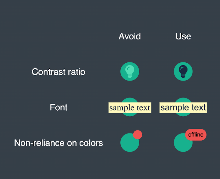
Choose colors, styling, and fonts carefully when designing your graph visualizations. Users with color blindness or visual impairments may struggle to tell apart colors with similar brightness or saturation.
The color blindness challenge
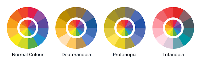
What works for one user won’t work for everyone. For example, red and green might provide excellent contrast for someone with low vision, but these same colors are nearly impossible to distinguish for users with deuteranopia or protanopia (both forms of red-green color blindness).
Providing color options
Provide multiple color schemes – including colorblind-friendly modes and high contrast options for low vision users. Adding just a few alternative color schemes makes a big difference.
Use free tools like the Color Contrast Checker to test your color schemes for accessibility. Remember: no color is accessible or inaccessible on its own. Accessibility depends on who’s viewing it and what colors surround it.
Don’t rely on color alone
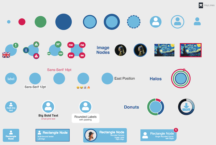
Use multiple visual cues to convey information – like size, shape, borders, icons, position, or animation. For example:
In KronoGraph we use different styles for event types (like folds and duration events) so users can understand them through multiple visual signals, not just color.
In ReGraph and KeyLines you can choose which visual cues work best for your users – combining node shapes, labels, glyphs, halos, and other visual indicators.
Text, icons, and visual clarity
Size and legibility
Size matters. Icons and text need to be large enough to read. If users can’t see them, they can’t use them.
Keep fonts simple. Sans-serif fonts are usually easiest to read, especially on zoomable graphs where text size changes. Hide text and icons at zoom levels where it becomes too small to read clearly.
Keep icons simple too. Make them easy to recognize at a glance, but not so simplified that their meaning becomes unclear.
Check color contrast. Even the clearest font or icon becomes invisible against a background with poor contrast. Test all text and icons against their backgrounds to ensure they’re readable.
Combining visual cues
Combine text, icons, and other visual cues. For example, a red node might indicate a problem, but adding the word “offline” makes it clearer, and an icon can make it instantly recognizable. If showing all these cues on every node would clutter your graph, provide a key that explains your visual system.
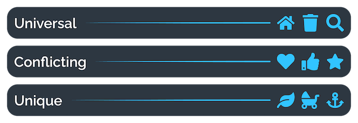
When to use icons
Don’t use icons alone. Icons can be confusing without context. Before adding an icon, ask yourself:
Is it universal? Icons like search, home, or trash are widely understood anywhere.
Is it ambiguous? Icons like hearts, stars, or thumbs-up mean different things in different contexts.
Is it specialized? Some icons only make sense in specific industries or are completely custom.
Unless your users are highly specialized, ambiguous and custom icons need accompanying text labels to be clear.
Animation and motion
Avoiding seizure triggers
Flashing, flickering, or rapid color changes can cause seizures in people with photosensitive epilepsy. Follow the W3C guidelines on seizures and flashes to keep your visualizations safe.
If you’re using animated features like the ping function (which adds a pulsing halo to nodes), either:
- Let users turn off animations
- Make sure the flash frequency and colors follow W3C guidelines
Subtler animations are less likely to trigger seizures, but they also need enough contrast to be visible to users with low vision. You’ll need to balance both needs or provide accessibility settings to accommodate different users.
Getting started
Everyone deserves access to powerful tools, including graph visualization. Following these accessibility best practices will help you build applications that work for all your users.
Explore the Keyboard Shortcuts demo in KeyLines to see example controls in action
Use the customization options in all our products to meet your users’ accessibility needs
Request a free trial to test what works best for your application