FREE: Managing fraud with visual link analysis
The ultimate guide to the role of link analysis and timeline visualization in fraud detection, investigation and prevention.
In this blog post, I show how to use data visualization and AI in a healthcare fraud detection application that keeps investigators one step ahead of fraudsters. I’ll rely on graph and timeline visualization toolkits to reveal insights that are hard to spot or interpret without visual analysis.
According to the 2022 census, 92.1% of the US population had medical insurance, making healthcare a multi-trillion dollar industry and a lucrative target for fraudsters. The National Health Care Anti-Fraud Association (NHCAA) reports between 3-10% of US healthcare expenditure is lost to medical fraud – that could be more than $300 billion a year.
This kind of fraud takes many forms, but the FBI identifies some of the most common as:
Organizations tasked with medical fraud detection need to understand the complex network of patients, healthcare providers and services they’re dealing with. Many rely on graph technology and healthcare data visualization for this because it’s powerful, it’s accessible, and its advanced algorithms help analysts to identify, investigate and predict fraud.
The ultimate guide to the role of link analysis and timeline visualization in fraud detection, investigation and prevention.
The artificial intelligence revolution introduces new models trained for complex tasks and in-depth analysis. For medical fraud detection, this means using AI-powered systems to process data at scale and identify potentially fraudulent activity.
The hard part is working out how to integrate these new capabilities with new or existing applications and workflows. AI-generated outputs are often complex, making it difficult to see how to use the data and turn it into actionable results.
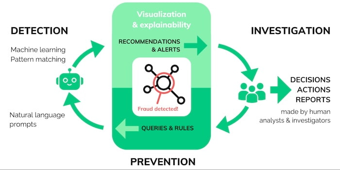
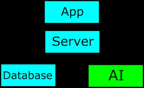
Here’s where you can leverage the power of graph visualization to convert sprawling and intractable output into something human-readable. AI insights brought to life with graph visualization make sense to users instantly, meaning analysts can take action fast.
AI and data visualization fit seamlessly together into the intelligence cycle.
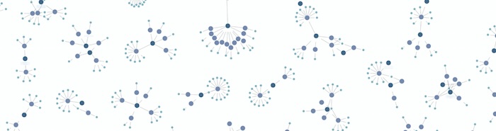
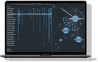
I created a visualization application using KeyLines, our graph visualization SDK for JavaScript developers. It uses fictitious healthcare data which mimics real-world insurance fraud scenarios:
Here’s the entire dataset:
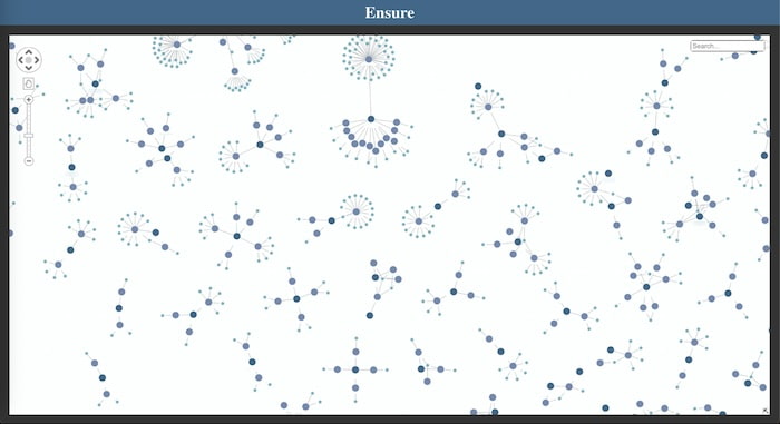
I immediately spot similar shapes and patterns in the data. Notice the separate components representing claims against small subsets of medical centers. This is fairly common behavior, as patients are likely to rely on medical facilities they’re familiar with, or that are closer to home, or be referred to a small number of specialist facilities to treat a particular problem.
How can I enhance my application with the power of AI?
Most AI models are designed to highlight and analyze input data, and so we can think of them in much the same way as fetching data from a database; we send data to the endpoint as a request and get a response back with new information.
Once we receive a response, we need to use it. I made a simple AI model for our fraud application using ollama.ai, and trained it to identify unusual activities and connections in an investigation.
A common problem is that the data we get back from AI-generated data sources is unreadable and hard to decipher. Here’s an example JSON response from our fraud detection AI application:
{
  “Type”: ”ai-fraud-scan–full”,
  “Status”: “success”,
  “input_Ids: [],
  “Compute_time”:
  “Usr_alert_score”: 0.8,
  “Cases”: {
    “As4p-fj7fn-4hf73”: {
       “sev”: “high”,
       “attr”: “acsn”,
       “attr_nonce”: 453,
       “val”: 0.97,
       “alt_prob”: 0.547,
       “en_dis”: 54.235,
       “rel_siz”: 120.1,
       “dup”: [],
       “dup_m_prob”: 0,
    }
    “As5n-ag1ak-0qf3a”: {
       “sev”: “mid”,
       “attr”: “upc”,
       “attr_nonce”: 8164,
       “val”: 0.73,
       “alt_prob”: 0.649,
       “en_dis”: 13.105,
       “rel_siz”: 98.4,
       “dup”: [
         “Ow3k-fx5pd-9rn85”
       ],
       “dup_m_prob”: 0.71,
    }
  }
}
Even if we can work out what AI found, it’s impossible to explain why it found it. In many cases, a human needs to understand the AI-generated recommendations or decisions – to explain them to a customer, make further investigations or submit them as evidence. For that to happen, we need to make the information easily accessible to analysts and investigators. That’s where graph and timeline visualization comes in.
I already have a graph visualization of the data in our fraud investigation, which gives us a solid context for each insurance claim. With my new AI-assisted analysis, I’ll enhance this further.
AI gives us a lot of relatively complex metrics, which may or may not be important. We can use graph visualization to highlight the AI metrics we care about in a way that instantly makes sense to analysts and investigators.
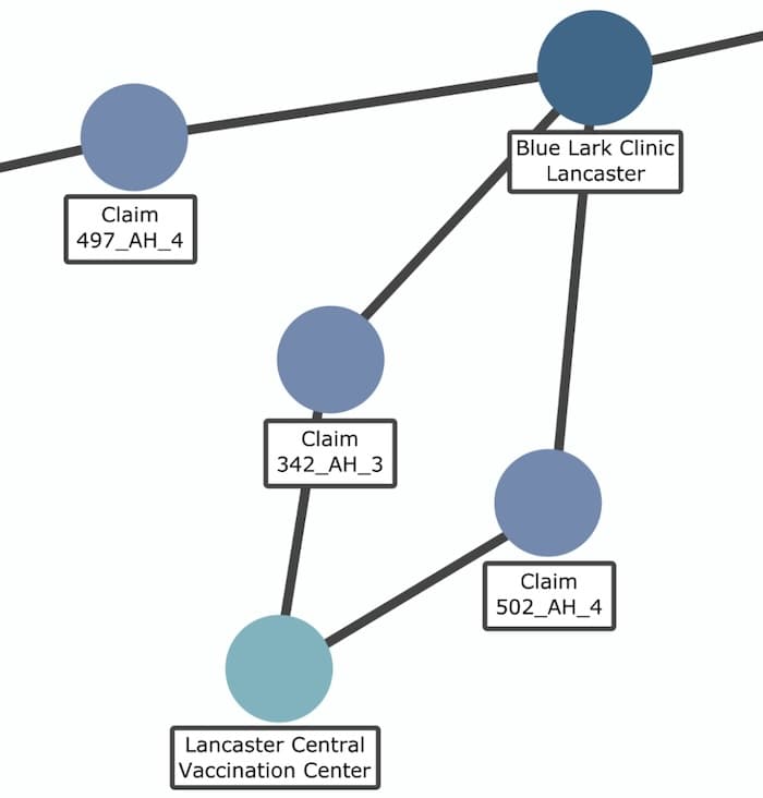
In this example, my application has flagged a medical center associated with a single claim:
The graph provides context to the alert, so an analyst can investigate further to verify whether it’s valid. This human interaction is vital: remember, AI can’t necessarily explain why it thinks there’s a problem, the intelligence cycle still relies on an investigator to make the final decision.
I dig deeper into the alert to find out why this center has been flagged:
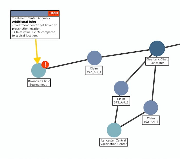
Interesting! The AI compared three similar claims and found problems with one of them. Firstly, there’s an unusually large distance between the location of treatment (Rowntree Clinic, Bournemouth) and the medical center where diagnosis took place (Blue Lark Clinic, Lancaster). What’s the reason for this? The other two claims for the same issue attended a nearby vaccination center. Why didn’t the other patient do that too?
The second problem reveals that the value of the claim is 20% higher than the other two claims for the same treatment. This could be a case of upcoding, where the claim itself is legitimate, but the value has been inflated by the fraudster.
The AI also gives us time-based data. Visualizing this effectively can be tricky, as screens are usually only effective at delivering 2D (and very occasionally 3D) data. Adding another dimension – time – is challenging.
Instead we can leverage the power of timeline visualization using KronoGraph, our time-based analysis toolkit. It’s the most effective way to explore how events and connections evolve over time.
Here, we’ve gone deeper into the claim data to reveal details of individual prescriptions, and how they were submitted. AI has flagged one online claim that took place on August 30th:
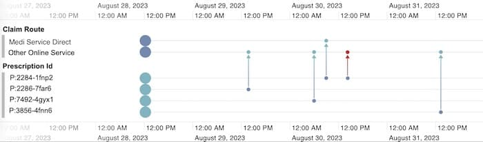
A closer look at prescription P:2284-1fnp2 reveals that it’s been claimed for twice, otherwise known as double-billing fraud. It wasn’t caught earlier because both claims were submitted from different online portals at similar times, so automated verification steps didn’t raise an alert.
While AI found this information, it’s the timeline that showed us what it means. It’s good practice to look out for technological errors, especially in something as new and poorly understood as AI. Analysts can make actionable decisions, but only if they’re shown the correct information in the right way.
Our customers have been using data visualization technology to gain insight into fraud cases for years. AI offers valuable enhancements to graph and timeline visualization applications, but finding insights in AI-generated data is a role reserved for analysts and investigators.
If you’re developing a fraud detection application, we’re here to help. Request a free trial today.
Visualize your data! Request full access to our SDKs, demos and live-coding playgrounds.


