Discover MapWeave
The revolutionary geospatial visualization SDK that uncovers every connection.
An interview with product manager Jan Girman, exploring how geospatial fusion is transforming defense and intelligence operations.
In this video, Jan shares his perspective on why fusing geospatial, temporal, and relational data has become critical in modern intelligence work. Below, we break the discussion into specific questions and key takeaways.
It’s to do with the growing complexity of the space in general. With the rise of modern ways of collecting signals intelligence and geospatial intelligence observations, there’s a lot more data now – but the number of analysts hasn’t grown at the same rate. In fact, it probably hasn’t grown at all.
And so you have these individuals who are responsible for bringing all this analysis together. They need one place to consume it all, especially if they’re under pressure to come up with better and faster decisions. So the need for a single pane of glass is stronger than it’s ever been.
Overlaying all those signals, open source and geospatial intelligence observations onto a map provides real-world context for the end user. Because in defense and intelligence, things usually happen within an area of responsibility, or an area of operations. You can triangulate those different layers of data to map out infrastructure and locate specific population centres, patterns of life. That’s the essence of geospatial fusion.
It depends on the type of operation, but more often than not, you’re talking about satellite imagery – whether that’s the base layer or an overlay. In defense, for example, you might map out a network of opposing military forces. In an order of battle analysis, you’d track individual units: Where are they right now? Where have they been in the last few hours, days, or weeks? That same pattern-of-life analysis extends to civilian populations. What’s the population flow? Where are the traffic jams? Where do people congregate?
But the operating environment isn’t just physical. You also need to visualize the cyber domain, military hierarchies, critical infrastructure – they’re all layers on the same operational map.
Then you have signals intelligence. Where are devices being detected? What are their movements? When you fuse all these layers together, that’s when new insights emerge.
These connections are invisible when all your intelligence streams are siloed.
Traditional GIS platforms give users a checklist to toggle layers on and off. And the heavy lifting they do under the hood – making sure different intelligence layers transpose correctly onto the map, handling coordinate systems and projections – that remains absolutely essential.
But modern, cutting-edge fusion is more demanding. Now that analysts have access to more data and intelligence than they ever had before, simply scrolling through a list of tick boxes isn’t enough. The important question becomes: How do users navigate this data? What’s the most important thing to show them in the first view? How can they then interact with it to go deeper, broader or explore laterally – moving through different intelligence layers almost without realizing they’re separate sources of information?
Because if the data is verified and validated, what does it matter if they’re from different sources? What matters is whether it helps them answer the operational question at hand. Modern fusion is about that user experience – navigating smoothly through layers of intelligence, surfacing the right insights at the right time, and ultimately delivering the answers operators need to make smart decisions.
When we talk about geospatial fusion, it’s important to remember that we’re not just talking about map data. The temporal element is critical, too. Exactly when did something happen? When might it happen? How did events unfold? And against that you need to understand who and what was involved, and the connections between those entities.
It comes back to putting yourself into the shoes of this overwhelmed analyst who’s pulling together multiple signals and intelligence streams to develop assessments, answers and operational plans. The sheer number of tools they need just to do their job is staggering. I’ve seen analysts physically running between workstations to get answers from different platforms.
So you can’t expect end users to switch between multiple applications to sift through different intelligence types and make critical decisions. That cognitive load isn’t sustainable – and in high-stakes environments, it’s dangerous.
The solution is to bring it all into a unified application where analysts can work fluidly across intelligence domains without context-switching, without losing their train of thought, and without missing connections that only become visible when everything is in one place.
An analyst’s work is extremely time-sensitive. They’re responding to things that are happening in real time, and trying to factor new intelligence into their operational planning. There’s a very narrow window to consume intelligence, make a decision, and communicate it up the chain. In the best case scenario, siloed data slows you down. By the time you’ve pieced everything together and made a decision, the situation has already evolved.
In the worst case, you miss mission-critical intelligence entirely. It exists somewhere in your systems – maybe in a different application, or in a format that doesn’t integrate with your primary workflow – but it never factors into your analysis, and you’ve lost situational awareness at a time when you need it most.
Gray zone activity is hostile activity that deliberately very often blurs the lines between peace and conflict. That’s where intelligence fusion becomes essential. Gray zone activity is obfuscated by design. The activity you’re witnessing is almost never carried out by the actors actually orchestrating it. There are layers of individuals, organizations, and state actors involved.
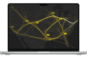
The power of network graphs for bringing this type of intelligence to life is well established. But the ability to overlay those networks onto a map – showing not just the connections between actors, but where they are operating – is genuinely novel.
When you can visualize both the organizational hierarchy and the geographic footprint on the same operational picture, you’re not only reacting to gray zone activities. You can anticipate them, identify patterns before they escalate, and potentially disrupt them before they do significant damage.
Since the start of the Ukraine war, there’s been a massive spike in maritime incidents targeting undersea cables and pipelines. This is gray zone activity at scale – disruptive, strategically important, but not quite an act of war.
When incidents like this happen, you first need to identify the vessel involved. That requires fusing vessel tracking data with incident reports, intelligence about suspicious maritime activity, and open-source information. It’s rarely a straightforward match – vessels turn off transponders, use false identities, operate in ways designed to avoid detection.
But that’s only half of the picture. You also need to peel back the ownership layers – digging through shell companies and front organizations to identify the state actor or entity that’s behind this activity.
Maritime intelligence specialists tell us these ownership structures can go as many as seven layers deep. It’s a complex network of individuals and companies deliberately obscuring who actually controls the vessel.
That’s where the real power of fusion lies. You need to see the vessel’s movements in space and time, scrubbing back and forth through its track history. You need to identify the other vessels it communicated with, because these operations rarely happen in isolation. And you need to visualize the network graph of connections and individuals behind the crew operating that vessel.
When you can see all three dimensions – the geographic movement, the temporal pattern, and the organizational network – all together on one platform, that’s when the full picture emerges.
Yes – another compelling example is pattern-of-life analysis. Say you have volumes of GPS movement data for individuals across an entire city, spanning weeks, months, or years. It’s a phenomenal amount of data, and analysts will come at it from different angles.
Sometimes they know exactly who they’re looking for, and it’s a case of linking a device to an individual, and tracking their movements. Other times, they don’t know who they’re looking for, but they’ve identified locations of interest. That’s where spatial context is really important. You isolate an area on a map and monitor activity. Who comes and goes at specific times? Who appears at unusual hours?
In larger scenarios – an entire district or city – you’re dealing with millions of people, millions of devices, all constantly moving. Then it’s more about understanding patterns. What does ‘normal’ look like on a given day, weekend, or holiday? And more importantly, can I spot what’s abnormal? Unusual surges in activity. Dead zones where signals drop. Someone deliberately blocking detection.
If you analyze this in just one dimension, you miss the full picture. The spatial dimension tells you where things happened. The time series tells you when. The graph reveals the connections between millions of individuals. For pattern-of-life analysis, no single dimension gives you enough to detect outliers and anomalies.
But when you fuse all three, you can see a device moving through space, correlate it with timing patterns, and link it to a network of associated individuals. That’s when outliers become visible. Someone should be somewhere, and they’re not. A location that’s usually quiet suddenly isn’t. A cluster of devices come together at an unexpected time.
Without fusion, this is all hidden in the noise. With it, you can identify threats, track suspicious actors, and even anticipate events before they unfold.
Absolutely, yes. Solutions that fuse different intelligence layers have fundamentally changed how analysts work – and what they expect from their tools. It certainly accelerates their decision making. But that’s contingent on the user experience – on giving analysts the right first picture that guides them through their investigation toward the right conclusions.
And that’s incredibly difficult to achieve as a software developer, because you’ll never see the actual data. So much of it is far beyond any security clearance we could hold. So you’re building tools for intelligence that you can’t access, workflows you can’t directly observe.
Fusion has raised the bar for what analysts expect. Nobody knew to ask for overlaid intelligence layers until they saw it in action. Now it’s ubiquitous, everybody’s asking for more. They want to work faster, analyze more efficiently, make more effective decisions.
So now analysts are demanding the next level of capability, which is fusion that’s not just visual but cognitive. They want to interact with the data in an almost tactile way. People think by touching, feeling, exploring things. The question becomes: how can we enable that kind of intuitive interaction so analysts can be more effective operators?
The next big step in geospatial intelligence fusion is moving beyond visual integration to true cognitive fusion. AI already plays a major role in that. But I’m not talking about the AI we use every day. As the world wakes up to a future beyond web-based large language models, we’ll see more specialized models operating in the sensitive networks where this intelligence actually exists.
They’ll be domain-aware models, trained on specific intelligence types, completely siloed from the open internet – running on-premises or in isolated cloud environments. They’ll provide decision support to analysts who are increasingly outnumbered by the volume of intelligence being generated.
Look at the rise of drone capabilities over the last couple of years – it’s been absolutely astronomical. Every platform is packed full of sensors and cameras generating massive amounts of data that someone has to consume and act on. But there aren’t enough analysts to keep pace.
They’re going to need tools that help them sift through the noise, figure out what’s pertinent, and support their decision making. But it isn’t the AI that you and I use every day when we’re chatting with good old GPT. This is a future more tailored, more bespoke, and much leaner – purpose-built for these siloed environments.
There’s another challenge: these capabilities which require enormous compute power, but in modern electronic warfare, you want to minimize your electromagnetic signature. Concentrations of signal activity become targets – they reveal where the HQ is, where intelligence operations are happening.
That’s a real catch-22. You absolutely need these powerful capabilities to process intelligence, but you can’t paint a giant bullseye on your back in the process. Over the next few years, we’ll see significant evolution in how to leverage AI capabilities while maintaining operational security. That’s definitely a frontier area.
Even as AI and machine learning become essential tools for consuming intelligence faster, visualization becomes more important. There’s always this element of validation and verification – V&V, as it’s called – and an element of trust. We’re definitely not yet at the point where operators can blindly trust machines to make the right assessment or extract the right intelligence. That ability for humans to validate findings – keeping the human in the loop – is incredibly important, especially in sensitive domains where decisions are critical.
So visualization doesn’t go away. In fact, the need for better, more informative visualization is amplified. As the sea of intelligence grows, the need to visualize the most important information becomes more pressing, whether you’re talking about things on maps, network graphs or temporal patterns.
The answer isn’t to put absolutely everything on the map. It’s to use AI tools to surface the right things, to guide analysts toward the right decisions based on fused intelligence. Visualization plays a key role in that process. It’s how analysts validate what the machines are telling them, how they maintain situational awareness, and ultimately, how they make decisions they can trust.
The revolutionary geospatial visualization SDK that uncovers every connection.
Registered in England and Wales with Company Number 07625370 | VAT Number 113 1740 61
6-8 Hills Road, Cambridge, CB2 1JP. All material © Cambridge Intelligence .
Privacy Policy | Security Framework


